


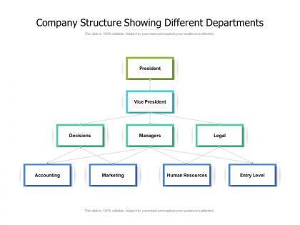
Company structure showing different departments




Try Before you Buy Download Free Sample Product
 Impress Your
 Audience
 100%
100% Editable
 Save Hours
 of Time


Highlight invalid documents with our Company Structure Showing Different Departments. Enable folks to identify counterfeits.
People who downloaded this PowerPoint presentation also viewed the following :
Company structure showing different departments with all 2 slides:
Enable folks to identify counterfeits with our Company Structure Showing Different Departments. Highlight invalid documents.
FAQs for Company structure
Honestly, org charts are a lifesaver for cutting through workplace confusion. You'll know exactly who reports to whom without guessing. Need to escalate something or find the right person for a project? No more playing email tag with random people (ugh, the worst). They're also clutch for onboarding – new hires can actually see how everything connects instead of being totally lost their first week. Plus you can spot weird gaps in your team structure or figure out if someone deserves that promotion. Update yours every few months though, or it becomes useless pretty fast.
Honestly, org charts are lifesavers for cutting through that "wait, who do I even report to on this?" mess. You'll finally know who makes decisions, who to bug when things go sideways, and whether someone's your peer or boss. Communication gaps become super obvious too - like when you spot two teams that should definitely be talking but aren't. Things just flow better when the hierarchy's clear, though I know some people think they're corporate nonsense. Definitely walk your team through it at the next meeting so nobody's confused about changes.
So there's basically three types: the classic pyramid (hierarchical), flat with barely any management, and matrix where people report to like multiple bosses. Pyramid works for traditional companies that need clear chains of command. Flat's perfect for startups or creative teams - way faster decisions. Matrix is honestly kind of a headache but makes sense when everyone's juggling different projects across departments. Most places end up being some weird combo anyway. I'd say just map out how work actually happens first, then pick whatever fits that flow instead of forcing some textbook structure.
Start by figuring out how things actually work right now - not how they're supposed to work on some org chart. Who talks to who every day? Those people should probably be grouped together. One manager with more than 7-8 direct reports? That's gonna be messy. Communication paths matter way more than fancy hierarchies, honestly. Try walking through some real scenarios - what happens when there's a crisis or big project? If the info has to ping-pong between five different people just to make a simple decision, you've got a problem. Better to catch that stuff on paper than deal with it later.
Dude, yes - definitely include an org chart in onboarding! New people get so lost trying to figure out who does what and who reports where. I remember being that person wandering around asking random questions to the wrong teams lol. Show them the chart early, maybe day two or three when they're not completely overwhelmed. It's honestly a lifesaver for avoiding those cringe moments where you email someone's boss instead of them. Plus it helps with the whole office dynamics thing - you'll know who actually makes decisions versus who just talks a lot in meetings. Takes like five minutes but saves weeks of confusion.
Honestly, your brain just grabs visual info way faster than reading through boring text lists. With org charts, you can instantly see who reports to who and spot the actual decision-makers. Super helpful when you need to escalate something - just check the chart first instead of guessing. They also show you communication bottlenecks and how different teams connect. I mean, it beats trying to decode job descriptions to figure out the pecking order, right? Next time you're collaborating across departments, pull up that visual hierarchy. Makes everything so much clearer.
So for org charts, Lucidchart and Visio are your best bet - they're made specifically for this kind of thing and have loads of templates. Draw.io is free and pretty decent, though it feels weird to use at first. PowerPoint actually works fine for basic charts too if you don't want to mess with new software. Larger companies usually go with HR tools like BambooHR since they build the charts automatically. Honestly though, I'd just use whatever your team already has access to. Why make life harder, right?
Honestly, update that thing every single time something changes - new hires, people leaving, role switches, the whole deal. I made this mistake once where our chart was like 6 months behind and it was a total mess. Nobody could figure out the reporting structure anymore lol. Soon as someone joins or bounces, update it. Same goes for any big reshuffles or if you merge with another team. Don't wait for some quarterly review - treat it more like a Google doc that's always current. Get HR or whoever to just shoot you a quick message when stuff changes. Way easier than trying to piece everything together later when you can't remember who moved where.
Honestly, most people way overthink these things. Don't make it look like some crazy flowchart nightmare - keep it clean so people can actually read it. Skip the fancy templates, they usually just confuse everyone. For bigger companies, you don't need every single employee on there, just hit the main roles and departments. Oh and use those dotted lines for people who report to multiple managers - that matrix stuff gets messy otherwise. The worst thing though? Letting it get outdated. Seriously, an old org chart just creates more confusion than having none at all. Update it when people move around.
Honestly, org charts are perfect for this! Just map out who's got what skills across your team structure. You'll instantly spot where expertise is clustered or totally missing - like when all your senior devs end up in one department. The visual makes it so obvious. I'd start by color-coding different roles based on skill sets on your current chart. You'll see the gaps right away, plus any redundancies where you've got too many people doing similar stuff. Once you overlay what skills you actually need onto that structure, the holes practically jump out at you. It's weirdly satisfying actually.
Yeah, org charts are pretty much useless now tbh. People collaborate way differently when everyone's remote - like, my team works with three different departments daily but you'd never know from looking at our official chart. Those old proximity hierarchies don't mean much anymore (who cares if someone sits next to the boss when we're all on Zoom?). The whole boxes-and-lines thing just can't show how fluid everything's become. You might want to map out who actually talks to who instead of focusing on formal reporting. That'll give you a way better picture of how stuff really gets done.
Honestly, org charts are lifesavers for project management. You'll know exactly who makes decisions instead of sending emails into the void hoping someone responds. I learned this the hard way on my last project - total mess. They also help you catch resource conflicts before they blow up. Like when marketing and IT both need Sarah for the same week? Yeah, the chart shows you that nightmare coming. Communication flows get clearer too since you won't accidentally skip over someone's boss. Trust me, keep that thing open during planning or you'll be dealing with angry managers later asking why nobody told them anything.
Honestly, org charts are way more helpful than people think for strategic planning. They show you exactly where the gaps and bottlenecks are hiding in your structure. You'll spot redundancies fast, plus see what roles you're missing for future projects. Decision-making paths that are too slow? They jump right out at you. The succession planning thing is huge too - suddenly you can see who's actually ready to move up and where you've got those scary single points of failure. I always tell people to sketch out both their current chart AND where they want to be before making any big moves.
Update that thing right after any changes happen - new people, departures, role shifts, whatever. Seriously don't let it get stale for weeks because then nobody trusts it. I'd set up monthly check-ins with HR to catch stuff you missed. If your software can sync with HR systems, do that - saves you tons of manual work. Also map out how teams actually work together, not just who reports to whom. Most people need access to it (they just don't realize). Oh and treat it like it's alive, not some annual chore.
Honestly, the coolest thing about digital org charts is how interactive they get. Instead of those boring static boxes, you can click on people and see their contact info, skills, current projects - even if they're available right now. Most platforms let employees update their own stuff too, which saves HR tons of headaches. What really sells me though is the search function. Need someone who knows Python? Just search instead of scanning through hundreds of names like some kind of corporate Where's Waldo. Mobile access is clutch too since everyone's always on their phones anyway. I'd start with Lucidchart or check out Microsoft Visio's interactive options.
No Reviews