

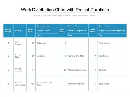
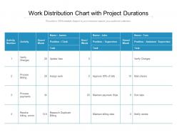
Work distribution chart with project durations




Try Before you Buy Download Free Sample Product
 Impress Your
 Audience
 100%
100% Editable
 Save Hours
 of Time


Avoid detours with our Work Distribution Chart With Project Durations. Take the straight road to success.
People who downloaded this PowerPoint presentation also viewed the following :
Work distribution chart with project durations with all 2 slides:
Be the detective with our Work Distribution Chart With Project Durations. Solve the mystery with your thoughts.
FAQs for Work distribution chart
You need employee names, their tasks, and how many hours each thing takes. Throw in deadlines too. Color coding helps - like red for swamped, green for available. But here's the thing - doesn't matter how pretty it looks if nobody updates it. I've seen so many beautiful spreadsheets that just sit there gathering dust. Start basic with names and tasks first. Once people actually use it, then add the fancy stuff. The whole point is spotting who's drowning and who could take on more work.
Honestly, work distribution charts are a game changer - no more of those "wait, wasn't that your task?" disasters. Everyone sees who's swamped and who's got bandwidth. Makes standups actually useful instead of just status updates nobody listens to anyway. Start by writing down your current projects and see where everything piles up. You'll probably find some weird patterns, like Sarah handling three urgent things while Tom's just doing busy work. Once you spot the bottlenecks, you can shuffle things around before deadlines start breathing down your neck. Worth the 20 minutes it takes to set up, trust me.
Honestly, I'd start with a team check-in to see who's drowning and who has space to breathe. Color-coding helps a ton - mark stuff by urgency or what skills you need. Then you can shuffle tasks around based on who's good at what and actually available. Buffer time is your friend because something always goes sideways (learned that the hard way). Short sentences work. Keep updating your chart as things change - and they will change, probably daily. The visual aspect really makes it click when you're trying to figure out who should take on what.
Honestly, I just update mine whenever something big changes - new people join, deadlines shift, that kind of stuff. Weekly check-ins work pretty well during busy phases, though some weeks literally nothing happens and I skip it. The real trick is being flexible instead of forcing yourself to stick to some rigid timeline. When someone's workload goes crazy or tasks get moved around, update it right away so nobody's confused. I set a weekly calendar reminder but then just adjust based on how chaotic things are getting. Way better than scrambling to figure out who's doing what when everything hits the fan.
Honestly, I'd just use Excel if you already have it - super flexible once you get the hang of it. Visio's great for professional stuff but kinda pricey. Lucidchart works well if your team needs to collaborate online. Google Sheets is solid too, basically Excel but free. Oh, and Smartdraw has decent templates if you don't want to build from scratch. Miro's more for brainstorming but can work. I always end up going back to Excel though, even when I try other tools. Just pick whatever your team can actually access without jumping through IT hoops.
Okay so work distribution charts are honestly game-changers for keeping projects from turning into total disasters. You'll know exactly who's handling what and when, which stops tasks from falling through the cracks. The best part? No more awkward "wait, I thought YOU were doing this" conversations halfway through. Bottlenecks become way easier to spot early, and you can actually balance workloads instead of overloading Sarah while Mike sits around. I mean, it sounds super basic but just mapping out tasks and assigning clear owners upfront saves so much drama later. Trust me on this one.
Don't get too detailed with your tasks or you'll create a nightmare chart nobody wants to touch. Broad categories work way better. Oh, and all that indirect stuff like meetings and emails? Track it because it's probably eating more time than you realize. You want to measure what's actually happening, not some fantasy version of productivity. Monthly check-ins are smart since things change constantly - I learned that the hard way when my chart became completely useless after like two weeks. Just adjust the numbers as your workload shifts and you'll be good.
Colors are your best friend here - give each person or team their own shade so you can instantly spot who's doing what. Bar charts crush those awful spreadsheet tables that nobody wants to read. Throw in some icons for different task types if you're feeling fancy. I personally think pie charts get messy with too many people, but they work fine for smaller teams. The height of bars should show how much work someone's actually carrying. You want it simple enough that your boss can glance over and immediately see who's drowning versus who could take on more stuff.
Honestly, start by figuring out who's good at what and how swamped they already are. Don't stick your detail person on big picture stuff - that's just asking for trouble. Look at your deadlines too, especially if some tasks depend on others finishing first. Remote team? Time zones will mess with you if you're not careful. I always try to balance getting shit done efficiently with giving people chances to grow. Oh, and I literally make a list of everything first - sounds basic but it helps when you're mapping out who can handle what based on their current bandwidth.
Try adding skill indicators next to everyone's names - like color codes or just "junior/senior" labels. Makes it super easy to balance workload by actual capacity instead of just counting tasks. Trust me, this prevents so much burnout drama later. A junior dev might handle three smaller bugs while your senior person tackles one massive feature. Both matter equally, you know? The trick is tracking volume AND complexity together. I'd start by looking at what you've got assigned right now - bet there's some weird imbalances you didn't even notice.
Honestly, feedback is what makes the whole thing actually work. Your chart means nothing if you're not checking in with people about how they really feel about their workload. I've watched managers make these gorgeous-looking distribution charts that were total fantasy - meanwhile Sarah's pulling all-nighters while Mike's playing solitaire. Ask your team straight up: does this feel fair? Are you overwhelmed or bored? Build it into your regular one-on-ones because people won't always volunteer that they're drowning. The chart should change based on what you hear back.
Honestly, work distribution charts are a game-changer for remote teams. Think of it as your go-to visual for who's handling what and when everything's due. We update ours during standups or weekly meetings so there's no confusion about responsibilities. The best part? You can spot dependencies right away without playing email tag across different time zones. Just keep it straightforward - throw it in your shared workspace where everyone can jump in and edit. Way better than constantly asking "hey, what's the status on that thing?" Trust me, it'll save your sanity when you can't just walk over to someone's desk.
Honestly, these charts are game-changers for spotting who's drowning and who's coasting. You'll see right away if Sarah's pulling 60-hour weeks while Mike's checking emails twice a day. They also catch those annoying situations where your best people get stuck doing busy work instead of the stuff that actually matters. The visual layout makes bottlenecks super obvious too. Just map out what everyone's currently doing, then shuffle things around based on what you find. I probably should've started using them way earlier than I did.
Look at completion rates first - are people actually finishing what they're assigned? Time-to-completion matters too since it shows who's efficient vs struggling. Quality scores are honestly make-or-break because fast but crappy work defeats the purpose. I'd also watch workload balance to catch if someone's drowning while others coast. Bottlenecks that keep happening are worth tracking down. Oh, and don't go crazy with metrics - pick like 2-3 that actually relate to what your team's trying to accomplish. You'll just overwhelm yourself otherwise.
Honestly, just pick 3-5 categories that match what you're actually doing. Software teams might split between dev/testing/docs, while marketing projects could be creative/strategy/execution - whatever makes sense for your work. I've watched teams argue for ages about the "perfect" breakdown when basic categories work just fine. Start simple and adjust later once you see what data actually helps. The whole point is figuring out where time goes, not creating some elaborate tracking system. You'll know pretty quick if your categories are too broad or weird.
No Reviews