


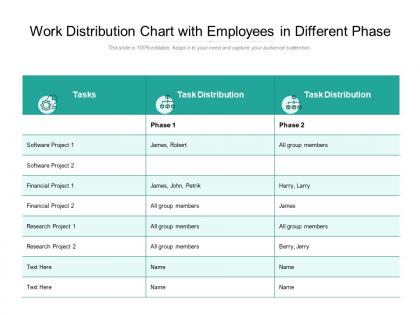
Work distribution chart with employees in different phase




Try Before you Buy Download Free Sample Product
 Impress Your
 Audience
 100%
100% Editable
 Save Hours
 of Time


Let nothing deter you from your goal. Our Work Distribution Chart With Employees In Different Phase will keep urging you on.
People who downloaded this PowerPoint presentation also viewed the following :
Work distribution chart with employees in different phase with all 2 slides:
Determine the sequence with our Work Distribution Chart With Employees In Different Phase. Put your thoughts in a logical framework.
FAQs for Work distribution chart with employees
You need the basics: employee names, their roles, and what tasks they're actually doing. Time allocation is key - like how many hours or what percentage goes where. Honestly, half the charts I see are just confusing mess with too many arrows everywhere. Keep descriptions clear and show who reports to whom. Deadlines help if they matter for your situation. The real goal? Spotting who's swamped and who's got too much downtime. Start simple with a basic template, plug in your team's real work, then update it monthly. Otherwise it'll just collect dust and become useless pretty fast.
So basically it's like a visual map showing who's doing what on your team and how swamped everyone is. Super handy for catching when Sarah's buried under 50 tasks while Mike's just chilling with like 3 things. No more of those "oh crap, I thought YOU were doing that" disasters either. Everyone can see how their stuff connects to other people's work, which honestly makes everything run smoother. I'd just list out what everyone's currently working on and their time commitments, then bring it to your next meeting. You'll probably spot the problems right away.
Dude, visual aids are a game changer for work distribution charts. Color coding is where it's at - green for light workload, yellow for moderate, red for overloaded. You'll spot who's drowning instantly. Charts beat boring spreadsheets every time. I swear people's brains just shut off when they see rows of numbers, but throw in some colors and icons? Suddenly everyone's paying attention. Icons work great for different project types too. Start simple with the color system - honestly, you won't believe how much clearer everything gets once you can actually see the workload patterns.
Honestly, just start with Excel or Google Sheets - everyone already knows them and they work fine. Don't overthink it. Lucidchart makes prettier charts if you're presenting to executives or whatever. Miro's great when your whole team needs to collaborate at once. I swear I've watched people waste entire afternoons picking the "perfect" tool when a simple spreadsheet would've done the job in 20 minutes. Use whatever your team's already comfortable with first, then switch later if you actually need the fancy features.
So basically, work distribution charts are about WHO handles what - like making sure Sarah isn't buried under ten tasks while Tom has nothing. Gantt charts? That's your WHEN - timelines, deadlines, what needs to happen before other stuff can start. I usually mess around with the distribution chart first during planning (honestly saves so much drama later) to balance everyone's workload. Then I'll jump into the Gantt to actually track how things are moving. It's like... one helps you not burn people out, the other keeps your project from falling apart timeline-wise.
Honestly, forget the job descriptions and just watch what everyone actually does for a week or two. People always forget to mention half their tasks when you ask directly. List out each team member and get specific about their activities - plus how much time they're spending on stuff. That's where you'll find the good insights. Look for the obvious overlaps and imbalances once you've got the data. Oh, and definitely run your draft by the team before you call it done - they'll catch things you missed.
Honestly, these charts are game-changers for figuring out who's doing what. You'll see patterns jump out immediately - like Sarah always getting stuck with data entry while Mike handles every technical crisis. It's basically a talent heat map, which sounds fancy but makes total sense once you see it. Look for people drowning in their weak areas or coasting on boring stuff when they could crush bigger projects. Then you can actually redistribute work smarter instead of just hoping things balance out. Plus it gives you real talking points for those career convos nobody wants to wing.
Honestly, work distribution charts are game-changers. Everyone can see who's handling what and how loaded up people actually are. No more awkward "so... how's that project going?" check-ins every five minutes. Your team gets this shared view where tasks don't just disappear into the void. People step up more when their stuff is visible to the whole group - there's something about that transparency that just works. I swear it cuts down on so much back-and-forth messaging. Try it on your next thing and you'll probably notice way less confusion overall.
Honestly, going digital is a must - try Asana or Monday, even a basic Google Sheet works. Add everyone's time zones and how they prefer to communicate because coordinating across time zones is actually the worst. I'd throw in more details about what deliverables should look like too, since you can't just pop over to someone's desk. Weekly updates during team calls keep everyone on the same page. Oh, and make it way more transparent than you normally would - remote work means less casual check-ins, so the chart becomes your lifeline for tracking who's handling what.
Honestly, the biggest trap is getting way too detailed with every little task - you'll lose your mind and nobody will use it. Just stick to the big stuff and time blocks. Oh, and definitely build in buffer time for all those "quick questions" and surprise meetings that always pop up. I learned this the hard way lol. Don't make it super rigid either. Think of it more like a flexible guideline than some strict rulebook. Be realistic about timing too - we're all terrible at estimating how long things actually take versus what we hope they'll take. Keep tweaking it based on what's working.
Honestly, I'd say weekly at minimum. But it really depends on how crazy your project gets. Fast sprints or constant scope changes? Update that thing every couple days or you'll be lost. More stable projects can probably get away with bi-weekly. Definitely refresh it when team assignments shift or new tasks pop up. Once someone's workload changes dramatically, the chart's gotta reflect that. I learned this the hard way - let mine sit for three weeks once and it was basically fiction at that point. Set a calendar reminder though, trust me on this one.
Honestly, work distribution charts are kinda pointless if your team deals with unpredictable or creative stuff. Emergency requests that come out of nowhere? Constantly changing priorities? The chart just becomes annoying busy work. They're terrible for knowledge work too - like, tracking "thinking time" is weird and doesn't help anyone. If your team collaborates heavily and everyone jumps in where needed, the rigid categories don't match how you actually work. I'd skip it unless your workflows are pretty structured and predictable. Otherwise you'll spend more time updating the chart than getting value from it.
Honestly, you've gotta get your team involved in this stuff. They're the ones actually doing the work, so they'll catch things you miss - like when you think something takes 2 hours but it's really a 4-hour nightmare. I can't tell you how many "perfect" charts I've seen that were total garbage in practice. Quick monthly check-ins work great for this. Just ask what's not working. People will tell you straight up if the timeline's unrealistic or if two people are doing the same thing. Plus they'll actually use the chart if they helped create it, which... yeah, obvious but still.
Honestly, just watch if people are drowning while others seem bored - that's your biggest red flag right there. I'd check completion rates too, see who's missing deadlines consistently. Employee satisfaction surveys help a ton since stressed people will definitely let you know about unfair workloads. Track how much you're scrambling to reassign tasks or push back deadlines. If you're constantly playing musical chairs with work, your chart probably sucks. Oh and do these checks monthly, not like once a quarter when everything's already gone to hell.
Oh man, yeah this totally comes up! Team members from different backgrounds read those charts completely differently. Some cultures see uneven workloads as totally normal - like showing respect to senior people. Others think it's super unfair. Plus communication styles vary so much - some people won't directly say they're overloaded, which makes everything messier. I've watched teams get into weird conflicts over this during retrospectives. My advice? Just talk about what "balanced" actually means for your specific team upfront. Otherwise you'll keep having these awkward misunderstandings where everyone thinks they're being reasonable but interpreting everything differently.
No Reviews