


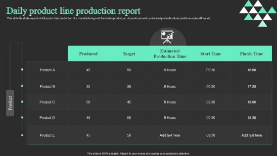
Daily Product Line Production Report




Try Before you Buy Download Free Sample Product
 Impress Your
 Audience
 100%
100% Editable
 Save Hours
 of Time


This slide illustrates report on full product line production of a manufacturing unit. It includes product, no. of produced units, estimated production time, start time and end time etc.
People who downloaded this PowerPoint presentation also viewed the following :
Daily Product Line Production Report with all 6 slides:
Use our Daily Product Line Production Report to effectively help you save your valuable time. They are readymade to fit into any presentation structure.






FAQs for Daily Product
So definitely track your production volume and quality stuff like defect rates. Efficiency metrics too - downtime, cycle times, all that. Cost per unit is huge, plus resource utilization since your boss will 100% ask about that in meetings. On-time delivery and safety incidents are must-haves. Oh, and throw in some trend comparisons to last month so people can see if things are getting better or worse at a glance. Honestly, the trick is sticking to metrics that actually matter for decisions instead of just cramming in random data to look impressive. Start with these basics, then add whatever your leadership team obsesses over.
Honestly, charts and graphs are game-changers for production data. Nobody wants to dig through endless spreadsheet rows trying to spot if something's off. Bar charts work great for comparisons, line graphs show trends over time. Color-coding is clutch too - red for issues, green when you're hitting targets. The trick is matching your visual to the story you're telling. Figure out your main point first, then pick whatever chart actually highlights that. Oh, and dashboards are perfect because people can catch problems at a glance instead of playing detective with raw numbers.
Oh man, data quality issues will make you want to scream. Everyone submits stuff last minute with totally different formatting - it's like they do it on purpose sometimes. Manual entry errors are the worst though, one tiny mistake ruins everything. Then you're stuck copying between Excel, random databases, and whatever weird system each department decided to use that week. Honestly? Build in fake deadlines way before you actually need things, and force people to use your templates. Trust me on the templates thing - it'll save your sanity later when you're not reformatting spreadsheets at 9pm.
Honestly, automating your data collection is a game changer - no more manual entry mistakes eating up your time. You'll get real-time dashboards instead of waiting around for those end-of-shift reports. Cloud platforms let you share stuff instantly across teams (bye bye endless Excel email chains). AI can spot weird trends you'd probably miss anyway. But here's the best part - set up automated reports that run overnight. Nothing beats starting your day with fresh production data already waiting for you. Makes the morning coffee taste better, I swear.
Weekly reports are your best bet for most production stuff. Daily feels like overkill unless you're running something super high-stakes - honestly, too much data just makes everyone's eyes glaze over. Monthly? Way too slow. You'll miss problems until they've already blown up. With weekly cadence, you can actually spot patterns before they become disasters. Plus it gives your team breathing room to digest the info and act on it. I'd start there and see how it feels. Maybe you'll need to tweak it based on how fast things actually change in your operation, but weekly hits that sweet spot between being informed and drowning in spreadsheets.
So basically, data viz turns those brutal spreadsheets into something you can actually read. Charts and graphs show you trends, bottlenecks, performance issues - stuff that's impossible to catch when you're drowning in numbers. I was skeptical at first, but visual dashboards changed everything for me. You'll instantly see which shifts are killing it, where efficiency's tanking, quality problems... all that good stuff. Bar charts work great for output. Line graphs are perfect for tracking trends over time. Way better than going cross-eyed staring at endless rows of data.
Looking at your past production numbers is honestly the best way to figure out what's coming next. You'll see which bottlenecks keep happening and spot the processes that always mess up. Way smarter than just winging it, right? The data shows seasonal patterns, helps predict what resources you'll need, and reveals where improvements actually worked. Oh, and you can catch problems early before they cost a fortune. Realistic target-setting becomes so much easier too. Just pull up your last six months of reports and compare them side by side to start.
Look, basic production reports just show "we made X units today" - pretty useless tbh. What you want is the comprehensive version with efficiency breakdowns, quality data, downtime analysis, all that stuff. Think of it like checking your bank balance vs getting your full statement. The detailed reports actually show you where bottlenecks are happening and give you trend analysis too. Plus they'll suggest improvements instead of just dumping raw numbers on you. If your current reports only have volumes and timestamps, definitely push for the upgrade. Way more helpful for actually understanding what's going on.
Know your audience - execs want the big picture stuff upfront with key numbers, but tech teams need all the nitty-gritty details. I swear by color-coding different sections because it cuts down on so many "wait, where's the..." follow-ups. Structure it with clear headers and bullets so people can skip to their part. Your exec summary should be one page tops, then pile on the technical stuff after. Oh, and always throw in next steps at the end - people love knowing what happens next. Quick hack: shoot everyone a note with the report telling them which sections to actually read.
Just block out 10-15 minutes at the start of your weekly meetings for this stuff. I'd do it right after general updates but before you get into project details. Screen share the latest numbers - output, quality scores, bottlenecks, whatever matters to your team. Honestly, the biggest thing is making it a regular agenda item instead of only checking when something's broken. Short sentences work better here. Keep everyone focused on the metrics that actually tie to your goals - otherwise people zone out or go down rabbit holes about random data points. Consistency's everything with this approach.
Honestly, just start with Excel or Google Sheets - everyone already knows how to use them and they're super flexible. Power BI and Tableau look impressive but they're probably overkill unless you really need fancy interactive stuff. Your audience matters way more than the tool itself, you know? Real-time manufacturing data might need something beefier like QlikView or custom Python dashboards (though that's getting into developer territory). I'd say begin with basic spreadsheets first. You can always upgrade later if people start asking for more complex visualizations or real-time updates.
So production reports are your best friend for catching problems before they blow up. I always tell people to look for patterns - like if Machine 3 keeps slowing down every Tuesday, or quality dips during night shifts. Most companies just file these reports away though, which drives me crazy. You gotta actually read them! Check trends over a few months and you'll spot operator issues, supply problems, whatever. Then fix the biggest pain points first - maybe that means retraining someone or finally replacing that ancient equipment.
Okay so first thing - get your team on the same page with how you're collecting data. Consistent timing, calibrated equipment, all that stuff. Double-check everything before hitting submit because I swear, one wrong batch number will mess up your entire report (learned that the hard way). Set up some automated checks to catch the obvious mistakes. Anything weird or if someone needs to make corrections? Get a supervisor to sign off. Oh and actually explain to people WHY accuracy matters - they'll care way more when they understand the bigger picture instead of just following rules blindly.
So basically, you gotta figure out what standards apply to your industry first - that's where all your required metrics come from. Like if you're doing food stuff, FDA wants those temp logs and contamination data front and center. ISO certification? They'll want specific quality numbers and process docs. Honestly it's kinda annoying how rigid some of this gets, but at least everyone's playing by the same rules. Oh and build your report template around these requirements from the start - trust me, retrofitting later is such a pain. Save yourself the headache and just check what your sector needs upfront.
Honestly, production reports are like a snapshot of what's actually happening vs what you planned. They'll show you bottlenecks, which equipment is just sitting there doing nothing, and departments that are burning through materials way faster than expected. Night shift being more efficient than day shift? Yeah, that happens more than you'd think. Look at labor costs per unit too - sometimes it makes total sense to move people between lines. My advice? Grab last month's report and find the biggest gaps between what you planned and what actually happened. That's where you should focus your next move.
-
No second thoughts when I’m looking for excellent templates. SlideTeam is definitely my go-to website for well-designed slides.
-
Amazing product with appealing content and design.