


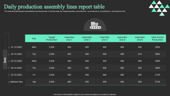
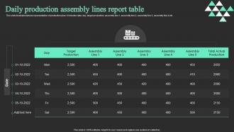
Daily Production Assembly Lines Report Table




Try Before you Buy Download Free Sample Product
 Impress Your
 Audience
 100%
100% Editable
 Save Hours
 of Time


This slide illustrates tabular representation of production plan. It includes date, day, target production, assembly line 1, assembly line 2, assembly line 3, assembly line 4 etc.
People who downloaded this PowerPoint presentation also viewed the following :
Daily Production Assembly Lines Report Table with all 6 slides:
Use our Daily Production Assembly Lines Report Table to effectively help you save your valuable time. They are readymade to fit into any presentation structure.





FAQs for Daily Production Assembly
Ok so first thing - map out your main points and how they'll flow together. Then make slides that actually support what you're saying, not replace it. I cannot stress this enough: don't just dump walls of text everywhere! Clean headlines work way better, plus lots of white space. Practice saying it out loud because thinking through it silently is totally different. Oh and definitely do a tech check beforehand - I learned that one the hard way. Maybe have your slides on a USB too just in case.
Honestly, visual storytelling is a game changer for production presentations. People's eyes just glaze over with spreadsheets and bullet points. But show them your production flow as an actual journey? Now they get it. Infographics make bottlenecks obvious instantly. Charts with before/after scenarios pack way more punch than saying "we improved efficiency 23%" - though I still include the numbers obviously. What works for me is thinking about your product's whole story, from that initial concept meeting to final delivery. Sketch your next presentation like a story arc instead of just dumping data on people.
Dude, audience analysis is everything. It decides your tone, how complex you get, what examples work. Like you wouldn't talk blockchain to devs the same way you'd explain it to marketing people, ya know? Your whole approach changes - technical terms vs normal language, boring slides vs cool interactive stuff. How much background do they actually need? Honestly, skipping this step is like throwing darts blindfolded. I always jot down who's gonna be there and what they actually give a damn about before I even start working on anything.
Right now everyone's obsessed with interactive stuff - live polls, Q&A features, that kind of thing. Visual hierarchy is huge too, so ditch those text-heavy slides for bold fonts and more white space. Motion graphics look slick but honestly don't overdo it or you'll seem dated. Data viz is getting creative with custom charts instead of boring spreadsheets (thank god). Oh and storytelling layouts that actually hold attention are everywhere now. I'd say pick one thing that matches your style and try it out. No point overwhelming yourself with every trend at once.
Just throw your production metrics right onto the slides - real-time dashboards with throughput, quality scores, bottlenecks. Charts should tell a story instead of just showing random numbers. Interactive stuff is cool for virtual presentations, but honestly? Sometimes basic bar charts work better than all the fancy bells and whistles. Focus on trends and compare different shifts or product lines. People need to spot problems and wins immediately. Oh, and definitely keep backup slides with raw data - there's always someone who wants to dig into the weeds on specific issues.
Honestly, just stick with PowerPoint or Keynote for the main stuff. Google Slides works great too if your team needs to collaborate - saves you from that nightmare of everyone emailing different versions back and forth. Canva's pretty solid for quick graphics, though Adobe's better if you're doing anything fancy. Oh, and definitely grab some icons from Flaticon or Noun Project. Makes everything look way more professional. Unsplash has decent free photos if budget's tight, or Shutterstock if you can spend a bit. Start simple though - I've watched people get totally lost in complex tools when basic ones would've worked fine.
Oh man, this stuff is trickier than you'd think! Colors are huge - red screams "danger" here but means good luck in China. Don't even get me started on hand gestures (learned that one the hard way). Some cultures read right-to-left, so your whole layout gets flipped. Honestly, the pacing thing caught me off guard too - Western audiences want everything rapid-fire while other cultures prefer more breathing room. My biggest tip? Find someone from that culture to preview your deck first. Trust me, it beats bombing in front of actual clients.
Templates are your best friend - seriously, don't make your team rebuild everything from scratch each time. Get approval workflows sorted with actual people assigned to review stuff, otherwise you'll be in email hell forever. Figma or Google Slides let everyone jump in at once instead of that annoying file-passing thing. Always pad your timeline because stakeholders will definitely want changes at the worst possible moment (learned this the hard way). Oh, and lock content a few days early so you're not pulling all-nighters trying to fix typos.
Honestly, you'll miss so many issues if you don't get feedback first. When I'm deep in creating something, I think it's crystal clear - but then someone else looks at it and goes "wait, what?" Getting input early helps you catch confusing parts, fix timing, and spot tech problems before showtime. Each round makes your content way better. I always do a quick run-through with a coworker now, even if it's super informal. Trust me, it's saved me from some pretty embarrassing moments! Your audience will actually connect with what you're saying instead of being lost.
Ugh, virtual presentations are honestly brutal. You're just staring at a wall of black squares with muted mics - how are you supposed to know if people are even awake? Can't see confused faces or feel if the room's into it. Technical disasters happen constantly too. Someone's audio cuts out, screen sharing breaks, people randomly disappear. In-person lets you actually read the room and adjust on the fly. Virtual? You've gotta plan like crazy with polls and chat stuff to keep people engaged. Oh, and definitely have someone on standby for tech issues - learned that one the hard way!
So basically create a solid brand guide first - fonts, colors, logo rules, the whole thing. Make sure everyone designing templates can actually access it (sounds obvious but you'd be surprised). Have someone from marketing approve stuff before it goes live because I swear, logos that randomly move around make companies look so unprofessional. Oh and use design software with shared brand libraries if you can - keeps your colors locked in automatically. Definitely pick one person to be the final gatekeeper though, otherwise you'll get that "too many cooks" situation.
Dude, break that complex stuff into smaller pieces - nobody wants to sit through a lecture. Visuals are everything. Charts and diagrams beat paragraph dumps every single time. I swear, half the engineers I know lose people immediately with all the technical speak. Just use normal words when you can, and if you absolutely have to throw in jargon, explain what it means. Real examples help tons too. Oh, and do a quick summary after each section so people don't get lost. Test it on your roommate or someone first - they'll tell you if you're being too nerdy.
Oh man, live polls are game-changers! Instead of watching glazed-over faces during presentations, you actually get to interact with people. Real-time feedback means you can tell if everyone's confused or totally getting it. The anonymous Q&A thing is brilliant too - people will ask stuff they'd never say out loud. Honestly, I've seen the quietest team members drop the best questions once they know it's anonymous. You can adjust on the fly instead of plowing through slides nobody cares about. Start simple with yes/no polls first, then get fancier once people are used to it.
Want to know if your presentation actually worked? Start with the basics - did people ask questions or just stare blankly? Anonymous surveys are honestly your best friend here, people get surprisingly real when nobody knows it's them. Check if they retained anything with a quick follow-up quiz maybe a week later. But here's what really matters: are they actually using what you taught them? I'd follow up in like 3-4 weeks to see what stuck. That's when you'll know if you nailed it or if it was just another forgettable meeting.
Yeah, definitely work with other people on this stuff! Someone always catches things you totally missed. Different perspectives make everything way stronger - like they'll suggest angles you never would've thought of alone. I've watched teams come up with wild creative ideas, interactive parts that actually work. Multiple eyes on content means you won't have weird inconsistencies or confusing parts your audience has to figure out. Oh and don't just review at the end - do regular check-ins throughout the whole thing. Makes such a difference honestly.
-
Qualitative and comprehensive slides.
-
Placing an order on SlideTeam is very simple and convenient, saves you a lot of your time.