


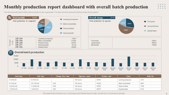
Monthly Production Report Dashboard With Overall Batch Production




Try Before you Buy Download Free Sample Product
 Impress Your
 Audience
 100%
100% Editable
 Save Hours
 of Time


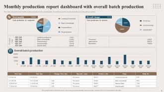
The slide shows the total monthly batch production by the organisation. The slide covers the dashboard with pie charts and bar graphs.
People who downloaded this PowerPoint presentation also viewed the following :
Monthly Production Report Dashboard With Overall Batch Production with all 6 slides:
Use our Monthly Production Report Dashboard With Overall Batch Production to effectively help you save your valuable time. They are readymade to fit into any presentation structure.





FAQs for Monthly Production Report Dashboard With
Focus on output volume, quality metrics, and efficiency rates first. Downtime tracking too. Production costs per unit and on-time delivery are huge - leadership always asks about those two. Resource utilization rates matter, plus safety incidents if that's relevant for you. Keep it simple though, like 6-8 KPIs tops with month-over-month comparisons. Oh, and definitely add a short narrative explaining big variances. Trust me, raw numbers without context just create way more questions down the road. Makes everyone's life easier.
Honestly, color coding is a game changer for dashboards - red for problems, green for good stuff, yellow for heads up. So many people just throw gray numbers everywhere and wonder why nobody catches issues. Put your biggest KPIs right at the top where you'll actually see them. Group similar metrics together, use fonts people can actually read, and don't cram everything into one corner. Oh and white space isn't wasted space, it makes things way easier to scan. Test it with whoever's gonna use it - they'll tell you what's confusing pretty quickly.
Power BI or Tableau are your best bets if you want something that actually looks professional. Google Data Studio works great too and won't cost you anything. Excel? Sure, it'll do the job, but updating it manually every month is pure torture. Check what licenses your company already has first - no point buying new software if you've got something sitting there unused. The real game changer is auto-refresh from your database. Saves hours of copy-pasting nonsense. Pick whatever connects easiest to your data sources. You don't need every bell and whistle right away.
Honestly, most people way overthink this at the start. Look at how fast your production stuff actually changes - if you're dealing with daily output or quality problems, yeah you need daily or hourly updates. But for monthly dashboards? Weekly usually works great. Catches trends without drowning you in noise. Also think about when your team actually makes decisions - like if leadership only looks at stuff monthly, why stress about real-time data? I'd say start weekly and see how people use it. You can always tweak from there.
Honestly, data viz just turns those nightmare spreadsheets into something your brain can actually process. Charts and graphs let you spot trends instantly - way better than scrolling through endless rows wondering if your numbers went up or down. I mean, who has time to manually compare April vs March when you could just glance at a line graph? Dashboards help you catch bottlenecks fast and show your team what's happening without boring them to death. Pro tip though - start with charts that track your main KPIs first, then build from there.
So basically, monthly dashboards let you see production patterns through charts showing output, efficiency, quality scores - stuff like that. You'll start noticing weird trends, like maybe your numbers always tank in March or bounce back after maintenance cycles. Here's what's cool though - when you layer different metrics together, you catch connections that aren't obvious in spreadsheets. Honestly, the best part is setting up alerts when things go off track. Way better than playing detective months later wondering why everything went sideways.
First thing - get automated checks running that catch bad data before it even reaches your dashboard. Document how every calculation works too, because guaranteed someone's gonna question your numbers eventually. Weekly reconciliation is clutch - cross-check everything against your source systems. Make sure someone actually owns this stuff though, otherwise discrepancies just sit there forever. Oh, and set up alerts for weird variances. Nothing worse than leadership finding out about data issues before you do. Trust me on that one. Having a single source of truth for each metric will save you so many headaches.
Hit that "Filters" button in the top right corner - you can mess around with date ranges, product lines, regions, whatever metrics you need. Your changes won't mess with anyone else's view, which is nice. There's a star icon that bookmarks your setup so you don't have to redo everything next time. Honestly, if you're always presenting to different teams, I'd make 2-3 saved views. Way easier than constantly tweaking filters. Oh, and the filtering gets pretty granular if you need it to be.
Honestly, data quality is gonna be your biggest headache - sources are inconsistent, timing's off, real-time stuff gets messy. Everyone argues over which metrics matter too. Manufacturing obsesses over units while quality team cares about defects, you know? Then you've got the whole "how much detail without making people's eyes glaze over" problem. I learned this the hard way but start with maybe 3-5 metrics that everyone can actually agree on first. Once people see it's actually useful and not just another dashboard collecting digital dust, then you can add more bells and whistles.
A production dashboard basically lets you see everything happening on your floor in real-time. Output rates, quality problems, equipment breakdowns - it's all right there instead of waiting around for those end-of-shift reports that come too late anyway. You can catch bottlenecks forming or quality dropping before things get messy. The smart move is setting up alerts for your critical numbers so the thing actually pings you when something needs fixing. Honestly feels like cheating once you get used to it. Way better than running around blind trying to figure out what went wrong after the fact.
Track throughput first - how many units you're actually making vs what you planned. Quality stuff like defect rates matter too, obviously. Equipment downtime will kill you if you're not watching it. OEE is honestly the best metric if your data's decent - it rolls availability, performance, and quality together. Cycle times, labor utilization, material waste percentages... all good indicators. My advice? Don't go crazy trying to measure everything day one. Pick what you can actually track consistently and expand from there. Way easier than drowning in spreadsheets.
Ask your team what they actually need - seriously, this saves so much time. They'll tell you which charts are confusing and what data they're missing. Maybe they need different breakdowns or faster updates. I learned this the hard way after building dashboards nobody used lol. Your team will also spot data errors you missed since they work with this stuff daily. Just do a quick monthly check-in or ask directly. Way better than guessing what's useful. You'll end up with something people actually open instead of pretty charts collecting digital dust.
Don't cram everything onto one screen - people will just ignore it. Talk to whoever's actually using this thing before you even start building. Their daily routine should shape how you design it. Skip the vanity metrics that look cool but don't help anyone make decisions. I've honestly seen some dashboards that are just... pretty but useless? Match your refresh rate to how often data actually updates. Oh, and avoid red/green everywhere since colorblind teammates can't tell the difference. The whole point is making their job easier, not showing off fancy charts.
Honestly, having those KPIs right on your dashboard is a game changer - you'll see what's actually going wrong (or right) without drowning in Excel hell. I'm talking cycle times, throughput, defect rates, all that good stuff. Problems literally jump out at you before they blow up into bigger headaches. Plus when things improve, you've got real numbers to prove it worked. My advice? Pick maybe 3-5 metrics that actually matter to your specific setup first. You can always add more later, but don't overwhelm yourself right out the gate.
Honestly, APIs are your friend here - they'll grab real-time data straight from your systems without you having to touch anything. You can also set up database queries to run automatically, like daily or weekly depending on what you need. ETL tools work too but they're kind of a pain for simple stuff. I'd probably just start with whatever data you can already access and go from there. Oh, and definitely bug IT first about existing API endpoints - might save you some headache. Scheduled data refresh in Power BI is pretty solid if you're already using that.
-
Professionally designed slides with color coordinated themes and icons. Perfect for enhancing the style of the presentations.
-
Nothing beats the well-formatted and professionally designed templates offered. Kudos to SlideTeam for their amazing collection of PPT slides.