

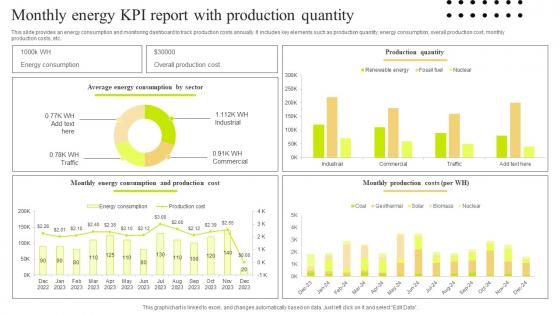
Monthly Energy KPI Report With Production Quantity




Try Before you Buy Download Free Sample Product
 Impress Your
 Audience
 100%
100% Editable
 Save Hours
 of Time


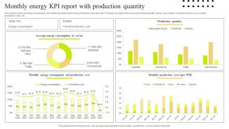
This slide provides an energy consumption and monitoring dashboard to track production costs annually. It includes key elements such as production quantity, energy consumption, overall production cost, monthly production costs, etc.
People who downloaded this PowerPoint presentation also viewed the following :
Monthly Energy KPI Report With Production Quantity with all 7 slides:
Use our Monthly Energy KPI Report With Production Quantity to effectively help you save your valuable time. They are readymade to fit into any presentation structure.





FAQs for Monthly Energy KPI Report
For your Energy KPI Report, start with the basics: total usage, peak demand, and cost per unit. Then add efficiency ratios - stuff like energy per square foot or per production unit. Trend analysis is huge too - compare current vs historical data. Oh, and definitely explain any weird spikes upfront because someone's always gonna ask about that random March jump anyway. Include how you're tracking against targets, maybe throw in some industry benchmarks if you can find decent ones. Don't forget to mention any energy-saving projects you've rolled out. Most importantly? End with actual next steps, not just data dumps.
First thing - you need sub-meters for each department or you're basically guessing. Smart meters work great for tracking electricity and HVAC by floor or area. Create standard metrics like energy per square foot so you can actually compare departments (accounting vs manufacturing is obviously gonna be wildly different). Real-time dashboards are clutch - department heads love seeing their numbers instantly. Monthly reports showing trends help too, but make sure you're comparing the same time periods or seasonal stuff will mess up your data. Honestly, getting everyone to buy into tracking their usage is half the battle.
So renewable energy will definitely mess with your KPIs - but mostly in good ways. Your carbon intensity and efficiency ratios improve since you're using cleaner sources with lower operating costs. The downside? Wind and solar make reliability metrics way more unpredictable. Honestly, that's the biggest headache most companies face. You'll see better sustainability scores and long-term cost performance, though the initial investment numbers might look rough at first. I'd track your usual metrics plus some renewable-specific ones like capacity factor. That'll give you the real story on performance.
Check out your last 2-3 years of usage data first - that's where the real patterns hide. Map it against your operational calendar to spot seasonal stuff and business activity spikes. We totally missed summer AC costs at my old job because nobody bothered looking at historical data! Short sentences work. Then dig into recurring patterns and correlate them with production schedules or how many people are actually in the building. Don't forget to account for any big changes coming up, like new equipment or facility expansions. Pull monthly consumption numbers and build your baseline from there.
Benchmarks are all over the place depending on your industry. Manufacturing usually shoots for 2-5% energy reduction yearly. Commercial buildings want ENERGY STAR scores above 75 - anything under 50 is kinda embarrassing tbh. Office buildings typically hit 15-25 kWh per square foot annually. Data centers obsess over PUE ratios under 1.5 (which makes sense given how much they spend on cooling). Check out ENERGY STAR Portfolio Manager or DOE's Better Buildings program for solid data. Your industry association might have stuff too. Just don't compare your downtown office to some warehouse in Arizona - climate zone and building type matter way more than people think.
So tracking energy KPIs basically shows you where you're bleeding money on wasted power. Track stuff like energy cost per unit or when your peak demand hits - you'll catch inefficient equipment and figure out better production timing. Honestly, seeing the data for the first time is wild. That one old machine might be eating up way more power than you thought, or you could shift some processes to cheaper off-peak hours. I'd just start simple though - pick 2-3 basic metrics and track them for a month. You'll spot patterns pretty quick and know exactly what needs fixing.
Smart meters and IoT sensors are probably your best bet - they'll give you real-time data instead of those error-prone manual readings. Schneider's EcoStruxure or Siemens' Navigator can pull everything together automatically across different systems. Those spreadsheet days really need to die already! Advanced analytics will catch weird data before it messes up your dashboards too. Oh, and definitely audit what you've got now first - then just tackle the most annoying reporting stuff one by one. Way less headache that way.
Honestly, energy KPI reporting is what turns sustainability from buzzwords into actual results. You'll want to track stuff like energy intensity, carbon emissions per unit, and your renewable percentage - gives you real targets to chase. Your boss will eat up those trending charts too, which makes getting budget approval way easier. The data helps spot your biggest energy wasters and shows if those green investments are actually paying off. Industry benchmarking is clutch for seeing where you stand. I'd start simple though - just pick 3-5 metrics that match your goals and track monthly.
Monthly updates are your best bet for staying on top of things - catches problems before they blow up. Then do a bigger picture review every quarter to see if you're actually measuring the right stuff. I can't tell you how many people just set these up once and never touch them again, which is... kind of pointless? If you've got seasonal changes or you're rolling out new efficiency stuff, maybe check in more often. Oh, and quarterly deep dives help you figure out if your KPIs are actually changing behaviors or just looking pretty on a dashboard. Start there and tweak as needed.
Honestly, the worst thing companies do is go crazy with KPIs from day one. They want to measure literally everything and their teams just burn out. Another big mess-up? Setting targets without any baseline data - you're just guessing at that point. I've seen so many orgs copy what their competitors track instead of thinking about what actually matters for their business (which is kinda lazy if you ask me). Oh, and nobody assigns ownership! KPIs without owners are useless. Keep it simple - pick 3-5 metrics that'll actually help you make decisions.
Honestly, it's all about whether your people actually give a damn. Engaged workers will turn off lights, report broken equipment, suggest fixes - all the stuff that moves your energy numbers. The disengaged ones? They walk past running equipment and couldn't care less. I've noticed engaged teams are way more likely to show up for energy training too, instead of just sitting there zoning out. Try tracking both engagement and energy data together - bet you'll see they match up more than you think. Makes sense when you think about it.
Check out EnergyCAP or ENERGY STAR Portfolio Manager first - they're made specifically for energy tracking so you won't have to build everything from scratch. Both have free trials which is nice. Power BI and Tableau work too if you're already using those platforms, but honestly the specialized tools are way less headache. Schneider's EcoStruxure is solid but might be overkill depending on your setup. The main thing is getting something that connects directly to your meters automatically. Excel works but you'll hate yourself after a few months of manual updates. I'd go with Portfolio Manager personally - it's pretty straightforward and handles most reporting you'd need.
So basically you need those energy KPIs to show regulators you're actually doing what you said you'd do. When auditors show up, your KPI reports are literally your get-out-of-jail-free card. They want documented proof of energy use, emissions cuts, all that stuff. The cool thing is they also catch issues before you accidentally blow past some limit and get slapped with fines (which honestly can be brutal). Just make sure you're tracking metrics that actually matter for your industry's rules. Oh and definitely set up automated reporting - I learned that one the hard way when I was scrambling through spreadsheets at 2am once.
Look, stakeholder feedback is what separates useful KPIs from meaningless dashboard decoration. Operations teams care about real-time efficiency stuff. Finance wants the cost impacts. Leadership needs those big-picture strategic numbers - honestly, they're probably the hardest to pin down on what they actually want. Without getting input from all these groups, you'll waste time tracking impressive-looking metrics that nobody uses for decisions. I'd say check in quarterly (maybe over coffee instead of formal meetings?) and tweak your KPIs based on what people are genuinely using. Otherwise you're just making pretty charts.
So you want to dig into those energy reports beyond just the monthly totals - that's where the good stuff is. Peak usage times tell you when you're getting hit hardest cost-wise. Track your cost per unit trends and see which departments are actually being efficient vs. just burning through resources. Most managers I know barely glance at this data, which is honestly their loss. Look for patterns that show what's working and what's bleeding money. Then you can make real decisions about budget priorities, maybe some equipment swaps, or operational tweaks. Numbers are useless unless they're pushing you toward actual changes.
-
They guys always go the extra mile to meet the expectations of their customers. Almost a year has been associated with them.
-
What a stunning collection of customizable templates! Really a time-saver..