


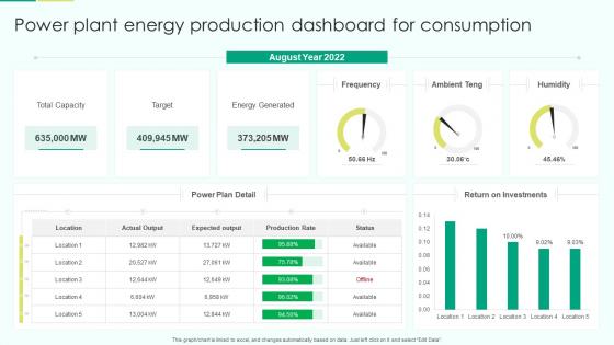
Power Plant Energy Production Dashboard For Consumption




Try Before you Buy Download Free Sample Product
 Impress Your
 Audience
 100%
100% Editable
 Save Hours
 of Time


Our Power Plant Energy Production Dashboard For Consumption are topically designed to provide an attractive backdrop to any subject. Use them to look like a presentation pro.
People who downloaded this PowerPoint presentation also viewed the following :
Power Plant Energy Production Dashboard For Consumption with all 7 slides:
Use our Power Plant Energy Production Dashboard For Consumption to effectively help you save your valuable time. They are readymade to fit into any presentation structure.





FAQs for Power Plant Energy Production
Honestly, start with the big three: capacity factor, heat rate, and availability - they'll tell you everything about efficiency and downtime. Track your emissions rates and fuel costs per MWh too. The load demand vs actual output thing is huge because mismatches cost serious money. Safety metrics matter obviously, like incident-free days. Set up alerts for when stuff hits critical levels instead of babysitting dashboards all day (learned that one the hard way). Unplanned outages are another big one to watch. Once you've got those basics down, add whatever makes sense for your specific fuel type.
Dude, real-time data integration is a game changer - you literally see everything happening in your plant as it happens. No more waiting for yesterday's reports to figure out what went wrong. All your sensors, equipment status, performance metrics, they all feed into one dashboard. Makes spotting problems way easier before they blow up into bigger issues. You can actually optimize stuff on the spot and react to demand shifts instantly. My advice? Don't try to connect everything at once though. Pick your most critical data streams first and build from there.
Look, predictive maintenance is what makes power plant dashboards actually useful instead of just fancy displays. Your dashboard needs to show equipment health scores, vibration data, temperature spikes, and when stuff might fail. That's how you avoid those nightmare unplanned shutdowns that cost a fortune. Set up alerts that give your maintenance crew real lead time - like weeks, not hours - so they can fix things during scheduled downtime. Otherwise you're stuck doing emergency repairs at 2am, which honestly nobody wants. The whole point is catching problems before they become disasters.
Honestly, dashboards are a game changer for power plant data. Instead of staring at endless spreadsheets (ugh), you get heat maps that show equipment temps instantly. Real-time gauges make everything feel more... I dunno, important? Interactive charts let your team dig into specific time periods without losing their minds. Color alerts jump out when something's actually wrong. Short version: people can spot problems way faster when the data doesn't look like an Excel nightmare. Your operators will thank you for making their job less painful.
Put your critical alerts right at the top - that's non-negotiable. Stick with red for danger, green for good, you know the drill. Group similar stuff together instead of scattering it everywhere. The dashboards that make me want to scream are the ones cramming every possible metric into one screen. Your key numbers need to be visible without any scrolling. Keep your icons consistent too - nothing worse than guessing what some random symbol means at 3am. Oh, and actually test this with the people doing those brutal overnight shifts. They'll catch usability issues you'd never think of.
Start with 12-24 months of historical data as your baseline, then add real-time stuff so you can catch problems fast. Rolling averages work great for efficiency ratios, heat rates, availability - the usual suspects. Time-series charts with daily/weekly/monthly toggles are clutch for different analysis needs. Don't go crazy with data overload though. Pick your top 5-6 critical metrics first and actually stick to that (easier said than done, I know). Make sure you can drill down from the big picture trends into granular details when weird stuff happens.
Yeah, the dashboard can handle basically all your regular reports - daily summaries, equipment metrics, fuel tracking, emissions stuff. Maintenance scheduling is clutch since it pulls straight from sensors. Honestly kinda kicking myself we didn't do this earlier because compiling everything weekly was brutal. Real-time alerts are great for threshold breaches too, plus you get automatic incident reports when shit hits the fan. I'd start with whatever's eating up most of your time each week - probably those big compliance reports? That's where you'll feel the difference immediately.
Honestly, mobile dashboards are a total lifesaver for field work. Your techs can see the same real-time data as everyone back at base instead of constantly calling in for updates. They'll get push notifications for critical stuff and can actually make decisions on the spot. Equipment status, maintenance schedules - it's all right there on their phone or tablet. I'd start with setting up alerts for your most critical systems first, that's where you'll notice the biggest difference. Way better than playing telephone tag with the control room all day. Oh, and your response times will improve like crazy once everyone's working off the same info.
Start with role-based access - seriously, half your team probably doesn't need to see everything they currently can. Multi-factor authentication is non-negotiable, and encrypt your data coming and going. Network segmentation matters big time since these systems are catnip for hackers. You'll also want audit logs tracking every click and access. Oh, and run security assessments regularly to catch weak spots before someone else does. Honestly though? First thing I'd do is audit who has dashboard access right now. Bet you'll find random permissions that make zero sense.
Set up regular feedback sessions with the operators and engineers who use your dashboard every day. Quick surveys work, but honestly? The best stuff comes from just grabbing coffee with people during shift changes. Monthly user meetings are solid too. They'll tell you what metrics are missing or which parts of the interface are driving them crazy. Track the common complaints and requests, then focus on fixes that hit safety and efficiency first. Oh, and here's a simple starting point - ask three different users what annoys them most about the current setup. You'll probably hear the same issues pop up.
Honestly, the worst part is dealing with operators who've been running the same system forever - they hate change. Training takes forever too. Oh, and don't even get me started on trying to make new software play nice with old control systems. It's like forcing a iPhone to work with a rotary phone sometimes. You'll need planned downtime for installation, which sucks when you can't just flip a switch at a power plant. Moving all that historical data over without screwing something up is stressful. Do a small pilot program first and let the operators actually mess around with it before going big.
Honestly, dashboards are a game-changer for compliance stuff. You get real-time data on everything - emissions, water temps, waste outputs, the whole deal. Set up alerts so you're not frantically trying to avoid violations at the last second (been there, it sucks). When audit time comes around, you'll actually have your historical data organized instead of digging through random spreadsheets. The automated reporting is clutch too - no more pulling numbers from five different systems. Pro tip: set your alert thresholds lower than the actual limits so you get a heads up before things get dicey.
So the tech that's really changing power plant dashboards right now - IoT sensors are everywhere, feeding you live data from all your equipment. Predictive analytics using AI can actually spot failures before they happen, which honestly is pretty wild when you think about it. Digital twins let you run scenarios without messing with real equipment. Edge computing processes everything locally so you get faster responses, and cloud platforms mean you can monitor remotely. There's even AR overlaying data right onto equipment views now. But the real game-changer? Moving from fixing things when they break to preventing problems entirely. That shift alone saves millions in downtime.
Dude, the dashboard basically gives you x-ray vision into what's happening with fuel burn and efficiency across all your units. You'll spot turbines running like crap or fuel quality issues messing with performance. Trends and weird spikes help you tweak firing patterns and catch maintenance problems early - way better than scrambling after something breaks. I'd definitely set up alerts for efficiency drops so you're not always playing catch-up. You can benchmark against your targets too, which makes it super obvious which units are slacking. Honestly saves so much headache compared to flying blind.
Oh man, training is everything - I've watched so many dashboard projects crash because they skipped this part. Your team might have the slickest interface ever, but if operators can't read the data properly or fumble around during emergencies, they'll just go back to whatever they used before. Focus on hands-on sessions, not boring PowerPoints. Cover the technical stuff AND the actual decision-making process - alarm prioritization is huge here. Those first few weeks are make-or-break territory. Also, give them reference cards they can actually keep at their workstation. Trust me on this one.
-
Happy to incorporate such stunning templates in my presentation. Made my presentation look professional and engaging.
-
Thanks for all your great templates they have saved me lots of time and accelerate my presentations. Great product, keep them up!