

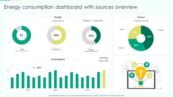
Energy Consumption Dashboard With Sources Overview




Try Before you Buy Download Free Sample Product
 Impress Your
 Audience
 100%
100% Editable
 Save Hours
 of Time


Our Energy Consumption Dashboard With Sources Overview are topically designed to provide an attractive backdrop to any subject. Use them to look like a presentation pro.
People who downloaded this PowerPoint presentation also viewed the following :
Energy Consumption Dashboard With Sources Overview with all 7 slides:
Use our Energy Consumption Dashboard With Sources Overview to effectively help you save your valuable time. They are readymade to fit into any presentation structure.






FAQs for Energy Consumption Dashboard
Start with the obvious stuff - total consumption, peak demand times, cost breakdowns by department. Real-time AND historical data is huge (trust me on this one). Efficiency ratios help spot problems early. Weather correlation is clutch if you've got heavy HVAC usage. Carbon footprint metrics are pretty much expected now. Don't sleep on alerts for weird spikes or equipment acting up. Oh, and baseline comparisons so you can actually tell if you're improving. I'd honestly just start with these basics and see what people actually look at before adding more detailed stuff.
Honestly, visualizations are a game-changer for energy data. Raw spreadsheets are basically useless - you'll just get lost in all those numbers. Charts and heatmaps show you exactly when energy spikes happen without the headache. Time-series graphs are perfect for spotting daily patterns, while bar charts help you find your biggest energy wasters. I'd start simple with basic line charts first. Your team can handle fancier stuff later once they're not intimidated by the data. Way better than hunting through endless rows trying to find patterns that should be obvious.
Dude, real-time data is a total game changer for energy management. You get to see what's happening RIGHT NOW instead of waiting for last month's bill to surprise you. Catching energy spikes the moment they happen? That's huge. Equipment running like crap shows up immediately, so you can actually do something about it. Honestly, most people don't realize how much they're wasting until they see those live numbers. Set up alerts for weird usage patterns and watch your biggest energy hogs first - that's where you'll see the biggest wins. It's like... why wouldn't you want that visibility?
Honestly, those dashboards are game-changers for catching where you're bleeding cash on electricity and HVAC. Real-time data shows you stuff you'd never spot otherwise - equipment running overnight, systems being way less efficient than they should be. I'd start with your biggest energy hogs first. You can shift non-essential operations to off-peak hours when rates drop, which adds up fast. The alerts are clutch too - they'll catch weird spikes before your monthly bill gets totally wrecked. Peak consumption periods become super obvious once you see the data laid out.
So basically predictive analytics turns your energy dashboard into this fortune teller that actually works. Instead of just reacting when your bill explodes, you'll see problems coming weeks ahead. Equipment about to die? You'll know. Peak demand spike incoming? Dashboard flags it so you can shift usage around. My favorite part is the "what-if" scenarios - you can test different efficiency moves without gambling real money. Set up alerts for predicted spikes and your team can jump on issues before they murder your budget. It's honestly pretty cool watching it catch patterns you'd never notice yourself.
You gotta match the dashboard to how each sector actually thinks about energy. Industrial places care about production efficiency and avoiding those brutal demand penalties - their dashboards need equipment-level data. Commercial buildings? They're all about occupancy patterns and HVAC optimization during business hours. Honestly, residential is way simpler - homeowners just want to see how their habits affect their bill. Time-of-use comparisons and basic cost tracking work best. The trick is keeping it simple enough that people can actually act on what they're seeing, you know?
Put your biggest numbers right up top - total usage, costs, whatever matters most. Don't make people hunt for it. Color-coding saves lives here, seriously - red for bad stuff, green for good. I'd stick with the same time frames throughout (daily, weekly, whatever) and always throw in comparisons like "up 15% from last month." Short sentences work. Longer ones help too when you're explaining something that actually needs context. Bottom line: if someone stares at your dashboard for more than 3 seconds trying to figure out what's going on, you've already lost them.
So most solar panels and wind setups already collect their own data - you just gotta figure out how to access it. Check what APIs or data feeds your system has first. Then get your IT folks to help connect that to your dashboard. Once it's hooked up, you'll see real-time stuff like how much power you're generating, storage levels, all that good stuff right next to your usage data. Honestly, it's pretty cool seeing when you're actually running on clean energy vs pulling from the grid. Makes you feel like you're actually making a difference, you know?
Ugh, you're gonna hate dealing with inconsistent data sources - some meters report hourly, others daily, and they all use different units. Missing timestamps are brutal too. Avoid manual data entry at all costs, trust me on this one. Sensor malfunctions happen constantly, plus network issues and those ancient legacy systems that refuse to work with modern APIs. Oh and data quality? Expect tons of outliers and random gaps. I'd set up automated validation rules from day one and schedule regular maintenance checks. Otherwise your dashboard will be completely useless when you actually need it.
Honestly, customizable dashboards are game-changers because people can actually focus on their stuff instead of drowning in irrelevant data. You can filter by your department, tweak time ranges, whatever you need. Generic ones? Total waste of time - just information overload that nobody wants to dig through. The trick is letting users control their view without breaking the main features. Oh, and definitely figure out which customization options would save your team the most time first when they're looking at energy data. Makes the whole setup way more useful.
Okay so energy dashboards are actually game-changers for sustainability stuff. They show you real-time data instead of just guessing where energy goes. Most places waste SO much electricity simply because no one's watching the numbers - it's honestly ridiculous. The visual setup makes it super easy for everyone to see their impact, not just the tech people. You'll usually see 10-15% energy savings in year one just from people paying attention. Oh, and definitely set up alerts for weird usage spikes first thing. That catches most of the stupid inefficiencies right away.
Dude, mobile energy dashboards are clutch when you're running around all day. You can catch weird energy spikes while stuck in traffic, hit emergency shutdowns from your couch, whatever. I swear facility managers lived in the stone age before this stuff. Push notifications are your best friend - set them up for anything urgent so you're not sprinting back to your office every five minutes. Quick controls right on your phone mean you can tweak settings between meetings or literally anywhere. Real-time data access changes everything when you're always on the move.
Focus on energy intensity first - that's kWh per unit you produce or per square foot. Total consumption trends matter too, plus peak demand patterns and cost per unit. Carbon footprint stuff if you need it for reporting (honestly depends on your industry). Track monthly and quarterly so you catch seasonal shifts or when equipment starts acting up. Energy intensity is your best metric since it adjusts for how busy your facility actually is. Set alerts when things drift 10-15% from baseline - you'll want to jump on issues fast before they get expensive.
So basically, those energy dashboards work because they put everything out in the open - nobody wants to be the department wasting the most electricity. Put up some leaderboards and watch people get weirdly competitive about it (seriously, you'd be surprised). The trick is sticking the data somewhere everyone walks by daily. Once people know they're being watched and ranked, they'll actually start doing stuff like turning off lights and unplugging their desk fans. My old office had one and suddenly everyone became the energy police.
Honestly, start simple with one metric they actually give a shit about, then build from there. Clear visuals are huge - nobody wants to decode your fancy charts. Set up notifications for milestones and weird spikes in their data. Real-time updates work great because people can see their actions matter immediately. Gamification is surprisingly effective too - leaderboards and badges make people competitive about the weirdest things (like who saved the most electricity this month lol). Don't forget weekly email summaries since most folks won't remember to check daily. Personalized goals help tons.
-
Fantastic and innovative graphics with useful content. The templates are the best and latest in the industry.
-
SlideTeam’s readymade presentations have landed my unique images with my bosses in the past and it continues to reward me.