

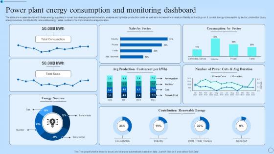
Power Plant Energy Consumption And Monitoring Dashboard




Try Before you Buy Download Free Sample Product
 Impress Your
 Audience
 100%
100% Editable
 Save Hours
 of Time


The slide showcases dashboard it helps energy suppliers to cover fast-changing market demands, analyse and optimize production costs as well as to increase the overall profitability in the long-run. It covers energy consumption by sector, production costs, energy sources, contribution to renewable energy, sales, number of power cuts and average duration.
People who downloaded this PowerPoint presentation also viewed the following :
Power Plant Energy Consumption And Monitoring Dashboard with all 7 slides:
Use our Power Plant Energy Consumption And Monitoring Dashboard to effectively help you save your valuable time. They are readymade to fit into any presentation structure.





FAQs for Power Plant Energy Consumption
Okay so you'll mainly see power output in MW, efficiency percentages, and fuel consumption rates. Equipment temps are big too. Grid frequency and voltage levels show up on most dashboards, plus emissions data - honestly the whole thing's pretty overwhelming when you first look at it lol. There's alarm indicators and maintenance schedules scattered around. Real-time cost per MWh is usually somewhere in there too. Which ones actually matter depends on what you're doing though. I'd just ask whoever's training you what to focus on first, since like a maintenance guy cares about totally different stuff than someone watching grid operations.
Dude, these dashboards are game-changers for catching problems early. Temperature spikes, pressure drops - you'll see it all happening live instead of discovering disasters hours later. Way better than the old clipboard days (though I kinda miss the simplicity sometimes). Your operators can actually jump on issues fast and schedule maintenance before things break down. The visual stuff makes patterns obvious that you'd totally miss buried in Excel hell. Honestly feels like cheating compared to how we used to do things. I'd start with whatever systems scare you most at night.
So predictive analytics is like upgrading your power plant dashboard from showing what already happened to actually seeing what's coming next. It takes all your historical data and uses machine learning to predict equipment failures and energy spikes before they hit. Way better than scrambling when stuff breaks, right? Your dashboard starts alerting you about that turbine that'll probably fail in two weeks instead of just reacting to emergencies. Honestly, the proactive alerts are a game changer. Start with your biggest failure risks first - that's where you'll see the most impact from these predictive models.
So basically these dashboards grab data from IoT sensors all over the plant using WiFi, cellular, or those industrial networks. The sensors track stuff like temperature, pressure, vibration - you name it. Updates come in every few seconds or minutes depending on your setup. It's actually pretty slick because you catch problems right away instead of someone having to walk around with a clipboard. Oh, and definitely lock down your network security though. Last thing you want is some random person poking around your operational data - that'd be a nightmare.
Dashboards are game-changers when you customize them right. Your plant manager only wants to see the big picture stuff - KPIs and financial metrics. Meanwhile, maintenance crews need equipment alerts and work order updates front and center. Operations? They're all about real-time generation data and grid demands. It's kinda like how you'd show different parts of your house to the owner versus the electrician, you know? When people aren't digging through irrelevant screens, decisions happen way faster. Role-based views are honestly a no-brainer - your team's efficiency will thank you for it.
Honestly, dashboard design is huge for power plant decisions. Good layouts let you catch efficiency drops and equipment problems way faster than digging through data tables. I've watched operators miss warning signs because alerts got buried in messy interfaces - it's wild how that happens. Clean designs with your critical KPIs up front make all the difference during emergencies. Response time really depends on having the right color schemes and logical grouping. Poor layouts will slow you down and you might miss something major. Keep it simple and put the most important stuff where you'll actually see it first.
Put the critical stuff front and center - operators need to see vital data instantly when shit hits the fan. Color coding has to make sense (red for bad, green for good) and stay consistent everywhere. Those legacy systems look absolutely ancient, but whatever. Big fonts are your friend since people get tired on long shifts. Don't make them click through menus to reach emergency controls. Test everything with real operators, not just during day shifts either. Speed matters more than looking pretty. Keep it simple so someone can use it when they're stressed and running on three hours of sleep.
Set up trend widgets that compare current data against the same time periods from past years - honestly, this catches way more issues than just monitoring current thresholds. Rolling averages work great for stuff like heat rate and availability. The predictive alerts are where it gets interesting though - I've watched plants spot turbine problems weeks before they'd normally notice. Seasonal patterns and equipment degradation cycles become super obvious when you're overlaying historical performance. Start with your most critical equipment since that's where you'll see the biggest impact, then branch out from there.
Look, you definitely need role-based access so random people can't see sensitive stuff. HTTPS/VPN for encrypted connections is a must. Audit logging tracks who's looking at what - super important with all these infrastructure breaches happening lately, honestly kinda terrifying. Network segmentation keeps your dashboard isolated from other systems. Don't forget automatic session timeouts and regular security patches. Oh, and test everything regularly because theory's great but you need to know it actually works. Treat this data like the critical asset it is - because it literally is.
So these dashboards basically show you all your environmental stuff in real time - emissions, water use, waste levels, whatever. They'll ping you when you're getting close to regulatory limits, which honestly beats finding out the hard way. The reporting feature is clutch too since it spits out exactly what regulators want to see. I'd set mine up to focus on whatever your local regs care about most. You can actually catch issues before they blow up into real problems. Way better than playing catch-up after something goes wrong.
Power plants usually run SCADA systems - Wonderware and GE iFIX are the big ones for real-time monitoring. Then they layer on Tableau, Power BI, or sometimes custom React/Angular dashboards for the fancy visualizations. Backend's typically Historian or SQL Server since you're drowning in time-series data. The whole setup gets messy fast, especially with older plants that have been frankenstein'd together over decades. Maintenance is your standard stuff - database tuning, software patches, keeping an eye on hardware. Honestly? Start by figuring out what SCADA you're already running. That decision basically dictates everything else you can do.
Honestly, these apps are a lifesaver when you can't be glued to your control room all day. You'll get real-time alerts pushed straight to your phone - super useful when you're out in the field or even just at home. Most show the key stuff like critical parameters and alarms, not every tiny data point (which would be overwhelming anyway). Perfect for quick checks and jumping on problems fast. I always tell people to set notifications for their most critical thresholds. Equipment doesn't care if it's 2am or you're on vacation - it'll break when it wants to.
Dude, you really need those real-time alerts - they catch issues before everything goes to hell. Without them you're basically flying blind while small problems turn into major equipment failures. These systems watch hundreds of parameters at once and flag anything weird, which honestly beats having someone manually check gauges constantly (plus who has time for that?). The trick is setting smart thresholds so you don't get bombarded with useless notifications. Prioritize safety stuff first, then equipment protection. Otherwise you'll just ignore everything when alerts keep going off.
So basically these dashboard collaboration tools let your whole crew see the same data in real-time - no more of that annoying back-and-forth over radios. You can drop comments right on the charts when you spot something weird, tag people when they need to check stuff out. The chat thing is actually pretty handy since you're discussing issues right where the data is. Oh, and definitely set up those shared alerts for your critical systems - that way when something hits a threshold, everyone gets notified at once instead of just one person scrambling to call around. Honestly saves so much headache during busy shifts.
So renewable dashboards are all about weather stuff - real-time feeds, forecasting, whether the wind's actually blowing today. Pretty different from non-renewable ones that track fuel rates and emissions instead. Wind and solar need those intermittency tools since you can't control when nature decides to cooperate. Traditional plants focus more on heat rates and environmental compliance metrics. Both show the basic output and grid status obviously, but honestly the whole data setup is just structured differently depending on your energy source. Worth looking at some real examples to see how they prioritize different info.
-
I can always count on your designs for my professional needs. I believe I found a one-stop-shop for PPTs.
-
“Thanks to SlideTeam. Now I can make smart presentations in a fraction of time without any hassle.”