


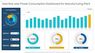
Machine wise power consumption dashboard for manufacturing plant





Try Before you Buy Download Free Sample Product
 Impress Your
 Audience
 100%
100% Editable
 Save Hours
 of Time


Our Machine Wise Power Consumption Dashboard For Manufacturing Plant are topically designed to provide an attractive backdrop to any subject. Use them to look like a presentation pro.
People who downloaded this PowerPoint presentation also viewed the following :
Machine wise power consumption dashboard for manufacturing plant with all 7 slides:
Use our Machine Wise Power Consumption Dashboard For Manufacturing Plant to effectively help you save your valuable time. They are readymade to fit into any presentation structure.





FAQs for Machine wise power consumption dashboard
Focus on real-time usage first - that's your bread and butter. Peak demand periods will show you where money's bleeding out. Break costs down by department or equipment so you can actually pinpoint problems. Historical trends are huge too, honestly without that data you're just guessing at inefficiencies. Power factor metrics matter if you've got industrial loads. Sustainability stuff like carbon footprint might be worth tracking depending on your company. Oh, and temperature correlations - those can reveal weird HVAC patterns you'd never expect. Start with these basics, then add more once everyone's comfortable.
Dude, real-time energy dashboards are actually pretty cool - you can catch waste as it's happening instead of getting smacked by your bill later. Like, you'll see equipment randomly spiking or notice the AC running when nobody's even there. Peak usage times become super obvious too. I got weirdly addicted to watching our energy patterns and tweaking things on the spot. Way more satisfying than I expected, honestly. The visual stuff makes it click better than just staring at numbers. Focus on whatever's your biggest energy hog first - that's where you'll see real savings.
Honestly, cloud platforms are a game changer for this stuff. The scaling happens automatically, which is huge. Your data gets processed in real-time and you can check everything from your phone if you want. Storage and analytics? That's all handled for you. Most cloud providers actually have better security than what companies try to do themselves - I've seen some pretty sketchy internal setups, trust me. Updates roll out automatically too, so no downtime headaches. Cost-wise you're only paying for what you actually use instead of maintaining all that hardware. I'd definitely try a small pilot first though, just to see how it plays with your current setup.
Manufacturing companies are obsessed with tracking machine downtime because every minute costs them thousands. Healthcare facilities? They're all about backup power status - imagine if life support went down. Retail chains love comparing store performance side by side, while data centers basically live and die by their cooling efficiency numbers (that's where all their money disappears). Honestly, the trick is ignoring generic energy stats and focusing on whatever actually keeps your industry's executives up at night. Build your dashboard around those specific pain points instead.
Basically, predictive analytics looks at your old energy data and figures out what's coming next. Pretty neat stuff - it'll catch usage spikes before they hit and tell you which equipment might crap out soon. Weather, how many people are in the building, seasonal changes... it factors in all that. Way better than trying to spot patterns yourself, honestly. Instead of scrambling when problems pop up, you can actually plan ahead. Oh, and definitely check your peak usage forecasts first - that's where you'll see the biggest impact on your bills.
Dude, these things are game-changers. Instead of guessing or checking meters manually, you get live data straight from your equipment. Each appliance shows up separately on your dashboard - not just one big building number. The sensors catch stuff you'd miss otherwise, like equipment that's "off" but still sucking power (happens more than you'd think). You'll spot weird spikes and usage patterns that would've flown under the radar. Set alerts for anything funky and boom - you catch problems before your electric bill does. It's basically like having eyes on everything 24/7.
Data integration is honestly the worst part - all your power meters and HVAC systems use different formats, so cleaning that mess takes forever. Real-time dashboards get super slow when you're pulling tons of device data too. Oh, and don't get me started on KPIs that actually matter versus just looking cool. Most people obsess over fancy visualizations but forget users need actionable insights. Start by mapping your data sources first though. Trust me, planning that pipeline upfront saves you from headaches later when everything's breaking.
Break it down by time first - hourly, daily, weekly patterns tell you tons. Then look at different zones or departments. Honestly, the operational vs non-operational hours thing is where you'll find the biggest surprises. So much stuff just sits running all night for no reason. Equipment types are huge too, obviously. If you need to charge teams back, definitely segment by cost centers - makes that whole process way less painful. Start with these basics though, don't overcomplicate it. Once you see what's weird in the data, then you can dig deeper into more specific categories.
Grafana's probably your best bet - it's what everyone uses for this kind of stuff and handles time-series data really well. Power BI and Tableau work too, but they'll cost you more. Plotly Dash is amazing if you know Python and want total control over everything. The main thing is checking if it plays nice with your data sources first. Like, if you're pulling from IoT sensors or whatever database you're using, make sure the connectors actually work properly. I'd honestly just spin up a free Grafana instance and mess around with it for a day or two. You can always switch later if it's not clicking.
Honestly, good UX makes all the difference here. Start with clear visual hierarchy so people can spot energy spikes right away - nobody wants to dig through messy data when the power bill's spiking. Color-code your consumption levels and set smart defaults for time ranges. Show the big picture first, then let users dive deeper if they need specifics. Tooltips help too, especially contextual ones that actually make sense. Oh, and test this stuff with people who'll actually use it daily - their workflow should drive your design choices. Trust me, it's worth the extra effort upfront.
Start with encryption - HTTPS for all your API calls and encrypt that consumption data before it hits the database. Role-based access is huge too. Only let authorized people see specific meters or buildings. MFA is basically mandatory now (crazy how some companies still don't use it, but whatever). Regular security audits catch problems early. Log everything so you can spot weird access patterns. Honestly? Encryption and access controls first. They'll give you the most protection for the effort you put in.
Looking at your energy data over time is honestly a game-changer. You'll catch patterns that just don't show up when you're only checking current usage. Peak times become super obvious, and you can spot which equipment is secretly draining way too much power. I usually tell people to grab at least 12 months of bills first - seasonal stuff really matters more than you'd think. Once you see the bigger picture, you can move heavy-duty tasks to cheaper off-peak hours and catch problems before they explode your budget. Start with the obvious spikes, those are your low-hanging fruit.
Honestly, these dashboards are a lifesaver for regulatory stuff. You get all your energy usage data in one spot - real-time numbers, historical trends, compliance metrics. Way easier than frantically digging through random Excel files when inspectors show up (been there!). The automated alerts catch problems before they turn into actual violations, which is huge. For environmental audits, you can just pull reports straight from the system. Carbon footprint tracking becomes pretty straightforward too. I'd definitely set up those monthly automated compliance reports - saves you from that last-minute panic scramble we all know too well.
Honestly, ML is a game-changer for predicting power usage. It picks up on weird patterns that basic forecasting totally misses - like how weather affects your consumption or seasonal quirks in your operations. Neural networks are basically like having that one coworker who's annoyingly good at spotting trends, except they work 24/7. The cool part? Your predictions actually improve as you feed in more data. You'll nail those peak usage times way better and avoid those "oh crap" moments with energy bills. Just start simple - dump your historical usage data into a basic model and see what happens.
Honestly, real-time alerts are a must for mobile power dashboards. Keep your charts super simple - nobody wants to squint at messy graphs on their phone. Focus on the big stuff first: current usage, cost projections, and spike warnings. Quick toggles for major appliances save so much time too. Since you're working with tiny screen space, swipe gestures work great for switching between time periods. Make your touch targets huge - I can't tell you how many times I've hit the wrong button by accident. Oh, and if you can add an emergency shutoff feature, definitely do that. Clear color coding beats fancy visuals every time.
-
Awesome presentation, really professional and easy to edit.
-
The content is very helpful from business point of view.