

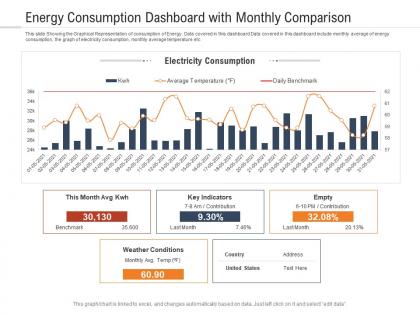
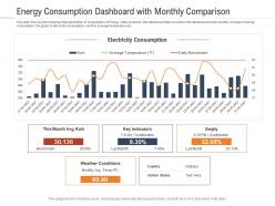
Energy consumption dashboard with monthly comparison powerpoint template




Try Before you Buy Download Free Sample Product
 Impress Your
 Audience
 100%
100% Editable
 Save Hours
 of Time


Our Energy Consumption Dashboard With Monthly Comparison Powerpoint Template are topically designed to provide an attractive backdrop to any subject. Use them to look like a presentation pro.
People who downloaded this PowerPoint presentation also viewed the following :
Energy consumption dashboard with monthly comparison powerpoint template with all 2 slides:
Use our Energy Consumption Dashboard With Monthly Comparison Powerpoint Template to effectively help you save your valuable time. They are readymade to fit into any presentation structure.
FAQs for Energy consumption dashboard with monthly
Track your real-time energy usage first - that's the foundation. Cost per day/month is obvious but crucial. Peak demand times will save you money once you spot the patterns. Don't forget efficiency ratios too. Compare against previous periods and similar buildings if you can get that data. Weather overlay helps a ton if temperature affects your usage. Honestly, alerts are what make these dashboards actually useful instead of just eye candy - set them for weird spikes and budget limits. Start simple with these basics, then you can get fancy later.
Honestly, visualization is a game-changer for energy data. Instead of staring at endless spreadsheets (ugh), you'll actually see what's happening. Peak usage times jump out. Heat maps show which departments are burning through power like crazy. I love how you can catch weird stuff too – like why is the server room going nuts every Tuesday at 3pm? Charts make those "holy crap" moments obvious, the ones that actually save you money. Oh, and seasonal patterns become super clear. Start simple though. Pick your top 3 energy hogs and throw them on a basic dashboard first.
Honestly, I'd go with Tableau, Power BI, or Grafana for energy dashboards. Tableau's amazing for complex stuff but costs a fortune. Power BI works great if you're already in Microsoft land. Grafana's my personal favorite though - especially for real-time IoT data, plus it's free which your finance team will actually thank you for. You could even start with Excel and Power Query if you just need basic monitoring. Sounds boring but it actually works pretty well. First thing though - figure out where your data's coming from. That'll make picking way easier.
So these energy dashboards show you exactly where your company's bleeding money on power bills. You'll catch stuff like machines running all night for no reason, or find out accounting uses twice the energy as everyone else (why is it always accounting?). Can't fix what you can't see, you know? Once you start tracking everything, you can actually set real goals and show the bosses that going green saves cash. I'd hit the biggest energy wasters first. Makes the most impact right away.
Honestly, real-time data is what separates useful energy dashboards from fancy wallpaper. Spot those energy spikes right when they happen instead of finding out weeks later on your bill - which sucks, trust me. Equipment acting up? You'll catch it immediately rather than letting it drain power for days. Testing changes becomes way more satisfying when you see instant results. Your team actually starts caring about energy use when they get that immediate feedback loop. Oh, and definitely set up alerts for weird consumption spikes so you're not glued to the thing all day. Without live data, you're just staring at yesterday's mistakes.
So you'll need to hook up your dashboard to pull historical data through APIs or database connections - basically anything with timestamped usage records. Set up automated pipelines to grab daily, weekly, monthly patterns. Clean data is key here though, missing readings will mess up your trend analysis big time. I'd pull at least 12-24 months of history to get decent insights. Then build out visualizations for year-over-year stuff, seasonal trends, peak usage times. Actually super helpful for planning once you get it running. The automation part saves you from manually updating everything constantly.
Honestly, the data mess is gonna be your biggest pain. You've got smart meters, building systems, and ancient equipment that barely communicate - it's like trying to get your grandparents to use TikTok. Getting departments on board is brutal too. Facilities people hate workflow changes, and executives always think setup takes like two weeks when it's more like two months. Data quality will drive you nuts, plus you'll waste time tracking vanity metrics that look cool but don't actually help. Pick one building first and show some wins before going bigger.
Dude, user feedback is seriously where the magic happens with dashboard improvements. People will straight up tell you what's broken or missing. Like, you might think daily summaries are perfect, but they actually want hourly data instead. Or they can't figure out where the hell the cost projections are hiding. Testing never catches the real workflow problems either - facilities managers export stuff totally differently than regular homeowners do. Just throw a feedback button right in the interface and ask what would save them time. Sometimes the obvious solutions are the ones that actually work.
Manufacturing plants get the most bang for their buck with energy dashboards - they're energy hogs with tons of moving parts to track. Data centers and hospitals are solid bets too since they never shut down. Oh, and retail chains love monitoring all their stores at once. Really though, if energy's eating up a big chunk of your budget, you'll probably see benefits. Manufacturing's where I'd start if I were you - the ROI usually shows up pretty fast, like within a few months. Way easier to justify the investment when you can point to real savings.
So these dashboards are pretty clutch for staying compliant - they track your carbon footprint and energy usage in real-time. You can set alerts when you're getting close to regulatory limits, which honestly has saved my butt more than once. The historical data helps too since you can spot trends before they become violations. Most of them will auto-generate compliance reports, which is amazing during audit season. I always tell people to set up monthly automated reports so you're not scrambling later. Way less stressful than trying to pull everything together at the last minute.
Definitely set up alerts for when your energy use spikes - those surprise bills are the worst. Equipment malfunction notifications are huge too, same with peak demand warnings so you don't get hit with crazy charges. I'd go for real-time alerts on the critical stuff, then maybe daily summaries for everything else. Budget and carbon target alerts are smart if you're tracking those. Oh, and maintenance reminders based on actual usage patterns - way better than just doing it randomly every few months. Start with the big-impact ones first. Your team will thank you later.
Start with hands-on training where people actually click around the dashboard and see real data from your facilities. Skip the boring slides - most folks learn way better by doing anyway. Make some simple visual guides showing which metrics matter and what good trends vs bad ones look like. I'd set up quick lunch meetings to celebrate when departments cut their energy use (people love recognition). The thing that really works though? Pick energy champions from each department. They become the go-to people for interpreting data and spotting ways to improve. Way more effective than top-down mandates.
Honestly, having mobile access is a total game changer. You can check your usage from literally anywhere and catch those weird spikes before they wreck your bill. I love getting real-time alerts when something's off - super helpful when you're traveling and want to make sure you didn't leave the AC blasting. The dashboards are pretty intuitive too, so it's easy to share with roommates or family. Quick adjustments from your phone beat waiting until you're home at your computer. Oh, and definitely set up those push notifications for usage limits - trust me on this one. Makes tracking patterns way less of a hassle.
You should track three main things. First, see if people actually use the dashboard - check which features get clicked most because honestly, what's the point of building something nobody touches? Document your current energy usage before you launch, then watch for 5-15% savings in year one. Data accuracy matters too, so benchmark refresh rates against your source systems. User satisfaction scores are huge since frustrated people just won't adopt it. I'd measure monthly improvements in both energy consumption and how users behave. Oh, and don't forget the obvious stuff like whether consumption actually drops after implementation.
So you'll want to hook up some ML models to your dashboard's data pipeline - they crunch the historical usage numbers and spit out forecasts. Tableau and Power BI both have ML stuff baked in, or just grab an API from AWS or Azure. Fair warning though, getting it dialed in initially is kind of a pain. But once it's running? You'll see predicted usage spikes, seasonal patterns, even equipment that's about to crap out. I'd start with basic time-series forecasting first. Then throw in weather data or occupancy sensors later for better accuracy.
-
Easy to edit slides with easy to understand instructions.
-
Use of icon with content is very relateable, informative and appealing.
-
Enough space for editing and adding your own content.
-
Visually stunning presentation, love the content.
-
Great product with highly impressive and engaging designs.
-
Design layout is very impressive.
-
Use of icon with content is very relateable, informative and appealing.