

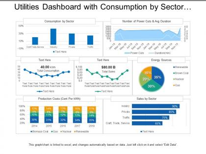
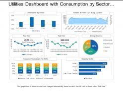
Utilities dashboard with consumption by sector and energy sources




Try Before you Buy Download Free Sample Product
 Impress Your
 Audience
 100%
100% Editable
 Save Hours
 of Time


Institute better health care with our Utilities Dashboard With Consumption By Sector And Energy Sources. Eliminate any cause for despair.
People who downloaded this PowerPoint presentation also viewed the following :
Utilities dashboard with consumption by sector and energy sources with all 5 slides:
Inject a bit of exuberance with our Utilities Dashboard With Consumption By Sector And Energy Sources. Add to the degree of happiness existing.
FAQs for Utilities dashboard with consumption by sector
Focus on the big four first: energy consumption, outage response times, peak demand, and cost per unit. Transformer temps and grid load percentages matter too. Don't go crazy with metrics though - I've seen way too many dashboards cluttered with stuff nobody checks. Maybe 8-10 max is plenty. Predictive alerts for demand spikes are super useful. Your field teams will know what's actually missing once you get the basics down. They're out there every day, so their input is gold. Start simple and build from there.
You'll catch problems and opportunities instantly instead of waiting days for reports to tell you what already happened. Power outages, energy spikes, grid issues - everything shows up in real time on one screen. Way better than drowning in spreadsheets, trust me. Visual patterns pop out that you'd never notice buried in data tables. Your whole team stays on the same page since everyone's watching live updates together. Oh, and collaboration gets so much faster when nobody's working off yesterday's numbers. Pick your most critical stuff first and get those dashboards running.
Honestly, customization makes or breaks a utilities dashboard. Your team won't touch it if they can't make it work for them. Being able to move widgets around, set up personal alerts, and focus on the KPIs that actually matter? That's what gets people using it daily instead of ignoring it. Nobody's got time to hunt through a bunch of random metrics - been there, done that. When users can tailor their view and prioritize what they need, decisions happen faster and adoption goes way up. Figure out what customization options your people want most first, then build around those.
So basically you connect ML models to your dashboard's data feeds - that way you can predict equipment failures and demand spikes before they actually hit. Set up automated alerts when the models spot anomalies or issues coming down the pipeline. Tableau and Power BI have built-in ML stuff, though honestly the initial setup is kind of a nightmare. Focus on the big wins first - transformer failures, peak load forecasting, that kind of thing. I'd start with just one model, get it actually working right, then build from there. Don't try to do everything at once or you'll lose your mind.
So first thing - put your big metrics right up front where people can't miss them. Energy usage, costs, alerts, all that stuff. Don't make people hunt for it. Simple charts work way better than fancy ones, trust me. I swear some dashboards look like someone just vomited spreadsheets everywhere lol. Let people start with the big picture then click deeper if they want details. Stick with the same colors and terms throughout - it gets confusing otherwise. Oh and definitely add time filters so they can adjust the date ranges. Test it with real users though, not just your team!
Honestly, data integration is a game changer - you get one dashboard instead of constantly switching between like five different apps. Your utility dashboard can pull from billing, outages, customer service, all that stuff at once. So when customers start calling about issues in one area, you'll actually see the full picture right away. Way faster to spot patterns and respond to problems. Plus you can make decisions based on real data instead of just guessing (which I used to do way too much). Set up automated feeds so everything updates itself - trust me, manual uploads are the worst.
Honestly, the data integration stuff will drive you nuts - utility data lives everywhere and nothing talks to each other properly. Getting people on board is rough too since everyone's married to their crappy old Excel sheets. Each department wants totally different metrics, which makes picking the right KPIs a nightmare upfront. Oh, and users hate change even when the new thing is obviously better (go figure). I'd start super small though - maybe one data source and like 3-4 friendly users who actually want this to work. Once you've got something decent running and can show it's not garbage, then you can expand from there.
Dude, mobile access is a total game changer for field teams. Your techs can check system status and update work orders right from wherever they are - no more running back to the office constantly. Response times get way faster since they can spot emergencies and prioritize on the fly. Communication between field crews and dispatch gets so much smoother too. Honestly, the paperwork delays alone used to drive me crazy at my old job. Efficiency goes through the roof when you're not waiting around for approvals. Start with your best field workers first, then expand from there.
Start with role-based access - only let the right people see your utility data. Multi-factor authentication is non-negotiable because passwords are basically useless these days. Encrypt everything, both stored data and stuff moving around the network. Audit logs help you track who's poking around where (and trust me, you'll want that paper trail). Network segmentation keeps your dashboard isolated from other systems. Oh, and don't forget regular security assessments - utility data makes hackers drool. Focus on access controls and MFA first since they'll protect you the most right out of the gate.
So basically you want different views for different people. Executives care about the big picture stuff - KPIs, costs, outage summaries, whatever makes them look good in meetings. Your field teams need the nitty-gritty: equipment alerts, work orders, real-time conditions they can actually do something about. Most dashboard tools let you customize permissions and layouts pretty easily. Here's what works: ask each group what decisions they're making every day, then only show them that data. Honestly, less is more here. Start with maybe 3-5 key metrics per role and expand later. You'll save everyone time and probably some headaches too.
Look, without historical data you're basically flying blind with your utility numbers. Like, is that energy spike normal summer stuff or is your HVAC dying? You need that context to actually make sense of what's happening now. I'd set it up so you can see historical trends right next to your live data - makes it super obvious when something's off. Seasonal patterns become clear, you can budget better, and honestly it's saved my ass more than once when equipment was failing but the signs were subtle. Anomalies jump out way faster when you know what normal looks like.
So utilities dashboards are like having a sustainability control room - you'll see exactly where your energy, water, and gas money is disappearing. The visual charts make spotting patterns super obvious (seriously, why does our electricity always spike Tuesday afternoons?). You can track carbon emissions in real-time and compare usage across buildings or different months. Best part? You get actual data to back up your environmental claims instead of just winging it. I'd start by finding your top 3 energy wasters first - that's where you'll make the biggest dent.
So for utilities dashboards, most people go with Tableau, Power BI, or Grafana. Tableau handles complex stuff really well. Power BI works great if you're already using Microsoft everything - which honestly, most companies are these days. Grafana's awesome for real-time monitoring and it's free, so utilities eat that up. Some places build custom things with D3.js or just stick with Excel if they're small. Really depends on your data volume and what plays nice with your SCADA systems. I'd figure out your data sources first, then pick from there.
Honestly, dashboards are a game changer for compliance stuff. You get everything in one spot instead of bouncing between like 8 different systems when audit time hits. Real-time tracking for service standards, environmental reports - all that regulatory mess stays organized. Set up alerts before you hit any thresholds though. Trust me on this one. Teams I know used to spend days scrambling for compliance reports, now they knock them out in a few hours. Way less stressful than the old days of playing catch-up with deadlines constantly.
So the big stuff right now is AI predictive analytics and real-time IoT integration. Mobile-first designs are everywhere too. Those awful static dashboards are finally dying out - thank god. Interactive visualizations actually help you make decisions now instead of just looking pretty. Cloud solutions are pretty much standard at this point since they scale way better. Oh, and cybersecurity features are getting more attention, plus self-service portals for customers. Honestly though? Predictive maintenance is where the real money is. It'll catch problems before they get expensive.
No Reviews