

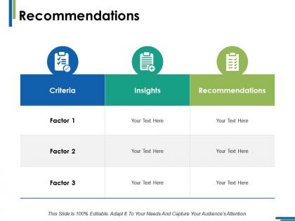
Recommendations insights ppt infographics example introduction




Try Before you Buy Download Free Sample Product
 Impress Your
 Audience
 100%
100% Editable
 Save Hours
 of Time


Our Recommendations Insights Ppt Infographics Example Introduction are genuinely gilt edged. They give you a golden chance.
People who downloaded this PowerPoint presentation also viewed the following :
Recommendations insights ppt infographics example introduction with all 5 slides:
Familiarize them with the empowering capabilities of the cloud with our Recommendations Insights Ppt Infographics Example Introduction. Get them aware of it's benefits.



FAQs for Recommendations insights ppt
Grab people right from the start with something strong. Then map out your points so they actually make sense together. Don't dump walls of text on slides - honestly, nobody reads that stuff anyway. Use visuals that back up what you're saying instead. I bombed a presentation once doing exactly this wrong! Get people involved somehow - throw in questions, make it interactive. Practice your timing and look at people when you talk. Oh, and always end with what you want them to do next. Otherwise they'll just sit there wondering "so... now what?"
Think of it like directing people's attention - bigger fonts grab eyes first, then smaller stuff follows. Your main headline should dominate the slide, with subheadings and body text stepping down from there. Most folks just scan anyway (which honestly makes our job easier). Bold colors work great for key points, while muted tones handle the supporting details. Oh, and spacing matters more than you'd think - gives everything room to breathe. Just pick your 2-3 most crucial elements per slide and make those pop visually. The rest can fade into the background.
Dark text on light backgrounds works best - or flip it around. Just avoid red/green and blue/purple combos since colorblind people can't tell them apart. I know this sounds ridiculous, but try squinting at your screen to see if the text still stands out. Works every time! Neutral backgrounds are your friend here. For contrast ratios, shoot for at least 4.5:1 with regular text. Oh, and definitely use those online contrast checker tools before you commit to anything - they'll save you from making terrible choices.
Look at a few presentations from companies you're targeting first - that'll show you their vibe. Tech goes super minimal with tons of white space. Finance? Way more buttoned-up with structured layouts. Creative agencies get to use wild colors and weird designs (honestly jealous). Healthcare sticks to clean, professional stuff because trust matters. Consulting loves those polished templates packed with diagrams to show they're the experts. Just match whatever formality level and visual style they're already using. It's like dressing for the office - you want to fit in, not stand out for the wrong reasons.
Dude, storytelling totally changes the game with presentations. Your audience will actually remember what you said instead of zoning out during another data dump. We're hardwired for stories - it's literally how our brains work best. Structure it like beginning, middle, end with characters people can relate to. The info sticks so much better that way. I mean, think about when you were a kid - you remembered every detail of bedtime stories, right? Same concept here. Figure out your main story first, then weave your data around that narrative. Way more engaging than bullet points.
Honestly, data viz is your best friend for making arguments that actually stick. People process visuals way faster than boring text blocks - it's just how our brains work. Bar charts work great for comparisons, line graphs for showing trends over time. But here's the thing: don't just slap any chart in there. I've watched so many people bomb presentations with confusing pie charts that made zero sense. Pick visuals that directly prove your specific point. Start backwards too - figure out what you want to conclude first, then create the chart that backs it up. Works every time.
So you'll want a killer opening that hooks them right away - honestly, you've got maybe 30 seconds before people zone out. Then lay out the problem clearly, followed by your solution with some solid proof behind it. I always toss in data or testimonials because people eat that stuff up. Your slides should flow logically from one to the next. Oh, and here's the thing most people mess up - don't just end with "questions?" Tell them exactly what you want them to do next. That call to action needs to be crystal clear and specific.
Oh man, so many companies screw this up! Don't just translate the words - you gotta adapt the whole vibe. Like, Americans are cool with direct messaging but that'll come off super rude in Japan. Switch up your visuals too so they actually reflect local people and customs. Colors mean different things everywhere (who knew, right?). Business practices and holidays are totally different region to region. Honestly, just get native speakers or cultural consultants to check your work before you launch. It's worth it to avoid looking like a complete amateur.
Focus on contrast first - those trendy light gray fonts might look sleek, but they're awful for readability. Go with sans-serif fonts, at least 24pt for presentations. Don't forget alt text for images, and use clear headings so screen readers work properly. Honestly, I'd skip the fancy animations too. They're distracting and make things harder for people with cognitive differences. Keep layouts simple and consistent throughout. Here's my go-to test: if you can't read it from the back row, people with visual impairments definitely can't either.
Dude, multimedia is a game changer for presentations. Videos work amazing for explaining tricky stuff, and good visuals beat walls of text every time. Different people learn differently too - some need to see it, others hear it. I'd skip cheesy sound effects though, unless you want people rolling their eyes lol. The trick is being smart about what you add. Don't just dump random graphics everywhere. Each thing should actually back up what you're saying. Try swapping out one boring text slide for something visual next time. You'll be shocked how much more people pay attention.
Yeah, animated templates are worth it! Your click-through rates will jump 2-3x higher than static ones. They're perfect for showing processes or before/after stuff that regular images can't really capture. Honestly? They just look way more professional in 2024. The catch is they take forever to make and can get annoying if you go overboard. But for important campaigns or complicated ideas, the engagement boost makes up for the extra work. I'd start by animating whatever static templates already perform well - that's where you'll see the biggest difference. Also, don't animate everything at once or people will get visual fatigue lol.
Honestly, just keep your slides super clean - they should back up what you're saying, not fight for attention. Bullet points are your friend for highlighting main ideas. Don't dump paragraphs on there or people will read instead of listening to you (learned this the hard way lol). Charts and images are clutch when they actually connect to your examples. My rule? If someone can follow along without getting distracted, you're golden. Oh and definitely rehearse first - you'll quickly figure out if your slides feel helpful or if they're stealing the show.
Ugh, the worst thing you can do is cram a wall of text on every slide. Nobody's reading that mess. Use big fonts - like seriously, pretend your grandma's in the back row. Skip the crazy spinning animations too, they just make you look amateur. Stick to maybe 3 colors that actually contrast well. Those cheesy stock photos of people pointing at laptops? Hard pass. Your slides should back up what you're saying, not distract from it. Oh and find one template you like and just roll with it for the whole thing.
Okay so first thing - don't let pretty slides kill your actual message. I've watched so many people do this and it's painful. Build everything around your core data first. Clean layouts work best, stick to consistent fonts, and only use colors that actually help (not just because they're trendy). White space is your friend - seriously, don't cram everything together. Make sure text is readable from the back row. Here's my test: if someone can't get your main point in 10 seconds, you need to strip stuff out. The goal is slides that flow naturally but still look polished.
Honestly, interactive stuff is everywhere now - like embedding live charts and clickable elements straight into slides. Mobile-first templates are kind of a big deal since everyone's scrolling through presentations on their phones anyway. AI design suggestions will literally auto-format your content based on what you're presenting, which is pretty wild. Dark mode's obviously huge too. Animation presets are clutch though - they'll save you so much time instead of building everything from scratch. Oh, and weirdly enough, those sustainability color palettes are trending hard right now. Video snippets embedded directly in slides are becoming standard too.
No Reviews