

Recommendations powerpoint presentation slides






Try Before you Buy Download Free Sample Product
 Impress Your
 Audience
 100%
100% Editable
 Save Hours
 of Time


For developing an ideal estimation of your business resources then you should utilize our Recommendations PowerPoint Presentation Slides which helps in explaining the proficiency of your resources. This recommendation PPT slide will help in detailing the term of recommendation in the concept of customer management where it is used as a measuring tool to check the customer recognition of your business products which will result in providing you a competitive edge over your competitors in the industry and results in enhancing your overall sales rate. Apart from this, our PowerPoint template will help you in portraying the effect of recommendation and its effect on business capabilities and its impact on the other business functions. You can also make use of this presentation design to explain the concepts like customer success management, customer satisfaction process, customer recognition process and many more like this. Thus, start working over this impeccable design and create informational presentation with this PPT layout. Create an air of exclusivity with our Recommendations Powerpoint Presentation Slides. They all come from a designer collection.
People who downloaded this PowerPoint presentation also viewed the following :
Content of this Powerpoint Presentation
Slide 1: This slide introduces Recommendations. State Your Company Name and begin.
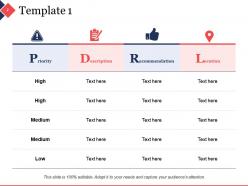
Slide 2: This is a Template slide for Priority, Description, Recommendation and Location.
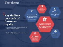
Slide 3: This slide presents Key Findings on Worth of Customer Loyalty.
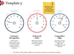
Slide 4: This is a Template slide showing- Customer Recognition, Enhanced Sales and Competitive Edge. State these aspects here.
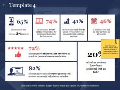
Slide 5: This is a Template slide. Enter the survey/ tracking results in this infographic slide to create an everlasting impact on the audience.
Slide 6: This is a Template slide with icon imagery. Present information, specifications etc. here.
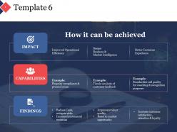
Slide 7: This is a Template slide showing- IMPACT: Improved Operational Efficiency, Deeper Business & Market Intelligence, Better Customer Experience. CAPABILITIES: Pinpoint compliance & process issues, Timely analysis of customer feedback, Standardize call quality for coaching & recognition purposes. FINDINGS: Reduce Costs, mitigate risks, Increase incremental revenues, Improve product quality, React to market opportunity, Increase customer satisfaction, retention & loyalty,
Slide 8: This is a Recommendations Icon Slide. Use the icons as per need.
Slide 9: This is a Coffee Break slide to halt. You may change the slide content as per your need.
Slide 10: This slide is titled Charts & Graphs to proceed forward. You may change the slide content as per your need.
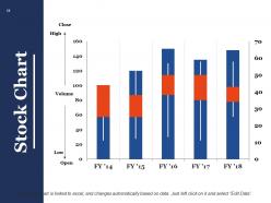
Slide 11: This is a Stock Chart to show product/entity comparison, information, specifications etc.
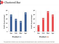
Slide 12: This is a Clustered Bar to show product/entity comparison, information, specifications etc.
Slide 13: This slide is titled Additional Slides to move forward. You may change the slide content as per your need.
Slide 14: This is Our Mission slide. State company mission here.
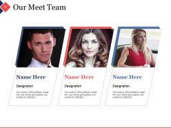
Slide 15: This is Meet Our Team slide to show team members with name, designation, and image.
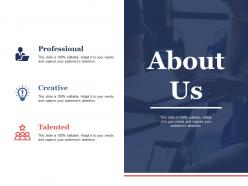
Slide 16: This is an About Us slide. Show company/team specifications etc. here
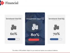
Slide 17: This is a Financial score slide. Present investment, financial aspects etc. here.
Slide 18: This is a Thank You slide with Email Address, Contact Numbers, Address# street number, city, state.
Recommendations powerpoint presentation slides with all 18 slides:
Continue to inch ahead with our Recommendations Powerpoint Presentation Slides. Gradually establish a huge advantage.





FAQs for Recommendations
Okay so first thing - pick something clean with readable fonts. Colors should vibe with your brand obviously. White space is your friend because you can tweak colors later but fixing cramped layouts? Total pain. Make sure there's good contrast so people can actually see from the back row. I learned that one the hard way lol. Check if it has the layouts you need too - comparison charts, section breaks, whatever. Skip the super flashy stuff though, it just distracts from what you're saying. Less is more with this stuff.
Honestly, color schemes can totally make or break your whole presentation. Go with high contrast stuff - dark blue background with white text is solid, or just stick with classic black on white if you're playing it safe. I've been really into navy and gold combos lately (maybe I'm weird but whatever). Don't do neon colors or anything where people have to squint from the back row. Three colors max is a good rule. Oh and definitely test your slides on different screens first - learned that one the hard way when my "perfect" colors looked terrible on the projector.
Honestly, fonts can make or break your presentation. Stick with boring stuff like Arial or Calibri - I know it's not exciting but people can actually read it from the back row. Make your text at least 24pt, bigger for titles. Last week I sat through this deck where someone used some weird curly font and literally nobody could read anything. So annoying! Don't go crazy with different sizes either - pick maybe 2 or 3 max and call it a day. Trust me, readable beats "artistic" every single time.
Dude, visual storytelling is a game-changer for PowerPoint. Nobody wants to sit through slides that are basically just bullet points reading themselves - I've been trapped in those meetings and they're painful. What you want to do is create an actual story arc using images and charts instead of dumping data everywhere. People remember stories way better than random facts. Each slide should have one strong visual that moves your narrative forward. Oh, and use visual metaphors when you can - they really help concepts stick. Your audience will actually stay awake and maybe even care about what you're saying.
Make sure every video or animation actually adds something meaningful to your talk - I've sat through way too many presentations with pointless spinning graphics that just gave me a headache! Your images need to be crisp and big enough for people in back to see clearly. Don't overload slides with tons of elements. Short audio clips work well, but always include captions. Test everything on the actual equipment you'll use so nothing crashes halfway through. File sizes matter too. Oh, and definitely save a PDF backup version just in case things go sideways.
Honestly, it's like two different worlds. Academic folks want clean, simple layouts - think Times New Roman, lots of white space, nothing flashy. You're gonna need more text on your slides too since you're explaining complicated stuff. Corporate presentations? Totally opposite vibe. They go for bold fonts, branded colors, slick graphics that grab attention. Bullet points work better than paragraphs. I learned this the hard way when I used my thesis template for a business pitch once - yikes. Just figure out your audience first, then pick your style. Makes such a huge difference.
Ugh, don't cram a wall of text on every slide - nobody reads that anyway. Also those super busy templates with random graphics everywhere? Hard pass. Honestly the worst thing is when people just use the template exactly how it came - like at least change the colors or something so it doesn't look like you downloaded it five minutes ago. Mix up your bullet styles and you'll look sloppy too. Keep formatting consistent across slides. Oh and those stock photo templates with the fake handshakes make me cringe every time. Your actual content matters way more than flashy design stuff.
Slide masters are your best friend here - seriously, they'll save you so much time. Just set up your fonts and colors once in the master view, then boom, every slide looks consistent without thinking about it. Stick to like 3-4 colors max (I learned this the hard way after making some truly hideous presentations). Same font throughout too. Oh, and you can copy formatting between slides if you need to match specific stuff. It might seem kinda basic, but your audience picks up on that polished look even if they don't realize it. Way better than rebuilding everything from scratch each time.
Honestly, the 6x6 rule saves lives - six bullet points max, six words each. Images should eat up like 60-70% of your slide real estate. People cram way too much text everywhere and it's painful to look at. White space actually helps! Your font needs to be readable from the cheap seats in back. High contrast colors are clutch. Oh, and here's my go-to test: glance at your slide for three seconds. Can't figure out the main point? You've overdone it. Visuals should back up what you're saying, not fight against it.
Oh man, cultural stuff can totally make or break your presentation! Like, red screams "danger" to us but it's lucky in China - who knew? Plus some cultures read right to left, which throws off your whole slide flow. I bombed a presentation in Japan once because I went way too direct upfront. They wanted more relationship-building first. Different places have completely different expectations for how you structure content too. Some want you to cut straight to the point, others think that's rude. Honestly, just ask a local colleague to look it over before you present. Saves you from looking clueless.
One chart, one message - that's it. Don't try cramming everything onto one slide. Stick with the same colors throughout (honestly PowerPoint's defaults work fine if you're rushed). Your text needs to be huge - like 24pt minimum for labels because people in the back can't see tiny fonts. Skip all that flashy 3D stuff and spinning animations, they're just annoying distractions. Oh and your chart title should basically tell people the punchline upfront. I'm talking dead obvious what they should think. If someone can't figure out your point in 3 seconds, you've lost them.
Honestly, go easy on the animations - your audience wants to focus on what you're saying, not watch some PowerPoint light show. Fade or Push transitions work great without being distracting. I learned this the hard way after watching someone's text literally bounce across the screen (so cringy). Use animations strategically though - revealing bullet points one by one helps control your pacing. Simple "Appear" or "Fly In" effects do the job perfectly. Skip anything that makes your presentation look like a 90s website. Your content's the star here, not the fancy effects.
Okay so here's the thing - your slide titles should actually tell people what happened, not just what topic you're covering. Like instead of "Sales Data," go with "Sales Jumped 23% This Quarter." Way better, right? I've sat through so many presentations where I'm basically playing detective trying to figure out the actual point. Your audience shouldn't have to work that hard! Keep titles under 10 words if you can. Here's a trick I learned: read just your titles out loud and see if they make sense on their own. If someone could understand your main points from titles alone, you're golden.
Definitely get some other people to look at your templates before you pick one! They'll catch stuff you totally miss. Like is the font actually readable? Does the color scheme work if someone's colorblind? I made that mistake once - picked this template I thought was so clean and modern, but everyone said it felt way too sterile. Your coworkers know what flies in your company better than some random template designer anyway. Have maybe 2-3 people check out your favorites and be brutally honest about what works.
Honestly, start with PowerPoint's built-in Designer thing - it's gotten way better and just automatically suggests layouts based on what you write. Super easy. If that's not cutting it, Canva and Adobe Express have like a million modern templates you can mess around with and export. I get lost scrolling through Canva for way too long lol. For more advanced stuff, there's Slide Master view where you can change fonts and colors for your whole presentation at once. But yeah, try Designer first since it's free and might save you from doing everything manually.
-
Out of the box and creative design.
-
Good research work and creative work done on every template.