


 0 Comment
 Customer Reviews

While the global energy sentiment is moving towards renewable sources like wind, solar, and geothermal, oil and gas are a significant and reliable source of power worldwide. Let’s take a look at this major power contributor.
Annually, over four billion metric tons of oil are produced worldwide, of which the Middle East holds more than 50% of the world’s proven oil reserves.
Counting for the global market, the value was approximated at USD 6,705.68 billion in 2023, projected to reach USD 8,917.40 billion by 2031 (growing at a CAGR of 3.68%). Furthermore, the industry employs over eight million people.
By revenue, Saudi Aramco and Sinopec are among the largest companies and the United States is the world’s largest oil consumer, while China the largest importer.
To make it easier to showcase these numbers, we have created 10 exceptional PowerPoint Slides with the right mix of text, graphs, diagrams, and charts.
How goes…well everything? Wish to showcase your work/project progress through visual aids like charts and graphs and diagrams? Click here for our ready-to-use PPT Templates for the same!
You’ll have our petroleum industry dashboard templates to count when you present that the world petroleum production for 2022 was 97,698,105 barrels per day and for 2021 was 97,264,198 barrels per day.
Energy Sector Metrics Tracker PPT Templates
SlideTeam prides itself on understanding business across all industries and product offerings, which are a must-have in any company’s sales plan. With our templates, we assist you in attracting customers and investors and take some burden off your shoulders.
Our templates entirely consist of content-ready and 100% editable slides. We’ve done the work for you. All that’s left to finish is to download the slide(s) you love and add your information to the visually appealing layout(s).
We save you valuable time and energy.
It all comes down to the fluid operation of the energy sector. To ensure this, deliver the KPIs in an easy to follow manner with our premade templates with a click here!
Prepare for the next big meeting with our 10 best Oil and Gas Dashboard Templates and make it a productive affair. Let’s tour these pre-made presets now and find the one that best suits your needs.
Template 1: Mining Oil and Gas Extraction KPI Dashboard
This colorful PPT Set presents a comprehensive snapshot that tracks total production (BOE), oil, gas, NGL, and condensate outputs, alongside budget achievement rates. Moreover, supporting metrics include weekly production sales against budget and year-over-year lease operating expenses with a $2.25M (example) reduction. Download this template now to provide precise monitoring of production efficiency, sales trends, and cost management for optimized operational performance.

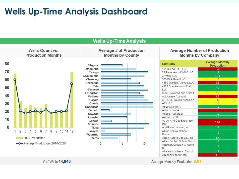
Template 2: Wells Uptime Analysis Dashboard Oil and Gas Industry Challenges
This visual PPT Preset represents the wells’ productivity and operational consistency with ease. Here we showcase a sample comparison in 2020 well counts vs production months, averages production months by county, and ranking of companies by average monthly production. The example showcases 14,940 active wells and an overall average production of 8.61 months. Grab his slide right away to enable performance benchmarking, identify underperforming operators, and assist in targeting operational improvements with the use of charts and graphs.
Template 3: Oil and Gas Well Summary Dashboard Strategic Overview
The monochrome PPT Format helps you represent the well status, purpose, downtime, and detailed production metrics. In this example scenario, it tracks 60 wells categorized as active, suspended, abandoned, or cancelled. Downtime analysis highlights causes like transportation and wellbore issues. The dashboard also presents well-specific data such as state, depth, and production and visualizes monthly trends in net and gross well counts. Get this template from the link below to aid in comprehensive operational oversight.

Template 4: Oil and Gas Production Dashboard Global Energy Outlook Challenges Recommendations
This minimalist PowerPoint Layout provides a quick yet extensive summary of the top 5 companies by average monthly and yearly production. The KPIs are presented for global firms like Allegany Energy, FOREXCO, McCracken Oil, and Talisman Energy. The dashboard also shows active well counts: 4,881 oil wells and 10,652 gas wells. This data offers up a clear view of operational scale. Download this preset now to deliver insights into benchmarking, capacity planning, and production optimization across operators.

Template 5: Lease Operating Expenses KPI for Oil and Gas Industry
This easy to follow diagram PPT Slide compares year-over-year LOE with a $2.25M cost reduction, visualizes yearly LOE growth from 2005 to 2021, and maps expenses by region. In this particular case study the monthly gross LOE trends reveal fluctuations across operational months. Grab this dashboard slide template now to help stakeholders track expense patterns, evaluate cost control effectiveness, and optimize financial management.

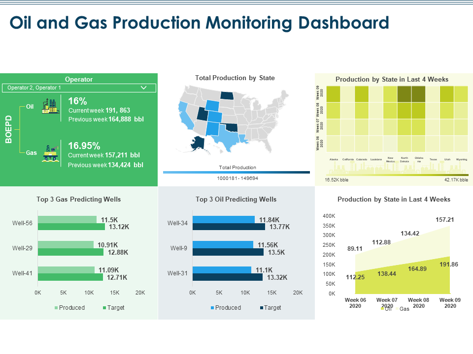
Template 6: Oil and Gas Production Monitoring Dashboard Industry Challenges
This comprehensive PT Preset delivers on every metric with a detailed view of weekly production performance. In this use case, it tracks oil and gas output, production trends by state, and recent 4-week production volumes. The dashboard highlights top performing wells for gas (Well-56, Well-29, Well-41) and oil (Well-34, Well-9, Well-31), comparing produced vs target output. Employ these visual maps and heatmaps to enhance regional analysis. Get this slide today!
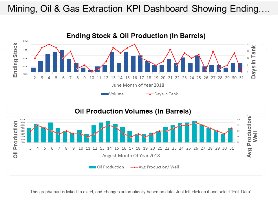
Template 7: Mining Oil and Gas Extraction KPI Dashboard Showing Ending Stock and Oil Production Volumes
Use this readymade PPT Slide to visualize daily ending stock, oil production volumes, and storage capacity trends with line and bar graphs. The top chart tracks June’s ending stock levels (in barrels) against days in tank, while the bottom chart monitors August’s oil production volumes and average production per well. Leverage these insights to optimize inventory management, balance production schedules, and ensure efficient tank utilization. Download this template now!
Template 8: IoT Applications in Oil And Gas
highlights top 5 gas and oil producing wells, comparing target vs actual outputs. The dashboard reports 95.67% production efficiency, 86.95% well uptime, daily gas production of 23.75K mcf, and oil production of 9.29K bbl. These insights support real-time operational decision-making, maximize production output, and ensure efficient resource utilization in oil and gas operations.

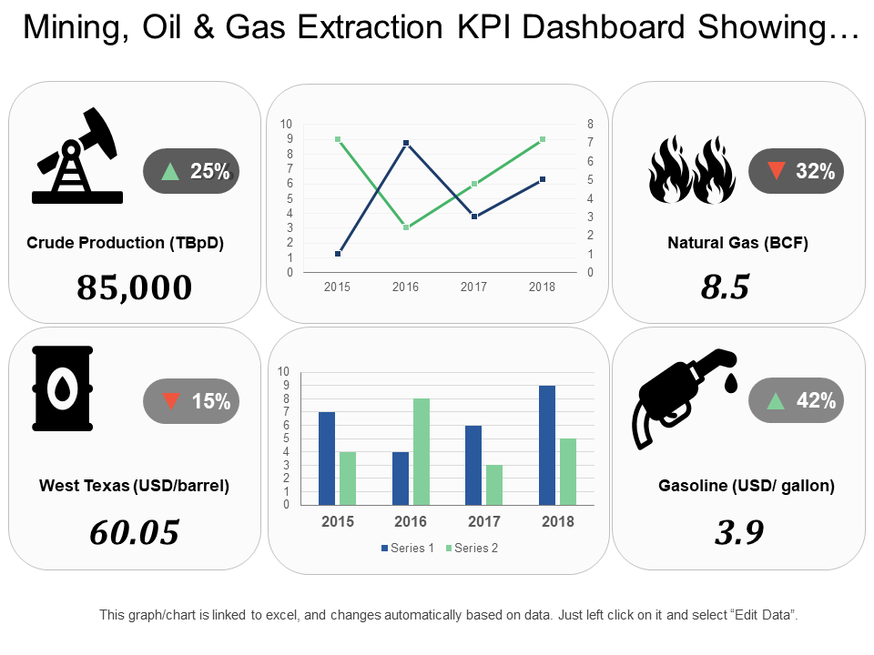
Template 9: Mining Oil and Gas Extraction KPI Dashboard Showing Crude Production and Natural Gas
This simple PPT Preset visually details the numbers for crude production (85,000 TBpD, up 25%), natural gas output (8.5 BCF, down 32%), and West Texas oil prices ($60.05/barrel, down 15%). Gasoline prices ($3.9/gallon) show a 42% rise. Get this template for its integrated time-series charts to provide year-over-year production and price trends, helping stakeholders monitor output efficiency and market fluctuations.
Template 10: IoT Applications in Oil And Gas
The extensive PPT Format delivers KPIs like the total wells, carbon gas emissions, water cut, and cost per BOE, along with detailed well summaries covering well status, water cut, emissions, and integrity. The dashboard slide includes visual gauges for well integrity and choke management, plus downtime analysis with causes. Grab this deck for efficient performance tracking, regulatory compliance, and proactive issue resolution.

Conclusion
With these ready-to-go templates at your disposal, you’re ready to present the right data the right way to your stakeholders. These slides use all the necessary elements, such as tables, graphs, charts, and more, to make your delivery superb and the overall presentation eye-catching.
Download these Oil and Gas Dashboard Templates and ease the burden on your shoulders.
PS Further detail the comings and goings of a gas turbine operations with our readymade, off-the-shelf PP Templates with a click here!
FAQs on Oil and Gas Dashboard
1. What key performance indicators (KPIs) are typically included in an oil and gas dashboard?
Let us take a look at the KPIs that define a dashboard within the oil and gas industry:
Typically included are daily production rates, well performance metrics, equipment uptime, and maintenance schedules. Then there are the KPIs that track operational efficiency, safety incidents, and environmental compliance. Moreover, the financial KPIs like revenue per barrel, operational costs, and profit margins are crucial. On the more technical end of things, it may include reservoir pressure, fluid levels, and drilling progress.
These KPIs define the company’s operational health and financial performance. This makes it easier for stakeholders to make data-driven decisions and identify areas for improvement.
2. How does the dashboard track production efficiency and good performance?
The method for tracking production efficiency and performance is by monitoring KPIs such as production volume, downtime, and equipment utilization rates. If done well, they use real-time data to compare actual production against targets, highlighting deviations and inefficiencies.
Moreover, it tracks metrics like energy consumption, emissions, and water usage to ensure sustainable operations.This way, the dashboard also helps operators optimize resource allocation, reduce costs, and enhance overall productivity.
3. What role does real-time monitoring of assets play in the dashboard’s effectiveness?
Real-time monitoring of assets is a crucial element to asset monitoring. It follows the simple adage of prevention being better than cure. There are numerous advantages to practicing this. Up-to-date information enables immediate detection of anomalies, reducing downtime and preventing potential failures. This also results in quick decision-making, enhancing operational efficiency and safety.
Ultimately, a real-time dashboard ensures optimal resource utilization, minimizes operational risks, and supports compliance with regulatory standards.