


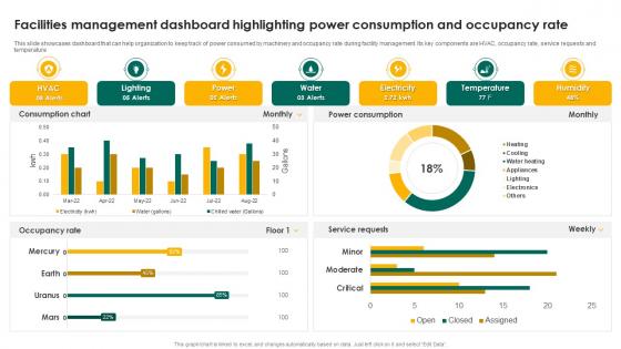
Facilities Management Dashboard Highlighting Power Consumption And Occupancy Rate




Try Before you Buy Download Free Sample Product
 Impress Your
 Audience
 100%
100% Editable
 Save Hours
 of Time


This slide showcases dashboard that can help organization to keep track of power consumed by machinery and occupancy rate during facility management. Its key components are HVAC, occupancy rate, service requests and temperature.
People who downloaded this PowerPoint presentation also viewed the following :
Facilities Management Dashboard Highlighting Power Consumption And Occupancy Rate with all 7 slides:
Use our Facilities Management Dashboard Highlighting Power Consumption And Occupancy Rate to effectively help you save your valuable time. They are readymade to fit into any presentation structure.





FAQs for Facilities Management Dashboard Highlighting Power Consumption
Focus on the basics first - space utilization rates, energy costs per square foot, and how fast you're knocking out work orders. Maintenance response times matter huge, trust me on that one. Track your preventive maintenance compliance too, plus tenant satisfaction scores and budget variance. Cost per square foot is solid for benchmarking against other properties. Honestly though, don't go crazy with metrics. Pick maybe 5-7 that actually help you make decisions. Start with whatever your boss cares about most and add from there.
Look, forget those messy spreadsheets - a good facilities dashboard shows you everything in real-time. Equipment trends, work orders, resource allocation, all right there. Honestly beats flying blind on maintenance stuff. The predictive features are clutch because you can actually plan ahead instead of scrambling when things break. Track your repair times and costs per asset too. Oh and start with whatever's driving you crazy first - configure the dashboard around those specific headaches. Way better than the old "hope nothing explodes today" approach most places use.
Heatmaps are perfect for showing which spaces get used most - way easier to spot patterns than tables full of numbers. I'd definitely use gauge charts for your main KPIs like energy and occupancy. Simple bar or line charts work great for tracking trends too. Those red/green status indicators are clutch for equipment health at a glance. Honestly, facility managers just need to quickly see what's broken or needs attention, so don't overcomplicate it. Oh, and put your critical alerts right at the top where they can't miss them.
So basically you need to hook up your building systems - HVAC, security, energy stuff - through proper API connections. Most platforms can pull data every few minutes automatically, which beats manual uploads by a mile. Webhooks are clutch for instant updates if your dashboard supports them. Map out what systems need to connect first, then figure out the best way to link each one. The whole point is getting everything to talk without bugging IT constantly. Oh, and middleware platforms are your friend here - they handle the heavy lifting between systems. Way less headache than trying to jerry-rig connections yourself.
Your dashboard's gotta be super easy to use or people will just ignore it. Make the fonts readable and navigation obvious - facilities staff need to find stuff fast, especially during emergencies. Color coding helps but don't make it the only way to tell things apart (colorblind users exist). Mobile compatibility is huge since these folks are always walking around with phones and tablets. Oh, and test it with real users constantly. I can't stress this enough - what seems obvious to you might be confusing as hell to someone actually doing the job. Catch those problems early before they tank everyone's productivity.
So custom dashboards let you move stuff around and pick exactly what metrics you want to see. Templates are just the boring default layouts everyone gets - they work fine but show random stuff you probably don't need. Honestly, templates feel pretty generic to me. You can drag widgets wherever with custom ones and set up views that actually make sense for your workflow. Way more personalized experience. Oh, and the learning curve isn't too bad - I'd just start with a template first to get the hang of it, then customize from there once you know what you're doing.
Put your critical incidents right at the top with color coding - red for urgent stuff, yellow for moderate. Response times need to be front and center, showing both current averages and how you're trending. Bar charts work great here since they're super easy to read at a glance. Group everything by category like HVAC, electrical, plumbing. Status indicators help you see what's done vs what's still hanging out there. Oh, and make sure you can click into individual incidents for the full details when needed. The overview should stay clean but actually useful for your team to act on.
So you basically hook up all your historical data from HVAC, lighting, whatever sensors you've got to some forecasting models. Pretty cool stuff - it'll predict filter changes, elevator breakdowns, energy spikes, all that. I was skeptical at first but it actually works. The predictions show up as alerts or color-coded warnings right next to your live data. Honestly I'd start with just HVAC maintenance since that's usually the easiest win. Once you see how spot-on the predictions are, you can expand to other systems.
Honestly, just go with line charts first - they're super clean for tracking energy usage over time. You can break it down by day, week, whatever works. Heat maps are cool too if you're comparing multiple buildings, but I'd skip those initially since they can get messy to read. The real game changer though? Set up those automated reports. I know it sounds boring, but when the data just shows up in your inbox, you'll actually check it instead of forgetting about it for three months. Plus you'll spot weird spikes way faster that way.
Dude, mobile access is a total game changer for facilities dashboards. Your techs can log issues right when they spot them, snap photos, update work orders - all without running back to a computer. I mean, who has time for that anymore? You'll catch problems way faster since everyone gets instant alerts about urgent stuff. Honestly the mobile notifications alone will speed up your response times like crazy. No more being chained to your desk just to check if the HVAC system is acting up again.
Start with role-based access - nobody needs to see everything. Multi-factor authentication is a must because passwords are basically worthless now. Encrypt your data when it's moving around and when it's stored, especially security codes and employee logs. Set up audit trails to track who looked at what. Oh, and definitely loop in your IT security people from day one. I learned this the hard way on another project - trying to add security afterward is such a pain. Way better to build it in from the start.
Honestly, I'd hit them from a bunch of angles - surveys, support tickets, those regular check-ins with facilities people. But here's what really works: stick a feedback widget right in the dashboard itself. People actually use those when they're frustrated or excited about something. Analytics are sneaky good too - when users keep avoiding features or get stuck on tasks forever, that tells you everything. Oh, and this part's crucial: close the feedback loop. Tell people what you fixed based on their complaints. Makes them feel heard and they'll keep giving you the good stuff.
Honestly, the data thing is gonna be your worst nightmare. HVAC systems, security, work orders - none of them talk to each other properly. Plus your team has to actually want to use this stuff, which is harder than it sounds. Training eats up way more budget than people expect, and don't even get me started on integration costs. My advice? Pick maybe two metrics you actually care about first. I've seen too many people try to build some crazy comprehensive dashboard right off the bat and it never works out.
Most platforms let you drop chat widgets or task boards right into your facilities dashboard using APIs or plugins. Slack and Teams both have connectors for this stuff. Fair warning though - the initial setup can be pretty annoying to configure. Whatever chat tool you're already using, start there. Once that's working smoothly, then add task management features. The whole point is keeping your team from constantly switching between apps when maintenance issues pop up. Way easier to just have everything in one place where they can see schedules and actually talk about problems.
Honestly, a decent FM dashboard can save you a ton of money. Energy waste becomes super obvious when you see the patterns laid out. Maintenance stuff gets caught early instead of turning into those nightmare $10K repairs. Space optimization is huge too - why pay rent on areas nobody uses? Real-time data means you stop getting ripped off by vendors selling services you don't need. The automated reports alone probably save someone on your team like 5+ hours weekly (which is basically a part-time job). Set up alerts for your biggest money drains so you can jump on problems fast.
-
Based on my personal experience, I would recommend other people to subscribe to SlideTeam. No one can be disappointed here!
-
Thank you SlideTeam for such an excellent service.