


Facilities Management Dashboard With Repair Services Facilities Management And Maintenance Company




Try Before you Buy Download Free Sample Product
 Impress Your
 Audience
 100%
100% Editable
 Save Hours
 of Time


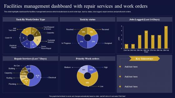
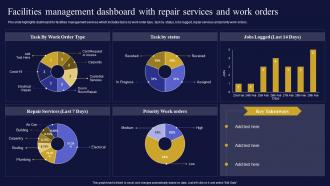
This slide highlights dashboard for facilities management services which includes tasks by work order type, task by status, lobs logged, repair services and priority work orders.
People who downloaded this PowerPoint presentation also viewed the following :
Facilities Management Dashboard With Repair Services Facilities Management And Maintenance Company with all 7 slides:
Use our Facilities Management Dashboard With Repair Services Facilities Management And Maintenance Company to effectively help you save your valuable time. They are readymade to fit into any presentation structure.





FAQs for Facilities Management Dashboard With Repair Services Facilities Management
Focus on these five metrics first: space utilization rates, energy consumption, maintenance response times, work order completion, and cost per square foot. Asset uptime matters big time - trust me, you don't want the AC failing in July! I'd also track your preventive vs reactive maintenance ratio to catch stuff early. Tenant satisfaction scores are gold if you've got leased spaces. Oh, and budget variance reporting obviously. Start simple with these basics, then add whatever's specific to your facility later. The real trick is getting data you can actually use in real-time, not just numbers sitting in some dashboard nobody checks.
Dude, get a facilities dashboard if you can. Real-time data beats guessing every time - you'll actually know what's happening with energy costs and space usage instead of flying blind. Honestly, having everything in one place instead of random spreadsheets feels like magic. The predictive stuff is clutch too; catches problems before they drain your budget. Oh, and definitely set up alerts for the important metrics. Way better than scrambling to fix things after they break. Trust me, being proactive saves so much headache.
Think of it like GPS vs. an old paper map - you're seeing what's happening right now instead of guessing. Equipment failures, energy spikes, occupancy changes, all that stuff shows up instantly on your dashboard. Honestly, it's kind of addictive once you get used to it. You'll catch problems before they turn into those expensive disasters that ruin your week. The live updates help with resource planning too. Just set up alerts for the critical systems so you're not glued to your screen 24/7.
Honestly, good design is a game-changer for dashboards. Your team can actually spot problems right away instead of squinting at messy screens trying to figure out what's broken. Clear navigation and smart color coding make all the difference. I swear some dashboards look like they're designed for NASA - way too complicated! Put the urgent stuff front and center. Keep the everyday data easy to find but don't let it crowd everything else. Focus on what matters most to your facilities team first. Trust me, they'll love you when fixing issues doesn't feel like solving a puzzle anymore.
Honestly, don't try building this from scratch - you'll hate yourself later. Grab something like AWS IoT Core or Azure IoT Hub first to handle all your sensor data. Then you need APIs or some middleware to connect that platform to your actual dashboard. InfluxDB works great for storing time-series stuff. For the visual part, Grafana's pretty solid, or Power BI if you're feeling fancy. Oh, and definitely figure out what formats your sensors are spitting out before you do anything else - saves tons of headaches.
So basically these dashboards show you what's happening with all your equipment in real time. Pretty cool actually - you get alerts when your HVAC filters are getting dirty or temps start going weird, instead of waiting for everything to break down on the worst possible day. I swear that always happens! You can plan maintenance based on how much stuff's actually being used rather than just guessing. Way fewer random service calls that way. The trick is setting up those automatic notifications so nothing sneaks past you. Saves money and your equipment lasts longer too.
Start with the stuff that actually matters - critical alerts and main KPIs right at the top. Color coding works great for quick status checks (red/green you know the drill), but honestly, avoid those crazy rainbow dashboards that make your eyes bleed. Group related things together - don't scatter energy data, space usage, and maintenance requests all over the place. Interactive filters are clutch so people can dig deeper without drowning in info. Oh, and definitely test with real users first. They'll spot annoying quirks you completely missed. Trust me on that one.
So your dashboard basically shows you what's actually happening with your spaces over time. You can see which conference rooms get booked constantly vs. the ones sitting empty (spoiler: that fancy boardroom probably isn't as popular as you think). Heat maps and usage graphs reveal peak hours and seasonal changes. Pull some weekly reports first - you'll spot patterns pretty fast. The data's great for finding underused areas and figuring out when you need maintenance. My old office had this "prime" meeting space that was literally empty 60% of the time. Once you see the trends, it's way easier to cut costs and shuffle resources around.
Start with role-based access - only show people what they actually need for their jobs. Multi-factor auth is a must, plus force regular password changes. You'll definitely want encryption for everything, especially since building layouts and security data could be pretty valuable to the wrong people. Honestly, audit trails saved my butt once, so track who's accessing what. Auto-timeout sessions and maybe IP restrictions for remote users. Oh, and don't forget data at rest needs encryption too. These basics will get you covered.
Honestly, just figure out what metrics your bosses actually care about first. Most platforms have drag-and-drop stuff so you can throw in whatever widgets show those numbers - like energy trends for sustainability goals or work order times if you're all about efficiency. Don't go crazy though. I'd stick with maybe 3-5 key things max because too many charts just makes everyone's eyes glaze over. You can always pile on more later, but starting simple actually gets people to use the thing. Way better than building some overwhelming monster dashboard that sits there collecting digital dust.
So basically it gives everyone a single place to check what's happening instead of constant back-and-forth emails. HR can actually see which meeting rooms are free, operations knows what's broken, finance tracks spending - all in real time. No more "I thought you were dealing with that" disasters. Honestly saves so much headache. First thing though - figure out who needs to see what info, then set up permissions so people only get the relevant stuff. Otherwise it gets messy fast and nobody uses it.
Dude, mobile access is seriously clutch for this stuff. You can approve work orders while you're literally walking around the building or sitting in traffic between sites. Energy usage spiked? Check it instantly. Need to reassign maintenance crew? Done. I swear, when something breaks at 2pm and you're across town, you'll thank me for this advice. Those real-time alerts catch problems early too - way before they turn into money pits. Just grab the mobile app first and set up push notifications for your most important systems.
Honestly, it's like comparing a basic calculator to your phone. Basic dashboards just show you the obvious stuff - work orders, who's in the building, that kind of thing. But advanced ones? They're actually predicting when your HVAC is gonna die before it happens. Pretty wild, right? You get real IoT sensors, automated workflows, and it connects to your budget systems too. Way better for managing multiple buildings - I learned that the hard way at my last job. If you're tired of everything breaking and scrambling to fix it, definitely worth the upgrade.
Okay so basically your facilities dashboard becomes like mission control for sustainability stuff. Track energy, water, waste, carbon footprint across all your buildings. You'll instantly see which locations are killing it vs the ones dragging behind. Real-time data catches weird spikes before your utility bills go crazy - honestly finance loves this part. Set up alerts for when consumption jumps unexpectedly. My advice? Don't go overboard initially. Pick 2-3 metrics to start with instead of tracking literally everything at once. Way less overwhelming that way.
Dude, you absolutely need user feedback for your dashboard - it's literally the difference between something useful and just eye candy. Get input from facility managers, techs, whoever's actually using it daily. Monthly surveys work, or even quick check-ins about what's confusing or missing. I swear, so many dashboards look amazing in presentations but totally bomb in real life. Track which complaints keep popping up. Those are your priorities. Don't just collect feedback though - actually do something with it or people stop caring.
-
I am a big fan of their newsletters because that is how I found my perfect requirement at the time of urgency. Thank God, I kept opening those.
-
I am extremely pleased with these PPT slides that we used for our event. They were easy to modify and came out great in all aspects!