


Monthly Performance Report Of Manufacturing Company





Try Before you Buy Download Free Sample Product
 Impress Your
 Audience
 100%
100% Editable
 Save Hours
 of Time


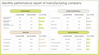
This slide represents monthly performance report of manufacturing company which includes key components such as productiveness, production, etc
People who downloaded this PowerPoint presentation also viewed the following :
Monthly Performance Report Of Manufacturing Company with all 10 slides:
Use our Monthly Performance Report Of Manufacturing Company to effectively help you save your valuable time. They are readymade to fit into any presentation structure.









FAQs for Monthly Performance Report
Start with your big ones - revenue, conversion rates, customer acquisition costs. Traffic and engagement numbers are solid too. I always add a quick comparison to last month because honestly, executives eat that trend stuff up. You need both the early signals (leads coming in) and the final results (actual sales closed). Keep it focused on what actually moves the needle for decisions. Here's the thing though - stick to 5-7 metrics tops. Any more than that and people just zone out during reviews. Nobody's got time to digest a spreadsheet of random numbers.
Dude, charts and graphs are a total game-changer for monthly reports. Nobody wants to stare at endless spreadsheet rows trying to find patterns. With visuals, you can spot trends instantly - like, what took 20 minutes before now takes 30 seconds. Bar charts work great for comparing stuff, line graphs show changes over time. Dashboards are clutch for quick overviews too. Your stakeholders will actually get what you're saying instead of glazing over. Plus meetings become way more focused on the actual insights rather than everyone squinting at numbers. It's honestly one of those small changes that makes a huge difference.
Looking at your numbers month-to-month is honestly a game changer - you'll catch problems early instead of scrambling later. One weird month won't freak you out because you can see if it's actually part of a bigger pattern or just random noise. Context is everything too. Like, decent numbers might still be bad news if they're part of a slide downward. Your boss will appreciate seeing progress over time rather than random snapshots anyway. I'd stick to 3-6 month comparisons - enough to spot real trends without drowning in data overload.
Honestly, try turning your monthly reports into actual stories. Nobody wants another boring data dump. Start with the challenge you faced that month, then walk through what actually happened using real examples. Like "our conversion rate tanked 15% in week two because the payment system totally broke" instead of just throwing charts at people. Way more interesting than spreadsheet recaps. End with what you learned and what's coming next. The whole beginning-middle-end thing works because it's how our brains naturally process info. Just test it on one section first and see how much better people respond to it.
You've gotta figure out who's actually reading your stuff first. Executives just want the big picture and ROI numbers - they don't have time for all the nitty-gritty details. But department managers? They need the specific metrics they can actually do something with. I made this mistake once and sent way too much technical junk to the C-suite who literally just wanted three bullet points, lol. Also think about how they like getting info - some people are super visual and want charts everywhere, others just want the key points laid out clearly. What decisions are they making with your data? Start there and work backwards.
Honestly, quarterly is the bare minimum but monthly works way better if things move quickly for you. Markets shift, priorities change, seasonal stuff happens - you don't want to chase numbers that made sense in January but are totally irrelevant now. Some places only update annually which is just asking for trouble. Short bursts work better than long ones. When something major hits your industry or strategy changes completely, screw the schedule and adjust immediately. Just document everything clearly so your team knows what they're actually working toward. Nobody wants to be that company still chasing last year's goals.
Honestly, just stick with Google Analytics for web stuff and whatever CRM you're already using for sales numbers. Excel's still clutch for combining everything - I know it's not fancy but it works. Your project management tool (Asana or whatever) handles productivity metrics. 15Five's decent if you need employee feedback, though that might be overkill depending on team size. Pick maybe 3-4 tools tops or you'll lose your mind juggling data. Start by figuring out what numbers actually move the needle for you, then find the simplest way to track those consistently. Don't get sucked into shiny new platforms.
Skip the surface-level numbers and dig into the trends instead. Most people just skim the summary (guilty as charged), but the real gold is in those variance explanations. Hunt for patterns where you're consistently crushing it or falling short across different metrics. Compare against last month AND the same time last year - seasonal stuff will smack you in the face once you see it. Then actually do something with what you find. Update next month's game plan or shift resources around. Otherwise you're just hoarding reports like some kind of data packrat.
Ugh, the worst thing you can do is dump every single metric on them - instant eye-glazing. Pick maybe 3-5 numbers that actually moved the needle. Charts without explanation are basically useless too. Like, tell me what this means and why I should care, you know? Clean visuals help a ton. I always wrap up with wins, what went sideways, and what's next - keeps things focused. Oh, and don't make your slides look like spreadsheet vomit. People tune out so fast when you overwhelm them with data instead of just telling the story.
Honestly, dashboards are your best friend here. Bar charts work great for comparing stuff, line graphs show trends over time. I'm a huge fan of those traffic light systems - green when you're crushing it, yellow for almost there, red when things are rough. Gauge charts are solid for showing targets vs what you actually hit. Keep it clean though - cluttered dashboards make everyone's eyes hurt. Pick like 3-5 metrics that actually matter to whoever's looking at it, then build from there. Simple beats fancy every time.
Dude, put your big findings right at the top - don't make people dig through endless data first. Charts and graphs are your friend because nobody's got the patience for raw spreadsheet hell. Throughout the presentation, throw in questions like "What caused this spike?" to keep everyone awake. Clean slides work better than cramming everything on there. Focus on the trends that actually matter. Oh, and here's the thing - save time at the end for discussion. That's honestly where people finally get it and start connecting stuff to what they're actually doing day-to-day. The Q&A is usually more valuable than half the slides anyway.
Just make a simple spreadsheet to track feedback - columns for the suggestion, who said it, whether you did it, and what happened. Before your next presentation, look through what you've actually changed since last time. Honestly, it feels pretty good seeing all that progress laid out! Then throw in a slide showing these improvements and give credit where it's due. People love knowing you listened. I'd start the tracker now with whatever feedback you remember from recent stuff. Creates this nice cycle where everyone stays engaged.
Here's the thing - tell a story with your data instead of just throwing numbers at people. I learned this the hard way after watching too many eyes glaze over in meetings lol. Pick 2-3 big insights upfront. Charts and graphs are your friend for showing trends quickly. Group similar stuff together and always compare to last quarter or whatever benchmark makes sense - otherwise people don't know if your numbers are actually good. Oh, and here's what really matters: end each section saying what you'll do about it. Executives care way more about your next moves than rehashing what already happened.
Here's my take: those monthly reports are actually gold for spotting what's working and what's just eating your budget. I've seen too many "game-changing" projects that basically went nowhere. Look for patterns over a few months instead of freaking out about one weird data point. Your gut instincts? Use the numbers to back them up or prove yourself wrong. When something's clearly not working, don't be stubborn about it. Oh, and actually sit down with your team to go through this stuff each month - don't just let reports collect digital dust.
Always cover your main goals progress, wins, and failures. The failures part is honestly where you'll find the most valuable stuff - everyone tries to gloss over that section but don't. Call out any roadblocks or missing resources that screwed things up. Use actual numbers instead of vague "pretty good" nonsense. Oh, and wrap up with 2-3 specific things you're doing next month to fix issues. Your stakeholders need to see you're actually learning from this stuff, not just dumping data on them.
-
Informative and engaging! I really like the design and quality of the slides.
-
“I always have a wonderful experience with SlideTeam. It's my ""go to"" when I need a template.”