

Dashboard snapshot for data storage and server usage monitoring cloud computing infrastructure adoption plan




Try Before you Buy Download Free Sample Product
 Impress Your
 Audience
 100%
100% Editable
 Save Hours
 of Time


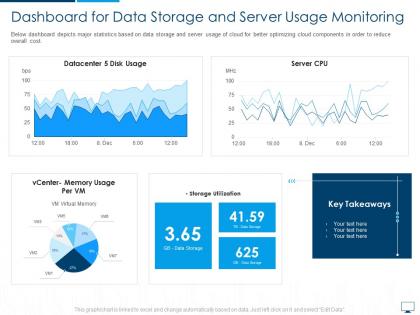
Below dashboard depicts major statistics based on data storage and server usage of cloud for better optimizing cloud components in order to reduce overall cost.
People who downloaded this PowerPoint presentation also viewed the following :
Dashboard snapshot for data storage and server usage monitoring cloud computing infrastructure adoption plan with all 2 slides:
Use our Dashboard Snapshot For Data Storage And Server Usage Monitoring Cloud Computing Infrastructure Adoption Plan to effectively help you save your valuable time. They are readymade to fit into any presentation structure.
FAQs for Dashboard snapshot for data storage and server usage monitoring cloud computing
Key components of an effective dashboard snapshot include real-time data visualization, customizable widgets, performance metrics alignment with business objectives, intuitive navigation design, and mobile responsiveness. These elements streamline decision-making by delivering actionable insights, enhancing operational visibility, and enabling faster strategic responses, with many organizations finding that well-designed snapshots significantly improve executive reporting efficiency.
Color psychology enhances dashboard readability by using red for alerts and critical metrics, green for positive performance indicators, blue for neutral data elements, and strategic contrast to guide attention hierarchies. Through intuitive color mapping, organizations streamline decision-making processes, reduce cognitive load on users, and ultimately deliver faster data interpretation, with many financial services and healthcare institutions finding that consistent color schemes significantly improve operational response times.
Visual hierarchies guide user attention through dashboard snapshots by strategically organizing elements through size, color, positioning, and contrast to highlight critical metrics first. These design principles enable stakeholders to quickly identify key performance indicators, trends, and outliers, while supporting data flows naturally guide viewers from high-level insights to detailed analytics, ultimately delivering faster decision-making and improved operational efficiency.
Ensuring mobile-friendly dashboard snapshots requires responsive design elements, optimized layouts, and touch-friendly navigation features. These approaches streamline data visualization by utilizing adaptive grids, simplified navigation menus, and scalable graphics, with many organizations finding that mobile-optimized dashboards enhance real-time decision-making capabilities and improve user engagement across field teams.
Best practices for integrating real-time data into dashboard snapshots include establishing automated data pipelines, implementing effective caching strategies, prioritizing critical metrics for live updates, and ensuring scalable infrastructure. These approaches streamline operations by reducing manual updates, enhancing decision-making accuracy, and maintaining system performance, with many organizations finding that strategic real-time integration ultimately delivers competitive advantages and faster business responses.
Different industries customize dashboard snapshots by prioritizing sector-specific metrics, regulatory requirements, and operational priorities that align with their unique business models. Healthcare organizations focus on patient outcomes and compliance data, while financial institutions emphasize risk metrics and transaction volumes, and manufacturing companies highlight production efficiency and supply chain indicators, ultimately delivering targeted insights that drive industry-specific decision-making and competitive advantage.
**INPUT**: What metrics should be prioritized in a dashboard snapshot for project management? **OUTPUT**: Priority metrics for project management dashboard snapshots include project timeline progress, budget utilization rates, resource allocation efficiency, milestone completion status, and risk indicator levels. These strategic measurements enable teams to streamline decision-making, enhance operational oversight, and deliver improved project outcomes, with many organizations finding that comprehensive dashboard visibility ultimately accelerates project delivery timelines. [Word count: 54 words]
Interactivity transforms static dashboard snapshots into dynamic exploration tools by enabling drill-downs, filtering, hover details, and real-time data updates. These interactive elements allow users to investigate anomalies, customize views, and access contextual information instantly, with many organizations finding that interactive dashboards increase user engagement and decision-making speed significantly.
Common dashboard snapshot mistakes include overcrowding with excessive metrics, using inconsistent visual elements, lacking clear hierarchy, ignoring mobile responsiveness, and failing to align with audience needs. These design pitfalls can overwhelm stakeholders and reduce decision-making effectiveness, with many organizations finding that simplified, purpose-driven snapshots deliver significantly better user engagement and strategic insights.
**INPUT**: How can storytelling techniques be applied in a dashboard snapshot? **OUTPUT**: Storytelling techniques in dashboard snapshots include narrative flow through logical data progression, visual hierarchy that guides viewer attention, contextual annotations, compelling headlines, and outcome-focused conclusions. These approaches transform static metrics into engaging narratives by establishing clear beginning-middle-end structures, highlighting key insights through strategic color and placement, and connecting data points to business outcomes, ultimately enabling stakeholders to understand performance trends and make informed decisions more effectively. [Word count: 60 words]
**INPUT**: What tools and software are recommended for designing dashboard snapshots? **OUTPUT**: Recommended dashboard snapshot design tools include Tableau, Power BI, Google Data Studio, Looker, and Qlik Sense, alongside specialized platforms like Grafana and D3.js for custom visualizations. These technologies streamline data visualization by offering drag-and-drop interfaces, real-time connectivity, and automated reporting capabilities, with many organizations finding that strategic tool selection ultimately delivers enhanced decision-making speed and operational efficiency. [Word count: 60 words]
Balancing comprehensive data with simplicity requires strategic layering, visual hierarchy, and progressive disclosure techniques that prioritize critical metrics while keeping secondary data accessible. Effective dashboard snapshots use clean layouts, intuitive groupings, and interactive elements, with many organizations finding that focusing on 5-7 key performance indicators delivers maximum impact without overwhelming users.
Emerging dashboard design trends include real-time data streaming, AI-powered predictive analytics, mobile-first responsive layouts, interactive data storytelling, and personalized user interfaces. These innovations enhance snapshot efficacy by delivering more contextual insights, faster decision-making capabilities, and intuitive user experiences, with organizations across retail, healthcare, and financial services finding significantly improved operational efficiency and strategic responsiveness.
User feedback enhances dashboard snapshots through direct surveys, usage analytics tracking, A/B testing of different layouts, and stakeholder interviews to identify pain points. Organizations can implement feedback loops that capture user preferences for data visualization, filtering options, and key performance indicators, with many companies finding that iterative improvements based on user input significantly increase dashboard adoption and decision-making effectiveness.
Customizing dashboard snapshots involves tailoring data views, metrics, and visual elements to match each stakeholder's role and information needs. You can adjust KPI selections, chart types, data granularity, and access permissions, with executives typically receiving high-level summaries while operational teams get detailed performance metrics, ultimately ensuring each audience receives relevant, actionable insights for informed decision-making.
-
Unique research projects to present in meeting.