


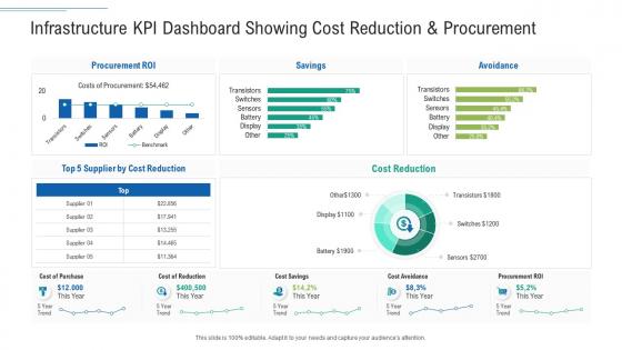
Infrastructure kpi dashboard infrastructure planning and facilities management




Try Before you Buy Download Free Sample Product
 Impress Your
 Audience
 100%
100% Editable
 Save Hours
 of Time


Our Infrastructure KPI Dashboard Infrastructure Planning And Facilities Management are topically designed to provide an attractive backdrop to any subject. Use them to look like a presentation pro.
People who downloaded this PowerPoint presentation also viewed the following :
Infrastructure kpi dashboard infrastructure planning and facilities management with all 7 slides:
Use our Infrastructure KPI Dashboard Infrastructure Planning And Facilities Management to effectively help you save your valuable time. They are readymade to fit into any presentation structure.





FAQs for Infrastructure kpi dashboard infrastructure planning
For your dashboard, I'd focus on five main areas. Uptime percentage and recovery time are non-negotiables - executives love those numbers. Performance stuff like response times and CPU/memory usage come next. Storage trends help with capacity planning (learned that one the hard way). Security metrics matter too - failed logins, patch compliance, vulnerability counts. Oh, and network bandwidth if you're tracking that. Honestly though? Less is more here. Pick maybe 10 solid KPIs that actually matter to your business instead of throwing everything at the wall. Set up alerts for the critical stuff so you're not constantly babysitting the dashboard.
Honestly, these dashboards are game-changers for catching problems early. Instead of digging through endless spreadsheets (ugh), everything's right there - budget issues, timeline slips, performance drops. The visual format makes patterns jump out at you way faster than raw numbers ever could. When something looks weird, you can click right into the details. Your stakeholders actually get excited about status meetings when the reports are this clear. Oh, and don't go overboard at first - pick maybe 5-7 metrics that really matter and expand later.
So operational KPIs are your daily firefighting stuff - server uptime, response times, how fast you squash bugs. Strategic ones look at the bigger picture like cost trends and capacity planning over months or quarters. Your team needs the operational metrics to know if things are broken right now. Strategic KPIs? That's executive dashboard territory. Most places dump everything together which drives me crazy because it's just visual noise. Split them up. Your engineers don't need quarterly budget reports cluttering their incident response screens.
You really can't mess around with stale data when it comes to infrastructure stuff. Catching problems as they happen is the whole point - batch reports from yesterday won't help when your servers are crashing right now. It's like trying to put out a fire with last week's weather report, you know? Set up alerts for your most important metrics so you're not glued to screens 24/7. Real-time monitoring helps you actually fix things fast instead of playing catch-up. Trust me, you'll sleep better knowing you'll get pinged the second something goes sideways.
Dude, raw tables are absolutely painful when you're trying to monitor like 50 different systems. Color-coded health indicators are a lifesaver. Heat maps instantly show you where things are breaking down. Trend lines help you catch issues before they blow up - honestly saved my butt more times than I can count. Interactive charts are clutch because you can actually dig into specific time periods or components. Gauge charts work great for SLA stuff since they're so visual. Figure out your most critical KPIs first, then just mess around with different chart types until patterns start jumping out at you immediately.
Honestly, data silos are gonna be your biggest pain. Your network guys track uptime totally different from the server team, so your dashboards end up looking like garbage. Tool sprawl gets ridiculous fast too - I've seen places pulling from 15+ monitoring systems. The real nightmare though? Teams arguing over what metrics actually matter and then gaming whatever you pick. Oh, and don't get me started on the politics around defining "good performance." Just pick 2-3 metrics everyone can agree on first. Once people see it's actually useful, then you can add more stuff.
Honestly, monthly is the bare minimum but I'd go with every 2-3 weeks if possible. Your infrastructure changes so fast - new stuff gets deployed, traffic shifts around, priorities change. I learned this the hard way when I realized we'd been watching useless metrics for like 4 months straight. Now I just set a calendar reminder to check if our KPIs actually make sense still. My rule is simple: if I wouldn't make a real decision based on the metric, it's gotta go. Replace it with something that'll actually help you sleep better at night.
Honestly, infrastructure KPIs are pretty straightforward once you break them down. Track your schedule performance (like % on-time completion) and budget stuff - how much you're over or under baseline costs. Quality metrics matter too - defect rates, safety incidents, that kind of thing. Most people aim for 90%+ schedule compliance and staying within 5% budget, but let's be real, that's super optimistic for infrastructure work. Don't forget operational efficiency once everything's actually running. Oh, and stakeholder satisfaction scores are clutch if you deal with communities or clients regularly. Start with your own historical project data to set realistic benchmarks, then tweak based on how complex or risky the current project is.
Here's the thing - your stakeholders totally dictate how you build that dashboard. C-suite people just want the big picture stuff, like those red/green status lights that tell them if things are good or bad. But your ops team? They need way more detail since they're the ones actually fixing problems. Then you've got IT wanting system metrics, facilities folks tracking space usage... honestly it can get overwhelming how specific everyone gets! I'd start by just talking to each group first. Figure out what decisions they're trying to make. Then build different views for different people - don't try to cram everything into one screen.
Honestly, Grafana's probably your best move if you're dealing with IT stuff - it's free and looks clean. Datadog and New Relic are solid too but cost more. Power BI works great for broader infrastructure monitoring since it connects to basically everything. I'd skip Tableau unless you already have it tbh, bit overkill for most dashboards. The real trick is finding something that doesn't fight with your current data setup. Oh and definitely test one tool first before getting your whole team involved - learned that the hard way. Grafana's my personal favorite though, super flexible once you get the hang of it.
So basically you want to stack some ML models on your current KPI setup to predict what's coming next. Pick metrics that actually show patterns first - server capacity, network usage, maintenance stuff. Historical data feeds the models, then they'll tell you what to expect over the next few weeks. I mean, it's honestly pretty wild watching it spot problems before they even happen. Oh and definitely set up alerts when predictions hit your danger zones. That way you're fixing things before they break instead of scrambling after. Way less stressful for everyone.
Oh man, picking bad KPIs will totally mess up your infrastructure projects. You'll be staring at meaningless numbers while your budget quietly explodes in the background. I've watched teams get obsessed with flashy metrics that look impressive but don't actually tell you anything useful. Meanwhile, real problems are brewing and nobody notices until it's way too late. Your stakeholders start losing faith, money gets thrown at the wrong things, and suddenly you're explaining to everyone why everything went sideways. Honestly, just figure out what actually matters for success first, then track those things religiously.
Your field teams can check KPIs right on their phones and fix problems immediately instead of waiting until they're back at the office. Pretty huge difference for response times. They can compare current readings to benchmarks, validate their work on the spot, and even escalate urgent stuff right away. No more documenting issues to deal with later - which honestly was such a pain. Better coordination between field crews and office people too. I'd start by figuring out which 3-4 KPIs your teams actually look at most.
Okay so three main things you gotta nail down. Start with solid data sources - document where everything comes from and stick to reliable ones. Automated checks are a lifesaver for catching weird outliers or missing stuff before it becomes a mess. I'd also do manual spot-checks regularly because automation isn't perfect, you know? Set up alerts that ping you when numbers look funky - seriously beats having your boss find errors first. Oh, and assign clear owners for each KPI so someone's actually accountable when things go sideways. Regular audits help too, but honestly the real-time alerts are where you'll see the biggest impact.
Honestly, these dashboards are game-changers for getting departments on the same page. You know how IT always says "everything's running fine" while ops is screaming about slowdowns? Well, now everyone's staring at the same real-time numbers, so no more of that back-and-forth nonsense. The visual stuff makes it dead simple for non-tech people to actually get what's happening. When you're all looking at identical data, meetings become way more about fixing problems instead of pointing fingers. Oh, and definitely do regular check-ins with all teams using the dashboard - keeps everyone honest and aligned.
-
Nice and innovative design.