

Tablero para la evaluación del programa de capacitación, desarrollo e implementación




Try Before you Buy Download Free Sample Product
 Impress Your
 Audience
 100%
100% Editable
 Save Hours
 of Time


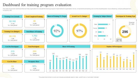
El tablero muestra los componentes clave: costo de capacitación, número de participantes, horas de capacitación, costo por participante y tasa de ocupación.
People who downloaded this PowerPoint presentation also viewed the following :
Tablero para la evaluación del programa de capacitación Desarrollo e implementación
Utiliza nuestro Panel de control para la evaluación, el desarrollo y la implementación del programa de capacitación para ahorrar tu valioso tiempo. Están listos para adaptarse a cualquier estructura de presentación.





FAQs for Dashboard For Training Program Evaluation
Focus on these four things: usability (can people actually find what they need?), performance (loading speed), data accuracy (do the numbers match your source systems), and user adoption. Honestly, adoption is where most dashboards die - doesn't matter how pretty it looks if no one uses it. That's the brutal truth. Also track user feedback and how long it takes people to get insights. Oh, and maybe throw in some time-to-insight metrics too. Just audit what you have now against these areas and the problems will jump out at you pretty quick.
Honestly, user feedback is like a reality check for your dashboard. You might think you nailed the design, but users will straight up tell you when they can't find stuff or something's confusing. They catch usability problems you totally missed - weird labels, messy layouts, whatever. Plus they'll ask for features you never thought of that actually make sense. I always do quick 15-minute feedback sessions with people. Sounds boring but you'd be surprised how much useful stuff comes up that you'd never spot on your own.
Break down complex stuff into smaller pieces that people can actually process. I like starting with the big picture metrics, then users can dig deeper if they want. Heat maps are clutch for showing patterns across different dimensions - way better than cramming numbers into tables. Small multiples work well too when you're comparing similar datasets. God, I've seen so many dashboards that just throw everything at you at once. It's like visual chaos. Stick with consistent colors and make sure there's a clear hierarchy so people know where to look first. Oh, and definitely test it with real users because what seems obvious to you might completely confuse them.
Figure out who's gonna be staring at this thing every day first - those are your main users. Also think about the people who'll pop in once in a while to check numbers or make decisions. I always sketch out quick profiles: what's their job, how tech-savvy are they, what do they actually need to decide? Honestly, assuming everyone wants the same info is how you end up with a mess nobody uses. Try to grab 10 minutes with a few potential users if possible. You'd be surprised how much you learn about their workflow and what frustrates them. The real trick isn't just knowing who they are, but understanding how this fits into their actual day.
Honestly, data accuracy is make-or-break for dashboards. Wrong data = wrong decisions, and I've watched teams crash and burn because of this. Check your data sources first, then validation rules and how often stuff refreshes. The pretty charts don't mean squat if the numbers are garbage underneath. Quick sanity check: grab a few key metrics and compare them against your source systems. Do the calculations actually match your business logic? Are your data pipelines solid? Sometimes the smallest data hiccup can throw everything off. Better to catch it early than explain to your boss why last quarter's numbers were completely wrong.
Grab someone who's never seen your dashboard and watch them try to find key info without any help. Their confusion spots? Those are your problem areas. I love doing the 5-second test too - flash it quickly, then ask what they remember. Put your most important stuff in the top-left since that's where eyes naturally land first. If people are squinting or going "huh?" then something's definitely off with your layout. You'll want at least 3-5 people testing it. Honestly, even your non-techy friends can give solid feedback on this stuff.
Get yourself a decent BI tool first - Tableau, Power BI, or Looker all work great for visuals and connecting to data. SQL is basically mandatory for prepping your data. Python or R if you're getting fancy with analytics. Your data warehouse setup (Snowflake, BigQuery) matters too, though honestly I've seen people obsess over tools when they should focus on what questions the dashboard actually needs to answer. Map that out first. Then pick whatever connects easiest to your current data sources. Oh, and data quality will make or break you - learned that one the hard way.
Honestly, dashboard evaluations are like a reality check for your decision-making. You'll spot which metrics actually matter versus the ones you *think* matter. Watch how people use your charts - where they click, what confuses them. That stuff reveals blind spots you didn't even know existed. It's kinda like realizing you've been holding the map upside down this whole time! Once you clean up the noise and focus on data that drives real decisions, your team will actually trust what they're seeing. And trusted dashboards? People act on those. Start tracking which visualizations actually influence business moves.
Honestly, I'd track four main things. Load time is huge - anything past 3 seconds and people get pissy. Data accuracy too, which sounds obvious but you'd be surprised how often that gets missed. Then there's adoption rates and whether folks can actually find their answers fast. Pretty dashboards are cool and all, but if they're slow or don't solve basic questions, what's the point? Oh, and here's something useful - check if you're getting fewer follow-up questions after launching. That's usually when you know it's actually working. Track this stuff for about a month first to see where you're at.
Honestly, stale data kills dashboards faster than anything else. People just stop checking if they can't trust what they're seeing. Match your refresh rate to how decisions actually get made - operations stuff needs real-time updates, but strategic reports? Daily or weekly is totally fine. The trick is being consistent about it. I've seen so many dashboards die because nobody knew if they were looking at fresh data or last month's numbers. Just pick a schedule that makes sense and stick to it. Oh, and tell people when things were last updated - saves everyone the guesswork.
Don't cram everything onto one screen - that's dashboard death right there. Those fancy 3D pie charts? They look impressive but nobody can actually read them. Put your most important stuff where people will see it first instead of burying it. Color choices matter more than you'd think. Stick with simple palettes that work for everyone, including colorblind users. Test it with real people early because I've seen so many dashboards that made perfect sense to the designer but confused everyone else. The main question is always: what decision does this actually help someone make?
Honestly, just talk to each department first - that's the biggest thing. Sales wants pipeline stuff and conversion rates. HR cares about headcount and who's leaving. Finance is obsessed with budgets and cash flow, naturally. Figure out what decisions they're making every day and what numbers they actually look at. Some teams want simple charts, others can handle complex data. Also match how often they need updates - don't give daily dashboards to people who only report monthly, you know? Start with like 3-5 key metrics per team. You can always add more later.
Honestly, accessible dashboards just make sense - you want your whole team actually using the data, right? Color blind folks, people with screen readers, anyone with motor issues... they all need to navigate your viz. I've seen way too many dashboards with that awful light gray text on slightly-less-light gray backgrounds. Like, why? Good contrast ratios aren't just for accessibility - they help everyone read faster. Start with checking your colors and throw some text labels on charts. Those two tweaks alone will get you most of the way there without much hassle.
Your dashboard needs to tell a story, not just vomit data everywhere. Start with the problem you're solving, then walk people through what's actually happening in the numbers. Build some tension - like "our conversion rates were crushing it, but then..." (sounds cheesy but it works). Guide viewers with annotations and make charts flow logically from one to the next. Honestly, most people's dashboards are boring as hell. You want folks wondering what comes next, not glazing over at spreadsheet dumps. Progressive disclosure helps too - don't show everything at once.
Start with session duration and how often people come back - that's your bread and butter right there. Click-through rates show which features actually work. Heat maps are super helpful for seeing where eyes go first. Honestly, bounce rates feel basic but they'll catch obvious problems fast. The stuff that really matters though? Track when users filter data, drill down, or export things. That's actual engagement, not just someone landing on your page by accident. Don't go crazy with metrics at first - pick maybe 3 or 4 and you'll get way better insights than drowning in data.
-
Easy to edit slides with easy to understand instructions.
-
Their designing team is so expert in making tailored templates. They craft the exact thing I have in my mind…..really happy.