


Design of google maps to find locations




Try Before you Buy Download Free Sample Product
 Impress Your
 Audience
 100%
100% Editable
 Save Hours
 of Time


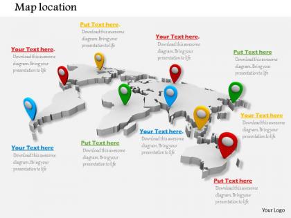
Create one of the most creative presentation designs for your business to represent locations and concepts related to it using this Design of Google Maps to Find Locations PowerPoint slide. This innovative PPT layout makes good use of various locations on Google map which can be customized as per user’s preference. Google map with various locations on it signify the idea of locating different areas. A business entrepreneur or a marketing professional can fix specific goals pertaining to location and can think of expanding a business with this creative design of Google maps presentation template. Whether you want to pin point the trade goals of various areas or wish to find one with certain business accomplishments, this concept can work in various ways. Depending on your innovation, you can create the engaging presentation slide using this Google map with location finders. It is a wonderful PPT design to explore. Use this professionally designed find locations PPT template to make a strong and lasting impression on the end user. Build compassion with our design of google maps to find locations. You have an opportunity to show your investors that this is your current locations, and this is where you are looking to expand. Download for your next presentation. Design one of the innovative presentations for your business to represent locations and concepts related to it using this Design of Google Maps to Find Locations presentation icon. This creative PPT template makes use of various locations on Google map which can be modified as per user’s convenience. Google map with various locations on it signify the idea of locating different areas. A business entrepreneur or a marketing professional can fix certain goals pertaining to location and can think of expanding a business with this creative design of Google maps presentation icon. Whether a user wants to pin point the trade goals of various areas or wish to find one with certain business accomplishments, this concept can work in various ways. Depending on the creativity of a presenter this Google map with location finders on it is a wonderful PPT icon to explore. Thus, use to make a strong and lasting impression on users. Build compassion with our Design Of Google Maps To Find Locations. Bring good deeds to the fore.
People who downloaded this PowerPoint presentation also viewed the following :
Design of google maps to find locations with all 3 slides:
Cast your line with our Design Of Google Maps To Find Locations. Reel them in with your thoughts.

FAQs for Design of google maps
Google Maps nails three things: keeping it simple, showing what matters most, and adapting to what you're doing. The interface stays super clean - no random clutter blocking your view of the actual map. Important stuff like your destination pops out visually while less critical details fade back. What's really smart is how the whole experience shifts based on context. Walking directions look totally different from driving ones. They also use this thing called progressive disclosure - basically you only see info when you actually need it, which honestly makes everything feel way less overwhelming. Watch how your eyes move around the screen next time.
Google Maps is brilliant at this - they keep the main screen super clean, just a map and search bar basically. But then all the crazy features are tucked away where you can find them if you need them. Like you tap once and boom, there's transit info, reviews, street view, all that stuff. The layering is what makes it work so well. I mean, think about how much is actually packed in there, but it never feels overwhelming when you first open it. That's the trick for complex apps - show people the basics first, then let them dig deeper. Pretty smart approach if you ask me.
Honestly, the color coding on Google Maps is what makes it so easy to read quickly. Your brain just gets it instantly - green means parks, blue is water, yellow/orange roads are the main ones. White streets are smaller local ones. I never really thought about it until someone mentioned it, but you don't have to read labels when the colors tell the whole story. Different shades help you figure out if something's a highway versus just a regular street too. It's pretty smart how they set it up. Makes navigation way less confusing when you can spot landmarks fast.
Oh Google Maps has gotten way better with accessibility stuff! Screen readers work throughout the whole app now, and there's high contrast modes for people with vision issues. The voice navigation is honestly pretty impressive these days - way more detailed than before. You can bump up text sizes too, plus it has tactile feedback when you tap around. They even show wheelchair routes now and tell you which subway stops have elevators. Oh and if you're building something similar, definitely test it with screen readers first. Don't just rely on touch gestures either.
Oh man, Google Maps has changed so much! The satellite hybrid view is gorgeous compared to the old flat version. Traffic overlays actually work now too - saved me tons of times. Lane guidance arrows are super helpful, and you can see photos of businesses before you get there. Indoor maps are kind of a game changer for huge malls and airports. The whole Material Design thing made it way cleaner looking. Honestly the layers feature is where all the good stuff is hiding - definitely mess around with that if you haven't already.
Yeah so Google Maps basically built everything around helping people find businesses. Photos and ratings get the best spots on screen because that's what we actually look for. Those little category bubbles? Business-focused. Even the colors help you spot what you need fast. They're honestly pretty good at cramming tons of info without it feeling messy. The whole "explore nearby" thing only works because they have all this business data. When you're building location stuff, just think about what business info people actually want right then and there.
Screen space is your biggest enemy - mobile gives you like 5 inches vs 15+ on desktop. Everything needs to be bigger for fingers, and you can't cram as much info on screen. Desktop lets you go crazy with multiple panels and detailed controls, but mobile? You've got to pick what matters most. Battery drain will murder you too since GPS eats phones alive. The whole interaction thing is different - people expect to pinch and swipe, not click tiny buttons. Honestly, I'd focus on showing the essential stuff first on mobile, then let people tap for more details. Progressive disclosure or whatever they call it.
Honestly, most of Google Maps' updates come straight from people like us complaining about stuff. Report wrong info or missing places? That data gets bundled up and fixed. They're also watching how we use the app - like where everyone gets lost or confused. Your reviews actually change which businesses show up more prominently, which is kinda crazy if you ask me. Oh, and they test changes based on what people whine about most. So yeah, definitely keep reporting bugs. It actually makes a difference in what you'll see tomorrow.
So basically Google Maps grabs live data from tons of sources and shows it through those color overlays you see. Your route changes automatically when there's traffic, accidents, or road stuff happening. The red/yellow/green indicators? They're updating constantly. Other drivers report slowdowns too, which honestly is pretty clever. Traffic sensors and satellite data feed into it as well. Watch your ETA next time you're driving - it'll change mid-trip based on what's happening ahead. That's the real-time stuff doing its thing. Pretty seamless for how much is going on behind the scenes.
Yeah, Google Maps has gotten way cleaner over the years. They simplified the colors and made POIs way more obvious with better icons. The coolest part? It actually adapts based on what you're doing - driving mode looks totally different from when you're just browsing around. They ditched those weird sharp edges for water and parks too, which honestly looks so much better now. Oh, and it learns your habits to show relevant stuff. If you're working on anything location-based, totally copy their "progressive disclosure" thing - basically don't overwhelm people with details until they actually want them.
Yeah Google Maps changes tons based on where you are! Like in Japan they pack in way more train info and use smaller text since that's how people actually get around. India's version focuses on landmarks instead of street names - which honestly makes way more sense there. The colors, icons, even whether they push walking or driving directions first... it all shifts based on what locals prefer. Typography changes too, which I never really noticed until someone pointed it out. You should definitely check out the local version next time you travel - the differences are actually pretty cool to spot.
So Google Maps is basically addictive because of a few things. That blue dot moving in real-time? Pure dopamine hit. Traffic colors changing live makes you feel like you're getting insider info or something. The way you can zoom from satellite view down to street level is so smooth - never feels cluttered. Their search predictions are honestly creepy good at reading your mind. But here's the thing - they turned it into way more than just directions. You've got reviews, photos, business hours all built in. It's like a discovery engine now. That seamless layering between different info types is what you want to copy.
So Google Maps basically shows you the most important stuff first, then adds more detail when you zoom in. Traffic shows up as those colored lines, and points of interest cluster together so it's not totally chaotic. They've got different map styles too - satellite, terrain, whatever - that highlight different things. What's really smart is how your actual route pops out while everything else stays subtle. They use color and size to create this visual hierarchy that somehow doesn't make your brain explode. Honestly kind of impressive how much data they cram in there without it feeling overwhelming, you know?
Clean visual hierarchy is key - basically just copy what Google Maps does. They nail the readability thing by using muted backgrounds (light grays work great) so your actual data stands out. Stick to a small color palette that clearly separates different elements. Simple, readable fonts are your friend, especially since people zoom in and out constantly. I honestly think you can't mess up if you just steal their typography choices. Keep icons familiar and intuitive - nobody wants to guess what stuff does. Oh, and definitely test it on different screen sizes. Trust me on that one.
Google Maps is crazy thorough with testing - they A/B test everything and dig into user feedback before releasing features widely. Instead of just throwing cool-looking stuff at the wall, they focus on solving actual navigation problems people have. What's smart is they measure how features perform in the real world, not just assume they work. Honestly, their approach should be the gold standard for UX design. For your projects, start small with real user testing, then iterate based on what people actually do (not what they say they'll do). Scale up only after you've proven something genuinely helps.
-
Great product with highly impressive and engaging designs.
-
Informative design.