


Multiple locations on world map with white background stock photo


Try Before you Buy Download Free Sample Product
 Impress Your
 Audience
Editable
of Time


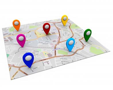
Download the professionally planned multiple locations on world map with white background stock photo template slide. This world map PowerPoint template is designed with 3d graphic of map on a white background made by our expert and experienced fashioners. Making a guide template slide is dependably a dull assignment as you don't know how you would like to highlight your business areas and speak to it to your crowd. All things considered, to make it simple for you we have made this wonderful guide visual for you. World guide with different pointers are utilized to outline this PowerPoint format. This PPT contains the idea of area finding. Utilize this slide for your worldwide area related subjects in any introductions. These slides are to a great degree flexible and can be used for various reasons, for example, showing abroad branches, voyaging purposes and significantly more. In addition, the realistic appeared on this design has extraordinary quality for better and clear understanding. Essentially click, download and introduce these stunning representations now. Gain their confidence with our Multiple Locations On World Map With White Background Stock Photo. Their faith in your ability will get a boost.
People who downloaded this PowerPoint presentation also viewed the following :
Multiple locations on world map with white background stock photo with all 1 slides:
Our Multiple Locations On World Map With White Background Stock Photo ensure consistency of effort. Your approach will never be halting.
FAQs for Multiple locations on world map with white
Keep it simple with clean world maps - no crazy textures or busy details that'll distract people. High contrast is key so folks in the back can actually see what you're showing. I made that mistake once, big time. Vector maps are perfect because they won't get all pixelated when projected. Stick with neutral colors like blues or grays. You don't want the map competing with your text or brand colors. Flat designs work way better than those overly fancy 3D ones that look cool but are hard to read.
Start with the emotion you're going for - that's your north star. Vintage maps hit different than sleek digital ones, you know? One screams "trust me, I've been around" while the other says cutting-edge tech. Your audience matters too. Are they daydreaming about vacations or crunching business data? Colors play a bigger role than people think - blues are chill, reds demand attention. I've watched friends spiral into analysis paralysis and end up with boring stock photos that could mean anything. Just write down 3 words describing your vibe first, then hunt for images that actually match those feelings.
Definitely go with vector maps for your presentation. They scale perfectly without getting pixelated - trust me, nothing looks worse than a blurry map on the big screen. Raster images turn into a mess when you resize them. With vectors you can easily tweak colors or remove stuff you don't need, since they're made of shapes instead of fixed pixels. File sizes are smaller too, which is nice when you're trying to email the thing around. Look for SVG or AI formats if possible. I learned this the hard way after using a crappy pixelated map in front of my entire team once.
So color schemes totally change how people read your world maps. Blues and greens feel calm and trustworthy - perfect for business stuff. Reds and oranges? They scream urgency or excitement, which works great for travel content. Bold contrasting colors make borders pop and emphasize divisions, but softer monochromatic palettes suggest unity instead. Oh, and cultural context matters too since colors mean different things globally. I'd go warm for anything travel-related. For presentations though, stick with professional blues or neutrals. Honestly, just think about the vibe you want first, then pick accordingly.
Yeah, totally! World map stock photos are super flexible - you can customize them however you want. Most come as PNGs or high-res JPEGs that work perfectly in Canola, PowerPoint, or Photoshop. Add your own colors, highlight certain countries, throw in data points or custom location markers. Honestly, plain stock maps look kinda boring anyway, so personalizing them always makes presentations way better. Just double-check the licensing first - most allow edits for commercial stuff. Grab a decent quality base map and go wild with it!
Go with royalty-free or extended licenses for commercial stuff - no ongoing fees to worry about. Standard ones work for most marketing materials and websites. Extended costs more but you need it for big print runs or if you're reselling products. World maps are everywhere so the good ones get snapped up fast. Check for any weird geographic restrictions or usage limits. I know it's tedious, but actually read the license agreement. Trust me, it beats having a client freak out about usage rights later. Download it and keep it somewhere you can find it.
Honestly, world maps are such a game-changer for presentations. They make global stuff way less abstract - like when you're explaining market expansion, people can actually *see* what you mean instead of just hearing words. Way more engaging than bullet points (which are the worst). You can highlight regions, show where you're growing, mark your company's presence - whatever tells your story best. The geography thing really helps keep everyone focused on the same page too. Oh and definitely grab a high-res one that matches your brand colors - makes such a difference. Trust me, your next global strategy deck will be so much clearer.
So everyone's obsessed with minimalist stuff right now - muted blues, grays, earth tones instead of those crazy bright colors that were everywhere before. Abstract and geometric shapes are way more popular than the traditional boundary lines too. Those rainbow maps honestly look super outdated now (though I still kinda like them lol). You'll definitely want something customizable with separate layers you can edit. The main thing is avoiding anything that screams "generic stock photo" because people can spot that from a mile away. Modern and clean is the vibe.
So basically world map stock photos are like your starting canvas for any geographic data viz project. You can throw heat maps, charts, or color-coding on top to show sales territories, climate patterns, whatever you're tracking. Way better than staring at endless spreadsheet rows - that stuff just makes my eyes glaze over. Just make sure you pick the right projection for your data story. Oh and definitely grab high-res versions! Trust me, pixelated maps look awful when you zoom in or need to print them for meetings.
Pick maps that actually show your target regions clearly - random world maps are usually trash for this. Country names should be in local languages if that matters for your audience. Borders change more often than people realize, so double-check you're not using outdated stuff. Some map projections make continents look weirdly huge or tiny compared to reality, which sends mixed signals you probably don't want. Honestly, if you know someone from that market, show them first. They'll catch cultural mistakes you'd never even think about.
Get at least 300 DPI and aim for 3000+ pixels on the longest side - you'll need that for crisp prints. JPEG works fine, but TIFF is better if you're doing anything fancy. Vector files like EPS are amazing since they never pixelate when you blow them up huge. Check the licensing though, some have weird commercial restrictions. Oh, and grab different map projections if you can - Mercator looks funky for certain projects. Honestly, I always end up downloading like three versions because you never know what you'll actually need until you're halfway through designing.
Dude, interactive world maps are game-changers for keeping people hooked. Add clickable hotspots for different regions or hover effects that show extra info. I've literally watched audiences lean in during presentations - it's wild how much more engaged they get. People love exploring data themselves instead of just staring at static slides. You can layer different datasets too and let them toggle between views. Honestly, start simple with basic click-to-reveal stuff (way easier than it looks). The whole thing just makes your data stick in their heads way better.
World maps work great when you overlay your data right onto countries - use colors, icons, whatever fits your stats. Flow charts are solid too, with the map as your main focal point and arrows shooting out to different info. I've always thought the zoom-in approach looks pretty slick, like when you focus on just Europe or Asia for regional stuff. You could even do puzzle pieces or those dotted flight path lines connecting cities. Just don't force it though - if your data isn't actually geographic, the map'll just confuse people and kill your whole message.
So educational maps are all bright colors and simplified - like they're made for kids, which makes sense. Corporate ones? Totally different vibe. Much more sleek with muted colors and super detailed boundaries. They look expensive and boring but photograph really well in fancy offices. Educational maps care more about being clear and engaging than looking pretty. Corporate maps are basically the opposite - all about impressing people in boardrooms. Honestly depends what you need it for. Teaching kids about continents? Go colorful. Client presentation or office wall? Definitely go with the sophisticated boring one.
Honestly, if you've got Photoshop or Illustrator already, use those - though they're kinda overkill for simple stuff. Canva's my go-to for presentations since it's super easy and has decent map templates. GIMP works great too if you don't want to pay for Adobe. PowerPoint can actually handle basic edits like adding pins or changing colors, which is pretty convenient. I'd just start with whatever's on your computer first. Even MS Paint can work in a pinch lol. Most tools can get your maps looking good with a little creativity.
-
Out of the box and creative design.
-
Really like the color and design of the presentation.