

Location presentation examples





Try Before you Buy Download Free Sample Product
 Impress Your
 Audience
 100%
100% Editable
 Save Hours
 of Time


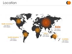
Introducing our Location Presentation Examples PowerPoint Slide. Incorporate our PPT theme to recount all the places where your company avails its product and services. Select this content-specific designed PPT visual and highlight all the global market bases that your company operates its business from. With this invigorating and well-color-coded PPT design, you can showcase your market presence demographically and geographically in an eye-catching manner. Illustrate the report on the regions providing the best outcomes for your company with the help of our PPT template. Identify the regions that will prove to be the best offshoring location for your company by taking the aid of this PPT graphic. Spread awareness about your various customer and market bases by employing this PPT presentation. Download this high-quality PPT graphic and give your presentation an action-oriented outlook. This professionally created and aptly designed content-specific PowerPoint presentation will allow you to save your time and efforts and put your vision out there effectively.
People who downloaded this PowerPoint presentation also viewed the following :
Location presentation examples with all 5 slides:
Glow with delight with our Location Presentation Examples. You will experience complete contentment.
FAQs for
Make sure you've got maps and the exact address - people need to know where this thing actually is. Throw in some solid photos or maybe a video tour if you can swing it. Don't forget the boring but necessary stuff like square footage and lease details (I know, I know, but people actually care about this). Include parking info and transit options since that's always the first question. Oh, and any foot traffic data helps too. What makes this spot different from everywhere else? That's your hook right there. Wrap it up with what they should do next.
Dude, visuals are everything for location pitches. People need to *see* themselves there, not just imagine it from boring descriptions. Floor plans with sight lines marked? Gold. Before/after photos of spaces you've worked on? Even better. Mix wide shots for context with close-ups of the good stuff. Demographics charts and foot traffic data actually make sense when they're visual - nobody's reading paragraphs about square footage (yawn). Oh, and always include at least one visual that backs up whatever you're selling as the main benefit. Trust me on this one.
Honestly, focus on demographics that match your customers - income levels, age groups, population density in your area. Traffic patterns are huge too. I've literally seen crappy spots look amazing just because they had killer foot traffic numbers during rush hour. Throw in some competitor sales per square foot if you can get it. Employment rates and any new developments coming in are solid additions. Population growth trends help too, but don't go overboard with every single stat you find. Pick maybe 3-4 metrics that actually matter for your specific business and lead with those.
Yeah, it's wild how different this gets by country. Americans expect street addresses and zip codes first, but Japan? They describe locations by train stations or landmarks since their addressing system is honestly kinda weird. Europeans want transit info that Americans would never think to include - we just assume everyone's driving. Oh, and some places read right-to-left so your whole layout needs to flip. I usually just peek at how Google Maps shows stuff in that region or bug local coworkers about what looks normal to them. Way easier than guessing.
Honestly, zoom way in on just the area you need - showing whole continents is useless. Make everything high contrast so people in back can actually see it. Those default map pins are trash, nobody can make them out. Go with bold markers or color the whole regions instead. If you're showing data, throw a legend on there. Oh and test it on the actual projector first because colors always look weird compared to your laptop. One thing that works really well is revealing locations one at a time instead of dumping everything on screen at once - keeps people focused.
You want to make them actually care about this place, right? Connect it to their lives first - why should they give a damn? Paint the scene with real details. What would they smell walking down those streets? Numbers aren't sexy but they work - drop some population stats or economic data to back up your points. I'm big on telling stories about actual people who lived there. Makes it stick better. Mix the emotional stuff with hard facts, then get them imagining how that place shaped everything that happened there. Works every time.
Dude, you gotta turn that location data into actual stories instead of boring spreadsheets. Like, walk people through a customer's journey or show how foot traffic changed when that new coffee shop opened. Our brains just eat up narratives way better than raw numbers, you know? Skip the static heat maps - show me how visitor patterns shifted during the holidays or whatever. Give your data some kind of arc with a beginning and ending. Honestly, people will actually remember it that way and maybe do something with it instead of zoning out.
Look, it's all about knowing who you're talking to. Investors? Hit them with the money stuff first - ROI numbers, market trends, growth potential. They live for spreadsheets and profit margins. But tourists? Totally different game. Show them the fun parts - cool attractions, local food, activities that'll make their friends jealous on Instagram. Same place, completely different pitch though. Honestly, good photos can sell a destination better than any fancy presentation. Figure out what your audience defines as "winning" and build everything around that. The location doesn't change, but how you frame it makes all the difference.
Ugh, the worst thing people do is cram way too much info on their slides - like seriously, nobody wants to read a novel up there. Also huge mistake: not knowing your audience. Raw data dumps will put everyone to sleep instantly. Here's what really bugs me though - people forget to explain WHY their location matters. Don't just say "it's downtown," tell them how that drives foot traffic or cuts shipping costs. Oh and test your tech first! I've seen so many presentations crash because maps wouldn't load. Keep it visual, stay relevant, and honestly? Always have a backup ready.
Dude, AR and VR are game-changers for showing off locations. Instead of boring photos, people can literally walk through spaces that don't even exist yet - it's honestly pretty wild. VR lets them explore without traveling anywhere. With AR, you overlay cool stuff like data or future plans right onto the real location. You can do before/after comparisons or change lighting conditions throughout the day. Though I'd start simple - even basic 360° photos beat the hell out of PowerPoint slides. The tech's gotten way more accessible lately too.
Honestly, starting with a crazy statistic always works - like something that'll make people go "wait, what?" I love doing the mystery thing where you show weird close-up details first, then pull back to reveal the actual place. Gets people hooked every time. You could also try the whole "then vs now" comparison with photos, or just throw in some local background sounds to set the mood. Drone footage is pretty sweet if you've got it. Oh, and sometimes a good quote about the place hits different than just rattling off boring demographic stuff. The goal is making them feel like they're discovering something cool, not sitting through a geography lesson.
Honestly, case studies are game-changers for location pitches. Real examples beat empty promises every time. You'll want 2-3 solid stories that match your audience's vibe - like "Restaurant Y hit profitability in 6 months here" or "Company X got 40% more foot traffic after relocating." People remember stories way better than random statistics anyway. Don't just dump them all at the end either. Weave specific outcomes throughout your whole presentation. The concrete proof shows stakeholders this spot actually works instead of just sounding good on paper.
Honestly, go with map-based templates - they're perfect for this stuff. Your audience gets the visual context right away without having to think about it. Interactive ones where you can zoom in? Even better, especially if you're hitting multiple spots. I've watched so many people bomb by shoving everything on one slide... just don't. Timeline layouts work really well too if you're doing expansion plans or showing growth over time. Oh, and for retail/real estate presentations, those split-screen comparisons between locations are money. Bottom line: pick something that tells your story geographically instead of just dumping a bunch of facts on people.
Oh man, I've been there! One thing per slide is key - seriously, information overload kills presentations. Use contrasting colors and clear labels so people know where to look. I once did this nightmare 15-layer map thing and literally watched everyone's eyes glaze over. Super awkward. Tell a story with your data instead of just throwing numbers around. Break complex stuff into smaller pieces and reveal info step by step. Quick context at the start of each section helps too. Honestly? Test it on someone who doesn't know your data first - they'll catch confusing parts you totally missed.
So everyone's doing interactive mapping now - Mapbox, ArcGIS Online, that stuff. People love clicking around and exploring locations themselves instead of just staring at slides. 3D visualizations are everywhere too. AR overlays are getting popular (though half of it's pretty gimmicky if I'm being honest). Real-time data integration is huge. Oh, and storytelling through your geographic data chronologically works really well - like walking people through a timeline. Basically just make it interactive somehow. Static presentations are dead. Try adding at least one clickable element next time you present.
-
Professional and unique presentations.
-
Design layout is very impressive.