


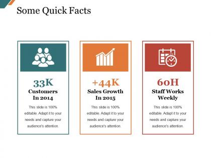
Some quick facts presentation examples




Try Before you Buy Download Free Sample Product
 Impress Your
 Audience
 100%
100% Editable
 Save Hours
 of Time


Bag the desired deal with our Some Quick Facts Presentation Examples. They ensure you earn approval.
People who downloaded this PowerPoint presentation also viewed the following :
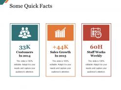
Some quick facts presentation examples with all 5 slides:
Encourage a bit of informal banter with our Some Quick Facts Presentation Examples. Indulge in a good humored exchange.

FAQs for Some quick
Clean layouts and consistent branding are your basics. Don't skip the logical structure either - stakeholders want to see problem, solution, timeline, and pricing sections. I've watched proposals crash just because someone used Comic Sans or went crazy with colors. White space is your friend here. Keep it simple with the color scheme. Oh, and definitely build in spots for charts and data since numbers actually convince people. Test the template with real content first though - learned this the hard way when something looked great empty but turned into a mess with actual client info crammed in. You'll thank me later.
Honestly, turning your slides into a story changes everything. People zone out with bullet points, but they'll follow a narrative. Our brains are just wired that way! Structure it like any good story - problem, tension, then your solution saves the day. Even quarterly reports work better when you frame them as "here's what happened to us this quarter." Pick your main message first, then find visuals that actually support it throughout. I've seen the most boring data become memorable just by adding that story backbone. Makes presentations way less painful for everyone.
You want something clean and simple - no crazy animations or your students will just stare at the spinning graphics instead of listening. Go for readable fonts and consistent formatting. I'd skip the flashy business templates completely, they're too much. Look for ones labeled "academic" or "educational" since they're built for this stuff. Simple color schemes beat busy patterns every time. Make sure there's room for charts or images, and bullet points should fit naturally. Honestly, start with your platform's basic education templates and just tweak from there - way easier than starting from scratch.
Dude, using graphics that actually match their industry is huge. People instantly connect when they see visuals from their world - like their actual tools or workspace instead of boring stock photos. Makes them feel like you really understand what they deal with every day. Plus your message hits way faster since they don't have to decode what you're showing them. They already know the context, so they focus on what you're actually saying. Honestly, even swapping basic charts for something that looks like their workflow makes such a difference. It's like... why wouldn't you speak their visual language?
Start with your brand stuff - colors, fonts, logo placement. Keep it clean with lots of white space so your main points actually stand out. Seriously, I've seen decks that look like someone went crazy with a highlighter set! Set aside specific areas for charts and customer quotes since you'll need those anyway. Oh, and make template slides for different sections - intro, problem/solution, pricing, whatever. Trust me, you'll thank yourself later when you're rushing to customize everything for a new client. Saves so much time.
Colors seriously mess with people's heads during presentations. Blue's your safe bet - builds trust without being boring. Red gets people pumped but honestly, I've seen too much red make audiences fidgety. Green screams "growth" while orange feels super approachable. Purple? That's for when you want to look creative or fancy. The trick is matching your palette to what you're actually saying. Like, don't throw bright yellow all over slides about layoffs - people will think you're nuts. Stick with grays or blues for serious stuff. Works way better than trying to sugarcoat bad news with rainbow colors.
So for remote presentations, bigger text is everything - trust me on this one. Use simple fonts that won't look weird on different screens, and go high contrast since everyone's monitor is set up differently. Skip fancy animations (they just lag anyway) and add slide numbers so people can follow along easier. Oh, and leave space for your webcam if you're doing that picture-in-picture thing. The notes section is honestly a lifesaver when you can't see if people are confused or bored. I always test mine on a quick video call first because what looks good on your screen might be tiny on theirs.
Okay so there's this 6x6 rule that actually works - stick to 6 bullet points max, 6 words each per slide. Let your visuals carry the weight instead of cramming text everywhere (seriously, nobody reads those paragraph slides anyway). Good images and charts beat walls of words every time. Your slides should work like billboards - if people can't get the point in 3 seconds, you've lost them. Don't be afraid of white space either. Here's what I do: write out everything first, then cut like 70% of it and swap half for visuals. Sounds brutal but it works.
Honestly, animations can make or break your presentation. Use them like salt - just enough to enhance things. Simple fade-ins work great for revealing points at the right time. But those bouncing text effects? They scream amateur hour and nobody takes you seriously. I learned this the hard way in college! Keep transitions clean and consistent throughout. Short movements help guide attention without being distracting. Always test everything beforehand though - nothing's worse than animations glitching during your actual presentation. The goal is smooth flow, not a circus show.
Honestly, you gotta dig into their cultural stuff first - like how they communicate and what colors even mean to them. Red's lucky in China but screams danger here, so that matters. Some cultures want you to cut to the chase, others need the whole relationship-building song and dance first. I've seen deals tank over this kind of thing. Don't forget reading patterns too - not everyone goes left to right. Oh, and figure out if they're into individual wins or team success stories. My advice? Make a few different versions and run them by native speakers before you send anything out.
Honestly, go super clean and minimal for data stuff. White space is your friend - cramped charts are the worst. Stick to maybe 2-3 colors max and keep everything consistent. Dashboard-style templates work great since they're made for this exact thing. Oh, and skip the fancy animations - I learned this the hard way when half my audience got distracted by bouncing pie charts instead of listening to my actual points. Look for templates with dedicated spots for key takeaways. Your data should tell the story, not fight with busy backgrounds or weird fonts to get attention.
User feedback is seriously a game-changer for template design. It shows you what actually works in real presentations vs. what just looks pretty on screen. I've found that people will tell you about issues you'd never think of - like text boxes being way too small or colors that look awful when projected. You get insights into different industries too, which is super helpful. The whole point is creating templates people actually want to use again and again. My advice? Grab 3-5 coworkers and have them test your template first. Get their honest thoughts before you call it done. Trust me, it saves so much headache later.
Match your colors and fonts to their branding first - makes everything look way more professional. Actually customize the content for your audience, don't just change the title and hope for the best lol. Delete slides you won't use instead of skipping through them awkwardly. Test your animations beforehand because venue tech is always a wildcard. Honestly, I'd make a backup version without all the fancy effects just in case their system crashes. You'll thank me later when you're not frantically troubleshooting in front of everyone.
Dude, templates now are SO much cleaner than they used to be. Everything's going minimalist with tons of white space and bold colors. Dark mode is huge too since we're all staring at screens constantly. Those old 2010 PowerPoint templates? Absolutely tragic looking back lol. Modern ones focus way more on visual hierarchy and making data actually look good - people expect that polished Instagram vibe now. Remote work changed things too. Templates are built for screen sharing and smaller displays since we're not presenting in conference rooms as much. Just grab something that works with these trends instead of fighting them.
Ugh, the worst thing you can do is cram every slide with tiny text nobody can read. Pick templates that actually match your vibe - like don't use comic sans for a budget presentation lol. Never leave in placeholder text (saw "Lorem ipsum" in a board meeting once, so awkward). Just because there's space doesn't mean you need to fill it. Skip the crazy animations too - they're distracting. Oh and definitely test it on the actual screen beforehand because fonts always look different. Trust me on that one.
-
Awesome use of colors and designs in product templates.
-
Awesomely designed templates, Easy to understand.