


Dos and donts vector powerpoint slide template




Try Before you Buy Download Free Sample Product
 Impress Your
 Audience
 100%
100% Editable
 Save Hours
 of Time


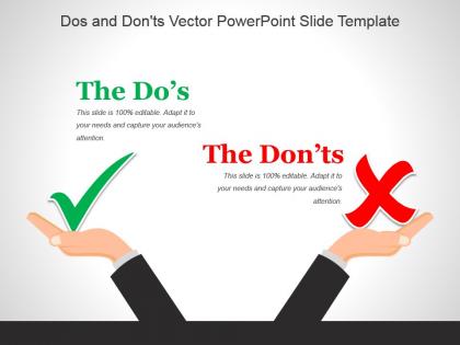
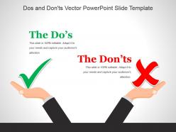
If you want to highlight the best and the worst thing in any scenario, then this Dos And Don’ts Vector PowerPoint Slide Template is for you. This image of two hands of a person comparing two actions as giving contrary results – one being beneficial and the other being detrimental is ideal for displaying the pros and cons. You can also identify the right and wrong situation which is easily identifiable as the right one has a green colored tick mark and the wrong option has a red colored cross with it. The visual display of icons makes the PPT informative and attractive. The layout is apt for highlighting business etiquettes dos and don’ts. You can convey the dos and don’ts instructions for new users of a product or service through this template. The PPT slide can also be used to convey the dos and don’ts in an interview and, to discuss what to do and what not to do for successful internet marketing campaigns. This slide with vector images is a powerful info graphic tool and can be downloaded at the ease of a click! Our Dos And Donts Vector Powerpoint Slide Template enhance any exhibition. Your facility will be the center of attraction.
People who downloaded this PowerPoint presentation also viewed the following :
Dos and donts vector powerpoint slide template with all 5 slides:
Our Dos And Donts Vector Powerpoint Slide Template help your eminence grow. They bring your expertise to the fore.
FAQs for Dos and donts vector
Dude, vector graphics are amazing for PowerPoint. They scale without getting blurry - your stuff looks crisp on any screen size. No more pixelated logos that scream "amateur hour." File sizes stay pretty small too, which is nice when you're sending presentations around. Colors don't shift between devices either. Honestly, I started using them after seeing someone's presentation with these gorgeous icons that stayed sharp even blown up huge. If you've got PNG icons lying around, swap them out for vector versions. Takes like 5 minutes but makes everything look way more professional. Trust me on this one.
Dude, you've gotta try vector PowerPoint templates - they're a game changer. The graphics stay super crisp no matter how big you make them, so no more pixelated mess when you're presenting on those giant conference room screens. Your slides will look way cleaner and more professional. I swear, anything beats those awful clip art presentations we've all sat through (you know the ones). Since vectors resize perfectly, you can use the same template for different formats without it looking terrible. Trust me, people actually notice when your slides don't look like garbage - it makes your whole presentation feel more legit.
Oh totally! Vector templates are so much better for this stuff. They're math-based instead of pixels, so you can make them huge or tiny without them getting all blurry and gross. I made this mistake once with a regular image - stretched a PNG logo for a presentation and it looked absolutely horrible on the big screen. Super embarrassing. But vectors stay sharp no matter what size you need. Works great when you're presenting on different screens or want to reuse slides later. Just make sure you're actually getting true vector files like SVG, not just regular images disguised as "templates."
Start with vector graphics so everything stays sharp when you resize. Pick 3-4 colors max and stick with them - trust me on this one. Clean fonts are your friend, especially ones that look good on phones too. Your icons need to match each other or it'll look messy (learned this the hard way). Good contrast between text and background is key. Don't cram everything together - white space actually makes things look more professional. Oh, and create a master layout first with spots for titles and content. Then just copy that template for new slides.
Oh this is actually pretty straightforward! First thing - swap out their colors for your brand ones, then change the fonts to whatever you guys use. The best part about vector templates? You can resize everything without it looking pixelated, which has saved me so many times. Replace their generic icons with your stuff, throw your logo on there, maybe tweak the layout if needed. Honestly, I'd recommend saving it as a master template when you're done - trust me, you don't want to be redoing all that customization work every single time you need a new slide deck.
Honestly, I'd go with Adobe Illustrator for vector PowerPoint templates. It's built for this stuff and exports really cleanly. Canva's easier if you're just starting out, and Figma works too - though neither handles complex vector stuff as well. Here's something weird: PowerPoint actually has pretty decent vector tools built in now. Who would've thought? You can make simple vector elements right in there. For editing templates you already have, stick with Illustrator or just use PowerPoint's own tools. My advice? Start with whatever you know best. You can always upgrade to Illustrator once you've got the basics down.
Yeah, vector graphics are actually amazing for keeping PowerPoint files small! They're basically just math equations instead of actual pixels, so even crazy detailed illustrations barely take up any space. I've had slides crammed with vector graphics that load way faster than a single iPhone photo - it's wild. Your presentations will run so much smoother and won't take forever to upload when you're sharing them. The graphics stay super crisp too no matter how much you resize them. Just don't go nuts adding a bunch of high-res photos on top of everything, because that's what really kills your file size.
Keep it simple - PowerPoint isn't Illustrator, so don't go nuts with crazy detailed vectors. Heavy files will make your presentation lag like hell. Test it on different PowerPoint versions too because compatibility gets weird sometimes. Oh, and make sure you're actually creating scalable stuff, not just dumping in high-res images. White space is your friend - people need room for their actual content. Your template should help the message, not fight with it. I learned this the hard way, but always test with real content first. Saves you from looking stupid later.
Okay so basically vector graphics are made from math equations instead of pixels, which means they stay super sharp no matter how big you make them. Raster images? Total opposite - they're just grids of colored dots, so they get all blurry and pixelated when you stretch them. I made this mistake once with a client's logo on a huge banner... looked terrible. PowerPoint's tricky because you never know if you'll be on a laptop screen or some giant projector. Honestly, vectors save you so much headache. Just use them whenever you can for logos and icons.
Tech and consulting companies are obsessed with vector slides - makes sense since they're always presenting on different screens. Finance and marketing agencies use them tons too. The scalability thing is actually pretty huge when you're going from laptop to massive projector. Any business doing client presentations benefits, but I've noticed it's especially useful if you share decks digitally a lot. Vectors just look way more professional at any size. SaaS companies are big on them too, probably because they're already thinking about that clean, scalable aesthetic. You should try them for your next presentation - the difference is noticeable.
Honestly, animations can make vector slides way more engaging - they draw eyes to key points and help control how info flows. Vector graphics stay super crisp when animated too, unlike regular images that get pixelated. I usually do subtle fade-ins for bullet points or smooth transitions between slides to keep everything cohesive. Morph transitions are my favorite though - they make vector elements transform seamlessly and look ridiculously polished. Oh, but don't go crazy with effects. Stick to maybe 2-3 animation types max or your presentation starts looking like a Vegas show instead of something professional.
Dude, colors totally make or break your presentation! Reds and oranges get people hyped up, blues make you seem trustworthy. I watched this guy completely tank his pitch once because he used these awful neon green slides that literally hurt to look at. High contrast helps your main points stand out - but if you go too subtle, your text just vanishes into the background. Oh, and definitely test everything on the actual projector first because colors always look different than on your laptop. Pick something that matches your vibe and you're golden.
If you're looking for vector PowerPoint templates, I'd start with GraphicRiver or Creative Market - they're pricier ($15-50) but the quality is solid. SlideModel focuses specifically on PowerPoint stuff which is handy. For cheaper options, Freepik and Vecteezy have decent free templates, though you might need to wade through some mediocre ones. Oh, and don't sleep on Etsy - I've actually found some cool unique designs there from independent creators. TemplateMonster's another good premium option. My advice? Browse the expensive sites first to get a feel for what good design looks like, then see if the free alternatives cut it.
Vector templates are seriously the way to go for accessibility. Your text stays sharp no matter how much someone needs to zoom in - no gross pixelation. Screen readers can actually read the text elements too, since they're not just flattened into an image. Colors stay true when you resize, which honestly just makes everything look more professional anyway. I've seen too many presentations where someone zooms in and suddenly everything's blurry as hell. With vectors, you can resize freely and it works for everyone in the room. Way better than dealing with bitmap images that fall apart.
Honestly, go for templates with clean layouts and colors that don't clash. The text placeholders should be super easy to edit - like you can just click and type without everything going haywire. Make sure the graphics actually resize properly (learned that one the hard way). Multiple layout options are clutch because sometimes your content just doesn't fit the standard format. Also test out changing fonts and colors before you download anything - some templates are weirdly locked down. Oh, and readable fonts! Sounds obvious but you'd be surprised how many use tiny decorative text that nobody can actually read.
-
Excellent products for quick understanding.
-
Illustrative design with editable content. Exceptional value for money. Highly pleased with the product.