


Dos and donts thumbs up thumbs down ppt slide





Try Before you Buy Download Free Sample Product
 Impress Your
 Audience
 100%
100% Editable
 Save Hours
 of Time


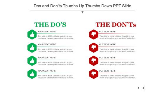
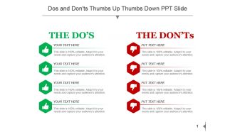
Interlink your thoughts with our, dos and don’ts thumb up thumbs down PPT slide. Following design shows do's column in green and don’ts column in red, holding every four points which could be combined with your data. Examine the complexities and explain better what key factors set commencing groups apart. Use this PPT image to elaborate pro and cons of any business process or any marketing presentation. Elaborate and mention key points and reach your vision. Text boxes evident here allows you to write a brief about the topic and provides information to the onlooker. So, get ready for a superior experience with our dos and don’ts thumbs up thumbs down PPT slide and take the right step towards the completion by downloading this excellent Presentation slide. Our Dos And Donts Thumbs Up Thumbs Down Ppt Slide are an inspiration. It awakens artistic ambition.
People who downloaded this PowerPoint presentation also viewed the following :
Content of this Powerpoint Presentation
Description:
This image displays a PowerPoint slide that is titled "Dos and Don'ts Thumbs Up Thumbs Down PPT Slide". The slide is divided into two columns; the left column is labeled "THE DO'S" with green thumbs-up icons, and the right column is labeled "THE DON'TS" with red thumbs-down icons. Each column contains four bullet points, each accompanied by the placeholder text "YOUR TEXT HERE".
Use Cases:
Here are seven industries where such slides can be effectively utilized, along with potential uses, presenters, and audiences for each:
1. Healthcare:
Use: Educate staff on proper patient care protocols.
Presenter: Healthcare trainer or compliance officer.
Audience: Medical personnel, including doctors and nurses.
2. Education:
Use: Provide guidelines for teaching methodologies.
Presenter: Educational consultant or academic administrator.
Audience: Teachers and educators.
3. Finance:
Use: Outline best practices for investment and risk management.
Presenter: Financial advisor or risk consultant.
Audience: Investors and financial services employees.
4. Manufacturing:
Use: Illustrate safety procedures and common workplace hazards.
Presenter: Safety officer or operations manager.
Audience: Factory workers and floor managers.
5. Retail:
Use: Demonstrate customer service dos and don'ts.
Presenter: Retail trainer or customer service manager.
Audience: Retail employees and store managers.
6. Technology:
Use: Discuss design principles and anti-patterns in software development.
Presenter: Lead developer or UX designer.
Audience: Software developers and engineers.
7. Hospitality:
Use: Exhibit hospitality standards and guest interaction guidelines.
Presenter: Hospitality trainer or guest relations officer.
Audience: Hotel staff and management.
Dos and donts thumbs up thumbs down ppt slide with all 5 slides:
Expect the best from our Dos And Donts Thumbs Up Thumbs Down Ppt Slide. They have a habit of being brilliant.
FAQs for Dos and donts thumbs up thumbs
Start with something that grabs attention right away - boring openings kill presentations before they even begin. Add an agenda so people know what's coming, and honestly, please number your slides. Can't tell you how annoying it is when someone's like "that slide from earlier" and we're all just clicking around randomly. Make sure your fonts are big enough to actually read. Leave some breathing room too - cramped slides look terrible. You'll want spots for your data and a solid wrap-up with clear next steps. Oh, and build it flexible so you can tweak things for different crowds or if you're suddenly given half the time.
Honestly, visuals can totally save your presentation or completely tank it. Good images that actually relate to what you're talking about? They'll help people remember your stuff way better. But I see so many people just throw random stock photos on every slide - you know, those awkward business people pointing at graphs that have nothing to do with anything. It's distracting as hell. Your audience stops listening and starts wondering why there's a woman laughing alone with salad on your budget slide. Keep it simple. If the visual doesn't actually help explain your point, just don't use it.
Don't go crazy with colors - 2 or 3 tops. I've seen so many presentations that look like a rainbow exploded on them. Avoid anything neon or super bright because honestly, it's just painful to look at. Make sure your text actually shows up against your background - sounds obvious but you'd be surprised how many people mess this up. Oh, and test it on a projector if you can! Colors look totally different when projected vs. on your laptop. If it's for work, throw in your brand colors. Pick your palette early and stick with it throughout the whole thing.
Honestly, just go with boring fonts like Arial or Calibri for your slides. Yeah, they're not exciting, but people can actually read them from the back. I learned this the hard way once using some "cool" font that looked like hieroglyphics from 10 feet away. Save fancy fonts for maybe your title slide if you really want to, but that's it. Don't mix more than two different fonts or it'll look messy. Make your text at least 24pt - bigger for headings. Quick test: stand across the room and see if you can read everything.
Start with a solid title and keep your headings consistent - makes everything look way more professional. One main point per slide works best, maybe 3-5 bullets tops. People zone out fast otherwise. White space is your friend! Stick with whatever fonts and colors your template has. Left-align text because it's easier on the eyes. Each slide should connect to the next one logically - you don't want people getting lost halfway through. Oh, and definitely add slide numbers. Maybe throw in a quick agenda at the beginning too so everyone knows what's coming.
Okay so first thing - bump your font size to at least 18pt because nobody wants to squint. Dark text on light backgrounds is your friend for contrast. I always go with simple fonts like Arial or Calibri since they're way easier to read. Clean layouts with lots of white space look better anyway, plus use bullet points instead of cramming everything into paragraphs. Don't forget alt text for images and add slide numbers - screen reader users need those to navigate. Oh and here's a quick test: view everything in grayscale first to see if it's actually readable.
Yeah, transitions can definitely help your presentation flow better, but honestly? Most people go way overboard. I'd stick with simple stuff - basic fades or slides work great. Avoid the spinning text nonsense that makes everyone nauseous lol. The bouncing bullet points with sound effects are the worst (I've sat through way too many of those). Use maybe 2-3 transition types max. The goal is guiding attention to your key points without being distracting. Always preview your slides first though - the timing needs to feel natural, not like a circus act.
Charts work great for numbers, trends, and comparisons - stuff that'd take you paragraphs to explain otherwise. Your audience can spot patterns way faster with visuals. But honestly? I've sat through way too many presentations that just bombarded me with graphs for everything. Text is better when you're explaining processes or telling a story that needs context. My rule: if you can make your point in a sentence or two, just say it. Save the charts for actual data that backs up your argument. Oh, and percentages over time? Definitely chart those. People will actually absorb complex info instead of zoning out.
Honestly, just make a solid brand guide first - logo rules, exact hex codes for colors, fonts (keep it to 2-3 max), spacing standards. Then actually use it! I swear half the companies I've worked with create these guides and then... ignore them completely. Make your brand stuff non-negotiable, not suggestions. Quick brand check before any new template goes live. Yeah, it's like 10 minutes of extra work upfront, but you'll thank yourself later when you're not fixing wonky decks with random fonts and colors. Consistent margins and layouts across everything makes such a difference too.
High-res images are a must - blurry ones make everything look amateur. Stick to your brand colors and style too. Those cheesy stock photos with people fake-smiling at laptops? Hard pass. Don't mix a million different image styles either or it'll look like chaos. I always make a quick mood board first - saves me from going off track later. Oh, and double-check your licensing if you're using this commercially. You don't want legal drama over a stock photo. Keep the lighting and filters consistent across all your images.
Ugh, I'd say every 6-12 months honestly. Had this super awkward moment using a 2019 template with our old logo - never again lol. Really depends on your industry though. Tech or marketing? Definitely lean shorter since trends move crazy fast. Also if you're presenting constantly vs like once a quarter, that changes things. Pro tip: set a reminder to check your template folder every few months. Way better than panicking before a big presentation. You'll know it's time when your slides look ancient compared to everyone else's in meetings.
Definitely go for templates with smart layouts that adjust automatically when you add stuff - saves so much time with last-minute changes. Interactive features are key too: clickable tabs, smooth transitions, embedded videos. Some of these newer templates honestly look way better than presentations I used to spend hours making from scratch. Oh, and data visualization is massive right now. Charts that actually update themselves? Game changer. Plus those infographic-style layouts make boring numbers way more interesting. I'd grab a few free samples first though - test how easy they are to edit before you buy anything premium.
Honestly, peer feedback is a game changer for presentation templates. After you've been staring at slides forever, you literally can't see the problems anymore. But a fresh pair of eyes? They'll immediately spot the messy layouts and tell you when you've crammed way too much text on one slide. Plus they'll let you know if your color scheme is actually hurting to look at (happens more often than you'd think lol). The flow thing is huge too - what makes perfect sense in your brain might be confusing to everyone else. Just ask specific stuff like "is this slide too busy?" instead of the generic "thoughts?" You'll get way better feedback.
Mix things up every 10-15 minutes with polls or quick partner discussions - seriously saves you from the dreaded phone-checking audience. I bombed a presentation once with wall-to-wall text slides, never again! Throw in images, white space, actual stories instead of just bullet points. People's brains need variety or they zone out completely. Ask for reactions and questions throughout rather than saving everything for the end. Oh, and those "turn to your neighbor" moments work surprisingly well even with adults. When people feel like they're part of it instead of just sitting there, you'll actually hold their attention.
Oh man, cultural stuff is huge for templates! Like, Arabic and Hebrew readers go right-to-left while we read left-to-right, so your whole layout needs to flip. Colors are weird too - red screams "danger" here but means good luck in China. Some places love clean, minimal designs, others want everything super decorative (Indian presentations can be gorgeously over-the-top). Don't even get me started on fonts that completely butcher certain languages. Honestly? Test your design with someone local if you can. It'll save you from looking totally clueless later.
-
Presentation Design is very nice, good work with the content as well.
-
Colors used are bright and distinctive.
-
great!!