


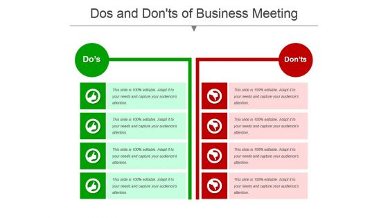
Dos and donts of business meeting powerpoint templates




Try Before you Buy Download Free Sample Product
 Impress Your
 Audience
 100%
100% Editable
 Save Hours
 of Time


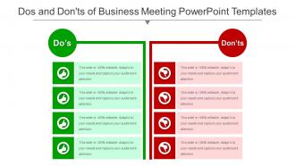
SlideTeam brings you “Dos And Donts Of Business Meeting Powerpoint Templates”. This template focus on the points which needs to be kept in mind while attending any kind of business meeting. This template is very easy to understand. It shows the green thumbs up for the right and corrects measures which one should adhere to and the red thumbs down shows the incorrect measure which one should not adhere to. A visual representation of these template if once seen stays in the mind as compared to non-visual one and therefore every business man should download our presentation for an effective way to show the business members and subordinates of their methodology of working in the organization. Our PPT template covers topics on solution, current state future state, before after, challenges solutions, compare, comparison. So, offload and lighten your work by using our templates and creating 100% efficiency. Move heaven and earth with our Dos And Donts Of Business Meeting Powerpoint Templates. They allow you to do everything feasible
People who downloaded this PowerPoint presentation also viewed the following :
Dos and donts of business meeting powerpoint templates with all 5 slides:
Give folks a clear indication of the implications with our Dos And Donts Of Business Meeting Powerpoint Templates. Be able to interpret judicial jargon.
FAQs for Dos and donts of business
Start with a clean title slide and basic agenda. You'll want different layouts for discussions, data, and action items - honestly, I'd keep the design super boring so people focus on what you're saying instead. Drop in placeholders for date, attendees, objectives, all that stuff. Make your fonts big enough that someone in the back can actually read them! The real magic happens with next steps and follow-up slides though - that's where most meetings totally bomb. Throw a few blank slides at the end too, because there's always some random topic that pops up.
Honestly, your slide design can totally kill a presentation before you even start talking. People will check out instantly if you're using tiny fonts or cramming too much stuff on each slide. White space is your friend here – gives eyes a place to rest. I learned this the hard way after watching someone use like 6 different colors that made my head hurt. Stick to maybe 2-3 colors max. Also, conference room lighting is usually garbage, so make sure there's good contrast between your text and background. Go for clean templates with big fonts that won't fight with what you're actually trying to say.
Templates from your industry are such a game-changer. They've already got the right jargon and visuals baked in, so your audience won't be confused by weird design choices. You'll look like you actually know what you're doing - honestly, that credibility boost alone is worth it. The structure is usually spot-on too since they're built for how people in your field think. Skip the generic business templates (they're boring anyway) and hunt down ones made specifically for your sector. Then just tweak the colors to match your brand and you're golden.
Dude, just use a template next time. Seriously saves you from staring at that evil blank slide for like 20 minutes wondering where to even start. You'll spend way less time messing around with colors and fonts - I swear I used to waste entire afternoons on that stuff. Most templates already have spots for your agenda, main points, charts, whatever. Just drop your content in there and boom, you're done. Oh and your slides actually look professional instead of... well, mine used to look pretty rough. Honestly cuts your prep time in half, maybe more.
Honestly, less is more with charts - one main point per slide or people zone out completely. Stick with colors that actually match your template (learned this after creating what looked like a unicorn threw up on my presentation lol). Your text needs to be readable from the cheap seats, obviously. But here's the thing - don't just dump numbers on them. Tell them what it means for business. Like, why should they care? Always throw your data source at the bottom and prep some backup slides. Someone's gonna ask detailed questions, trust me.
So color and fonts are like 80% of looking professional - people judge before they even see your content. Pick 2-3 colors tops. Navy/white is foolproof, or dark gray with blue accents. Skip the neon unless you're presenting to teenagers lol. For fonts, just go clean - Calibri or Arial for your main text. Maybe something different for headers but don't get crazy. Oh and whatever you choose, stick with it the whole way through. I swear this one thing will put you ahead of most people who just wing it with random colors.
Go for something clean that won't fight your content for attention. White space is your friend here. Font size matters too - nobody wants to squint across a conference room. Charts and graphs should have dedicated spots because honestly, making data look decent is like 80% of the work. Consistent colors help but don't go crazy with animations - they usually look cheesy anyway. Test it out with real content first, not just the sample stuff. Oh, and make sure it somewhat matches your company's style so you don't look totally off-brand during the presentation.
Build it like a story - your business problem is the main character going through beginning, middle, end. Pick some visual elements (colors, icons) and stick with them so people can actually follow what you're doing. Honestly, I borrowed this from Netflix shows - each slide should pull you into the next one. Creates this nice momentum thing. Design some transition slides between your big points, and definitely leave space for real examples or case studies. Oh, and here's the thing most people mess up - build in pauses for discussion. Your template should start conversations, not just blast information at people.
Honestly, visuals are a total lifesaver when you're dealing with complicated stuff. Your brain just processes images way faster than text - like, would you rather look at a boring spreadsheet or a chart that actually makes sense? I learned this the hard way during my last presentation (yikes). When you show quarterly trends or project timelines visually, it does most of the heavy lifting for you. People remember what they see way longer than what they hear too. Just swap out half your bullet points for charts or diagrams. Trust me, you'll see the difference in how people react.
Hey! So for virtual stuff, definitely go bigger on fonts - like 24pt minimum because everyone's squinting at laptop screens. Colors need to be way more contrasted too since video compression makes everything look washed out. I always strip down my slides more than I think I need to... people zone out so fast on calls. Bigger graphics help a lot. Also maybe this is obvious but test it in actual presentation mode first? I learned that one the hard way when my beautiful slide deck looked terrible once I hit "present." Oh and throw in more section breaks - gives people's brains a rest.
Start with the obvious stuff - title, agenda, problem overview, your solution, next steps, Q&A. Seriously though, the agenda is clutch because I've sat through way too many presentations where people just ramble. Throw in some data slides between your main points to back up whatever you're pitching. Build yourself a template so you're not starting from scratch every damn time. Oh, and don't end with some generic "thanks" slide - actually tell people what they need to do next and who's doing it.
Dude, user feedback is everything when you're making PowerPoint templates. People will tell you if they can actually read your fonts from across the room or if your colors look terrible on certain projectors. The real test is whether your layouts help presentations flow or just get in the way. Designers love making things look fancy, but honestly? Most presenters just want something that works without fighting them. Get feedback from people who've used your templates in actual important meetings - those are the ones who'll give you the brutal truth about what sucks and what doesn't.
Oh man, biggest thing is don't cram everything onto one slide - people in the back can't read tiny text anyway. Skip those awful stock photos of businesspeople pointing at charts, they look so fake. I'd stick with maybe 2-3 colors max because those rainbow presentations hurt my eyes honestly. Animations can be cool but don't go crazy with them bouncing everywhere. Clean layouts work way better - give things room to breathe with white space. Also definitely test it on whatever screen you'll actually be using since colors look different on every projector.
Okay so first thing - get your exact brand colors and fonts locked down, not just "eh, close enough" versions. Trust me on this one. Create one master template with your logo in the same spot every time, plus maybe throw in some of those little design elements from your other marketing stuff. Keep it to 2-3 fonts tops or it'll look messy. The real trick? Save it and actually get your whole team using the same template. Way better than playing cleanup crew on everyone's random slide designs later.
So PowerPoint's gotten way cleaner lately - people are ditching those awful bullet point slides for actual data viz and infographics. Dark mode is everywhere now, which honestly looks so much better than those bright white decks that blind you. Minimalist stuff with tons of white space is in. Video elements too, but like, ones that actually make sense. Oh and animated transitions that don't make your audience want to die. My advice? One main point per slide, stick with sans-serif fonts, and pick a color scheme you'll actually use consistently. Way less cluttered overall.
-
Informative presentations that are easily editable.
-
Great product with highly impressive and engaging designs.