

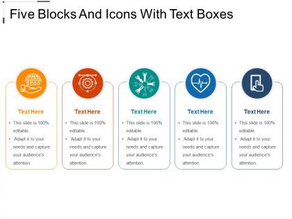
Five blocks and icons with text boxes




Try Before you Buy Download Free Sample Product
 Impress Your
 Audience
 100%
100% Editable
 Save Hours
 of Time


Our Five Blocks And Icons With Text Boxes are amenable to improvisation. Feel free to customize as you desire.
People who downloaded this PowerPoint presentation also viewed the following :
Five blocks and icons with text boxes with all 5 slides:
Involve yourself in fun and frolic with our Five Blocks And Icons With Text Boxes. Indulge in the high jinks.
FAQs for Five blocks and icons
Honestly, the biggest thing is not cramming a million bullet points on one slide - I'm totally guilty of this too. Make sure you've got a clean title and stick to the same fonts/colors throughout. White space is your friend! Structure it so there's a clear hierarchy - headers, then subheads, bullet points, whatever works. I'd say keep text super minimal and let visuals do the heavy lifting. Your audience should be able to glance at a slide and immediately get it, like within 3 seconds. Also, try viewing your slides from way in the back to check if everything's actually readable. Trust me on that one.
Dude, colors can totally save or kill your presentation. Pick 2-3 max - any more and it looks like a rainbow threw up. Dark text on light backgrounds is your safest bet (boring but works every time). High contrast is key so people aren't squinting. I learned this the hard way after using lime green text on yellow once... nobody could read anything. Test your slides on different screens first because what looks good on your laptop might be trash on the projector. Good colors guide attention, bad ones give headaches.
Oh man, typography can make or break your whole presentation! Pick fonts that actually fit your content's vibe - like don't use Comic Sans for a budget meeting, you know? Test your slides from way across the room first because I've definitely been burned by tiny text that nobody could read. Two or three font styles max, otherwise it looks messy. Make your headers bigger than body text (duh but people forget). Honestly the contrast thing is huge too - light gray text on white backgrounds are the worst. Your audience will thank you for keeping it simple and readable.
Honestly, white space is everything when it comes to slides that don't suck. Give your content room to breathe instead of cramming stuff into every corner. I always use generous margins and leave space between bullet points - resist filling empty areas just because they exist. Less content per slide works way better. Your audience needs places for their eyes to rest, and white space shows them what actually matters. Oh, try squinting at your slide - if you can't immediately spot the key message, you need more space. Trust me on this one.
Definitely stick with left-aligned text - your audience will actually be able to read it. Center alignment looks pretty but it's honestly a nightmare for anything longer than a headline. Images are different though, you can center those or just match them to your text margins. White space is huge - cramped slides make people's eyes tired. Your presentation software probably has alignment guides, use them! Trust me, people notice when stuff looks wonky even if they can't pinpoint why. Oh and step back from your screen sometimes to check if everything feels balanced.
Business slides need way more white space and bold headers - execs want the main points without digging through clutter. Academic presentations are the opposite though, packed with tiny fonts and citations everywhere. Honestly looks messy but that's just how scholarly stuff works. Your audience totally changes everything too. CEOs want quick insights while professors expect you to show every piece of methodology. I'd figure out if they want speed or depth first, then match your slide density to that. Makes a huge difference once you nail down what they're actually looking for.
Don't cram everything onto one slide - it's brutal to look at. Pick bigger fonts (24pt minimum) so people in the back row aren't squinting. Those cheesy stock photos? Skip them completely. They just scream "I googled 'business handshake.'" One main idea per slide works way better than dumping your whole presentation at once. Test this: stand six feet from your screen. Can't read it? Your audience won't either. Oh, and please don't use neon green text on red backgrounds - my eyes are still recovering from the last presentation that did that.
Pick images that actually back up what you're saying - don't just throw in random stock photos because you need something there. I swear, half the presentations I see have these weird generic business handshake photos that mean nothing. Your best visuals should go right next to your main points so people's eyes hit both at once. Keep the style consistent throughout, and please use high-res images. Blurry photos make everything look amateur. Quick test: if someone glances at your slide for like 2 seconds, can they get the main idea from just the image and headline together?
Honestly, consistency is everything for presentations. Your audience won't get distracted by weird font changes or random colors if you stick to the same design throughout. Makes it way easier for people to actually focus on what you're saying. Pick your fonts and colors upfront, then don't mess with them. I learned this the hard way after a disaster presentation in college lol. Even tiny stuff like using the same bullet style matters more than you'd think. When everything matches, you automatically look more professional and put-together. Nobody wants to watch something that screams "I made this at 2am."
Honestly, animations can totally save your presentation or completely ruin it. I made this mistake once with way too many bouncing text effects - looked like a circus act lol. Use them to guide people's eyes where you want, but don't go overboard or nobody will focus on your actual content. Sequential bullet points work great. So do slides that build on each other logically. Just keep your transitions consistent throughout and definitely test the timing beforehand. Nothing worse than awkward pauses while you're presenting. Strategic is better than flashy every time.
Honestly, less is more with data slides. Don't cram everything in there - white space is your friend. One insight per chart, and write a title that actually tells people what they're looking at. I used to throw everything on one slide and wonder why people looked confused lol. Put your best visual in the upper left since that's where eyes go first. Colors and fonts should match the rest of your deck obviously. Here's what really helps though - add a little callout pointing to what matters most. Always end with a "so what does this mean" statement that ties back to your main point.
Your audience's culture totally shapes how they'll receive your presentation. Western folks scan left-to-right, but Arabic audiences go right-to-left - position your key info accordingly. Colors are tricky too. Red screams "danger" here but means good luck in China (yeah, I've messed that up before). Japanese audiences want detailed slides with nuanced messaging. Germans? They prefer things direct and clean. Honestly, the information density thing can make or break you. Research their cultural background first, then tweak your visual flow and color choices to match what feels natural to them.
Honestly, templates are a lifesaver. They keep all your slides looking consistent - same fonts, colors, spacing, all that stuff. It's like having a blueprint that every slide follows automatically. Once you've got your template set up with the right placeholders, you can just focus on what you're actually saying instead of messing around with formatting. I can't tell you how many presentations I've seen that look like a hot mess because someone skipped this step. Do yourself a favor and create a solid template upfront. You'll thank me later when you're not up all night fixing wonky margins.
Honestly, feedback is like a reality check for your slides. You think everything makes sense because you know the content inside and out, but then someone else looks at it and points out the text is way too small or the transitions are weird. People will straight-up tell you if they're getting lost or if a slide feels cluttered - stuff you'd totally miss on your own. Don't just ask "what do you think?" though, that's useless. Ask specific things like "could you follow the main points?" Then actually fix what they mention, even if it stings a bit.
Honestly? PowerPoint or Google Slides work fine for most stuff - they're pretty solid for business presentations. Canva's where I'd go next though, way more templates and they don't all look corporate and boring. Adobe InDesign is the fancy option if you really need control over everything, but fair warning - it's kinda brutal to learn at first. Oh and Figma works great too if you're already messing around with it for other design things. I'd say just start with whatever you already know, then maybe try Canva if you want something that looks less... generic.
-
Good research work and creative work done on every template.
-
Excellent work done on template design and graphics.