

Fraud Dashboard Powerpoint Ppt Template Bundles




Try Before you Buy Download Free Sample Product
 Impress Your
 Audience
 100%
100% Editable
 Save Hours
 of Time


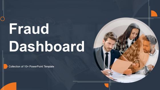
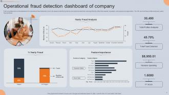
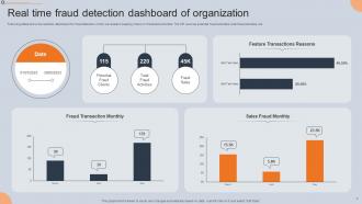
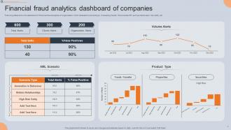
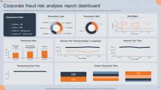
Introducing the Fraud Dashboard, your comprehensive tool for combating double dealing and scams. This powerful PPT presentation is designed to equip you with the essential information and strategies needed to detect and prevent fraud. With its user friendly interface and intuitive design, the Fraud Dashboard empowers you to identify potential fraudulent activities swiftly and efficiently. Stay one step ahead of cheaters and safeguard your organizations integrity with real time data visualization, analytics, and fraud indicators at your fingertips. Whether you are a business owner, financial analyst, or risk management professional, this scam dashboard is your ultimate ally in the fight against deceit. Enhance your security measures and protect your assets with the Fraud Dashboard today.
People who downloaded this PowerPoint presentation also viewed the following :
Fraud Dashboard Powerpoint Ppt Template Bundles with all 18 slides:
Use our Fraud Dashboard Powerpoint Ppt Template Bundles to effectively help you save your valuable time. They are readymade to fit into any presentation structure.








FAQs for Fraud Dashboard Powerpoint
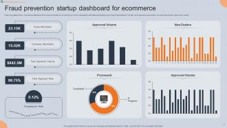
Track your fraud rate - both attempts and what actually gets through. Dollar amounts at risk matter too, obviously. Detection accuracy is huge, especially false positives since those piss off real customers. Watch transaction volume spikes closely - they usually mean either new attacks or your system's broken. Time-to-detection and resolution times tell you how fast you're moving. Break everything down by fraud type, payment method, geography. Honestly, the prettiest dashboard is useless if it doesn't help you act. Set alerts for threshold breaches so you're not babysitting charts all day.
So you'll need APIs that hook into your core banking system and payment processors - stuff like FIS or Jack Henry if that's what you're using. Real-time data feeds are crucial here because stale info is basically useless for catching fraud. Webhooks work great for instant alerts when sketchy patterns pop up. Honestly, the biggest headache is usually your IT folks - they guard data access like it's Fort Knox! Map out where your transaction data lives first, then work with your vendor to set up those live connections. Short sentences mixed with longer ones help avoid that robotic feel.
Time series charts are perfect for fraud trends - you can instantly see spikes and patterns over time. Heat maps are solid too, especially for geographic stuff or transaction types (plus they look impressive in presentations). Bar charts work well for comparing fraud rates between different channels or segments. Keep everything visual and simple though - if people have to decode what they're seeing, you've already lost them. Oh, and don't overthink it. These three chart types will handle most of what you need for showing fraud trends effectively.
Honestly, you'll want real-time updates or close to it - like every 15-30 minutes max. Fraud doesn't wait around, you know? Stale data is basically useless for catching stuff as it happens. Finding out about yesterday's fraud spike when it's already too late? That's just frustrating. Your transaction volume matters here, but anything over an hour between updates puts you behind. I learned this the hard way at my last job - we were updating twice daily and missing everything. Set up automated refreshes and alerts so your team can jump on suspicious patterns immediately.
So basically, ML can spot fraud patterns that would take humans forever to find manually. It crunches tons of transaction data in real-time and learns from past fraud cases. Pretty neat how the algorithms actually get smarter over time - you'll see automated risk scores and alerts for sketchy activity. The tricky part is feeding it good training data (garbage in, garbage out, you know?). Also gotta keep updating your models since fraudsters are always finding new tricks. It's like a constant cat-and-mouse game honestly.
Start with three basic levels - analysts get read-only access to cases and reports. Investigators can see transaction details and update statuses. Managers get everything including the sensitive customer stuff. Honestly, don't overcomplicate it right away. You can always get fancier with permissions once your team gets bigger. The main thing is limiting access to what people actually need for their jobs - especially with all that personal data floating around. Oh, and set up quarterly reviews to clean out old access. Trust me, that stuff piles up fast if you're not watching it.
Transaction data's your bread and butter, obviously. User behavior patterns and device fingerprinting come next. Payment processors flag weird stuff automatically, so tap into those APIs for sure. Customer service tickets are actually gold - they spot fraud attempts way before your systems do half the time. Login attempts, account changes, identity verification fails - all that matters too. Geolocation data helps but honestly feels a bit creepy sometimes. I'd start with transactions and behavior since you'll see results fast, then add the other stuff once you've got the basics down.
Honestly, fraud dashboards are lifesavers for compliance stuff. Real-time monitoring catches suspicious activity automatically instead of you spending hours digging through reports. Regulators eat that shit up during audits too. It pulls all your AML and KYC data into one place - way better than bouncing between a dozen different systems like some kind of masochist. The audit trails are solid, and you'll get alerts before small issues turn into actual violations. Oh, and definitely set up automated thresholds so you're not babysitting the thing 24/7. Makes your life way easier.
Put your highest-risk alerts right at the top - your fraud team shouldn't have to dig around for the scary stuff. Color coding helps a ton, but honestly, I've seen too many dashboards that look like a unicorn exploded. Stick with red for "oh shit" moments and yellow for moderate risk. Charts are cool if they actually help people make decisions. Otherwise you're just making pretty pictures. Make sure analysts can click through from the big picture down to specific transaction details fast. And definitely test this with real fraud people before you launch it - they'll catch issues you'd never think of.
Set up quick feedback forms right in your dashboard interface - nobody fills out long surveys anyway. Monthly user sessions work great too, where you demo stuff and get real reactions. I'd also check your usage analytics to see which sections people totally ignore (red flag that something's broken). Track what gets clicked vs what doesn't. The biggest thing though? Actually show users how you used their feedback. Otherwise they'll think you're just collecting suggestions for fun and stop helping you out. Circle back with "hey, remember when you said X was confusing? We fixed it."
Definitely start with basic stuff like refund spikes and chargebacks going above normal levels. Same card hitting multiple accounts quickly? That's sketchy as hell. Geographic weirdness is massive - transactions from random countries you don't serve, or someone "traveling" from NYC to Bangkok in 20 minutes. Multiple failed logins from the same IP address should trigger something too. Oh, and watch for people creating duplicate accounts with slightly different details - fraudsters love that trick. Honestly, I'd also flag anything bypassing your usual verification steps. Start simple with these alerts, then tweak based on whatever patterns you're seeing.
So basically the dashboard learns from you - when you mark stuff as false positives, it gets smarter about future alerts. Pretty cool actually. Each alert comes with confidence scores too, which helps you tackle the obvious ones first. I was doubtful at first but it really does improve over time. Just make sure your whole team marks the bogus alerts consistently - that's what keeps everything running smooth. Oh and you can flag incorrect stuff right in the interface, no extra steps or anything.
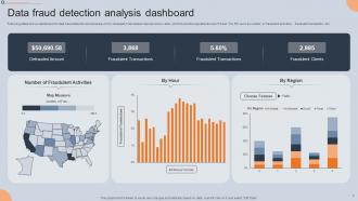
Heat maps are your best bet - executives love them because the hotspots jump right out. Choropleth maps are solid too, especially if you're comparing fraud rates between states or countries with different colors. For individual fraud cases, pin maps show exact locations, but honestly they get pretty cluttered with lots of data. Bubble maps size the circles based on fraud volume or dollar amounts, which looks pretty impressive in presentations. I'd go with heat maps first since they're the easiest to understand quickly.
Oh definitely use your fraud dashboard for training! The visual stuff really helps people spot what's normal versus sketchy behavior. I'd pull real cases from your data - way better than made-up scenarios honestly. Focus on whatever fraud types are actually hitting you most since that's what matters. Monthly walkthroughs work well too, just go over the highlights with everyone. Keeps people updated on current threats and all that. The patterns become pretty obvious once you start looking at the data regularly - much more effective than boring classroom stuff.
So banks are obsessed with transaction speed and account takeovers - makes sense since money's literally disappearing in real time. Retail's different though. You're looking at payment fraud, sketchy returns, inventory theft patterns. Banks have way more regulatory crap to deal with, so their dashboards get super complex with all these audit trails. Retail ones are usually cleaner, more focused on loss prevention trends. Honestly, I'd figure out your biggest fraud headaches first, then build around those. No point tracking everything if you're not watching what actually hurts you.
-
The design is clean-cut, modern, and sleek, keeping the users' needs in mind. The multiple uses make this product worth every penny!
-
Much better than the original! Thanks for the quick turnaround.