


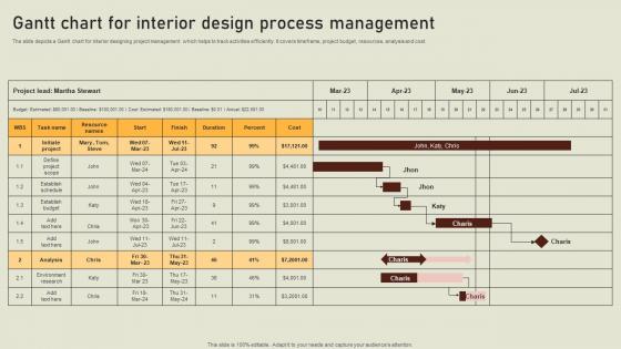
Gantt Chart For Interior Design Process Management




Try Before you Buy Download Free Sample Product
 Impress Your
 Audience
 100%
100% Editable
 Save Hours
 of Time


The slide depicts a Gantt chart for interior designing project management which helps to track activities efficiently. It covers timeframe, project budget, resources, analysis and cost.
People who downloaded this PowerPoint presentation also viewed the following :
Gantt Chart For Interior Design Process Management with all 6 slides:
Use our Gantt Chart For Interior Design Process Management to effectively help you save your valuable time. They are readymade to fit into any presentation structure.






FAQs for Gantt Chart For Interior
Honestly, Gantt charts are lifesavers for project stuff. They show you this visual timeline of all your tasks - what needs to happen when, how long things take, and which tasks can't start until others are done. Super helpful for catching problems before they blow up. You can track how everything's going and show stakeholders what's happening without those confusing spreadsheets (which I hate dealing with anyway). Real-time updates are clutch too. Try starting with something basic like Asana or just Excel if you're not ready to invest in fancy software yet.
Honestly, Gantt charts are lifesavers for keeping everyone on track. No more awkward "wait, wasn't that your job?" conversations during meetings. You'll spot which tasks depend on others finishing first, so bottlenecks don't sneak up and wreck your timeline. Way better than digging through a million emails to figure out what's happening - I swear those email threads multiply when you're not looking. The visual layout helps people actually plan around each other's work. Update it weekly when your team meets so nobody gets lost.
Honestly, people go way overboard with these things. You'll see charts with every tiny detail mapped out - total mess. Focus on the big stuff instead. Timeframes are where everyone screws up though. We're all guilty of thinking "oh that'll take two days" when it's really a week, especially with handoffs between teams. Dependencies matter too - if Sarah needs to finish before Mike can start, make that crystal clear. Oh and actually update the damn thing! I've seen so many charts that are basically fiction after a month. Keep it simple, pad your estimates a bit, and don't let it collect digital dust.
Honestly, Gantt charts handle changes way better than people think. You can just drag tasks around, stretch the bars longer or shorter, throw in new rows when scope creeps up on you. Tools like Asana are pretty smart about updating all the connected stuff automatically - saves so much headache. The visual thing is clutch because you instantly see how moving one thing affects everything else. Oh, and definitely loop your team in when you make updates. I've been burned by people working off old versions before. Keep it fresh and you're golden, even when projects go sideways (which they always do).
So for Gantt charts - Microsoft Project is super powerful but honestly kind of a pain to learn. Asana and Monday.com are way easier if your team needs to collaborate on stuff. I'm probably weird but I actually love Smartsheet since it's like Excel that doesn't suck for project management. There's also GanttProject which is totally free, though pretty bare bones. Even regular Excel works if you're just doing something quick and dirty. I'd probably just check first if whatever tool you're already using has Gantt stuff built in before switching to something new.
Yeah, totally! Gantt charts work fine with Agile - just don't get crazy detailed with them. Map out your sprint timelines and big milestones instead of every tiny task. Honestly, stakeholders eat this stuff up because they love seeing those pretty timeline bars. Your team keeps doing their normal Scrum thing inside each sprint. Just update the Gantt after sprint reviews so it doesn't become total fiction. Oh, and start high-level with epics and releases first - you'll save yourself a headache trying to track individual user stories on there.
So basically, Gantt charts show your whole project timeline - like start dates, end dates, all those dependencies. Kanban boards? They're more about workflow stages and what you're actually working on right now. I'd go with Gantt when you need that big picture view, especially if your project has tons of moving pieces. Though honestly, they can get pretty overwhelming sometimes. Kanban's way more flexible for daily stuff. Oh, and if you're doing waterfall projects, definitely Gantt. But for agile work or anything ongoing, Kanban's usually the better bet.
Gantt charts suck when your project changes every five minutes - like agile dev work or anything creative where requirements are all over the place. For simple stuff with just a few tasks? Total overkill. Plus they're honestly a nightmare to update when you've got tons of interdependent activities. Real-time collaboration tools like Kanban work way better for that. They're great when you have clear timelines and know exactly what you're delivering, but once uncertainty hits, you'll want something more flexible. Oh, and if you're juggling resources across multiple projects, forget Gantt charts entirely.
Honestly, color-coding your Gantt chart is a total game changer. Your brain picks up on visual patterns way faster than reading through every task name. I usually go with red for urgent stuff, blue for marketing tasks - whatever makes sense for your project. Diamonds work great for milestones too. Don't go overboard though - stick to maybe 3 or 4 colors max, otherwise it gets messy. Make sure everyone on your team knows what each color means. You'll be able to spot issues and track progress so much quicker once you get this set up right.
Look, there's tons of good stuff you can pull from Gantt charts. Schedule variance is huge - basically are you ahead or behind? Critical path performance matters too. Resource utilization rates tell you if people are swamped or sitting around. Task completion percentages are pretty self-explanatory. Watch for bottlenecks though - that's where everything gets messy and piles up. Dependency delays can really screw you over since they cascade down the timeline. Honestly, just set up a basic dashboard to calculate this stuff automatically. Trust me, you don't want to be doing math right before every status meeting!
Dude, Gantt charts are seriously game-changers for catching resource conflicts early. When you can see the whole timeline laid out, it's way easier to spot when Sarah's booked on three projects simultaneously or when everyone needs the same equipment on Tuesday. I used to just wing it with spreadsheets - terrible idea. The visual aspect makes redistributing workload so much simpler. You can quickly shift deadlines around or figure out where you need extra help. Pro tip: color-code different resources because the patterns become super obvious that way.
So this guy Henry Gantt came up with these charts back in the 1910s for factory stuff. Wild that we're still using them, honestly. They got really popular during big construction projects like the Hoover Dam in the '30s. Everything changed in the '80s though when software made them actually manageable - before that you'd be redrawing the whole thing by hand every time something shifted (nightmare). Now you've got Microsoft Project, Asana, even Excel works. They automatically update when your timeline gets messed up. Definitely try making one for your next project - seeing those dependencies mapped out is a game changer.
Honestly, just make it a weekly thing - like, actually put it on your calendar. Someone needs to own this or it'll never happen (learned that the hard way). I'd tie the updates to meetings you're already having, like sprint reviews or whatever. The software matters too - if updating is a nightmare, people will avoid it. Quick updates during team meetings work really well since everyone's there anyway. Oh, and automated reminders help but don't rely on them completely. Treat it like any other deadline you can't miss.
Match your timeline to how your industry actually moves. Construction? Go daily/weekly with weather buffers and resource tracking visible. Software teams work better with sprint blocks - color-code your feature types. Healthcare projects absolutely need those compliance checkpoints baked right in (auditors eat that stuff up, honestly). Manufacturing should highlight production line dependencies and bottlenecks on the critical path. Here's what works: ask your stakeholders what decisions they're making from this chart first. Then build the view around surfacing exactly that info. Don't overthink it.
First thing - write down everything they're saying about timelines, resources, whatever's bugging them. Then go into your project management tool and start tweaking the Gantt chart based on their feedback. I always throw in color coding or little notes so I can remember later which changes came from who (trust me, you'll forget otherwise). Short sentences work here. Longer ones need to actually flow naturally when you're explaining the more complex stuff. Once you've updated everything, send the new chart back out to everyone. Follow up to make sure you actually fixed what they were worried about - sometimes you think you nailed it but missed the mark completely.
-
The service is fast, and I could access any presentation after buying the subscription. I don’t think I’ll ever have to worry about a presentation in my life.
-
Very unique and reliable designs.