

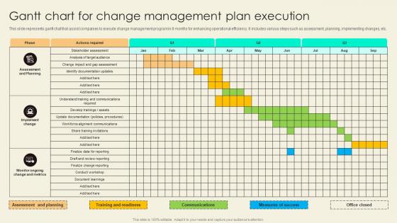
Gantt Chart For Change Management Plan Execution




Try Before you Buy Download Free Sample Product
 Impress Your
 Audience
 100%
100% Editable
 Save Hours
 of Time


This slide represents gantt chat that assist companies to execute change management program in 9 months for enhancing operational efficiency. It includes various steps such as assessment, planning, implementing changes, etc.
People who downloaded this PowerPoint presentation also viewed the following :
Gantt Chart For Change Management Plan Execution with all 9 slides:
Use our Gantt Chart For Change Management Plan Execution to effectively help you save your valuable time. They are readymade to fit into any presentation structure.








FAQs for Gantt Chart For Change
A Gantt chart is just a visual timeline showing your project tasks - when they start, finish, and how they connect. Each task appears as a horizontal bar against dates, so you can quickly see what's happening when. Honestly, they're lifesavers for complex projects because everything clicks into place visually. No more trying to juggle a million moving pieces in your head! You can spot bottlenecks, track progress, and show stakeholders what's up without overwhelming them with messy spreadsheets. Google Sheets works fine for basic ones, or grab Asana if you need something fancier.
Oh totally! Gantt charts are way more flexible than people think. Most tools let you mess with the timeline (days vs weeks vs months), throw in custom columns for budget stuff or who's doing what. Color-coding is clutch - I always do it by team or how urgent things are. Templates are honestly a game changer if you're doing similar projects over and over. You can set up custom dependencies and milestones too. Really depends on what weird info your specific project needs beyond the basics. I'd say figure out what makes your project different first, then just start tweaking things.
So basically you've got your tasks running down the side, timeline across the top, and bars showing how long each thing takes. Dependencies are those connecting lines - super important but honestly where everyone screws up at first (I definitely did). They show what has to finish before the next thing can start. Milestones pop up as little diamonds for major deadlines. Some get fancy with resource stuff and progress bars, but don't worry about that yet. Just nail the tasks, timeline, and those dependency connections first. Way easier to add the other bits once you've got the basics down.
Honestly, Gantt charts are game-changers for keeping everyone aligned on project timelines. You'll see exactly who's doing what and when, plus how different tasks connect. No more awkward "I thought you were handling that" conversations! The visual aspect is clutch - stakeholders get it immediately without you having to explain every little detail. When stuff gets delayed (and it will), you just point to the chart instead of writing those painful update emails. I'd start small though - just map out your next project's big milestones and see how it feels. Trust me, once your team gets used to it, you won't want to go back.
Don't get crazy detailed from the start - you'll waste hours tweaking every little thing when plans change. Always add buffer time because stuff *will* take longer than you think. Seriously, I've never seen a project finish early. Skip the unrealistic deadlines just to keep people happy, and don't cram everything into one view or it'll look like spaghetti. Oh, and actually update the thing regularly - I see so many people create these beautiful charts then never touch them again. Treat it like a living doc, not some fancy decoration.
Honestly, Gantt charts are like having a roadmap for your whole project. You'll see every task laid out with start dates and how long stuff takes - plus which things depend on others. Super helpful for catching delays early before everything goes sideways. I always map out the critical path first, that's key. Real-time updates are clutch too. When something's running late, you can instantly see how it'll mess with other deadlines and figure out if you need more people or just push things back. Makes explaining timelines to your boss way easier.
Honestly, Microsoft Project is way too much unless you're managing something huge. Smartsheet and Asana hit that sweet spot - decent features without the headache. TeamGantt's pretty clean if you want something straightforward and web-based. GanttPRO too. Excel works in a pinch with templates, though it's kind of clunky. I'd probably start with Asana's free version first - see if their basic Gantt stuff does what you need. Then you can always move up to something fancier later if you need all the resource tracking bells and whistles.
So dependencies are basically just arrows connecting your tasks - shows what has to finish before something else can start. There's four types but honestly finish-to-start is like 90% of what you'll use. Most software lets you drag between tasks to connect them, which is pretty satisfying once you figure it out. When you change dates, everything shifts automatically (thank god). I'd map out your main workflow first, then worry about the smaller connections. Oh and start-to-finish dependencies exist but I've literally never used one in real life.
Honestly, you've gotta update that thing at least weekly - daily if your project's moving fast. I made this mistake once where I didn't touch mine for like two weeks and it was a complete disaster when I finally looked at it again. Track your actual dates against what you planned, and shift those dependencies around when stuff inevitably changes. When team members switch or tasks get done, update it right away. Don't forget to tell your stakeholders about big timeline shifts too - they hate surprises. Set a calendar reminder or you'll definitely forget. Also, loop your team in on changes because updating in a vacuum is pretty useless.
Yeah totally! Gantt charts can work with Agile, just don't get crazy detailed like old-school waterfall projects. We use them for sprint timelines and tracking bigger epics across multiple sprints. Dependencies between user stories show up nicely too. Keep it simple though - high-level stuff works best. Update during your sprint reviews when scope inevitably changes. Jira's pretty good for this, or Monday.com if your team likes that interface better. I'd start with just major milestones first. See what actually helps before adding more complexity.
Honestly, Gantt charts are pretty clutch for seeing who's swamped and who's got time to kill. You can assign people to tasks and watch their workload across the whole project - no more Sarah working weekends while Mike plays solitaire. Most tools will flag you when someone's double-booked with colors or notifications. Makes it dead simple to move stuff around when needed. Oh, and update those assignments weekly or you'll be living in fantasy land. The visual aspect is what really sells it though - way better than spreadsheets for catching problems before they explode.
Swimlanes are gonna be your lifesaver here - they let you separate each project visually but keep everything on one timeline. Most Gantt tools have this hierarchical thing where you can group tasks under different project headers. Like folders inside folders, you know? Color coding each project differently makes scanning way easier too. I'd start with your longest project first, then add the shorter ones underneath. Oh, and make sure your timeline actually covers all the projects or you'll end up with a hot mess. Trust me on that one - learned it the hard way last quarter.
Dude, Gantt charts are a game-changer for remote work. Everyone can see who's doing what and when stuff's due without those painful status meetings we all hate. Perfect for different time zones too - people just check in whenever they're online. The visual setup makes it super obvious how everyone's tasks connect, which honestly saves so much confusion. Oh, and bottlenecks become way easier to spot before they become disasters. Get your team on something like Asana or Monday where you can all update things in real-time. Trust me on this one.
Dude, Gantt charts are seriously clutch for stakeholder meetings. Everyone gets the visual immediately - no confusing spreadsheets or walls of text. Show your milestones, task dependencies, progress updates. When stuff goes sideways, you can point right to the delay and explain why. Stakeholders eat up those colorful timeline bars way more than boring status reports, trust me. Perfect for highlighting your critical path stuff too. Just don't go overboard with details or you'll lose half the room. Keep it clean and they'll actually pay attention for once.
Honestly, Gantt charts are a game changer for project reports. Way better than drowning people in those endless email updates nobody reads anyway. Your stakeholders can see what's behind schedule, what's cruising along fine, and how everything connects. It's visual, which people actually like looking at - kind of like choosing a map over written directions, you know? Plus if there's a bottleneck or resource mess, it jumps out instead of getting lost in paragraphs of text. Next status meeting, try throwing in a Gantt screenshot instead of your usual bullet points.
-
SlideTeam makes creating presentations easy. Unlimited products, premium quality designs and affordable.
-
Based on my personal experience, I would recommend other people to subscribe to SlideTeam. No one can be disappointed here!