


Software Development And Implementation Project Software Implementation Project Gantt Chart


Try Before you Buy Download Free Sample Product
 Impress Your
 Audience
Editable
of Time


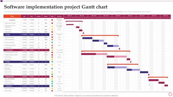
This slide represents the Gantt chart showing effective implementation of software development project. It includes details related to analysis, design, development, testing, implementation etc. of the software development project.
People who downloaded this PowerPoint presentation also viewed the following :
Software Development And Implementation Project Software Implementation Project Gantt Chart with all 6 slides:
Use our Software Development And Implementation Project Software Implementation Project Gantt Chart to effectively help you save your valuable time. They are readymade to fit into any presentation structure.


FAQs for Software Development And Implementation Project Software Implementation
So you'll need tasks listed down the left side and a timeline running across the top. Horizontal bars show when each task starts and ends - pretty straightforward stuff. Dependencies are the tricky part though (those connecting lines between tasks). I swear that's where everyone gets confused at first! Milestones should be marked as diamonds for your big deliverables. Oh, and don't forget who's assigned to what or you'll have people sitting around wondering what they're supposed to be doing. Honestly just keep your first attempt simple - my boss went overboard on our first one and nobody could read the thing.
Dude, Gantt charts are seriously worth trying. They show everything laid out visually so you can see what's happening when. Dependencies between tasks become obvious, which helps you catch problems early. Your team stays on the same page about deadlines too. Honestly, I was skeptical at first but they make communicating with higher-ups so much easier - no need to explain every little detail. Even a basic one in Excel works. The timeline format just clicks better than endless task lists. You'll probably wonder why you didn't start using them sooner.
Honestly, the biggest mistake is overcomplicating everything. You'll go crazy trying to map every little subtask - trust me, it just turns into unreadable mess. Stick to major milestones instead. Don't make dependencies too rigid either because when stuff shifts (and it always does), your whole chart becomes pointless. Oh, and actually update the damn thing regularly! I've seen so many beautiful Gantt charts that just sit there collecting digital dust. Start simple, build in extra time for inevitable delays. It should grow with your project, not against it.
Yeah, most Gantt tools nowadays connect with pretty much everything. Check your platform's native integrations first - Asana, Monday, Smartsheet all hook up with Slack, Excel, Toggl, that kind of stuff. The data flows both ways too, so your CRM updates can automatically shift your project timelines. I've been surprised how smooth these connections have gotten lately. Way better than the clunky exports we used to deal with. If you need something weird that doesn't have a direct link, Zapier usually fills the gaps. Start simple though - pick like two integrations max or you'll drive yourself crazy managing all the moving parts.
So Gantt charts are basically all about that visual timeline thing - you get those bars that show exactly when stuff starts and ends. What's cool is you can instantly see dependencies, like how you obviously can't launch until testing is done. Other project tools like kanban boards are more about workflow, but Gantt charts? They're obsessed with time. You can spot scheduling conflicts way easier and actually show progress against deadlines. Honestly, if you're dealing with stakeholders who want to know "when will this be finished," nothing beats a Gantt chart for that conversation.
Honestly, I always start by guessing how long stuff will take, then basically double it lol. Things ALWAYS take way longer than you think. Figure out what has to happen before other things can start - that dependency stuff is crucial. I know it sounds backwards, but I like working from the deadline and going in reverse. Really shows you if you're being realistic or just wishful thinking. Don't forget weekends exist, people take sick days, and nobody's firing on all cylinders 24/7. I'd throw in at least 20% extra time for random disasters.
So here's the thing about dependency mapping - it's what turns your Gantt chart from a useless pretty picture into something that actually works. You map out which tasks need others done first, then boom - you can see where things might get stuck. Otherwise you're just throwing dates around hoping they stick (spoiler: they won't). The cool part is it shows your critical path, so you'll know which delays actually matter vs. ones where you've got breathing room. I'd start with the absolute must-happen-in-order stuff first. Then worry about everything else after.
So I used to think Gantt charts and agile were enemies, but turns out you can totally make them work together. Just ditch the rigid timeline thing. Map out your sprints and big milestones instead of getting stuck in detailed task weirdness. Honestly, stakeholders love seeing the visual roadmap - it's way easier than explaining scrum ceremonies for the hundredth time. Keep everything at the epic level, not individual stories. After each retro, update based on what you actually learned. Sprint boundaries and team dependencies are your focus. You'll get that timeline view without becoming a waterfall zombie.
After you finish a project, pull up that Gantt chart again - it's like a treasure map of what went wrong. Tasks that blew past deadlines? Those show where you're bad at estimating. Dependencies that created chaos reveal your real bottlenecks. I swear, seeing it all laid out makes the problems so obvious. Which team members or task types keep screwing up your timeline? Those are your critical path killers. Also check who was drowning in work while others sat around. Next time, pad your estimates for the problem areas and actually plan for the stuff that always goes sideways.
It really depends on what kind of project you're dealing with. Software stuff? Break it down by sprints or dev phases. Construction is more like permits → foundation → framing, that whole sequential thing. Marketing campaigns are tricky - I usually go by channel or campaign stages, but honestly that's just me. The trick is making your breakdown match how work actually happens in your field. Short projects need days, longer ones work better with weeks or months. Start with your big deliverables first, then figure out what specific tasks and dependencies will get you there.
Honestly? Update that thing every week, or at least every two weeks if you're swamped. I've watched so many people build these beautiful charts then completely abandon them - such a waste! Track your actual progress against what you planned. When tasks take longer than expected (and they will), adjust the timelines realistically. Dependencies are tricky too - one delay can mess up everything downstream. Mark off completed milestones and shift future deadlines accordingly. Your stakeholders need to know about changes right away, not three weeks later. Pick a consistent schedule for updates and actually stick to it, even during crunch time.
Dude, collaborative Gantt charts are a lifesaver! Your team can update stuff in real-time instead of that endless email back-and-forth about project status. When deadlines change, boom - instant notifications. Everyone sees the same version, so no more "wait, which file are we even looking at?" People can comment right on tasks, and multiple team members won't accidentally overwrite each other's work. The best part? Accountability happens naturally since it's super obvious who's doing what and when. Oh, and definitely set up proper edit permissions first - learned that one the hard way when too many cooks spoiled the broth, if you know what I mean.
Honestly, Gantt charts are like project storytelling made visual. Instead of boring status reports nobody reads, you can literally point at the timeline and go "we're here, this is why I need your feedback by Friday." Non-technical people actually get it - they can see how everything connects without drowning in details. The best part? You'll spot problems early. Dependencies, bottlenecks, delays that could blow up later - it's all right there. I use them in every meeting now. Way easier than explaining project flows from scratch each time.
Oh man, there are so many good ones! Microsoft Project is solid if your company already pays for it, but it's honestly way too much for most stuff. Asana and Monday.com are way easier to use - both have the drag-and-drop thing going on. Smartsheet's pretty decent too. For free options, GanttProject gets the job done for basic stuff. TeamGantt and Wrike are somewhere in the middle price-wise and their mobile apps don't suck. Honestly though? I'd just check what project management tools you're already using first. Most of them threw in Gantt features over the past few years anyway.
Honestly, the visual stuff is what'll make or break your Gantt chart. I've sat through way too many meetings where everyone's squinting at terrible charts - don't be that person! Pick maybe 3-4 colors max and actually stick with them. Make your text big enough so people can read it from across the room. Spacing between tasks matters more than you'd think. Oh, and good contrast saves everyone's eyes - nobody wants to strain reading light gray text on white backgrounds. Clear gridlines help people track dates without getting lost in the mess.
-
One-stop solution for all presentation needs. Great products with easy customization.
-
My team has been relying on SlideTeam’s professional PPT designs for a while now. It has greatly sped up quality work at my organization. So thanks!