


Gantt Chart For Project Software Development Planning




Try Before you Buy Download Free Sample Product
 Impress Your
 Audience
 100%
100% Editable
 Save Hours
 of Time


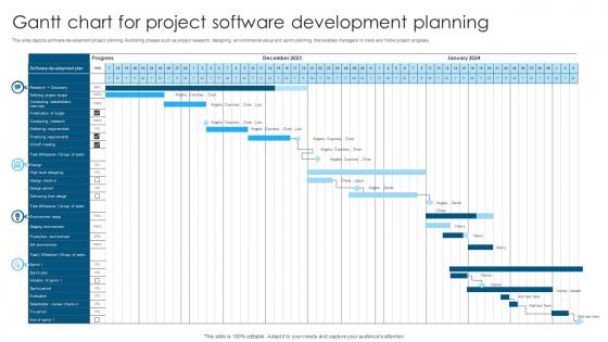
This slide depicts software development project planning illustrating phases such as project research, designing, environmental setup and sprint planning that enables managers to track and follow project progress.
People who downloaded this PowerPoint presentation also viewed the following :
Gantt Chart For Project Software Development Planning with all 6 slides:
Use our Gantt Chart For Project Software Development Planning to effectively help you save your valuable time. They are readymade to fit into any presentation structure.





FAQs for Gantt Chart For Project
So there's task bars, timeline, dependencies, and milestones - super straightforward once you mess around with it. Those horizontal bars basically show how long stuff takes and when it's happening. Dependencies are clutch because they show you which tasks are stuck waiting for others to wrap up. Your timeline keeps everyone on the same page about deadlines, and milestones are like your big project wins. I'd definitely map out your critical path first though - that's where any delays will really screw you over. The whole visual thing makes it way easier to catch problems early and spot bottlenecks before they blow up.
First thing - fix the timeline to match how long your project actually takes. Then swap out their generic tasks for your real deliverables and milestones. Add columns for whoever's doing what, priority stuff, budget if you need it. Color coding is clutch here - map it to your workflow or different teams so people can scan it fast. Honestly, templates always look way more complicated than they need to be at first. I'd say start basic and build it up once everyone's used to checking it. The whole point is making status updates obvious at a glance.
Honestly, Gantt charts are a game changer compared to spreadsheets or random task lists. You see everything at once - timeline, who's doing what, which tasks depend on others. I was drowning in Excel before this, trying to figure out overlapping deadlines was brutal. Now I catch scheduling problems way before they blow up. Your stakeholders will actually get what's happening when you show them the visual timeline instead of some confusing list. Oh and updating progress is so much simpler since you immediately see how one delay screws with everything else. Start small - pick one project to test it out first.
Gantt charts are honestly a game-changer because they turn messy project timelines into something visual that makes sense. When you're in meetings, people can actually see what depends on what and where things might get stuck - way better than trying to explain it verbally. I love how you can just point at the chart when someone asks about deadlines instead of launching into some complicated explanation about task dependencies. Even non-technical folks get it right away. The timeline format catches scheduling conflicts that you'd totally miss otherwise. Definitely throw your Gantt chart up on screen during every status meeting - it'll make discussions so much clearer.
Yeah so Microsoft Project is still the heavyweight champion, but it's way too much unless you're managing like massive construction projects or something. Asana's pretty solid for most teams - super clean interface. Monday.com and Smartsheet are good too if you want decent Gantt charts without the headache. Already using Google stuff? TeamGantt plays nice with that ecosystem. Notion's Gantt views have gotten better lately, which is cool since you can dump everything there. Honestly though? Just pick whatever your team won't complain about using, then switch later if it sucks.
For sure! Tons of teams do this actually. The key is keeping your Gantt charts short - like one sprint at a time instead of planning months ahead. Some people use them just for tracking dependencies or high-level roadmaps while doing daily stuff on their regular boards. My old team loved this approach. Don't get too attached to the timeline though - you still need room to pivot when things change. It's way more flexible than old-school waterfall but gives you that visual timeline if stakeholders are bugging you for dates.
Start with your critical path - that's your backbone. Then use different colors for overlapping tasks so you don't go crazy trying to read it. Most tools automatically adjust timelines when you drag stuff around, which honestly saves so much headache. Connect dependencies with arrows but don't go overboard - I've seen people create these insane webs that are impossible to follow. Break big overlapping tasks into smaller pieces if they can't actually run at the same time. The finish-to-start relationships are usually your best friend here.
Diamond shapes work great for milestones - way better than trying to hack regular task bars. Most Gantt tools have this built in already, which honestly saves so much time. Put them at zero duration on big moments like kickoff, deliverables, approvals. Keep labels short but clear - "Design Review Complete" beats just "Review." Use bright colors that pop against your other bars. Nobody wants to squint looking for tiny gray diamonds! Also throw them in your legend so people aren't confused about what those shapes mean when they're scanning through.
Weekly updates work for most projects, but honestly it really depends on how crazy things get. Fast-moving stuff? Update every couple days, maybe even daily when you're in crunch mode. The trick is updating when actual changes happen - new deadlines, shifted dependencies, resource changes. Don't just update because it's Tuesday or whatever. Longer-term projects can totally get away with weekly check-ins during team meetings. But seriously, don't let that thing sit there for weeks getting completely out of sync. I've seen too many dead Gantt charts that nobody trusts anymore. Pick a schedule and actually stick to it.
Honestly, the two biggest traps are overcomplicating everything and being way too optimistic about timing. Don't stuff every little task in there - it gets messy quick. Dependencies are huge too (learned that one the hard way last year). Give yourself buffer time because stuff always takes longer than you think. Short sentences work better than long ones. Oh, and actually update the thing regularly - I've seen too many abandoned charts that still show everything as "green" from months ago. Start basic, then add more detail if you really need it.
Just update the completion percentages right on your Gantt chart - shows you what's done and what's lagging behind. Most tools let you compare actual vs planned timelines, which is honestly a lifesaver for catching delays early. You can even throw budget burn rates or resource stuff right onto the timeline view. Way better than digging through endless spreadsheets (been there, done that). The visual part makes explaining things to your boss so much easier too. I'd say update it weekly and focus on the critical path view - those are the tasks that'll totally mess up your timeline if they slip.
Dude, colors are seriously a lifesaver for Gantt charts. Without them you're just staring at this confusing mess of black lines trying to figure out what belongs to who. I like using different colors for each team or project, then maybe red for urgent stuff, green for completed tasks - you get the idea. Progress bars and those little milestone diamonds make it super easy to see how things are actually going. Just don't go crazy with like 15 different colors or it'll hurt your eyes. Stick to maybe 5-6 max. Trust me, once you start color-coding everything becomes way clearer.
Honestly, the biggest thing that helped me was keeping tasks super high-level instead of mapping out every little detail. When stuff goes wrong (which it always does), you won't have to redo everything. I always add buffer time between the big milestones now - learned that one the hard way lol. Get software where you can just drag tasks around instead of redrawing the whole thing. Weekly updates are clutch too, don't treat it like it's permanent. Your first version will definitely suck, but that's fine. Just start tweaking it this week and you'll see how much smoother everything gets.
Honestly, less is more with Gantt charts - focus on the big stuff your audience actually cares about. I've watched people completely lose rooms with charts that look like someone threw up a rainbow of tasks everywhere. Colors should mean something (progress, delays, priorities), not just be pretty. Walk through everything chronologically and explain why Task A has to finish before Task B starts. Oh, and definitely prep for the inevitable "what happens if we're late?" questions. Having a couple backup scenarios ready makes you look like you actually know what you're doing instead of just winging it.
Oh totally! Gantt charts are perfect for remote teams since everyone sees the same project view no matter where they're working from. Tools like Asana or Monday sync everything automatically, so you're not constantly chasing people for updates. The visual timeline thing is honestly a game-changer - no more endless Slack messages asking "wait, what's the deadline again?" You can spot dependencies and see how your delays might mess up someone else's work. Only downside is people actually have to update their stuff regularly. Otherwise you're staring at useless old data that tells you nothing.
-
Like always a great experience with you guys. Always there on the drop of hat to help.
-
I am glad to have come across Slideteam. I was searching for some unique presentations and templates for my business. There are a lot of alternatives available here.