

Guy kawasaki 10 20 30 rule pitch deck template powerpoint presentation slides





Try Before you Buy Download Free Sample Product
 Impress Your
 Audience
 100%
100% Editable
 Save Hours
 of Time


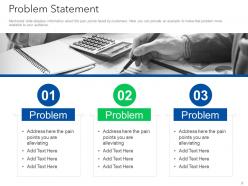
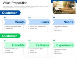
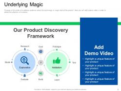
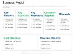
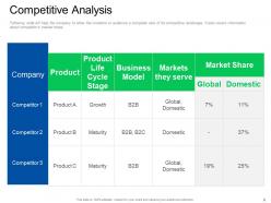
Introducing our Guy Kawasaki 10-20-30 rule pitch deck template PowerPoint presentation slides. Pitch the efficiency of your company to your audience with help of our elevator investment PowerPoint deck. Utilization of this sponsorship assistance PPT theme addresses the problems that the customers of the company deal with. This ready-made investor finance pitch PowerPoint design contains a slide that elaborates on the needs, wants, benefits, and experiences of the customer in detail. Deploying this pitchbook assistance PPT layout will help you in laying out the product discovery framework. Incorporating this particular corporate investment PPT theme allows you to display the business model with a description of key resources. Use of this Guy Kawasaki support elevation PowerPoint creative set contains a slide that displays the cost structure and business stream for the new business model. Selection of this investor promotion PowerPoint template provides you with a slide that visually gives a competitive analysis of the new product. Choose this elevator pitchbook PowerPoint design to showcase organization and assurance. Download this PPT slide to explore true perfection.
People who downloaded this PowerPoint presentation also viewed the following :
Guy kawasaki 10 20 30 rule pitch deck template powerpoint presentation slides with all 23 slides:
Use our Guy Kawasaki 10 20 30 Rule Pitch Deck Template Powerpoint Presentation Slides to effectively help you save your valuable time. They are readymade to fit into any presentation structure.






FAQs for Guy kawasaki 10 20 30 rule pitch deck template
Honestly, stick to 10-12 slides max. Hit the big stuff - problem, solution, market size, your business model, any traction you've got, competition, team, financials, and what you're asking for. Lead with the problem hard. Make investors actually feel it, you know? Way too many founders mess this up by being all wishy-washy. Solution needs to be super clear after that. Then show your market data and prove people actually want this thing. Oh, and don't sleep on the team slide - investors bet on people, not just ideas. One focused point per slide. Practice the whole thing in under 10 minutes or you'll lose them.
Honestly, who you're pitching to changes everything. VCs want clean slides packed with data - financial projections, market size, all that stuff. But if you're doing a customer demo? Focus on the actual problem and make it visual with real scenarios people can relate to. Board meetings are different again - they want strategic overviews and performance metrics (boring but necessary). Research who'll be in the room first though - that's huge. Match your language and what you emphasize to what they actually care about. Don't waste time on features when they want to see revenue numbers, you know?
Dude, the worst thing you can do is cram your slides with walls of text - nobody reads that crap. Start with the problem you're solving, not all your fancy features. I've seen so many pitches where they jump straight into technical specs before explaining why I should even care. Your financials better be realistic too, because investors can spot fake numbers instantly. Tell an actual story about the market opportunity and what traction you've already got. Oh, and seriously practice your timing - going over makes you look like you don't have your shit together.
Honestly, most pitch decks are boring as hell - just charts and bullet points that investors forget the second they close their laptops. You need to tell an actual story instead. Start with a real problem your customer is dealing with, show how your solution fixes it, then paint the picture of what happens next. Think of it like a movie: problem (beginning), your product swooping in (middle), happy ending (results). I always tell people to use real customer examples because that's what makes investors actually *feel* something about your idea. Data's great, but emotion is what gets them to write checks. Trust me on this one.
Focus on metrics that actually show you're gaining traction - revenue if you have it, user growth, how many people use your product weekly/monthly. Customer acquisition cost and lifetime value matter too. Retention rates are honestly where you can really impress investors. Shows people don't just try your product once and bail. Don't overwhelm them with every single number you track though. Pick maybe 3-5 of your strongest ones that tell a clear growth story. Whatever you show, be ready to explain what's driving those numbers and how they tie back to making money. That's what they really care about anyway.
Dude, visual design can totally make or break your pitch deck. I've watched investors mentally check out the second they see slides that look like they're from 2003 - it's brutal. Clean, professional design shows you sweat the details and actually care about your business. You don't need anything crazy fancy, but keep it consistent and readable. Stick to simple fonts, give your content room to breathe with white space, and maybe 2-3 colors tops. Honestly, just grab a decent template if design isn't your thing. Way better than winging it and looking amateur.
Dude, you gotta do your homework on each investor first. VCs are all about massive scale and market size. Angels? They're more interested in your team and whether you actually understand the problem you're solving. Family offices think way longer-term and want to see real traction already. It's basically like dating - you wouldn't pitch the same person to your mom and your college buddy, right? Switch up your case studies, highlight whatever metrics they actually care about. Also adjust your timeline projections to match how they typically invest. Oh, and definitely stalk their portfolio companies first to see what gets them excited.
Get straight to the point - slide 2 or 3 max. One clear sentence: here's the problem we solve and who we solve it for. Skip the "revolutionary solution" BS that makes investors roll their eyes. I've seen way too many decks that just meander around the actual value. Use real numbers, not fluff. What specific pain are they dealing with? Show how you fix it, then make it feel personal to their situation. Actually, test this on someone outside your company first - if they're confused after 10 seconds, you need to simplify. Your audience shouldn't have to work to understand why they need you.
Okay so market research is basically what holds your whole pitch together. Without it, investors will tear apart your assumptions in like two seconds. You need solid data to prove there's actually demand for your product and show you understand who you're competing against. Plus it helps with realistic market sizing - nobody wants to hear made-up numbers. Honestly, I'd start collecting this stuff early because it's gonna influence pretty much every slide in your deck. The research also makes your messaging way stronger and proves you actually know what you're talking about instead of just winging it.
Shoot for 10-12 minutes max. I know that sounds short, but trust me - investors' attention spans are brutal these days. Keep your deck to like 10-15 slides tops. The real magic happens in Q&A anyway, so don't eat up all your time with the presentation part. Practice at home with a timer (yeah, it feels weird but whatever). You want to wrap up with at least 5-10 minutes left for questions. That's where you'll actually win them over. Oh and definitely prepare for anything between 5-20 minutes depending on the venue. Some places are super rushed, others give you more breathing room.
Dude, check out Airbnb's Series A deck - they pulled in $7.2M and it's basically perfect. Clean design, nails the problem-solution thing, shows crazy market potential without trying too hard. Uber's seed deck is solid too. Buffer went full transparency mode and you can still find theirs online, which is pretty cool. LinkedIn's Series B focuses hard on metrics if that's more your vibe. Most of these are public now so you can actually study them. Pay attention to how they structure the flow and present numbers - way more helpful than generic advice.
Honestly, treat it like you're telling a story. Go heavy on visuals, light on text - nobody wants to read paragraphs off your slides. I always structure mine with a problem-solution flow that actually makes sense. Practice your timing though! You don't want to rush or drag. Oh, and throw in one stat that'll make people go "wait, really?" - those moments are gold. The biggest thing? Rehearse out loud. Like, actually say the words. You'll catch all the weird transitions and "um"s before it matters. End each section cleanly so you're not losing people between topics.
Honestly, less is more with slides. One main point per slide, maybe a solid visual or chart - but skip the text walls because nobody reads those anyway. Make your fonts big enough so people in the back can actually see (learned this the hard way). Don't just read everything out loud either, that's awkward for everyone. Your slides should back up what you're saying, not say it for you. Oh and practice moving between slides so you're not fumbling around. The goal is telling your story well, not cramming everything onto PowerPoint.
Honestly, I'd update it every 3-6 months or whenever something big happens - new funding, revenue jumps, major pivots, whatever. I cringe when I see founders pitching with year-old decks that have completely stale numbers. Your deck needs to show where you are now, not ancient history. What I do is keep one master version that gets updated regularly, then I tweak specific slides for different investors. Oh, and set a quarterly calendar reminder to review it even if nothing's changed - sounds nerdy but it works. Fresh metrics make you look like you actually know what's happening with your business.
Just use PowerPoint or Google Slides honestly - they're solid and you won't spend forever figuring them out. Keynote's pretty nice if you're on Mac. Canva has crazy good templates but yeah, half the startup world uses the same ones now lol. You could try Figma for something different, or Prezi if you want those swooshy transitions (though some investors find that annoying). But real talk? The tool doesn't matter nearly as much as your actual story. Pick whatever feels comfortable and spend your energy on the content instead.
-
Very unique, user-friendly presentation interface.
-
Nice and innovative design.
-
Easily Understandable slides.
-
Awesome presentation, really professional and easy to edit.
-
Designs have enough space to add content.
-
The Designed Graphic are very professional and classic.
-
Very well designed and informative templates.
-
Graphics are very appealing to eyes.