


Product slide pitch deck ppt template




Try Before you Buy Download Free Sample Product
 Impress Your
 Audience
 100%
100% Editable
 Save Hours
 of Time


Product is an economic good and equally valuable for the market with no regard to who produced them. It carries the center for all the marketing activities and is considered vital for market success. It is something that is bought or sold and requires marketing. Here is a professionally designed template on the Product Slide that will combine all the functions of the sales and marketing teams for you. The template highlights the critical points for the awareness, such as the problems and the solutions for each. Businesses can showcase the products provided by them and the crucial objective for this whole product. You can even display the results using line charts and column charts for sales and revenue and fulfill the new marketing plan designs criteria. The proposal exhibits the ideas, financials, and roadmap for the target market, also the critical strategies in combination with product marketing. The monthly timeline presents the picture for each task and the investment details for every phase. One can showcase their company, clients values, and information related to target prospects. Book a free demo and talk to our experts and access the markets best template on the Product Slide. Download the template now.
People who downloaded this PowerPoint presentation also viewed the following :
Content of this Powerpoint Presentation
Slide 1: This is the cover slide of Product Slide Pitch Deck.
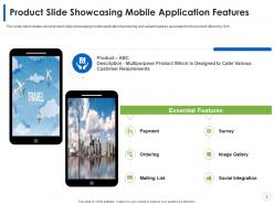
Slide 2: This slide caters details about product slide showcasing mobile application functioning and salient features associated to the product offered by firm.
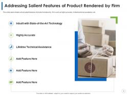
Slide 3: This slide caters details about salient features of product rendered by firm such as highly accurate, limited technical assistance, etc.
Slide 4: This slide caters details about comparison between free and premium subscription membership associated to product rendered by firm and comparing both memberships on several features.
Slide 5: This slide caters details about various products offered by firm in terms of hardware devices and services.
Slide 6: This slide caters details about different product comparison on various parameters.
Slide 7: This slide caters details about competitive landscape of products rendered by different competitors and assessing the products on various features.
Slide 8: This slide caters details about product management canvas for product rendered by firm including details about idea, market, business value, features, metrics, etc.
Slide 9: This slide caters details about competitive advantage of product rendered by firm including factors of competition and product’s competitive advantage.
Slide 10: This slide caters details about strategies positioning of firm’s product as compared to competitors by assessing it parameters such as level of expensive and ease to use.
Slide 11: This slide caters details about explosive growth of product rendered by firm with successful integrations with third parties, high usage of product by clients, etc.
Slide 12: This slide caters details about customer value proposition of software platform emphasizing on collaborative communication.
Slide 13: This slide caters details about impressive performance metrics of product solution rendered by firm with ARR growth, quarterly revenue cohorts, user cohorts.
Slide 14: This slide caters details about product demonstration depicting product’s functionality over desktop and mobile platform.
Slide 15: This slide caters details about product demonstration showcasing user interface accessibility through different steps.
Slide 16: This is an Icon Slide. Use it as per your needs.
Slide 17: This is an Additional Slides.
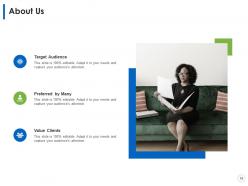
Slide 18: This is an About Us slide. State company/team specifications etc. here.
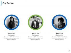
Slide 19: This is Our Team slide with name and designation to fill.
Slide 20: This is Our Mission Our Vision slide to state your mission, vision etc.
Slide 21: This is GOALS slide. State your goals, aspirations etc. here.
Slide 22: This is a Bar Chart slide that can be used to compare different products.
Slide 23: This is a Line Chart slide that can be used to conduct comparative analysis between different elements.
Slide 24: This is a Post It Notes slide that can be used keep important data at one place.
Slide 25: This is a RoadMap slide that can be used to present chronological sequence of events.
Slide 26: This is a creative Puzzle image slide to state information, specifications etc.
Slide 27: This is a Timeline slide that can be used to showcase series of events.
Slide 28: This is Thank You slide for acknowledgment. You can share your contact details here.
Product slide pitch deck ppt template with all 28 slides:
Use our Product Slide Pitch Deck Ppt Template to effectively help you save your valuable time. They are readymade to fit into any presentation structure.
-
Product Slide Pitch Deck
-
Product Slide Showcasing Mobile Application Features
-
Addressing Salient Features of Product Rendered by Firm
-
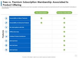
Free vs Premium Subscription Membership Associated to Product Offering
-
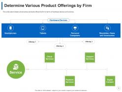
Determine Various Product Offerings by Firm
-
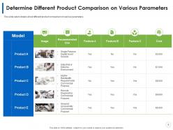
Determine Different Product Comparison on Various Parameters
-
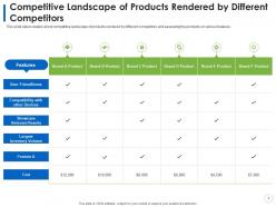
Competitive Landscape of Products Rendered by Different Competitors
-
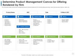
Determine Product Management Canvas for Offering Rendered by Firm
-
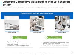
Determine Competitive Advantage of Product Rendered by Firm
-
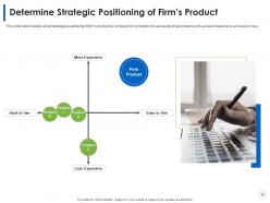
Determine Strategic Positioning of Firm s Product
-
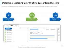
Determine Explosive Growth of Product Offered by Firm
-
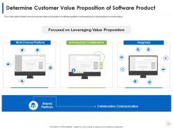
Determine Customer Value Proposition of Software Product
-
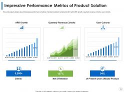
Impressive Performance Metrics of Product Solution
-
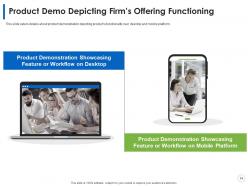
Product Demo Depicting Firm s Offering Functioning
-
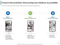
Product Demonstration Showcasing User Interface Accessibility
-
Icons Slide for Product Slide Pitch Deck
-
Additional Slides
-
About Us
-
Our Team
-
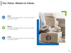
Our Vision Mission Values
-
Our Goal
-
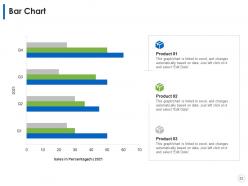
Bar Chart
-
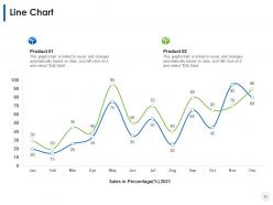
Line Chart
-
Post It Notes
-
RoadMap
-
Puzzle
-
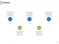
Timeline
-
Thank You
FAQs for Product slide pitch
So for your pitch deck, you'll definitely need the basics: problem, solution, market size, business model, traction, team, financials, and your funding ask. Honestly, if you nail the problem and solution slides, you're already ahead of most decks I've seen. Competition analysis matters too - don't skip that. Go-to-market strategy is huge. Keep it clean though, like one main point per slide. Most people cram way too much info on each slide and it looks messy. Shoot for 10-12 slides total. Oh, and your title slide better have a solid one-liner that actually explains what you do. Build everything else around that story.
Honestly, design can make or break your pitch. Clean slides with consistent fonts and smart color choices keep investors focused on what matters. Messy layouts? Total credibility killer - I've watched solid startups bomb because their slides looked like a middle schooler made them. You want that Apple keynote vibe, not some boring corporate deck. One key point per slide works best. Oh, and visuals should back up your story, not tell it for you. Professional doesn't have to mean soulless, you know?
Ugh, biggest thing? Text-heavy slides are death - nobody's reading that mess. One point per slide, seriously. Cut the startup buzzword BS too, it's so cringe. Your problem better actually matter, and please don't inflate your market size with made-up numbers. I swear half these decks sound identical. Always end with what you want - specific funding amount, partnership, whatever. And time yourself! You don't want to rush through the good parts because you spent forever on intro slides. Oh, also practice not reading directly off them.
Dude, your audience is literally everything when it comes to pitch decks. VCs want to see huge market potential and those sweet financial projections - keep it clean and data-heavy. But customers? They care more about how you're solving their actual problems, so go heavy on visuals and demos. I totally bombed once using the same deck for both - learned that lesson real quick lol. The whole vibe changes too - different language, metrics, even colors that'll click with each group. Before you even open PowerPoint (or whatever), just think about what that specific room actually gives a shit about. Makes all the difference.
Honestly? Stick to 10-12 slides max. I've sat through way too many pitch decks that just drone on forever - people's eyes glaze over after slide 15, trust me. Hit the basics: problem, solution, market size, your team, money stuff. But don't try cramming your whole life story onto slides. Think of them more like conversation starters than novel chapters. One big point per slide, visuals beat bullet points every time. Practice getting through it in maybe 8-10 minutes so you've got time for actual back-and-forth. That's where the real magic happens anyway.
Show trends that actually back up your pitch, don't just throw numbers around. Clean charts are everything - bar graphs, line charts, stuff investors get instantly. I've watched so many founders bomb because they went overboard with fancy visuals. Keep it to 2-3 data points per slide, colors that match, and always add a sentence explaining what it means for your business. Short sentences work. The whole point is making your data prove why you're worth betting on, not confusing people with spreadsheet hell. Make it tell your story instead of burying it.
Think of your pitch like telling a story - problem is the villain, your solution swoops in to save everyone. Start with emotion, not spreadsheets. Investors are human first, calculators second. I've seen too many founders just dump stats everywhere instead of sharing actual customer stories that hit you in the feels. The whole problem-agitation-solution thing works, but make it personal. Paint the before and after picture - show how your customers' lives actually change. Short version: best pitches feel like great stories that happen to have killer business numbers tucked inside.
First thing - swap out their colors, fonts, and images with your actual brand stuff. Makes a huge difference. Then ditch any slides that don't tell your story (honestly, most templates have way too much filler anyway). The content sections need to showcase what makes YOU different, not some generic placeholder garbage. Rearrange everything so it flows like you'd naturally explain your business to someone. And please inject your actual personality into the copy! Investors want to see the real person behind the pitch, not some corporate robot.
Honestly, color psychology matters way more than you'd think for pitch decks. Blue screams trustworthy (especially for fintech stuff), green feels stable and growth-focused. Red grabs attention but can come off aggressive - probably skip it unless you're disrupting something major. Orange is cool for innovation but might be too casual for stuffy VCs. Don't overthink it though! I've watched founders spend hours debating navy vs royal blue when their content was still rough. Keep it simple - 2-3 colors tops, make sure text is actually readable, and definitely test it on a crappy laptop screen first. Your brand should feel consistent but not scream "I hired a designer on Fiverr."
Yeah, definitely include financial projections - investors will expect them and it proves you're not just winging it. Charts work way better than spreadsheets (nobody wants to decode tiny numbers). Show your main stuff: revenue, user growth, burn rate for like 3-5 years. Don't go crazy with unrealistic hockey stick growth though - makes you look amateur. One slide with the big picture numbers should work, maybe keep a detailed backup slide just in case. Oh and make sure you actually understand your own assumptions because they'll definitely ask about those.
Okay so definitely put your call to action on that last slide - and be super direct about what you actually want. Meeting? Specific dollar amount? Partnership chat? Don't make them play guessing games lol. I've watched so many pitch decks just... end. Like they forgot to ask for anything. Make it feel natural but you've gotta ask for something concrete. Throw your contact info right there too. Honestly, investors are busy as hell so if they're interested, you want zero friction between "yes this sounds cool" and them actually reaching out to you.
Look, you gotta actually *listen* when people give feedback, not just sit there planning what to say next. After each pitch, get specific - ask "which slide lost you?" instead of the generic "any thoughts?" You'll notice patterns pretty quick. Maybe your market size confuses everyone or the demo drags on forever. Here's the thing though - don't get defensive about your current version. Just fix what's broken and test it again. Honestly, the deck that actually gets you funded? It'll probably look completely different from whatever you started with. That's normal.
Yeah, you can totally throw videos, audio clips, animations, and interactive charts right into your deck. PowerPoint, Google Slides, Canva - they all handle this stuff pretty well. Videos are perfect for product demos or testimonials. Animated transitions help highlight data points (just don't go overboard - nobody needs a rave presentation). Audio clips can really punch up certain moments. Interactive elements are cool too - investors can actually click through your product mockups or financials themselves. Oh, and definitely test everything first! Nothing kills momentum like broken media during your actual pitch.
Honestly, your opening slide matters most - if it's boring, you've already lost them. I'd go with the problem-solution-market flow since it just works. Don't cram a million things onto each slide though, one main point per slide. The story should flow naturally between slides, not feel like random facts thrown together. Time yourself practicing - I always rush the money stuff when I'm nervous. Your closing needs a specific ask, not some vague "let's chat soon" thing. Oh and definitely practice out loud at least three times. Trust me on this one.
Yeah, totally! Just swap out the slides that don't fit your industry. Tech startups should hammer home scalability and user growth - that's what VCs want to see. B2B companies need different stuff though, like market size data and CAC numbers. Healthcare? You'll need those boring regulatory slides that fintech can skip entirely. The basic pitch structure stays the same (problem, solution, market, blah blah), but your content needs to match what investors in your space actually care about. Oh, and definitely look up successful pitches from companies like yours first - saves you from guessing what works.
-
Appreciate the research and its presentable format.
-
Topic best represented with attractive design.