


Healthcare pitch deck abc medical company business model canvas ppt powerpoint images





Try Before you Buy Download Free Sample Product
 Impress Your
 Audience
 100%
100% Editable
 Save Hours
 of Time


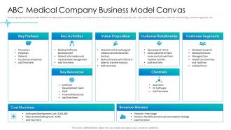
Following slide identifies the ABC Medical Company Business Model Canvas. It includes various information such as key partners, key activities, value proposition, customer relationships, customer segments, etc.
People who downloaded this PowerPoint presentation also viewed the following :
Healthcare pitch deck abc medical company business model canvas ppt powerpoint images with all 2 slides:
Use our Healthcare Pitch Deck ABC Medical Company Business Model Canvas Ppt Powerpoint Images to effectively help you save your valuable time. They are readymade to fit into any presentation structure.
FAQs for Healthcare pitch deck abc medical company business model canvas
Start with the problem you're solving and why existing solutions suck. Your team's credibility matters huge - investors want to see actual healthcare experience, not just tech bros. Show clinical data or pilot results if you have them. The business model is tricky since healthcare moves slow as molasses. Map out your regulatory path and reimbursement strategy too. Here's the thing - most health tech pitches completely ignore how hospitals and health systems actually buy stuff. They have committees, budgets, compliance headaches. Make sure your go-to-market shows you get how these decisions really happen, not just the fantasy version.
Be super specific about what problem you're actually fixing and how you're different. Don't say "better care" - say "we cut hospital readmissions by 40%." Healthcare is flooded with companies claiming they're "revolutionary," so hard numbers are what matter. Call out your competitors by name and explain why your clinical workflow actually works in real hospitals (not just in theory). I'd also throw in a solid case study at the end. The vague pitch thing just doesn't work anymore - people want proof you can deliver results.
Definitely get your market size numbers together - show them the total addressable market for your solution. Patient population stats are clutch too. Clinical trial results? Gold mine if you have them. Investors eat that stuff up because it's actual proof your thing works. Regulatory timelines, competitive analysis, health economic data - like cost savings per patient or fewer readmissions. Real-world evidence is everything honestly. Oh, and start collecting this early because it's such a pain to track down later. Stick to legit sources though - medical journals, government databases, that kind of thing.
You gotta know what each group actually wants to hear. Investors? Hit them with market size and revenue potential right off the bat - honestly they tune out if you don't show the money angle first. Doctors are totally different though, they want clinical data and patient safety stuff. I always prep two different versions of my pitch deck. Change your opening, swap which metrics you highlight, adjust the language too. Like investors eat up "market penetration" talk while healthcare folks respond better to "patient outcomes." Oh and definitely stalk your audience beforehand - LinkedIn works great for this. Makes such a difference when you customize.
Honestly, storytelling can make or break your healthcare pitch. Don't lead with boring market size slides - I've watched investors' eyes glaze over immediately. Start with a real patient story or that moment when your founder realized this problem existed. Healthcare hits people personally, so make them *feel* the problem before you throw numbers at them. Connect your story throughout the whole deck too - problem flows into solution flows into traction. The emotional hook matters way more than you'd think. Once they actually care about what you're solving, then hit them with your data. Makes such a difference.
Dude, visuals are a lifesaver when you're dealing with complex healthcare stuff. Like, nobody wants to read paragraphs about molecular pathways - that's just brutal. Flowcharts work great for patient journeys, and infographics make clinical data way less intimidating. Before/after shots? Those hit different when showing outcomes. I always do one concept per slide though, otherwise it gets messy fast. Oh, and diagrams explaining how devices work are clutch. Start with whatever's confusing people most and just sketch out some visual alternatives. Trust me, charts and graphs make everything more digestible.
Ditch the medical jargon - half your investors won't be doctors anyway. Map out your regulatory pathway clearly because that's where most healthcare startups die a slow death. Here's the thing: too many founders get stuck explaining the problem forever instead of showing why their solution beats the competition. I've seen so many pitch decks that read like journal articles, honestly. Your clinical data matters, but make it readable. Sales cycles in healthcare are brutal, so nail down your go-to-market strategy. Focus on proving you can actually make money, not just save lives.
Dude, you gotta hit them with the brutal math first. Like "5 million people deal with this shit" or "$12 billion wasted on broken solutions every year." Then explain why everything currently available is trash - patients hate it, doctors are pulling their hair out, nothing actually works. I'd definitely slip in a real patient story here because pure numbers can be kinda soulless. Show them trend data proving it's getting worse, maybe some regulatory stuff opening doors. Honestly, you want VCs walking away like "wait, why hasn't anyone fixed this obvious disaster yet?"
Look at Ro's Series A deck first - they absolutely killed the telehealth market sizing. Oscar Health's early pitch is solid too, especially their positioning against traditional insurers (design was kinda meh though). Livongo's pre-IPO deck shows how to nail the diabetes management story with actual metrics and user testimonials. Oh and they made all the regulatory stuff super digestible which is clutch. Don't straight up copy their designs, but definitely study how they framed problems and showed traction. These healthcare regulations can be a nightmare to explain to investors.
Honestly, be conservative with your numbers first - healthcare investors have seen too many crazy optimistic projections crash and burn. Break down your unit economics super clearly: what it costs to get patients, their lifetime value, reimbursement rates if that applies to you. Timeline-wise, healthcare is painfully slow (like, slower than you think), so factor in realistic windows for regulatory stuff, partnerships, all that. Back everything with real data from comparable companies or market research. Oh, and definitely show three scenarios - conservative, base case, and optimistic. Investors want to stress-test your assumptions themselves. Your projections need to tell a story about sustainable growth while handling healthcare's weird risks.
Okay so for healthcare pitches, clinical stuff comes first - patient outcomes, safety data, trial results if you've got them. Show your commercial wins next: partnerships with health systems, revenue growth, how many people are actually using it. FDA approvals and regulatory stuff are massive - honestly, investors freak out without them. Patient satisfaction scores and retention rates prove it works in real life, not just theory. Partnerships with big healthcare names help too. Just lead with whatever's your strongest number and tell the story from there. Makes it way more compelling.
Dude, don't skip the regulatory stuff in your pitch - investors will smell that from a mile away. Make a whole slide about it. Show them you actually get what's required for your specific thing, like FDA pathways or HIPAA rules or whatever applies. Map out realistic timelines and budget for compliance properly. Having someone with regulatory experience on your team or board is huge too. I swear, so many founders think they can wing this part and it backfires every time. You've got to prove you're not clueless about the hoops you'll need to jump through.
Honestly, most healthcare pitch decks are trash because they all look the same. Investors are drowning in these things, so yours better pop immediately. High-contrast colors work. Minimal text per slide is crucial. And for the love of god, ditch those awful stock photos of smiling doctors - I swear every deck has them. Show actual screenshots of your product instead. Data visualizations hit different too. One key point per slide, consistent fonts, and you're golden. Complex healthcare stuff needs to be digestible in under 10 minutes, so don't try cramming your entire business model onto three slides.
Dude, you HAVE to nail the exit strategy part. VCs are obsessed with how they'll get their money back, especially in healthcare where everything takes forever - like 7-10 years minimum. Look up similar companies in your space that got acquired or went public and mention those. You don't need to be a fortune teller, but show you've thought about who might buy you or when an IPO could happen. Honestly, strategic partnerships can work too for liquidity. The brutal truth? No clear exit path means no funding. Period.
Lead with your clinical credentials immediately - investors want to see MDs, PhDs, or serious healthcare ops experience upfront. List specific years in the industry and previous healthcare companies. This slide honestly makes or breaks your credibility before they even see the product. Don't just dump degrees though. Connect each person's background to why they're perfect for solving THIS problem specifically. Include advisory board members if they're healthcare names people recognize. Oh, and make it scannable - clear headings, company logos from past gigs. Regulatory experience is huge too if you've got it.
-
Great product with effective design. Helped a lot in our corporate presentations. Easy to edit and stunning visuals.
-
Use of different colors is good. It's simple and attractive.