

Infinity loop diagram powerpoint templates





Try Before you Buy Download Free Sample Product
 Impress Your
 Audience
 100%
100% Editable
 Save Hours
 of Time


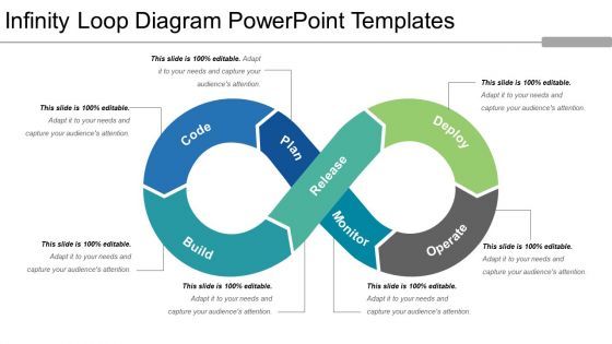
If you are looking forward for some visually attractive way of sharing your data enriched professional information, all you need is the back support of our infinity loop diagram PowerPoint template. This infinity symbol diagram for PPT presentation is enriched with impressive quality info graphics so as to easily fit into the heart and mind of its target audience. Make use of this infinity symbol flow PowerPoint presentation model to impart knowledge on processes which are never ending and vicious in nature. This infinity flow presentation PPT graphic has seven sections to it in seven color codes respectively. Sufficient space has been allocated to talk about the attribute of each section in detail. So without any further delay download this highly beneficial infinity process flow PPT presentation slide model by clicking on the download link provided here below. Infinity loop processing PowerPoint layout has all the information attached to it in slide page to execute the editing part successfully. Assist folks in finding good clues with our Infinity Loop Diagram Powerpoint Templates. It will add to the investigations.
People who downloaded this PowerPoint presentation also viewed the following :
Infinity loop diagram powerpoint templates with all 5 slides:
Use our Infinity Loop Diagram Powerpoint Templates to effectively help you save your valuable time. They are readymade to fit into any presentation structure.
FAQs for Infinity loop
You'll want clear labels for each loop section and contrasting colors so people can tell the two sides apart. Directional arrows are crucial - they show the continuous flow. Keep your text short because honestly, nobody wants to read tiny paragraphs on a diagram. Make sure there's a logical connection between your loops, like cause-and-effect or problem-solution cycles. Font size matters too - people in the back row should be able to read it. Consistent spacing throughout looks way more professional. Oh, and sketch out what goes in each loop first before you get lost in PowerPoint formatting hell.
So infinity loop diagrams are actually perfect when you need to show how stuff connects back on itself - like customer feedback cycles or how departments work together. Way better than those boring straight-line flowcharts everyone uses. They're great for agile workflows too, since you can show how outputs loop back as inputs. I've found stakeholders really get it when they see the visual - there's something about that figure-8 shape that just clicks. Plus they look pretty sleek in presentations. Definitely try one next time you're explaining how different parts of your strategy feed into each other.
Right-click any part of the diagram and hit "Format Shape" to mess with colors and effects. Colors first - that's what makes the biggest difference honestly. Click the text boxes to edit them, super easy. If you need to resize everything, select it all (Ctrl+A) then drag the corners. Oh and if you can't move stuff around individually, try ungrouping the elements first. I usually match whatever theme I'm already using in my slides since it looks way cleaner. Text and colors are really all you need to focus on initially.
Your color choices can totally make or break these diagrams. High contrast between loop segments is super important - otherwise people can't tell where one step ends and another begins. I'd go with either complementary colors or stick to one color family with different shades. Just make sure your text doesn't disappear against whatever background you pick. Oh, and definitely test it on the actual screen you'll use for presenting. I learned this the hard way when my "perfect" colors looked completely washed out on the conference room projector. Colors always look way different than they do on your laptop screen.
Oh man, infinity loops are everywhere once you notice them! Software teams love these things - perfect for showing agile sprints and how development cycles keep going. Manufacturing uses them tons for production workflows. Consulting firms are obsessed with them too, especially for process optimization stuff. Basically any industry dealing with repetitive processes instead of one-time projects will eat these up. Project management, quality control, continuous improvement - you name it. I swear every PowerPoint deck has at least one these days. If you're showing something that repeats or builds on itself, definitely throw one in there.
Honestly, infinity loops are perfect for stuff that just keeps cycling - like customer journeys, agile sprints, feedback between departments. Regular flowcharts work fine for step-by-step processes, but they get messy when things loop back continuously. I'd throw an infinity loop at continuous improvement workflows, recurring campaigns, employee development - you know, things that don't really "end." The symbol instantly shows people this process runs forever, which beats trying to draw a million arrows pointing back to step one. Way cleaner visually and gets the point across immediately.
Sequential reveals are your best bet for infinity loop animations. Each segment should fade or slide in one by one so people can actually follow the flow. I'm obsessed with entrance effects that build energy as they circle around - fade-ins work great, or try slide transitions that follow the curve. Timing's everything though. Rush it and your audience won't catch how the steps connect. Start simple with basic entrance animations for each piece. Then maybe add a slow rotation to the whole thing? That really sells the "infinite" vibe. Short answer: don't overthink it.
Don't cram tons of text in each section - looks awful and nobody can read it anyway. Make your arrows thick enough that they'll actually show up when you're presenting (learned this the hard way lol). Stick with the same colors throughout or it just looks random. Here's the thing - if you throw in more than 6-8 points total, you've basically ruined the whole flow concept. The beauty is in that clean cycle effect. Oh, and definitely check how it looks on different screens first. Trust me on this one.
Dude, infinity loops are actually clutch for showing processes that keep going - like customer journeys or feedback cycles. Way better than those boring bullet point lists everyone defaults to. The circular flow makes people follow your logic instead of spacing out halfway through. Perfect when you're explaining something that doesn't really "end," you know? I used one last week for a project timeline and it clicked way better than my original flowchart. They just feel more dynamic since everything connects back to itself. Definitely try it next time you need to show how different parts influence each other.
Oh, those infinity loops are great for improvement stuff! They show that whole plan-do-check-act cycle that never really ends. You know how with Lean or Six Sigma, you're always tweaking things? It's not like you fix something once and you're done. The loop makes that super obvious - your team tries something, sees what happens, learns from it, then goes again. I actually like using different colors for each phase (probably overthinking it but whatever). Makes the whole flow way clearer when you're presenting to people.
Yeah definitely! First thing - don't cram tons of text in there or it'll look messy as hell. Stick to maybe 4-6 points max around the loop, anything more is just overwhelming. Make sure people can actually tell which direction it flows with good arrows or whatever. I swear half the ones I see, you're just guessing where to start lol. Keep your colors and fonts consistent throughout. Oh and test if it's readable from far away before you present - learned that one the hard way. White space is your friend here, trust me.
So feedback totally changes how you build those infinity loops. People get confused? Add clearer arrows or color-code everything better. Your flow might need to go the opposite direction, or honestly, sometimes you realize one big loop should actually be like three smaller ones. Oh and test it with a few people first - I learned this the hard way. They'll point out missing steps you never thought about. Simple stuff like adding numbers helps too. The whole point is fixing the confusing parts before you present to everyone. Save yourself the awkward "wait, what?" faces during the real thing.
Oh, there's actually a bunch of good options for infinity loop diagrams! I'd probably go with Canva first - it's really user-friendly and has templates already made. Lucidchart is solid too. If you want free and don't mind something basic, Google Slides works fine (your whole team can jump in and edit at once). Draw.io and Visme are decent for simple stuff. Now if you're feeling fancy, Figma or Adobe Illustrator are amazing but honestly they're kinda overkill unless you're doing complex design work. I always end up going back to Canva though - it just makes everything look nice without much effort.
Yeah so basically use the infinity loop as your main thing, then add charts or whatever at each point to back up your steps. I've definitely seen people throw way too much stuff on there and it just looks messy - don't be that person lol. What works better is animating the loop first, then bringing in your bullet points or images as you go through each part. Oh and group similar stuff together so it doesn't feel all over the place. The main thing is making sure everything actually supports the loop instead of fighting with it for attention.
Keep your labels super short - like 2-4 words tops. Nobody wants to squint at tiny text trying to figure out what each section means. I usually put labels inside the loop curves when there's space, but outside with clean lines works too. Just stay consistent with font sizes and make sure the colors actually pop against your background. The whole point of an infinity loop is showing that continuous flow, right? So your labels should reflect that - "Plan → Execute" or whatever makes sense for your process. Don't cram everything into the diagram itself. Save the detailed explanations for bullet points underneath.
-
Perfect template with attractive color combination.
-
Informative presentations that are easily editable.