


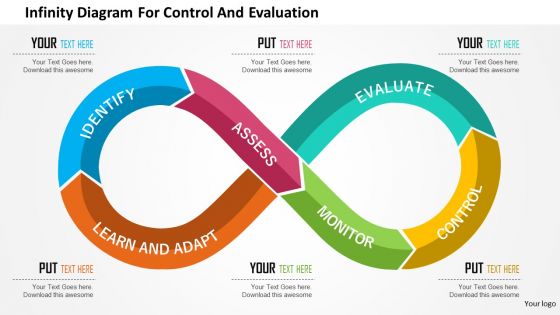
Infinity diagram for control and evaluation flat powerpoint design




Try Before you Buy Download Free Sample Product
 Impress Your
 Audience
 100%
100% Editable
 Save Hours
 of Time


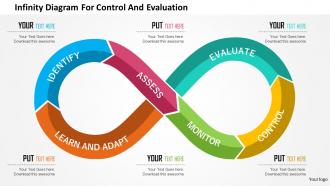
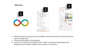
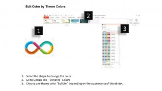
Download infinity diagram for control and evaluation flat PowerPoint design to highlight the concept of managing business process. The Presentation template showing the graphic of infinity spiral diagram with some key points that assist to manage the commerce in the organized manner. This PPT slide shows aspects such as identify, learn and adapt, assess, monitor, control and evaluate. Managing the business is not an easy task you are required to ensure its smooth functioning. Our innovatively designed PowerPoint diagram gives you the access to present the information related to this important to your audience and make them aware of the measures that are required in the business success. The PPT layout is totally editable and this enables you to edit and present it as per your preference. Besides this, there is enough space provided for adding text that you want to show to your audience. So, download and then insert it in your presentation. Check other PowerPoint slides as well that are crafted as per the business need. Make them so with Infinity Diagram For Control And Evaluation Flat Powerpoint Design for every design need.
People who downloaded this PowerPoint presentation also viewed the following :
Infinity diagram for control and evaluation flat powerpoint design with all 5 slides:
Our Infinity Diagram For Control And Evaluation Flat Powerpoint Design can be excellent game-changers. Add another dimension to your efforts.
FAQs for Infinity diagram for control and evaluation
Hey! So infinity diagrams are perfect for showing how two things feed into each other constantly - like A affects B, then B circles back to affect A again. Business folks love them because they look way cleaner than those messy flowcharts with arrows going everywhere. Picture customer satisfaction boosting loyalty, which then creates even more satisfaction, and the cycle keeps going. Honestly, they're just easier for people to understand at a glance. Next time you've got any feedback loop or mutually reinforcing stuff to explain, definitely try one instead of regular flowcharts.
Oh man, these are actually super useful! So instead of those rigid step-by-step flowcharts, infinity diagrams show how things loop back and connect continuously. Perfect for stuff like customer journeys or feedback cycles where there's no real starting point. The loop format helps people actually *see* how different pieces influence each other over time. Makes abstract concepts way easier to grasp - honestly wish more people used them. They're great when you're dealing with processes where everything affects everything else. I used one last week for explaining ecosystem relationships and it clicked instantly for everyone.
Start with your main process flow, then layer on the complicated stuff later. You'll need obvious entry/exit points and decision spots where things split off or come back together. Label everything clearly - trust me, nobody wants to decode your mystery symbols! The feedback loops should jump out at people since that's literally why you're using the infinity shape. Consistent symbols throughout, and show who's involved at each stage. Oh, and timing matters too if there are specific triggers. Honestly, the worst infinity diagrams are the ones where you can't follow the logical sequence.
Colors totally make or break how people navigate your infinity diagram. Red and orange grab attention fast - perfect for key points. Blues and greens feel calmer, good for regular process steps. You want contrast so people can actually follow the loop, but don't go crazy with neon everything (learned that one the hard way). Two or three colors max works best. Pick one main color to guide where you want their eyes to go first. Honestly? Just have someone trace the path with their finger - you'll know immediately if it works.
You know those infinity diagrams? They're perfect for stuff that loops around continuously. Customer journeys are a great example - people don't just go A to B to C, they circle back through different stages constantly. Same with feedback cycles in product dev. Honestly, most real processes aren't linear anyway, but we keep trying to jam them into flowcharts that go start-to-finish. Timelines do the same thing - force everything into this rigid sequence that misses how interconnected things actually are. Next time you're wrestling with something cyclical, skip the linear format and go infinity instead.
Dude, don't overcomplicate your loops - that's where everyone screws up. Each cycle should focus on one clear thing. Cramming too much into a single loop just confuses people. Your arrows need to actually make sense too, not just connect random boxes because it looks neat. I've seen so many diagrams where people force connections that aren't really there. Oh and definitely keep your text short - nobody wants to read paragraphs in tiny boxes. Honestly? Start super simple first. You can always add more detail later if you really need it.
Dude, animation totally changes the game for infinity diagrams. You can actually show the path flowing around that figure-eight instead of people just staring at a static loop like "where does this thing even start?" Build up complex parts gradually too - saves everyone from getting lost in the chaos. Fade-ins work great when you're walking through different sections. Oh, and keep your loops around 3-4 seconds or people get motion sick trying to follow along. Trust me on the timing - I learned that one the hard way.
Definitely go vector for infinity diagrams - they're way better with curves. Illustrator's my top pick since the Bezier tools are perfect for those smooth loops. Inkscape's a great free option too (honestly gotten really good lately). Figma or Canva work for basic stuff but aren't as precise. Oh, and if you're doing actual math diagrams, GeoGebra's pretty cool for that specific use case. LaTeX with TikZ too but that's probably overkill unless you're already into that world. I'd just start with whichever vector program you know and upgrade if needed.
Yeah absolutely! For formal stuff, stick with clean lines and professional fonts - boring but it works. Informal presentations though? That's where you can get creative with colors or even just sketch it on a whiteboard. Honestly, some of my favorite meetings have been the messy whiteboard ones. Just don't mess with the actual flow logic - people need to get the cyclical relationship you're showing them. Oh and match your explanation style too. Fancy audience gets fancy words, casual crowd gets normal language. Pretty straightforward really.
Oh man, infinity diagrams are perfect for this! Everyone can see how stuff connects and affects other parts of the project. No more "wait, what happens if we change this?" panic at the last minute. People get really into tracing the loops around - it's weird but it works. The best part? When the whole team builds it together on a whiteboard, they actually care about following it later. Way better than just showing up with some polished flowchart nobody helped create. Honestly, collaboration beats perfection every time. Try it at your next planning meeting!
So the infinity diagram basically creates this endless loop where your outputs feed back as inputs for the next round. Each effect becomes the cause for whatever happens next - everything's linked together. It's actually pretty clever for spotting where things go wrong. When you map out your workflow this way, bottlenecks become super obvious because you can see how one slow step messes up everything that comes after. I'd honestly just sketch out what you're doing now as an infinity loop - you'll probably catch some dependencies you didn't even realize were there.
People actually follow your infinity diagrams when they feel like stories, not just abstract loops. Add characters facing real problems - suddenly viewers care about the outcome. I mean, nobody remembers boring flowcharts, but they'll remember a mini-adventure. Drop in personas or "what happens next" moments at each stage. Makes people see themselves in the process, you know? Even simple scenarios work better than plain old circles and arrows. Honestly, just try adding one story element to your next diagram. The engagement difference is pretty wild.
Honestly, you'll miss stuff when you're staring at your own work for too long. Get 2-3 people who know the problem to look at your infinity diagram - they'll catch unclear connections or suggest things you forgot to include. Sometimes what makes perfect sense in your head is total gibberish to everyone else (been there). Fresh eyes are clutch for spotting whether your cause-and-effect relationships actually work in real life. I always do this before I finalize anything because, yeah, tunnel vision is real. Just make sure they understand the topic well enough to give useful feedback.
Oh totally, infinity diagrams are perfect for anything cyclical! Like when I showed how customer feedback loops work - users give input, we update the product, more feedback comes in, repeat forever. Works great for business stuff too. Employee training → better performance → more revenue → funds more training. Way better than those boring bullet point slides everyone defaults to. Just make sure your process actually cycles back on itself, you know? If it's got that continuous loop thing going on, ditch the linear format. Makes everything look way more dynamic.
These diagrams are actually pretty flexible - just pick two concepts that bounce off each other in your field. Education folks might connect theory with practice, or student engagement with how well teachers perform. Marketing people are obsessed with using them for customer acquisition/retention loops. Tech companies do the user feedback → product development thing constantly since those two never stop affecting each other. Honestly works for anything cyclical. Find your two main elements first, then figure out how they strengthen each other. Sometimes I think people overthink it, but it's really just about showing that continuous loop.
-
Great product with highly impressive and engaging designs.
-
Enough space for editing and adding your own content.