

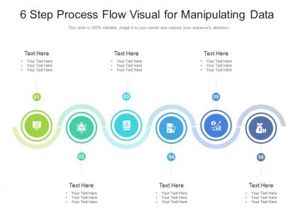
6 step process flow visual for manipulating data infographic template




Try Before you Buy Download Free Sample Product
 Impress Your
 Audience
 100%
100% Editable
 Save Hours
 of Time


This 6 Step Process Flow Visual For Manipulating Data Infographic Template is a professionally drafted slide that can be deployed by managers, executives, owners, consultants, and other individuals to make their presentation more visually appealing. This layout helps the viewers gain quality information in less amount of time, thus conveying your message in the best possible manner. It reinforces the topics presented and makes their explanation more simplified, which is why this infographic template will suit any professional domain. Its vivid colors, graphics, design, etc., not only increases the aesthetics of the slideshows but also initiates immediate action. One of the advantages of downloading this PowerPoint design is that it can be reproduced as PNGs, JPGs, and PDFs that can be stored for further application. Hence, without indulging in a vigorous brainstorming session, download this layout now.
People who downloaded this PowerPoint presentation also viewed the following :
6 step process flow visual for manipulating data infographic template with all 2 slides:
Use our 6 Step Process Flow Visual For Manipulating Data Infographic Template to effectively help you save your valuable time. They are readymade to fit into any presentation structure.
FAQs for 6 step process flow visual for manipulating
Honestly, you'll spend most of your time filtering data to grab specific rows and sorting stuff. Joining datasets together is massive - you're always combining tables from different sources. Grouping and aggregating with sum, count, average... that's your bread and butter right there. Cleaning is probably half the job though - duplicates, missing values, all that annoying stuff nobody warns you about. Converting data types constantly too since dates come in as text or whatever. Pivoting tables helps reshape everything. Master these basics in SQL or Python (or even Excel) and you're golden for like 90% of what you'll actually do day-to-day.
Think of data manipulation as getting your messy dataset ready for the real work. Raw data is always a disaster - duplicates everywhere, missing chunks, formats that make zero sense. So you clean it up first: remove the weird outliers, fill in gaps, make everything consistent. Honestly, skipping this step is like trying to cook with rotten ingredients. Your analysis will be trash if the underlying data is garbage. Start simple though - just handle duplicates and missing values. Those two things alone will save you tons of frustration down the road when you're building models or making charts.
Honestly, data manipulation tools are like your best friend when it comes to viz work. You'll want to clean up all that messy raw data first - trust me, nobody wants to look at charts full of inconsistencies and random gaps. These tools let you filter stuff out, create new calculated fields, and basically reshape everything until it makes sense. I always start backwards though - figure out what story you're trying to tell first. Then work your way back to see what transformations you actually need. It's way more efficient that way, plus you won't get lost in endless data rabbit holes.
Honestly, validate everything at each step - nulls, duplicates, weird formatting. I totally screwed up an entire dataset once by skipping this part, so trust me on that one. Back up your data first though, that's like rule
-
Appreciate the research and its presentable format.