

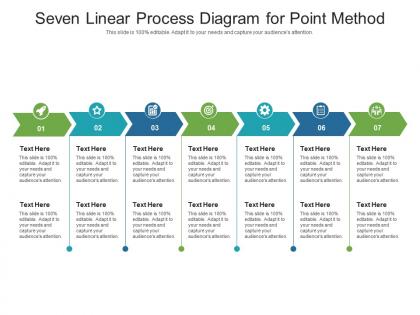
Seven linear process diagram for point method infographic template




Try Before you Buy Download Free Sample Product
 Impress Your
 Audience
 100%
100% Editable
 Save Hours
 of Time


Professionals belonging to any sector can use this set titled Seven Linear Process Diagram For Point Method Infographic Template. From managers, executives to lower-level employees, every individual can use this tool to present insightful details and implications in a well-structured format. Various charts and graphs are added to this infographic design that makes it a resourceful set. Not only will this add to the informative qualities of this template, but it also makes it an instant attention-grabber. Apart from this, it offers at a glance view of the topics, thus simplifying complex concepts. This helps in retaining the information presented for a long time. The biggest quality of this template is its visual elements, all added to elevate the aesthetic appeal of the presentation. Therefore download this template and present a customized version of it without any trouble.
People who downloaded this PowerPoint presentation also viewed the following :
Seven linear process diagram for point method infographic template with all 2 slides:
Use our Seven Linear Process Diagram For Point Method Infographic Template to effectively help you save your valuable time. They are readymade to fit into any presentation structure.
FAQs for Seven linear process diagram for point
So you've got seven main parts: input, your five process steps, then output. Pretty straightforward workflow mapping. Connect everything with arrows so the flow makes sense - I used to forget that part constantly. Each process step needs a short description underneath so people don't have to guess what's happening. Honestly, spacing these things is weirdly tricky at first, but whatever. Just sketch it on paper before jumping into software - saves you from redoing the whole thing later. The goal is making a visual guide that actually helps people follow along.
Okay so basically you take your project and split it into seven clear steps in order. Makes everything way less overwhelming when you can actually see the whole thing laid out. Plus you'll catch problems early - like when step 3 depends on something from step 5 (which happens more than you'd think). Your team won't get confused about where they are anymore. No more "wait, I thought we finished that part" conversations. Honestly, the visual thing just clicks for most people. Map out whatever you're working on right now using seven phases and you'll probably spot some messy areas immediately.
Manufacturing and healthcare are huge for these diagrams - they love the step-by-step clarity for complex workflows. Project management teams use them constantly too. Software dev is another big one, especially for sprint planning and deployments (though honestly, some teams go overboard with documentation). Service industries like hotels and logistics also jump on these since they need customers to understand their processes quickly. Oh, and anything with approval chains - those work great as linear flows. If you've got sequential steps that multiple people need to follow, definitely try mapping it out. Makes everything way clearer.
So basically, seven linear process diagrams are way more straightforward than regular flowcharts. Flowcharts can go all over the place with branches, decision points, loops - the whole mess. Linear ones just show seven steps in a straight line, period. It's like following a simple recipe vs. one of those crazy flowcharts that makes you feel like you need an engineering degree. Honestly, I love linear diagrams for stuff like onboarding new people or project phases where there's just one clear path. Save flowcharts for when things actually get complicated with multiple routes.
Don't cram too much detail into each step - high-level stuff works way better. Also, your flow should be super clean, like left-to-right or top-to-bottom. I've seen so many people get all fancy with the design when honestly, simple is king. Walk through it with someone fresh afterward - they'll catch the confusing parts you missed. Oh, and make sure your seven steps aren't just you splitting three real steps into smaller pieces (guilty of this myself). Those arrows can get messy fast if you're not careful. Test it before you call it done.
Dude, visual stuff is a game-changer for breaking down your seven steps. I'd use different colors or icons for each one – makes it super easy to tell them apart. Connect everything with arrows so the flow's obvious. Progress bars work great too, and honestly? Spacing matters more than people think. Don't make the same mistake I see everywhere with those text-heavy diagrams that nobody wants to read. Maybe throw in some simple illustrations that actually relate to what each step does. Oh, and definitely sketch it out by hand first before you mess with any design software. Way easier to spot problems early.
Oh totally! Just make it more of a loop instead of straight-through steps. Break those seven stages into smaller pieces that fit your sprints - like you're not doing all of stage 3 at once, just the chunk you need right now. Honestly, it feels weird at first going backwards to earlier steps, but that's kinda the whole point of agile anyway. I'd start by looking at which of your steps naturally go together, then see how they map to however long your sprints are. Way more flexible than the old-school waterfall stuff once you get used to bouncing around between stages.
Figure out your real starting trigger and actual ending first - those are your bookends. Don't pick some fuzzy "planning stage" as your start. Pick the first concrete action that kicks everything off. Most people screw this up by going too broad or weirdly narrow. You want specific enough to be useful but wide enough to cover everything that matters. Honestly? Write out your seven steps first, then work backwards. Ask yourself "what actually starts this whole thing?" and "when am I truly finished?" Boom - there's your endpoints. Way easier than trying to guess them upfront.
For seven process diagrams, I'd honestly just start with whatever you already have. PowerPoint or Google Slides work fine for basic stuff. Lucidchart is really solid though - great templates and you can share them easily with your team. Canva's got some nice-looking options too if you want something that doesn't look super corporate. Visio's good but kinda pricey unless your company already pays for it. Oh, and if you're already using Miro or Figma for other projects, those work too. I'd probably try the free options first, then switch to Lucidchart if you end up doing this regularly.
For your seven-step diagram, I'd go with a gradient - maybe blues flowing into warmer colors to show progression. Or assign different colors to whatever teams handle each step. Just don't make it look like a rainbow exploded on your page, you know? That's always a mess. Another option is keeping most steps neutral and using one bright color for the really important stuff like bottlenecks. Pick what you want to emphasize first, then stick with maybe 2-3 colors tops. Consistency is everything here.
Once you start noticing them, these seven-step processes are literally everywhere. Software dev has that whole plan-analyze-design-implement-test-deploy-maintain cycle. Manufacturing goes from raw materials straight through to shipping. Even employee onboarding follows this pattern - application to first day training. Honestly, I'm obsessed with using them for project management now. The main thing is each step has to flow into the next one without any loops or branches going sideways. It's like an assembly line, not some messy web thing. Next time you're planning a project launch, try breaking it into seven sequential phases. You'll spot the gaps in your process immediately.
Add curved arrows pointing backward from later steps to earlier ones - that'll show your feedback loops. Use dotted lines so they don't mess with your main flow. Like when step 5 loops back to step 2 for quality checks or whatever. Throw some labels on those arrows too ("if rejected," "needs revision"). Honestly, I've seen too many diagrams where feedback arrows turn everything into visual chaos, so don't go overboard. Keep your main linear process as the star of the show. The feedback stuff should feel secondary but still clear enough that people get it.
Honestly, seven-step linear diagrams are clutch for training new people. Complex stuff becomes way less intimidating when you break it down sequentially. Your trainees can see exactly where they are and what's coming next - no confusing branching paths or weird decision trees to stress about. Works great for customer onboarding, equipment setup, basically any procedure. I've found you can turn each step into a checklist pretty easily too, which helps with practice. Maybe start with whatever you train people on most? It's kinda amazing how much clearer things get when you just lay them out in order.
You'd be surprised how much cultural stuff affects those diagrams. Western readers expect left-to-right flow, but if you're dealing with Arabic or Hebrew audiences, flip it around. Colors are tricky too - red screams "stop" here but means luck in other places. Your icons might make perfect sense to you but confuse everyone else. Honestly, I learned this the hard way on a project last year. Get someone from that culture to look it over before you finalize anything. They'll spot problems you'd never catch, and it'll save you from looking clueless later.
Start with the big picture first, then break down your seven steps. Honestly? Seven steps sounds like a lot right off the bat. Group them visually or use colors to show different phases - makes it way less intimidating. Walk through everything in order instead of bouncing around. Your arrows need to be super clear because people will get confused otherwise. Oh, and ditch the internal jargon - use words stakeholders actually know. Don't try to cram everything into one presentation either. Stop at major milestones for questions instead of rushing through the whole thing.
-
I discovered this website through a google search, the services matched my needs perfectly and the pricing was very reasonable. I was thrilled with the product and the customer service. I will definitely use their slides again for my presentations and recommend them to other colleagues.
-
Excellent work done on template design and graphics.
-
Informative design.
-
Excellent products for quick understanding.
-
Much better than the original! Thanks for the quick turnaround.