


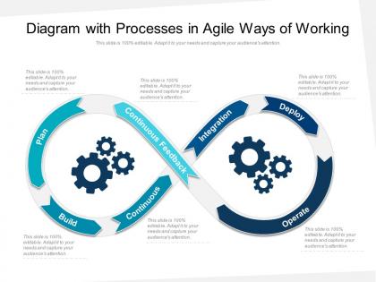
Diagram with processes in agile ways of working




Try Before you Buy Download Free Sample Product
 Impress Your
 Audience
 100%
100% Editable
 Save Hours
 of Time


Our Diagram With Processes In Agile Ways Of Working are topically designed to provide an attractive backdrop to any subject. Use them to look like a presentation pro.
People who downloaded this PowerPoint presentation also viewed the following :
Diagram with processes in agile ways of working with all 2 slides:
Use our Diagram With Processes In Agile Ways Of Working to effectively help you save your valuable time. They are readymade to fit into any presentation structure.
FAQs for Diagram with processes in agile
So most Agile diagrams have the usual suspects: product backlog, sprint planning, daily standups, sprint review, and retrospective. Plus the actual sprint work (obviously). User stories flow from backlog into sprints, with feedback loops connecting back to stakeholders and your product owner. The whole thing shows those iteration cycles - that's basically Agile's bread and butter. Honestly, I'd start by sketching out whatever process you're doing now. Then you can spot what standard Agile pieces you're missing or could tweak. Way easier than starting from scratch.
Honestly, having that visual diagram up somewhere saves so much time. New people can actually see where their work fits instead of being totally lost for weeks. Sprint planning becomes way less painful too - no more "wait, what comes after QA?" conversations every single time. Plus you'll spot the obvious bottlenecks faster when everything's mapped out. I mean, sometimes the problems are right there but you just can't see them without the visual. Keep it updated though, or it becomes useless pretty quick.
Oh man, so many good options! Miro and Mural are clutch for team brainstorming sessions - everyone can jump in and mess around with the sprint flows. If you need something polished for the higher-ups, go with Lucidchart or Visio. Draw.io is free and honestly pretty decent if budget's tight. I've literally seen people whip up solid diagrams in PowerPoint when they're desperate lol. My take? Just use whatever your team already has and can actually share easily. No point getting the fanciest tool if nobody wants to use it.
So Scrum diagrams are all about those time-boxed sprints - you'll see clear boundaries for planning sessions, daily standups, retrospectives, the whole cycle. Kanban's different though. It just shows work flowing through columns like "To Do" and "Done." Personally? Kanban looks so much cleaner visually. But some teams really need Scrum's structure to know when stuff happens. Your Scrum diagram will show specific roles and sprint timelines, while Kanban is more about steady flow with work-in-progress limits. Just pick whatever matches how your team actually operates - do you work in structured sprints or prefer that continuous flow thing?
Start with the main ceremonies - sprint planning, daily standups, reviews, and retros. The three roles (product owner, scrum master, dev team) should be clearly marked too. Product backlog, sprint backlog, and increment are your key artifacts. Arrows showing how backlog items flow through sprints are crucial - honestly, diagrams without clear flow just confuse everyone. Feedback loops make it actually useful since that's the whole point of Agile. Oh, and keep it simple at first. You can always add more detail later when people get the basics.
So those diagrams basically show you where stuff gets stuck by mapping out your workflow stages. When tasks start piling up in one column - like everything's jammed in "code review" - that's your bottleneck right there. Think highway traffic, you know? Way easier to spot these patterns visually than digging through boring spreadsheets. Look for stages where work flows in faster than it flows out, then figure out what's causing the backup. Oh, and definitely start timing how long each stage takes - that'll show you which bottlenecks are actually killing your delivery speed versus just being annoying.
So user stories are basically what flows through your Agile diagrams - the actual work going from backlog to done. They're the "what" that gets prioritized in sprint planning and built during sprints. I like to think of them as value packets moving through your workflow (sounds nerdy but whatever). What's cool is they keep your team focused on user needs instead of just tech stuff. In diagrams, they help you spot bottlenecks and see where things get stuck. Try mapping a few stories through your current process - you'll probably find some quick wins for improvements.
Yeah, absolutely change those diagrams as you go! Start with basic Scrum or Kanban stuff, but that's honestly just your starting point. Once you actually run sprints, you'll spot weird bottlenecks or realize you're missing steps. I always update mine after retrospectives - makes way more sense than sticking to some textbook process that doesn't fit your team. Plus new people can see how things really work, not just the theory. My first diagram looked nothing like what we ended up with after six months!
Swim lanes are clutch for separating who does what. Stick with standard flowchart symbols - nobody wants to decode your creative pentagon shapes. Color-code consistently: blue for dev, green for testing, red for blockers. I swear some people think more colors = better diagram. Your arrows should flow left-to-right or top-down naturally. Don't squish everything together either. White space actually helps people read the thing. Those feedback loops? Make them obvious - that's literally what makes Agile work. Oh, and start simple with your MVP version. You can always add complexity later if people aren't completely lost.
Honestly, Agile process diagrams are clutch for catching bottlenecks and showing stakeholders what's actually happening. Map out your workflow stages and dependencies first - it'll make those exec meetings way easier when you need to explain delays or ask for more resources. During retrospectives, these things are total lifesavers for spotting patterns. Keep updating them regularly though, otherwise they're useless. I learned this the hard way when I presented outdated info to leadership once... awkward. But seriously, use one in your next stakeholder meeting to show exactly where things get stuck. Way more effective than just talking about problems.
You should totally try agile process diagrams for your remote team. They're clutch when you can't just point at a whiteboard together. I love using Miro for this stuff - your whole team can jump in and edit things live, which honestly feels like magic sometimes. During standups, everyone's literally looking at the same visual of where work stands. Sprint progress becomes way clearer too. Retrospectives hit different when you've got diagrams to reference. Oh, and they're great for mapping workflows obviously. Just start simple with your next sprint and throw it up on your team calls.
Oh totally, most agile diagrams work great with project management tools! You can connect stuff like Jira or Monday directly to Lucidchart or Miro through APIs. Some even auto-update when your sprint data changes - seriously saves so much time explaining things to stakeholders. I'd honestly start by listing what tools you're already using, then find diagramming software that integrates well with those. Way easier than trying to force incompatible systems to work together (been there, not fun).
Oh man, the worst thing people do is cram everything into one massive diagram - it just becomes this unreadable mess. Start simple with your basic sprint cycle first. And please don't make it look like some old-school waterfall process with rigid gates everywhere... that's literally the opposite of what you're going for lol. People forget the feedback loops too, which is honestly where all the magic happens. Keep it visual and clean. You can always layer on complexity later, but most of the time? You won't need to.
Honestly, those process diagrams are game-changers for spotting where stuff goes wrong. Your team can actually see the bottlenecks instead of just complaining about them in meetings. During retros, everyone's looking at the same visual instead of having those "but that's not how it works" arguments - you know the ones I mean. The cool part is updating it after each sprint so it stays current with your changes. Start by mapping what you're doing now, then grab some red markers next retro and mark all the painful spots. Way more effective than just talking in circles about problems.
Honestly, color coding is a game changer for Agile boards. Different colors for each work type or team means you don't have to squint at labels during standups. Bottlenecks jump out immediately when you've got good visual separation. Your stakeholders will actually follow what's happening instead of looking confused – trust me on this one. Just don't go crazy with it though. Stick to maybe 3 or 4 colors tops, otherwise people's eyes start glazing over and you're back where you started.
No Reviews