

Issues solutions and result with icons




Try Before you Buy Download Free Sample Product
 Impress Your
 Audience
 100%
100% Editable
 Save Hours
 of Time


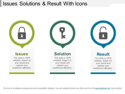
Struggling with project failures? Not sure how to highlight the issues of the project among the team? Do not worry! Download our predesigned issues solutions and results with icons PowerPoint template designed by highly skilful PowerPoint designers. Keeping our customer's daily project problems in mind, we have come up with this obstacles solutions and result PPT templates. This presentation template consists of three different steps which you can use to showcase your project issues, solution, and results. Apply this editable template design in your presentation to make your team understand the problems more clearly so that they can come up with the best solutions for project improvement. As this template design includes impressive icons, you can use the template design to craft presentation on various topics such as problem-solving techniques and strategies, problem statements, business challenges and opportunities, project management, project development, Business development, decision-making process, risk management, business problems, and solutions, etc. Go beyond the average ambit with our Issues Solutions And Result With Icons. Enrich yourself with a broader experience.
People who downloaded this PowerPoint presentation also viewed the following :
Issues solutions and result with icons with all 5 slides:
Instil good ethics with our Issues Solutions And Result With Icons. Caution folks about immoral conduct.
FAQs for Issues solutions and
Okay so three big things - clear hierarchy, good visual flow, and stick to one main story. Put your biggest stat front and center first. Then walk people through the supporting stuff in an order that makes sense. I'm telling you, I've watched perfectly good data get murdered by terrible rainbow color schemes. Use colors and fonts that don't assault people's eyeballs. Keep text short but actually useful. White space is your friend - cramped infographics look amateur. Oh and test it on someone clueless about your topic. If they're lost, you need to simplify more.
Okay so color theory is actually huge for infographics! Complementary colors make your key data really pop, while analogous ones give you that smooth, cohesive vibe. Warm colors are perfect for grabbing attention on important stats. Cool colors? Great for supporting details. Honestly, I used to go totally overboard with rainbow palettes - looked like a kindergarten art project lol. But sticking to 2-3 main colors plus some neutrals makes everything way more readable and professional. Pick one dominant color that matches your brand first, then build from there. Trust me, less is definitely more here.
So data visualization is just turning boring spreadsheets into something people actually want to look at. Charts and graphs help your audience spot patterns way faster than staring at raw numbers - which honestly, nobody wants to do anyway. The visual stuff guides people's eyes to what matters most. Makes comparisons super obvious too. I always tell people to pick whatever chart type tells your story best, not just what looks cool (though that's tempting). Oh, and don't dump everything into one chart - that's just visual chaos waiting to happen.
So you want your infographics to tell a story? Start with something that hooks people right away. Then walk them through your data like it's a mini adventure - problem to solution works great. I'm obsessed with ones that use real people or scenarios instead of just boring numbers floating around. Try arrows, numbered steps, maybe even those comic panel things to keep people moving through it. Short sentences work. Mix in some longer ones that actually flow naturally. The whole point is making someone go "oh wow, I get it now" instead of their eyes glazing over from data overload.
Honestly, the worst thing you can do is cram everything onto one slide - nobody wants to read your company's entire history in bullet points. Keep fonts big enough that people in the back can actually see them. I learned this the hard way at my first presentation, oof. Random colors everywhere screams amateur hour, so pick like 2-3 that work together. Double-check your numbers because one wrong stat and you'll lose all credibility. Oh, and skip those cheesy stock icons if possible. Start with what you want people to remember, then build everything else around that main point. Simple beats complicated every time.
Dude, typography can totally make or break your whole thing. Go with clean fonts - Arial, Helvetica, anything sans-serif really. They're way easier to scan quickly than those fancy decorative ones that look cool but are impossible to read. I learned this the hard way lol. Keep it to maybe 2-3 font families tops, play around with different sizes for hierarchy, and make sure there's good contrast with your background. Oh, and do the squint test! Sounds weird but if you can't read it while squinting, nobody else will be able to either.
Okay so for stats stuff, bar charts and line graphs are your go-to - there's a reason everyone uses them. Timeline or flowchart styles work perfectly for processes. Got comparison data? Side-by-side layouts are clutch, or those versus-style ones look pretty clean too. Maps are obvious for geographic stuff. Pyramid or tree formats handle hierarchical info really well. And honestly, network diagrams are great when you're showing how concepts connect to each other. The trick is matching how people already think about that info. Like, what would you naturally draw on a whiteboard? That's usually your answer right there.
So first thing - get your dimensions right for each platform. Instagram's all about squares, Twitter does landscape, Pinterest wants those super tall ones. Make your text huge because everyone's scrolling on their phone anyway. I literally cannot tell you how many beautiful infographics I've seen that are totally useless because you can't read them on mobile. Your brand colors should pop, and stick your logo somewhere it's visible but not annoying. Design stuff people actually want to share - those "holy crap did you know this" headlines work great. Oh, and save high-res versions for everything.
Honestly, just start with Canva - it's ridiculously easy and has a million templates. Yeah, you'll see the same designs everywhere but whatever, it works. If you want more creative control later, Adobe Illustrator is the gold standard (though it has a learning curve). Figma's cool too, especially if you're working with other people. Oh, and there's Piktochart and Venngage sitting somewhere in the middle - better customization than Canva but not as overwhelming as Illustrator. I'd say try Canva's free version first, see what bugs you about it, then decide if you need something fancier.
Oh man, this is such a big deal when you're designing for different countries! Colors are tricky - red screams "danger" to us but it's actually lucky in China. Reading patterns get weird too since some cultures scan right-to-left or totally different directions. Don't even get me started on icons... thumbs up seems harmless but it's super offensive in certain places! Data viz styles hit differently depending on cultural context too. What looks trustworthy to one group might seem sketchy to another. You'll definitely want to research your audience first and test locally before going global.
Always cite your sources - it's basic credibility stuff and keeps you out of plagiarism trouble. Throw a small "Sources" section at the bottom with URLs or study titles. Honestly, most people won't even look, but you need them there anyway. Keep the text readable but small, and if space is tight, use shortened links or QR codes that go to your full source list. Don't forget to credit any icons or data viz styles you borrowed too. Anyone should be able to fact-check your work easily.
Infographics are seriously game-changers for breaking down complicated stuff into bite-sized visuals that kids actually remember. Perfect for summarizing main points or showing step-by-step processes. I've watched teachers use them for everything from history timelines to science concepts - honestly, students just grasp things way faster when it's visual instead of boring text slides. Keep each one simple though, focused on just one main idea. Oh, and here's a tip that works really well: make templates students can fill out themselves. Turns them into active learners instead of just sitting there zoning out.
So interactive stuff is everywhere now - clickable charts, animated graphics, that whole deal. Mobile-first design is pretty much mandatory at this point. People want personalized data too, like charts they can customize or real-time updates. Motion graphics work crazy well on social media feeds. Way better engagement than static images. Oh, and accessibility is finally becoming a thing - better colors for colorblind users, screen reader support, all that. You should mess around with Figma or After Effects if you haven't. Even simple animations make such a difference. Data storytelling is big too - people don't just want numbers, they want the story behind them.
Honestly, interactive stuff makes all the difference for infographics. People want to click around and discover things - like hover effects that show extra data or sections that expand when you tap them. Way better than just staring at static info, right? It's kinda like getting to poke around vs. just being told what's there. Plus animated charts that build up piece by piece? *Chef's kiss* - users actually stick around longer instead of bouncing after two seconds. I'd start with basic hover states first though, since complex animations can get messy fast if you don't know what you're doing.
Honestly, I'd hit up your own stuff first - website, socials, email list. After that, shoot emails to bloggers and industry people who might dig it. Pinterest is weirdly amazing for infographics, and LinkedIn too if it's business-related. Make sure you create that embed code thing so other sites can post it easily while linking back to you. The friendly email approach works way better than you'd think - just explain why their readers would care. Oh, and definitely track what's actually working so you're not wasting time on dead channels.
-
Great designs, really helpful.
-
Innovative and Colorful designs.