Key Highlights Powerpoint Presentation Slides
Try Before you Buy Download Free Sample Product
Audience
Editable
of Time
Frame your thoughts with our Key Highlights Powerpoint Presentation Slides. They will acquire a fantastic look.

People who downloaded this PowerPoint presentation also viewed the following :
Content of this Powerpoint Presentation
Slide 1: This slide introduces Key Highlights with imagery. State company name and begin.
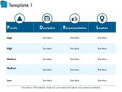
Slide 2: This slide presents Template 1 in a tabular form with the following sub headings- Priority, Description, Recommendation, Location.
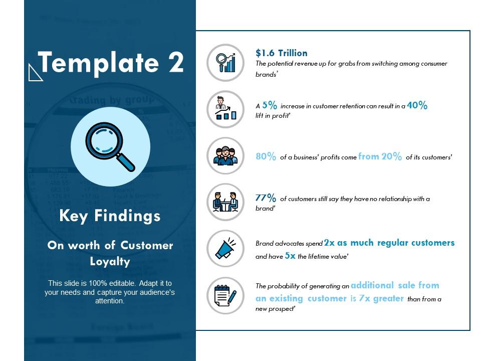
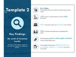
Slide 3: This is a Template 2 slide showing Key Findings with magnifying glass imagery.
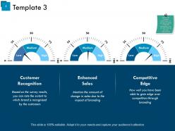
Slide 4: This is a Template 3 slide with the following parameters- Low, Medium, High. Monitor the company performance on the basis of these mentioned parameters. You can also alter them as per your requirement..
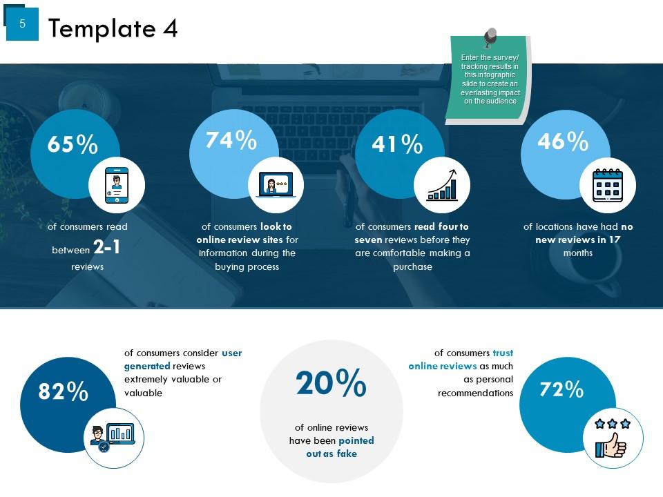
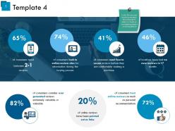
Slide 5: This slide showcases Template 4 infographic. Enter the survey/ tracking results in this infographic slide to create an everlasting impact on the audience.
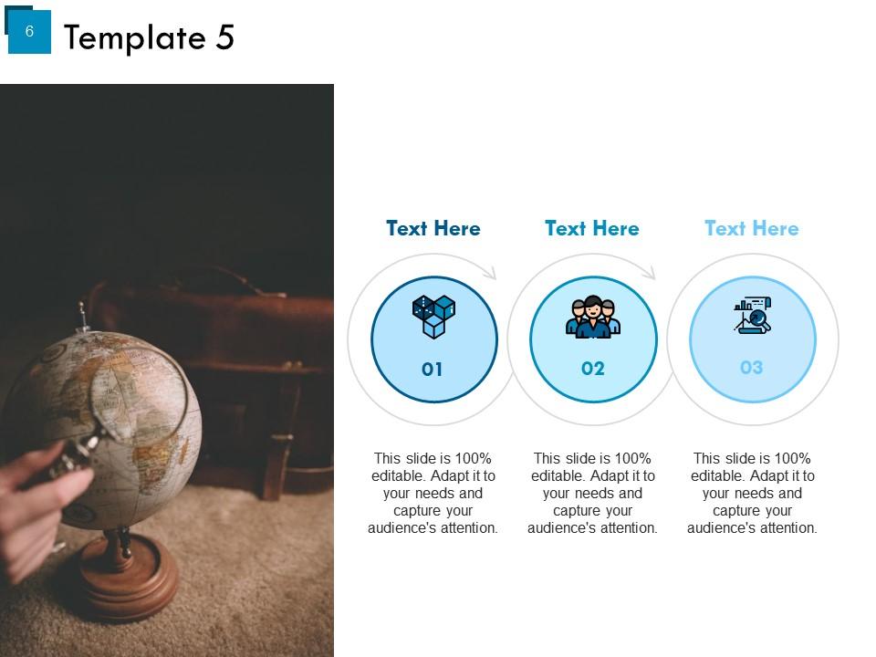
Slide 6: This slide presents Template 5 with imagery and text boxes.
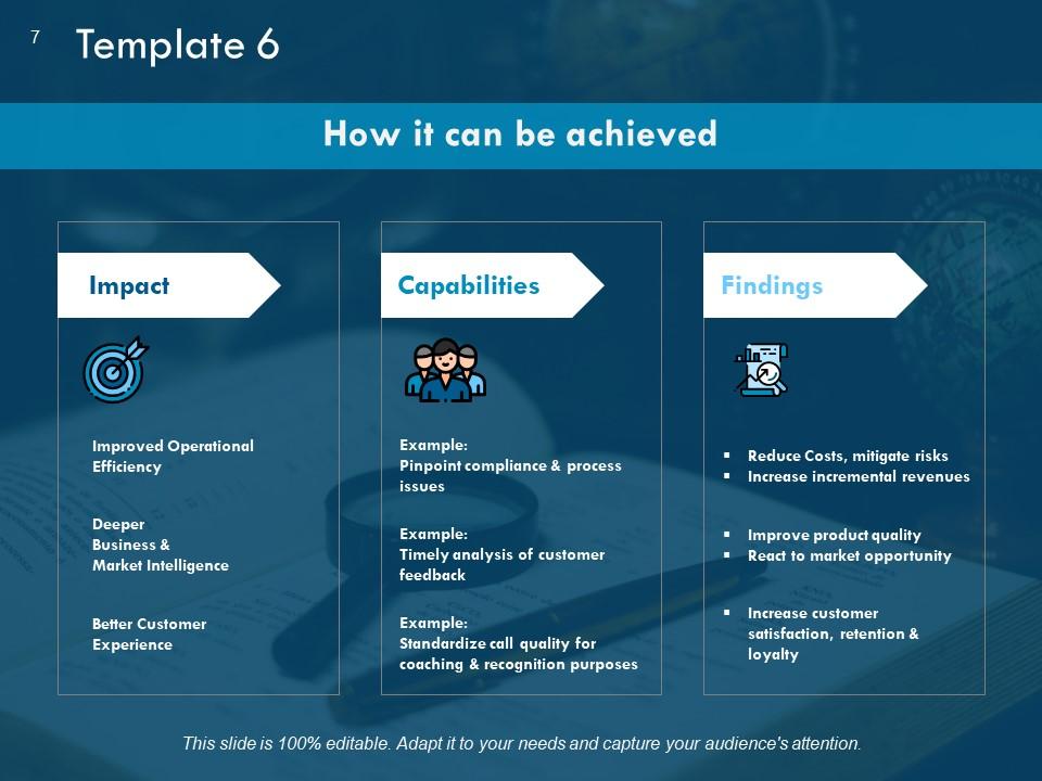
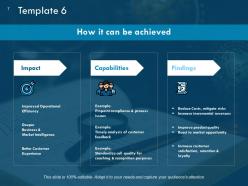
Slide 7: This slide states How it can be achieved with respect to- Impact, Capabilities, Findings. Present all these aspects here. You can also alter them on the basis of your requirement.
Slide 8: This is a Coffee Break image slide. You can modify the content as per need.
Slide 9: This is Key Highlights Icons Slide. Use or modify icons as per need.
Slide 10: This sldie is titled Charts & Graphs. You may change the slide content as per need.
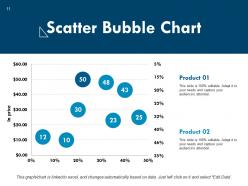
Slide 11: This is Scatter Bubble chart slide to state product/ entity comparison, specifications etc.
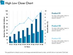
Slide 12: This is High Low Close Chart slide to state product/ entity comparison, specifications etc.
Slide 13: This slide is titled Additional slides for moving forward. You can change/ alter the content as per need.
Slide 14: This is Our Mission slide with vision, value and goal text boxes. State them here.
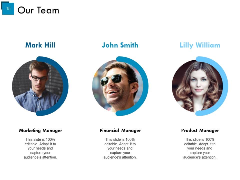
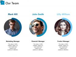
Slide 15: This is Our Team slide to present team related information, specifications etc.
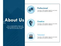
Slide 16: This is an About Us slide to state company or team specifications.
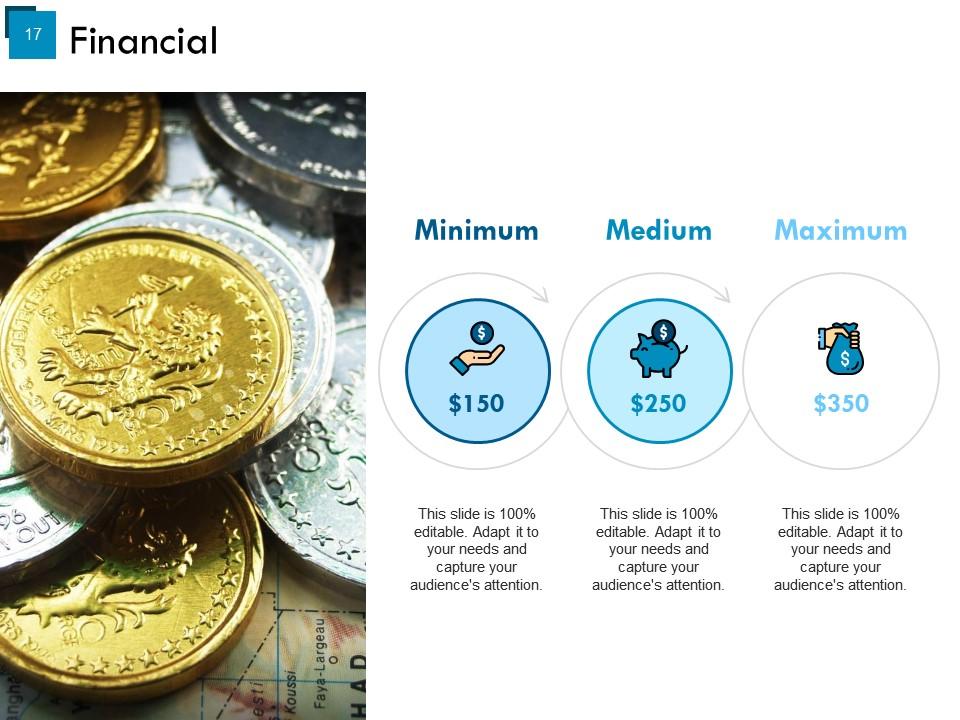
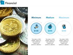
Slide 17: This is a Financial Score Highlights slide to show financial aspects etc.
Slide 18: This is a Thank You slide with Address# street number, city, state, Contact Numbers, Email Address.
Key Highlights Powerpoint Presentation Slides with all 18 slides:
Give the issue due importance with our Key Highlights Powerpoint Presentation Slides. Insist on it being considered.
FAQs for Key Highlights
Start with your company's brand colors and fonts - that's your foundation. You'll want a strong opening hook and clear agenda up front. Then focus on consistent visual design throughout the whole thing. I always make sure there's plenty of white space so it doesn't look cramped. Include designated spots for your key data points and supporting visuals. Logical transitions between sections are huge - I can't tell you how many pretty templates I've seen that totally bomb because the flow is garbage. End with a compelling call-to-action slide. Oh, and use placeholder text that actually helps structure your content, not just random Lorem ipsum stuff.
Pick 2-3 colors and stick with them - trust me on this one. Your slides will look way more professional instead of like a rainbow threw up on them. People can actually focus on what you're saying rather than getting distracted by clashing colors. I learned this the hard way after a presentation where I went crazy with different shades and could literally see people's eyes glazing over. Your brain colors are perfect for this since they're already cohesive. Consistent colors reduce mental overload too. Sounds obvious but you'd be surprised how many people mess this up.
Honestly, typography can make or break your whole presentation. Stick with simple fonts - Arial, Calibri, that kind of stuff. Nothing fancy that looks like you went wild in WordArt (we've all been there). Make your headers bigger than your body text so there's clear hierarchy. Don't cram everything together either - good spacing keeps people from getting overwhelmed and zoning out. Here's the thing: pick maybe two fonts max and stay consistent. I know it sounds boring, but it actually makes you look way more professional and put-together.
Just build visual stuff right into your templates - charts, icons, timelines, comparison blocks that auto-fill with whatever you're writing about. Create modular pieces like stat boxes or process diagrams. They work for basically any topic. Pick templates with spots for numbers and percentages that really pop visually. Honestly, plain text feels so boring once you start doing this. I'd grab maybe 2-3 infographic elements first and design templates around those - don't go crazy with everything at once. The modular approach is clutch because you can mix and match sections later.
Honestly, just go with boring fonts like Arial or Calibri - they actually work everywhere. Google Slides gets super weird with fancy transitions, so keep it simple. Make your text at least 24pt because trust me, what looks fine on your screen will be microscopic on someone else's. High-res images are good but compress them or your file will be huge and nobody wants to deal with that. Oh, and definitely test on both PowerPoint and Slides before you send it out. Always export a PDF backup too - there's always that one person still using Office 2010 or something ridiculous.
Start by swapping out the basic colors and fonts with your actual brand stuff. Then work on the logo placement and any graphics - honestly, most people stop here but that's why templates look so obvious. You want everything feeling cohesive, so if your brand's more serious, don't keep cutesy language in there. Adjust the spacing and layouts too. Even rewrite placeholder text to match your tone. The whole point is making it look custom, not like you grabbed something off the shelf and slapped your name on it.
Definitely go for high-res images - 300 DPI minimum so they don't look terrible when projected. Pick one style and stick with it throughout. Nothing looks more amateur than mixing stock photos with random clipart (seriously, it's painful to watch). Your images should actually relate to what you're saying, not just take up space. Make sure there's enough contrast if you're putting text over images. Oh, and compress those files or your presentation will be huge and probably crash mid-meeting. I'd suggest building a little image library with photos that match your brand - saves time later.
Your template layout is basically what guides people's eyes around each slide. When you have a clean, consistent setup, audiences can follow your points without getting confused by visual mess. Bad layouts? They make people work way harder to understand what you're saying - and honestly, who has time for that during a presentation. Where you put text, images, and white space all pulls attention where you want it. I'd say pick templates that actually help your story flow instead of fighting it. Oh, and definitely test a few slides first to make sure the layout works with what you're trying to say.
Hey! So with diverse audiences, start by thinking about accessibility and cultural stuff upfront. Colors mean different things across cultures, and you'll want bigger fonts for vision issues. Also, translated text can get weirdly long - learned that one the hard way. Mobile vs desktop usage varies tons between communities, plus internet speeds are all over the place. Honestly, the biggest thing is actually testing with real people from your target groups instead of guessing. Don't just assume what works. Get their feedback early because fixing things later is such a pain.
Honestly, less is more with animations. Only add them if they actually help - like drawing eyes to important stuff or making page transitions smoother. Keep them quick (under 300ms) and subtle. I've worked on sites where everything bounces and spins... it's just distracting tbh. Simple fades or slides work way better than flashy effects. Here's what I always do: turn off all animations and see if the content still makes sense. If your message needs animation to work, you've got bigger problems. The animation should fade into the background, not steal the show.
Oh nice question! Start with high contrast colors and stick to clean fonts like Arial - nobody needs fancy script making things harder to read. Add alt text spots for images and use proper heading order (H1, H2, etc). Here's something I learned the hard way: don't just use color alone to show important stuff since colorblind people will miss it completely. Focus indicators for clickable things are clutch too. Honestly, building this stuff into your template from day one is way smarter than trying to fix it later - trust me on that one!
Honestly, templates are lifesavers when you're dealing with messy info. They force you into organized chunks instead of word-vomiting everywhere. It's like having bumpers at a bowling alley - you can't just go off the rails! Each section guides your reader through logically. You end up prioritizing what actually matters and ditch the fluff. People can scan for key points without digging through walls of text. I used to hate templates (felt too restrictive) but now I swear by them. Try a basic one next time you're explaining something complex - you'll be shocked how much clearer everything sounds.
Honestly, templates are lifesavers. You'll have something decent in like 10 minutes instead of staring at a blank slide for an hour. They've got the colors figured out, fonts that don't clash, layouts that actually make sense. When I build from scratch, I always second-guess whether it looks amateur or not. Sure, you get more control doing it yourself, but unless you're secretly a designer... Templates aren't limiting either - just pick one that fits your style, swap in your content, maybe change a few colors. Way easier than starting with nothing.
Theme variations are basically the same template backbone with different styling - colors, fonts, images, content blocks. Your tech startup gets that clean minimal look. Meanwhile the restaurant version? Warm colors and food photos everywhere. Same foundation though, which is honestly genius because you're not rebuilding everything from scratch each time. I'd probably pick your main template first, then figure out what visual stuff would actually connect with each audience you want to hit. Saves you so much dev time.
Here's what I'd do - throw in some simple rating buttons (thumbs up/down works great). Comment boxes are clutch because people will literally tell you what sucks if you ask. I'd also watch your analytics to see which templates people bail on halfway through. Those monthly surveys help too, but honestly? Don't make the feedback process a pain. If it takes more than like 30 seconds, forget it - nobody's doing that. Oh, and actually use the feedback you get. I've seen so many companies collect feedback then do nothing with it, which is just annoying.
-
Good research work and creative work done on every template.
-
Topic best represented with attractive design.