


Key Findings Powerpoint Presentation Slides





Try Before you Buy Download Free Sample Product
 Impress Your
 Audience
 100%
100% Editable
 Save Hours
 of Time


Showcase educational research, business research, market research, scientific research and more using Key Findings PowerPoint Presentation Slides. Incorporate professionally designed key findings PPT presentation templates and present your conclusions to the clients, stakeholders, scholars, professors, etc. Summarize investigation and studies, jot down the results with key findings PowerPoint presentation slideshow. Present results in various forms such as lists, dashboards, graphs, etc. This deck comprises of different styles of PPT templates showcasing key findings and summarize research findings. Use easy-to-understand key findings PowerPoint presentation templates layout to summarize your research. Explain your points explicitly with key findings PPT slides. Report your findings of the study, final outcomes and put forward your recommendations. Use key findings PPT presentation slides for business and other reports. Our Key Findings Powerpoint Presentation Slides enable consensus to emerge. Focus on presenting the best with clarity and conviction.
People who downloaded this PowerPoint presentation also viewed the following :
Content of this Powerpoint Presentation
Slide 1: This slide introduces Key Findings. State Your Company name and get started.
Slide 2: This slide presents a Template with subheadings- Priority, Description, Recommendation, Location.
Slide 3: This slide presents another Template on Key findings with the subheading- On worth of Customer Loyalty.
Slide 4: This slide presents a Template for- Enhanced Sales, Customer Recognition, Competitive Edge.
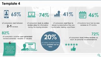
Slide 5: This slide presents a Template for showing customer oriented results and surveys. Enter the survey/ tracking results in this infographic slide to create an everlasting impact on the audience.
Slide 6: This slide presents a Template with imagery and text boxes to state specifications, information etc.
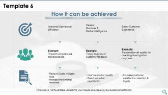
Slide 7: This slide Template focuses on- How it can be achieved. The sub headings include- Improved Operational Efficiency, Deeper Business & Market Intelligence, Better Customer Experience, Pinpoint compliance & process issues, Timely analysis of customer feedback, Standardize call quality for coaching & recognition purposes, Reduce Costs, mitigate risks, Increase incremental revenues, Improve product quality, React to market opportunity, Increase customer satisfaction, retention & loyalty.
Slide 8: This slide presents icons to be used for Key Findings. Choose as per requirement.
Slide 9: This is a Coffee Break image slide to halt. This icon is for display purposes only and is completely editable.
Slide 10: This slide is titled Charts & Graphs to proceed forward.
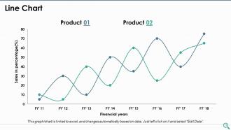
Slide 11: This is a Line Chart slide to show product/entity comparison.
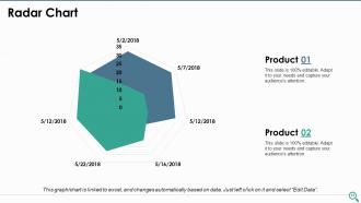
Slide 12: This is a Radar Chart slide to show product/entity comparison.
Slide 13: This slide is titled Additional Slides to move forward.
Slide 14: This is Our Mission slide. State mission, vision etc. here.
Slide 15: This slide presents Our Team with name, designation, image and text boxes.
Slide 16: This is an About Us slide. State team/company specifications here.
Slide 17: This is a Financial score slide. State financial aspects, results etc. here.
Slide 18: This is a Thank You slide with Email Address, Contact numbers, Address # street number, city, state.
Key Findings Powerpoint Presentation Slides with all 18 slides:
Eliminate communal discord with our Key Findings Powerpoint Presentation Slides. Create a foundation for amicable co-existence.
-

Key Findings
-
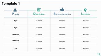
Template 1
-
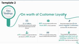
Template 2 Key Findings on Worth of Customer Loyalty
-
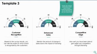
Template 3
-
Template 4
-
Template 5
-
Template 6 How it can be achieved
-
Key Findings Icon Slide
-

It s Time For A Coffee Break
-
Charts Graphs
-
Line Chart
-
Radar Chart
-
Additional Slides
-
Our Mission Vision
-
Our Team
-
About Us
-
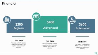
Financial
-
Thank You
 Click here to view PDF
FAQs for Key Findings
Keep it clean with lots of white space and stick to max 2 fonts. Your color scheme should work everywhere - cultural stuff matters more than you'd think. Build modular slides so you can swap content easily (total lifesaver when you're scrambling last minute). Make sure it handles everything: heavy text, visuals, charts, whatever you throw at it. I'd start with 3-4 solid master layouts. Oh, and create variations for different presentation lengths too. Test it with real content first though - don't just use placeholder text. Trust me on that one.
Colors mess with people's heads way more than you'd think. Red and orange get people hyped up - great for "buy now" buttons. Blues and greens? Total opposite vibe, super calming and trustworthy. Perfect when you're throwing a ton of data at people. I actually watched this guy bomb a presentation once because his colors were so jarring nobody could focus. Pick 2-3 colors that match what you're trying to say and don't go crazy with it. Your audience will feel it even if they don't realize why.
Dude, visuals are seriously a lifesaver for presentations. Your brain processes images like 60,000 times faster than text - which sounds made up but it's actually true. Nobody wants to stare at bullet point after bullet point, trust me on this one. When you use infographics, you're basically turning boring data into an actual story people can follow. I learned this the hard way after watching too many people zone out during my slides. Try swapping out half your text for relevant images or charts next time. You'll notice people actually paying attention instead of checking their phones.
So data-heavy templates are all about making info super easy to scan - tons of white space, clear sections, charts that make sense at a glance. Storytelling ones? Totally different vibe. They're designed to pull people through an emotional journey with smooth transitions between slides. It's like... you wouldn't organize a spreadsheet the same way you'd write a novel, right? Data presentations need stuff that stands alone - bullet points, tables, graphs. But storytelling decks build momentum as you go. Honestly, just ask yourself: do people need to analyze this info, or do I need to convince them of something? That'll tell you which route to take.
Honestly, I'd grab templates that already kinda match your vibe instead of trying to completely redesign them. Lock down your logo, colors, and fonts first - make those totally off-limits for changes. White space and button styles matter way more than people think too. Build yourself a simple brand kit so your whole team knows what's what. I swear, brands get so watered down because someone decides to "just change this one thing real quick." Create a couple solid master templates you can copy and tweak for different stuff. Way easier than starting from scratch every time.
Honestly, interactive stuff is a game changer because it forces people to actually pay attention instead of just sitting there scrolling Instagram. Polls work great - so do quizzes or anything clickable. Your audience has to engage their brain and respond, which keeps them tuned in. The bonus? You get instant feedback on whether your points are actually landing or if you're losing them. I'd say start simple though, maybe just throw in a poll or two. Even that small change makes people feel way more involved instead of like they're just being talked at for an hour.
Ugh, don't go for anything too flashy - those crazy animations just distract from what you're actually saying. I made this mistake once with some "premium" template that looked amazing in the preview but was a nightmare to work with. Keep it clean and simple so you can actually customize it without everything breaking. Also, match your company's vibe and how formal your audience is. Complex layouts will just eat up all your prep time. Honestly? Your content matters way more than fancy fonts or whatever. Go simple, you'll thank me later.
Oh definitely! Colors are huge - red screams luck in China but spells trouble here. Plus Middle Eastern folks read right-to-left, so your whole layout flips. Germans want ALL the data while we Americans love our flashy visuals. Japan? Super formal and clean. I bombed a Tokyo presentation once because I went too casual - learned that lesson fast! My advice? Do some quick research on their style first. Maybe grab a local coworker to peek at your slides before you present. Saves you from looking like an idiot.
Okay so the big thing right now is bold typography and interactive charts that actually tell a story. White space is huge - like, way more than you'd think looks right. Animations are cool but they need to have a point, not just random spinning stuff (honestly that drives me crazy). Everything has to work on phones since half the meetings are still hybrid anyway. Color-wise, earthy tones are having a moment, plus high contrast for accessibility. I'd start by looking at your current templates - the cluttered ones are probably what needs fixing first.
Honestly, templates are like having a GPS for your brain - readers don't get lost trying to figure out what you're saying. Put your big findings right at the top because people have zero patience these days. Use headers and white space so it doesn't look like a wall of text (nobody reads those). I always map out my main points first, then fill in the details. It's like organizing your junk drawer - way less frustrating when everything has a spot. Keep your formatting consistent throughout, and you'll be golden.
Okay so fonts - this matters way more than people think. Go with something clean like Arial or Calibri, nothing fancy or scripty because your audience shouldn't be playing detective with your text. Make it big enough that someone in the back row can actually read it (test it on your phone first). I usually stick to just two fonts - one for titles, another for everything else. Keeps it professional but not snooze-worthy. Oh and honestly? Skip those decorative fonts entirely. They look cool in theory but terrible in practice when projected on a wall.
Build accessibility right into your foundation from day one. High contrast colors and 16px+ text are must-haves. Structure everything with proper headings (H1, H2, etc.) so screen readers work smoothly. Alt text for images? Absolutely critical. Never use color alone for important info - learned that one the hard way when my colorblind coworker couldn't tell our "red = urgent" alerts apart. White space is your friend here. Make sure keyboard navigation actually works too. Honestly, just test with real accessibility tools before you launch anything. It'll save you tons of headaches later.
Here's what works: start with the problem you're solving, then your solution, then market size/traction. That 10-20-30 rule is still solid - 10 slides, 20 minutes, 30-point font minimum. Don't get caught up in fancy design when your content's weak. I see this constantly. Tell a story first, make it pretty later. Oh, and put your financials and what you're asking for upfront - investors hate digging for that stuff. One random thing that helps: write a killer one-page summary before you even touch slides. It'll force you to nail your core message.
Okay so here's what's been working for me - grab one of your templates and throw in a hook right at the start. Like, lead with an actual problem instead of diving straight into charts and data. I'd swap out those bullet points for something that flows better, you know? "We discovered this, then realized that..." Yeah it feels weird at first but trust me on this one. Your slides need that story structure - setup, challenge, how you solved it. Oh and definitely sprinkle in real examples throughout instead of keeping everything super abstract. Pick one template this week and just mess around with it. You'll see what I mean.
Want to know if your template actually worked? Watch your audience - were they engaged or scrolling their phones? Post-presentation surveys are honestly the best way to get real feedback on whether things flowed well. Did you hit your timing without rushing through slides? I always think the biggest tell is how confident I felt using it. Follow up in a few days to see what stuck in people's minds (that's when you know if your key points actually landed). But real talk, if you'd happily use that same structure again, it probably worked.
-
Helpful product design for delivering presentation.
-
Best Representation of topics, really appreciable.