


Key Initiatives To Enhance Productivity Powerpoint Presentation Slides




Try Before you Buy Download Free Sample Product
 Impress Your
 Audience
 100%
100% Editable
 Save Hours
 of Time


Check out our professionally designed Key initiatives to enhance productivity templates which aim to boost workforce efficiency and achieve organizational and individual goals. They provide a Performance management PPT workflow cycle and timeline to ensure the successful implementation of performance improvement strategies. Moreover, the Performance improvement methods deck encompasses various initiatives to enhance productivity, including work engagement and automation strategies suitable for all scenarios. Also, the staff productivity enhancement techniques PPT presents a detailed employee engagement plan outlining goals, purposes, and key performance indicators KPIs. Furthermore, the Employee Performance Management Presentation features a workflow chart, roles, and responsibilities of the HR manager and team, alongside cost analysis and a comparative software assessment to optimize overall performance. Lastly, in Performance management, Powerpoint presentations, KPI dashboards, and impact analysis tools are available to measure the effectiveness of employee engagement strategies. Take advantage of this opportunity to access these valuable resources and boost your staff productivity.
People who downloaded this PowerPoint presentation also viewed the following :
Content of this Powerpoint Presentation
Slide 1: This slide introduces Key initiatives to enhance productivity.
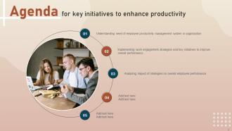
Slide 2: This slide depicts the Agenda of the presentation.
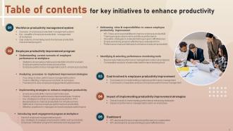
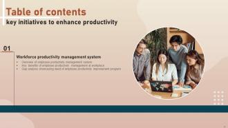
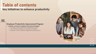
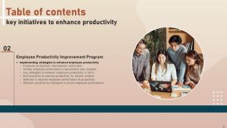
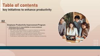
Slide 3: This slide incorporates the Table of contents.
Slide 4: This slide highlights the Title for the Topics to be discussed further.
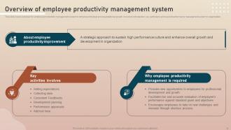
Slide 5: This slide presents the overview for employee productivity management system to enhance individual and organizational growth.
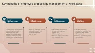
Slide 6: This slide showcases the Key benefits of employee productivity management at workplace.
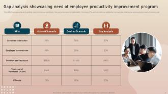
Slide 7: This slide portrays the Gap analysis showcasing need of employee productivity improvement program.
Slide 8: This slide elucidates the Heading for the Contents to be discussed next.
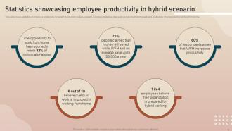
Slide 9: This slide reveals the statistics of employee productivity in current hybrid work culture scenario.
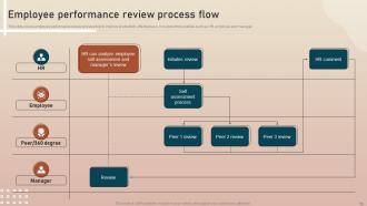
Slide 10: This slide deals with the Employee performance review process flow.
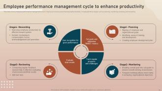
Slide 11: This slide covers employee performance management cycle to improve processes and enhancing staff productivity.
Slide 12: This slide displays the Title for the Ideas to be covered further.
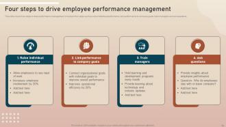
Slide 13: This slide exhibits the four steps to drive performance management.
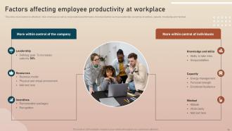
Slide 14: This slide shows the Factors affecting employee productivity at workplace.
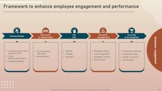
Slide 15: This slide illustrates the framework to drive employee engagement and performance.
Slide 16: This slide portrays the Heading for the Ideas to be discussed next.
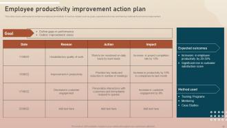
Slide 17: This slide focuses on the Employee productivity improvement action plan.
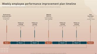
Slide 18: This slide talks about the employee productivity improvement plan timeline to enhance performance management.
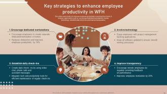
Slide 19: This slide lists the Key strategies to enhance employee productivity in WFH.
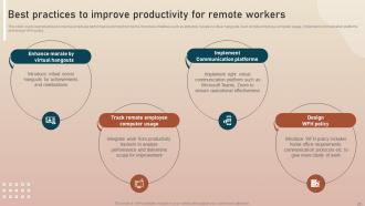
Slide 20: This slide incorporates the best practices to improve employee performance working from home.
Slide 21: This slide reveals the Methods to improve employee performance & productivity.
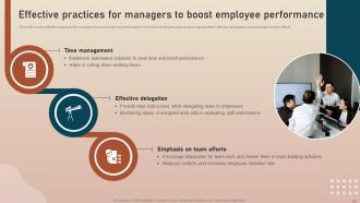
Slide 22: This slide emphasizes the Effective practices for managers to boost employee performance.
Slide 23: This slide mentions the Title for the Contents to be discussed next.
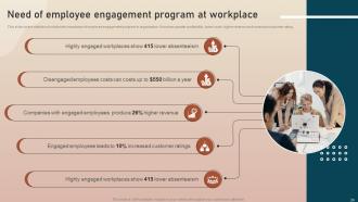
Slide 24: This slide mentions about the Need of employee engagement program at workplace.
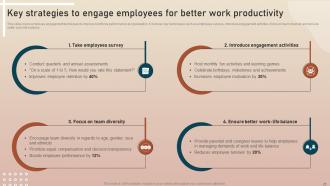
Slide 25: This slide indicates the Key strategies to engage employees for better work productivity.
Slide 26: This slide deals with the Employee motivation program to enhance work engagement.
Slide 27: This slide incorporates the Heading for the Topics to be covered in the upcoming template.
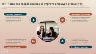
Slide 28: This slide elucidates the roles and responsibilities of HR managers to enhance employee performance at workplace.
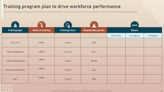
Slide 29: This slide represents the Training program plan to drive workforce performance.
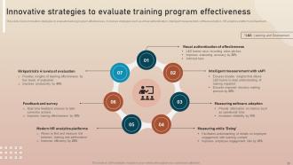
Slide 30: This slide provides information about the Innovative strategies to evaluate training program effectiveness.
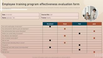
Slide 31: This slide indicates the Employee training program effectiveness evaluation form.
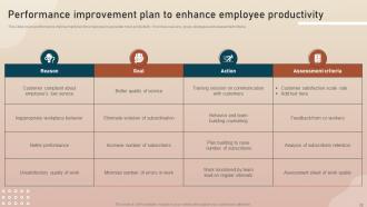
Slide 32: This slide reveals the Performance improvement plan to enhance employee productivity.
Slide 33: This slide elucidates the Title for the Topics to be discussed further.
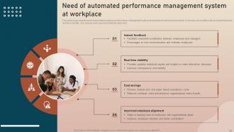
Slide 34: This slide covers significance of automated employee performance management system at workplace to enhance productivity.
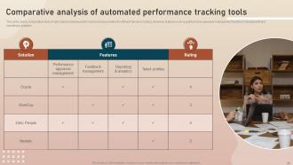
Slide 35: This slide presents the Comparative analysis of automated performance tracking tools.
Slide 36: This slide contains the Heading for the Components to be covered further.
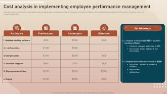
Slide 37: This slide deals with the Cost analysis in implementing employee performance management.
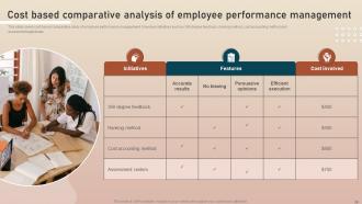
Slide 38: This slide covers cost based comparative study of employee performance management.
Slide 39: This slide depicts the Title for the Topics to be discussed in the upcoming template.
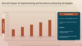
Slide 40: This slide outlines the Overall impact of implementing performance enhancing strategies.
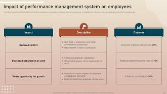
Slide 41: This slide focuses on the Impact of performance management system on employees.
Slide 42: This slide mentions the Heading for the Contents to be covered in the following template.
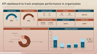
Slide 43: This slide showcases the KPI dashboard to track employee performance in organization.
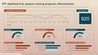
Slide 44: This slide presents the KPI dashboard to assess training program effectiveness.
Slide 45: This is the Icons slide containing all the Icons used in the plan.
Slide 46: This slide is titled as the Additional slides for depicting some extra information.
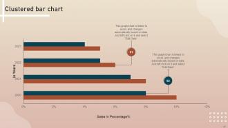
Slide 47: This slide portrays the Clustered bar chart.
Slide 48: This is the Venn diagram slide.
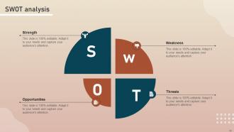
Slide 49: This slide shows the SWOT analysis.
Slide 50: This is the Puzzle slide with related imagery.
Slide 51: This is the Idea generation slide for encouraging fresh ideas.
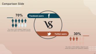
Slide 52: This is the Comparison Slide.
Slide 53: This is the Target slide for stating the Company targets.
Slide 54: This is the Thank You slide for acknowledgement.
Key Initiatives To Enhance Productivity Powerpoint Presentation Slides with all 59 slides:
Use our Key Initiatives To Enhance Productivity Powerpoint Presentation Slides to effectively help you save your valuable time. They are readymade to fit into any presentation structure.







FAQs for Key Initiatives To Enhance Productivity
Honestly, keep it super simple - clean layouts with clear before/after sections work best. You'll want space for actual numbers and timelines, not fancy graphics that distract from your point. Problem-solution-impact is my go-to template, or just do three sections: where you are now, your strategy, what you expect to happen. I've sat through way too many productivity presentations that were... well, totally unproductive because they were cluttered messes! Focus on showing real data and specific deadlines. That's what actually gets people to care. Think more like a dashboard, less like a design portfolio.
Dude, try swapping your bullet points for actual stories next time. People's brains are wired to remember narratives way better than random facts. I mean, how many PowerPoint slides from last month can you even recall? Stories with visuals keep everyone awake and actually paying attention. Complex stuff becomes way easier to grasp when there's a narrative thread. Your team will connect with the content emotionally instead of just sitting there waiting for it to end. Structure it like problem → journey → solution. Trust me, you'll get way more participation and better ideas flowing.
Oh definitely use color psychology! Blues and greens are your best friends - they keep people focused and help with decision-making. You can throw in some orange or yellow to highlight important stuff, just don't go crazy with it. Red's honestly kind of risky because it stresses people out, though it does grab attention. Keep it simple with like 2-3 colors max or you'll just distract everyone. I always use blue for my main slides and add yellow for action items. Works every time and looks way more professional than those rainbow nightmares some people create.
Look, charts and graphs are total game-changers for productivity data. Nobody wants to scan through endless rows of numbers – your brain just glazes over. With visual stuff like bar charts or heat maps, people instantly see if things are going well or tanking. I've sat through way too many meetings where someone pulls up a massive spreadsheet and everyone's eyes just... die. Progress bars, simple charts, whatever – they make your data actually digestible. Honestly, just throw one basic chart into your next report and watch how much more people pay attention.
Open with something they'll actually relate to - like spending 3 hours on what should've been a 30-minute task (we've all been there, right?). Structure it: what's currently broken, the real reasons why (not just obvious stuff), then solutions with actual examples. Don't forget implementation steps and ways to measure if it's working - otherwise you're just crossing your fingers. Keep each section tight and throw in some visuals so it's not a wall of text. Honestly, the ending matters most: give them clear next steps they can start tomorrow.
Your brain loves movement - that's why animated stuff works so well. When you show a task sliding from "to-do" to "done" or break down steps visually, it creates way more memory hooks than boring bullet points. Nobody wants to stare at static slides anymore, honestly. The motion keeps people focused and chunks info into bite-sized pieces. Instead of throwing everything on screen at once, try revealing tips one by one or animate those key transitions. Makes a huge difference in how much people actually retain.
Focus on metrics that actually matter - task completion rates, how long key processes take, employee utilization. Revenue per employee is good if you can track it. Quality stuff like error rates too, because what's the point of being fast if you're screwing everything up? Skip the flashy numbers that just look good in PowerPoint. Oh and maybe add some engagement scores since happy people work better (obviously). But seriously, stick to 4-5 max or everyone zones out when you're presenting.
Dude, whitespace is seriously underrated! I used to cram everything onto slides like I was running out of room - looked awful. Your brain needs space to actually process stuff, you know? Clean layouts help people focus instead of getting overwhelmed by visual chaos. Plus it makes those complicated productivity systems way less intimidating. Here's what works: only fill about a third of your slide with content. Leave the rest empty. Sounds weird but trust me, it's like giving your audience's eyes a place to rest between the important bits.
Honestly, go with the before/after template - it just works and people get it instantly. Show your baseline numbers, what you changed, then boom - the results. Problem-solution-results is solid too since it reads like an actual story instead of boring corporate speak. Always use real numbers though - like "cut task time by 40%" hits way harder than saying "improved efficiency." Oh and definitely lead with your biggest win first to grab attention. Visual comparisons are clutch too. I mean, nobody wants to stare at paragraphs of text when a simple chart tells the whole story, you know?
Tech companies are obsessed with metrics and automation stuff. Manufacturing goes hard on lean processes - cutting waste wherever they can. Healthcare's all about patient outcomes and fixing broken workflows. The jargon gets ridiculous no matter what industry you're in, honestly. What actually works across the board? Measure the right things, get your team on board, and test small before going big. Oh, and definitely steal ideas from companies your size in the same space. Way easier than starting from scratch. Case studies are your friend here.
Honestly, just tailor it to who you're talking to. Executives want the money stuff - ROI, bottom-line impact, all that data-heavy content. Team leads? They need the nuts and bolts: workflows, timelines, who's doing what. Individual contributors (and this is key) only care about tools they can use right now - skip the theory completely. Language matters too. Say "efficiency gains" to the C-suite, "streamlined processes" to managers, "time-saving hacks" to everyone else. Oh, and always start with what's in it for them personally before you connect it to bigger productivity goals. Works every time.
Throw in some interactive stuff - polls, Q&A breaks, quick check-ins every 10-15 minutes. Way better than just lecturing at people (seriously, watching eyes glaze over is painful). Ask how the tips actually fit their day-to-day work. Then hit them with a follow-up survey within 24 hours - what'll they really use vs. what sounds good but won't happen? Multiple feedback points before, during, and after keeps you tuned into what actually works. Oh, and people are surprisingly honest when you ask directly. You'll end up tweaking your content based on real responses instead of guessing.
Honestly, those templates are game-changers for team meetings. Everyone knows what's coming and actually shows up prepared instead of winging it. When people can jump in and edit stuff beforehand, you're not sitting there watching someone frantically pull slides together - been there, it's painful. The structure thing is huge too. Forces you to map out your agenda properly instead of just hoping for the best. I'd start basic: objectives up top, main talking points, then what happens next. Sounds boring but trust me, your meetings will actually get shit done instead of running in circles for an hour.
Honestly, realistic scenarios are where it's at because people see themselves in them instantly. Picture this: you show "Sarah juggling three urgent projects while getting pinged every 5 minutes" - everyone's like "omg that's literally me!" Then you walk through how Sarah actually handles it with time-blocking or whatever. Way better than boring bullet points, trust me. I always build presentations around 2-3 workplace personas now. It makes those abstract productivity tips stick because suddenly they're not abstract anymore - they're Sarah's Tuesday morning crisis that everyone relates to.
Honestly, Canva and Prezi will save you from making another soul-crushing PowerPoint. Miro's where it's at for collaboration - those sticky notes are weirdly addictive. Mentimeter keeps people awake with live polls, which is clutch. Oh, and Loom for recording quick explainers afterward. I'd probably start with whatever fixes your biggest headache first. Figma's solid too if you're doing more design-heavy stuff. Don't try to learn everything at once though - that's how you end up overwhelmed and back to boring slides.
-
I am glad to have come across Slideteam. I was searching for some unique presentations and templates for my business. There are a lot of alternatives available here.
-
I was mind-blown by the services that SlideTeam provided me. Thanks a ton!