

KPI Dashboard Snapshot To Measure Merchandising Plan Effectiveness




Try Before you Buy Download Free Sample Product
 Impress Your
 Audience
 100%
100% Editable
 Save Hours
 of Time


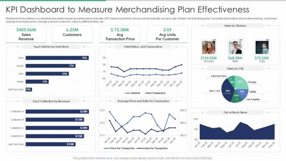
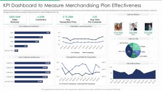
Mentioned slide outlines a comprehensive performance key performance indicator KPI dashboard which can be used to evaluate success rate of retail merchandising plan. It provides information about sales revenue, customers, average transaction price, average units per customer, sales by different cities, etc.
People who downloaded this PowerPoint presentation also viewed the following :
KPI Dashboard Snapshot To Measure Merchandising Plan Effectiveness with all 7 slides:
Use our KPI Dashboard Snapshot To Measure Merchandising Plan Effectiveness to effectively help you save your valuable time. They are readymade to fit into any presentation structure.





FAQs for KPI Dashboard Snapshot To Measure
Start with 3-5 metrics that actually move the needle - not just stuff that looks good in presentations. Your dashboard needs real-time data (or close to it) so you're not making decisions on old info. Design matters more than you'd think - keep it clean and readable. Nobody wants to squint at tiny charts. Drill-down features are clutch when something looks off and you need to investigate. I've seen way too many dashboards that try to cram everything onto one screen. It's a mess. Focus on metrics tied to real business goals, not vanity numbers that just make executives feel good.
First thing - figure out what metrics actually move the needle in your space. Healthcare? Patient wait times. Retail? Inventory turnover, that kind of stuff. Most dashboard tools are pretty flexible with widgets and data feeds, so you can customize however you need. But here's the thing - skip the executives and talk to whoever's actually in the data every day. They know what really matters. Don't go crazy with widgets everywhere. Pick maybe 5-7 solid KPIs and call it good. I'd honestly just build something basic first, then see what people actually use after a few weeks. Way easier than trying to nail it perfectly from the start.
Keep it stupid simple - gauges for single numbers, line charts for trends, and those red/yellow/green lights everyone gets instantly. Bar charts are solid for comparing teams or quarters. I swear, half the dashboards I see look like someone threw up a rainbow of charts everywhere. Nightmare to read. Max 5-7 metrics per screen, give everything room to breathe, and make those numbers huge. Oh, and here's the test - if your CEO can't figure it out in 10 seconds while walking by, you've overcomplicated it. White space is your friend, trust me.
First thing - get automated validation rules running on your data pipelines so garbage doesn't even make it to your dashboards. Assign owners to each metric because when stuff breaks (and it will), someone needs to fix it. Monthly audits are a lifesaver for catching discrepancies early. Document everything - your formulas, data sources, all of it. Future you will thank present you when you're not scrambling to remember why the conversion rate calculation looks funky. Also set up alerts for weird spikes or drops. Way better than having to explain questionable decisions to your boss later.
Here's the thing - real-time data is what separates useful dashboards from glorified PowerPoints. You'll catch problems while they're happening instead of discovering them days later when it's too late. Like, if your conversion rate suddenly drops, wouldn't you rather know immediately? Way better than getting blindsided by it in next week's report. I always tell people to set up alerts for their most critical metrics. That way you're not constantly staring at screens (because honestly, who has time for that?). Fresh data means you can actually do something about issues before they spiral.
Figure out what your business actually needs first, then pick KPIs that connect to those goals. Honestly, half the metrics people track are just for show - you want ones that'll actually change how you make decisions. Leading indicators are way better than lagging ones since they help you see what's coming instead of just what already happened. Don't go crazy with too many though. Stick to maybe 5-7 per dashboard or people's eyes will glaze over. Pay attention to which metrics your team actually talks about in meetings - that's how you know what's working.
Honestly, the worst thing you can do is cram everything onto one screen - it's like visual overload. Put your most important KPIs right up front where people can't miss them. Also, don't get sucked into vanity metrics just because they look cool. Make sure it works on mobile too since everyone checks these things on their phones now (learned that one the hard way). Your data needs to refresh regularly, and give people context around the numbers - raw data without backstory is pretty useless. Test it with real users first. They'll spot problems you totally missed.
Dude, once you get KPI dashboards set up, you'll wonder how you ever lived without them. No more waiting around for monthly reports when you can see what's happening right now. Conversion rates tanking? You'll know immediately instead of finding out weeks later when it's too late to fix anything. I'm probably way too obsessed with checking mine, but there's something satisfying about having your finger on the pulse like that. Just set up alerts for the stuff that really matters - otherwise you'll be glued to your screen all day like I was when I first started using them.
So for KPI dashboards, Tableau and Power BI are your best bets if you want something robust. Power BI's great if you're already using Microsoft everything. Google Data Studio won't cost you anything and honestly does most of what you need. Klipfolio and Geckoboard are decent too, though I haven't used them as much personally. Excel can work in a pinch - I know, I know, but sometimes you gotta work with what you have. Map out your actual KPIs first, then see what plays nicely with your data sources.
Honestly? Update that thing weekly at minimum, but daily's way better if your numbers are moving fast. Match it to how your data actually behaves - like website stuff changes daily, but monthly revenue can probably wait for weekly updates. I've watched so many dashboards just become background noise because they're stuck showing ancient data. Nobody cares about last month's conversions when they're making decisions today. Set up whatever automation you can swing, then actually make yourself look at it regularly. Short bursts work better than those marathon dashboard review sessions anyway.
Honestly, being able to check your numbers anywhere is game-changing. No more rushing back to your laptop when something feels off. Real-time data access means faster responses to problems - huge win there. I'm always checking stuff during random moments (coffee runs, waiting for meetings to start, whatever). Screenshots are super easy to fire off to teammates too. Oh, and definitely set up alerts for your main KPIs. Nothing worse than finding out about issues hours later when you could've acted sooner.
Honestly, you're gonna need some kind of ETL tool or data integration platform to pull everything together. Tableau and Power BI are solid choices - they can grab data from APIs, databases, spreadsheets, basically whatever you're working with. The real pain is getting your data schemas to match up. Otherwise you're stuck comparing completely different metrics and it's a nightmare. I'd start by listing out every single data source you have (trust me, there's probably more than you think), then find a tool that plays nice with most of them. Set up automated pipelines so it refreshes without you babysitting it.
Honestly, the key is making those dashboards actually matter to each person on your team. Show everyone metrics they can actually control - there's nothing worse than staring at numbers you can't do anything about. Visual stuff helps tons - good charts, colors that make sense. I know it sounds cheesy, but leaderboards and little achievement badges actually work pretty well if your team's into that. Regular check-ins where you talk through what the data means are huge. And definitely tie everything back to their personal goals so they can see how their work actually moves things forward. Makes all the difference.
So operational dashboards are all about daily/weekly stuff - response times, conversion rates, inventory. You know, things where you need to catch problems fast. Strategic ones? Those are the executive-level metrics checked monthly or quarterly. Revenue growth, market share, customer lifetime value. There's definitely some overlap though, which can get confusing. The main difference is really about timing and who's looking at it. With operational, you want data that lets you actually do something right away. Strategic is more like... are we hitting our big goals this quarter? Honestly, I've seen companies blur the lines way too much.
Honestly, permissions are huge - make sure teams only see what they actually need. Don't dump everything into one monster dashboard because scrolling through 50 charts to find your conversion rate is brutal. Role-based views work way better. Keep your naming consistent and let people know when data refreshes. Oh, and add little notes explaining what each metric means - half the battle is just understanding why something matters. The real magic happens when you get everyone in a room to actually talk through the numbers instead of just staring at screens. Trust me on that one.
-
Excellent design and quick turnaround.
-
Easily Editable.