


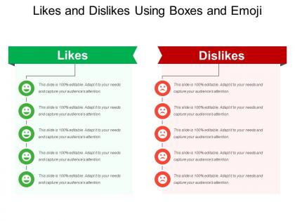
Likes and dislikes using boxes and emoji




Try Before you Buy Download Free Sample Product
 Impress Your
 Audience
 100%
100% Editable
 Save Hours
 of Time


Your thoughts will get about with our Likes And Dislikes Using Boxes And Emoji. They will come to everyone's attention.
People who downloaded this PowerPoint presentation also viewed the following :
Likes and dislikes using boxes and emoji with all 5 slides:
Enlist the support of our Likes And Dislikes Using Boxes And Emoji. They will give their all for your cause.
FAQs for Likes and dislikes using
Honestly, it mostly depends on who you're presenting to - boardroom meeting? Go conservative. Casual team check-in? You can be more relaxed about it. Also think about what kind of content you're showing. Data-heavy stuff needs cleaner layouts so people can actually read your charts. Your industry matters too (finance people are pretty boring with design choices, but creative teams can do whatever). Oh, and consider if you're presenting virtually or in-person - some templates just don't translate well on Zoom. I'd say start with your audience first, then pick something that matches your content's vibe.
Oh totally, colors really mess with people's attention spans. Blues make everyone chill and trust you more. Reds grab attention but can be overwhelming - I once used too much red and literally gave my audience headaches, whoops. Greens are super easy on the eyes though. Honestly, just pick 2-3 colors max that actually match what you're trying to say. High contrast helps people read your slides without squinting. Also think about your audience's background since colors mean different things in different cultures. Start with one main color that supports your message and build from there.
Dude, keep your presentation templates super simple. Trust me on this one. Your audience needs to focus on what you're saying, not get distracted by crazy fonts and flashy animations. I totally bombed a presentation once because I went overboard with the "creative" design - people just couldn't follow along. Clean layouts work way better anyway. Consistent formatting makes everything look more professional, plus it's honestly faster to put together. Maybe I'm boring, but minimal visual clutter wins every time. Your ideas should steal the show, not your template doing backflips.
Okay so first thing - grab your brand colors, fonts, and logo and build those into a master template. Most presentation apps let you set this up so new decks automatically use your stuff. Honestly, the "close enough" shade thing drives me crazy - use your exact brand colors! Keep it to 2-3 fonts max or it'll look messy. I'd make a few different template versions depending on what type of presentation you're doing. Then just save those as your starting points. Way easier than rebuilding everything from scratch each time.
Dude, minimalist stuff is everywhere right now - tons of white space and those chunky sans-serif fonts. Gradients are back but actually good this time, not like the weird 2010s ones. Interactive charts are getting crazy sophisticated, and honestly dark mode templates are kind of overdone at this point but clients love them. Everyone's doing these wonky asymmetrical layouts that break the grid system. Oh and accessibility is huge - better contrast, readable fonts, all that. You should definitely hit up Behance before starting anything new. 3D elements are cool now too if you can pull them off without looking cheesy.
Oh totally - this stuff matters way more than people think. Western crowds love that clean, minimal look with tons of white space, but Asian audiences? They're cool with dense, detailed slides that would overwhelm Americans. Plus there's the whole reading direction thing - learned that the hard way in Dubai when everyone seemed lost navigating my slides. Colors mean completely different things too depending where you are. Honestly, I'd just research your audience beforehand and maybe tweak your deck for different regions if it's a big presentation.
Honestly, just nail your visual hierarchy first - same fonts, colors, spacing throughout. That'll guide people's eyes exactly where you want them. Smooth transitions between slides help tell your story (but please skip the spinning text... we've all suffered through those). Give your content space to breathe with plenty of white space. Your icons and images should actually mean something, not just fill random gaps. Oh, and those little progress bars or section dividers? Super helpful so people don't get lost halfway through your presentation.
Honestly, focus on your content first - what you're actually trying to say. Then add design stuff that helps, not hurts. I've watched so many presentations where crazy animations just confused everyone lol. Your audience needs to get it fast, so readable fonts and clean spacing beat fancy decorations every time. But don't make it ugly either! Use color to highlight the important bits. Pick templates that actually fit your topic. Oh and definitely check how it looks from way back in the room - you'd be surprised how tiny some text gets. Function over flash, always.
Honestly, the worst thing you can do is fall for a template just because it looks slick. I've seen so many people grab these super elaborate designs thinking they're impressive, but then their actual content gets totally lost. Plus those busy backgrounds? Nightmare if you're presenting to a room full of people squinting from the back. Here's what I'd do - go simple. Find something clean where the text is actually readable. You want the template working FOR your message, not against it. Trust me, your audience will thank you when they can actually see what you're talking about.
Add clickable stuff right into your slides—polls, Q&A sections, even those "choose your own adventure" navigation things where people vote on what topic to cover next. Mentimeter works great for live polling. But honestly? Sometimes just asking "raise your hand if..." does the trick better than fancy tech. I'd throw in 2-3 interaction points throughout and maybe keep some blank slides ready for questions. Oh, and don't go overboard at first—start with one interactive thing per presentation. Nobody wants to feel like they're being forced to participate every five minutes.
Honestly, customizable templates are a game changer for user satisfaction. People just love making stuff their own - it's like finally getting to rearrange your workspace how YOU want it. Give them control over layouts, colors, fields, and they'll actually stick around and use your product way more. There's definitely a balance though. Too many options? Users get overwhelmed and bail. I'd start with maybe 3-5 solid templates they can tweak from there. The ownership factor is real - when users can personalize things, they're way more invested in actually using it consistently.
So basically, you want people's eyes to follow a path through your slides, right? Good typography does that automatically. I always stick to like 2-3 font sizes max - any more and it looks messy. Your headlines should obviously be bigger than body text, which should be bigger than those little caption things. Honestly, half the battle is just making sure people can actually read your stuff without squinting. I've sat through way too many presentations where the font was microscopic. The hierarchy thing sounds fancy but it's really just about making your main points pop while the supporting details stay in the background. Consistent spacing helps too.
Okay so first thing - ditch the tech jargon and code screenshots if you're presenting to healthcare people. They'll just stare at you blankly. Switch up your colors too, like finance folks expect those boring navy blues while creative agencies want something way more fun. Honestly, I'd keep your main structure the same though. Why torture yourself rebuilding everything? Just swap out the examples for stuff that actually matters to each audience. Oh, and definitely research their biggest headaches beforehand - makes such a difference. Pro tip: create a master template with blank spots for industry stuff. You'll thank me later.
Oh absolutely! You've gotta match what your audience expects. Gen Z wants bold, flashy stuff while executives prefer clean layouts. Industry matters too - creative fields love experimental designs but finance people want conservative, data-heavy templates. Cultural background affects color choices and imagery preferences as well. I totally bombed once presenting flashy slides to a traditional board (awkward). Tech comfort varies wildly between groups. Some love interactive elements, others just want basic slides that actually work. My advice? Research your audience first. Pick templates that speak their visual language, not yours.
Honestly, stick with clean layouts that won't make people's eyes bleed. You need the basics - title slides, regular content ones, maybe some image-heavy layouts for when you've got good visuals. Pick colors that actually work together (I've seen way too many neon disasters). White space is your friend - cramped slides look terrible. Oh, and please use readable fonts. Comic Sans is still a no, obviously. Keep headers and slide numbers in the same spots throughout so it looks professional. Once you've got a solid foundation, you can tweak it for whatever you're presenting.
-
Topic best represented with attractive design.
-
Commendable slides with attractive designs. Extremely pleased with the fact that they are easy to modify. Great work!