


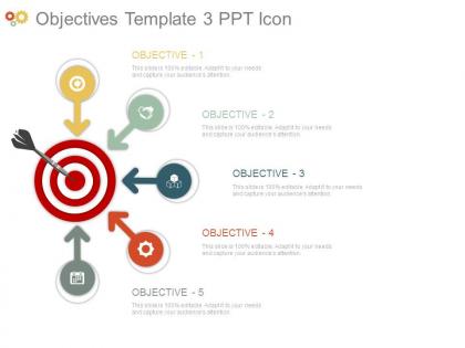
Objectives template3 ppt icon





Try Before you Buy Download Free Sample Product
 Impress Your
 Audience
 100%
100% Editable
 Save Hours
 of Time


Emblazon your brand with our Objectives Template3 Ppt Icon. Highlight the brilliant facilities available.
People who downloaded this PowerPoint presentation also viewed the following :
Objectives template3 ppt icon with all 7 slides:
Our Objectives Template3 Ppt Icon appeal to the cerebral types. They help project your mental dexterity.

FAQs for Objectives
Keep it stupidly simple - measurable goals, clear deadlines, and assign who's doing what. Your template should force people to be specific instead of writing vague bullshit (honestly, most corporate objectives are just fancy wishful thinking). Include the why behind each goal, not just what you're trying to hit. Build in check-ins so you're not flying blind for months. I'd rather have something almost too basic than another template that sounds impressive but tells you nothing. You can always jazz it up later once people actually start using it consistently.
So basically you gotta know your audience. Stakeholders? Hit them with ROI and business impact - that's all they care about. Your team needs the nitty-gritty stuff they can actually work with. Clients want to see how you're gonna solve their mess and what winning looks like. Honestly, I just keep different template versions because writing for everyone at once is a disaster. Way too confusing. Start with your main goal, then tweak the details for each group. Match the jargon and detail level to what they actually need. Makes life so much easier.
Honestly, the worst thing you can do is make your objectives super vague. Like "understand the market" - what does that even mean? I've sat through presentations with 8+ objectives and wanted to die. Keep it to maybe 3-4 max. Use action words like "identify" or "analyze" so people actually know what they're getting. Skip the corporate BS language too - just say what you mean. Oh, and make sure they're realistic for however much time you have. Nobody wants to sit there confused about what they're supposed to learn.
Oh totally, design makes a huge difference! I made this gorgeous template once with some fancy script font and literally no one could read it lol. Now I just stick to clean fonts - sans-serif works best. Colors help too if you use them right, like highlighting your top priorities or grouping similar objectives together. The whole point is making it scannable, you know? If people have to squint or think too hard about the layout, they'll just ignore it. Simple wins every time.
Honestly, visuals are a game-changer for making objectives crystal clear. People absorb info way faster when they see charts or icons instead of just reading paragraphs. Plus, nobody wants to stare at endless bullet points - that's just brutal. Simple graphics break everything into bite-sized pieces that actually stick. They also help create a natural flow so your audience can follow along without their eyes glazing over. I'd throw in some basic icons next to each goal or maybe a progress chart. Oh, and it keeps things visually interesting too, which... let's be real, matters more than we'd like to admit.
So basically these templates help you connect your team's work to the bigger company stuff. Start with whatever your company's focusing on this quarter, then break it down into what your department needs to hit, and finally what your specific team should tackle. Honestly, it's way better than everyone just guessing what matters. The cool part is everyone uses the same measuring stick, so you're not working in totally different directions. I'd work backwards from those big quarterly goals - makes it super clear what you should actually be spending time on. Way less confusing than most corporate planning nonsense.
So SMART criteria is your friend here - get specific with metrics and deadlines instead of wishy-washy stuff like "do better." Percentage targets work great. Also throw in a reality-check section because honestly, we all get carried away sometimes lol. Make sure your template forces you to list what resources you actually need and what might go wrong. That way you're not just dreaming big without thinking it through. The whole point is defining what success looks like upfront. Otherwise you'll just have those vague goals sitting there forever, never knowing if you actually hit them.
Oh man, objectives templates are honestly game-changers for getting better feedback. You know how you usually get those useless "nice job" comments? Well, templates fix that by giving people something concrete to respond to. Your audience can actually point to specific goals and tell you if you nailed them or totally missed the mark. Plus everyone's speaking the same language about what success looks like - way less confusing than those rambling feedback sessions that go nowhere. Pro tip: send the template ahead of time so people show up with real questions instead of just nodding politely.
Know your audience first - it totally changes how you write your objectives. Executives want the big picture stuff, but your team needs nitty-gritty details they can actually act on. I made this mistake once and watched the CEO's eyes glaze over during my presentation lol. The language you use matters too. If you're writing for clients vs internal stakeholders, everything shifts - your metrics, how detailed you get, even the terminology. Honestly, it's like switching between texting your boss and texting your friend. Figure out who's reading it, then adjust everything else around that.
Build in review checkpoints and use broader language when you write objectives. Don't get too specific with metrics - frame them around adaptable outcomes that can shift when priorities change. I learned this one the hard way after my project pivoted three times lol. Include buffer sections or "flex goals" that you can modify without redoing the whole template. Core objectives should stay stable, but make supporting details and timelines adjustable. It's honestly all about finding that sweet spot between structure and wiggle room so you're not starting over every time things change.
Build a main framework you can tweak for all your templates. Define your core categories first and stick to the same language - trust me, this saves so much "what did we call this again?" chaos later. Make a style guide with your go-to verbs and formatting rules. Different audiences need different complexity levels too. Do quarterly check-ins to catch any weird drift that happens over time (and it always does). Oh, and create a simple checklist for new templates so people don't go rogue with formatting.
You know what works really well? Turn those boring objectives into actual stories. Like instead of just saying "increase sales by 15%," tell people WHY - "customers keep complaining about slow service, so we're shooting for 15% growth by fixing our workflow." Way more interesting, right? Think of it as creating mini-stories with characters (your team, customers), problems (whatever's broken now), and the happy ending (what you want to achieve). People connect with stories so much better than random numbers on a slide. Honestly, I've seen this make meetings way less painful. Just start each goal with a quick scenario.
Honestly, just start with Google's OKRs - they're super transparent about their whole process and it's gold. Intel actually created this framework originally, which is kinda random but cool. Google does stuff like "Improve search quality" then breaks it down into specific measurable results. Spotify focuses heavy on user engagement numbers, Airbnb tracks growth plus host satisfaction. Even the Gates Foundation uses them for impact goals. The thing is, everyone keeps their objectives big and aspirational but then gets really concrete with the metrics and deadlines. I'd definitely peek at Google's published ones first - way easier to adapt something that's already working than starting from scratch.
Honestly, I'd go with Notion or Airtable for this - way better than basic spreadsheets. Google Sheets works too though if you're already comfortable with it. Set up dropdown menus for different goal types and use conditional formatting so things change colors when you hit milestones. Progress bars are super satisfying to watch fill up. You can even get fancy with automated reminders, but maybe start simple first? The clickable checkboxes and date calculations make everything feel more interactive. Just pick one platform and mess around with it - you'll figure out what works for your style pretty quickly.
Ok so for digital stuff, stick to 3-4 objectives max because honestly people's attention spans are trash online. Get them out there in the first couple minutes before everyone starts checking their phones. In-person is different though - you can do 5-6 since you've got actual eye contact and can tell when people are zoning out. Digital objectives need to be really bite-sized too, you're literally fighting against every notification going off. But when people are sitting right there in front of you, you can build something more complex since they're actually present. Oh and definitely throw in a recap slide at the end either way.
-
Design layout is very impressive.
-
Graphics are very appealing to eyes.